CoveragePost
November 6, 2020
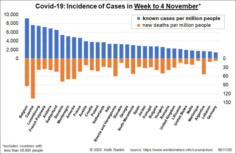
Analysis by Keith Rankin. This week’s first chart shows the resurgence of Covid19 in Europe, with Eastern Europe now much more prominent than before. The only countries in the Americas to appear in this chart are the Martinique (French Caribbean), United States and Argentina. There are no countries showing from Asia (excl. the Middle East and ... <a title="Keith Rankin Chart Analysis – Covid-19: Cases in the Week to 4 November" class="read-more" href="https://eveningreport.nz/2020/11/06/keith-rankin-chart-analysis-covid-19-cases-in-the-week-to-4-november/" aria-label="Read more about Keith Rankin Chart Analysis – Covid-19: Cases in the Week to 4 November">Read more</a>
CoveragePost
October 30, 2020
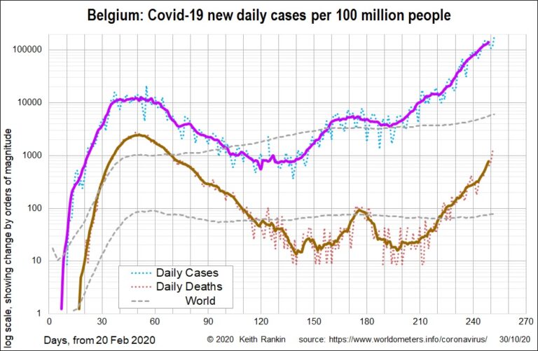
Analysis by Keith Rankin. This week’s charts show three small economically prosperous European countries with similar populations; Belgium has 11.6 million people, Switzerland 8.6 million, and Sweden has 10.1 million. Belgium has the third highest per capita death toll in the world from Covid-19; only Peru and little San Marino have had more deaths. Belgium got ... <a title="Keith Rankin Chart Analysis – Covid-19: Belgium, Switzerland and Sweden" class="read-more" href="https://eveningreport.nz/2020/10/30/keith-rankin-chart-analysis-covid-19-belgium-switzerland-and-sweden/" aria-label="Read more about Keith Rankin Chart Analysis – Covid-19: Belgium, Switzerland and Sweden">Read more</a>
CoveragePost
October 22, 2020
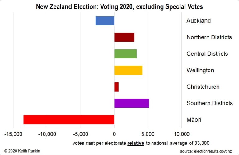
Analysis by Keith Rankin. This week’s first chart shows the average numbers of votes cast – on and before election day – in New Zealand’s different regions. In principle, all electorates have the same population, with electorate boundaries drawn with reference to population quotas based on census returns. However, each electorate may be up to ... <a title="Keith Rankin Chart Analysis – Election Day Demographics" class="read-more" href="https://eveningreport.nz/2020/10/22/keith-rankin-chart-analysis-election-day-demographics/" aria-label="Read more about Keith Rankin Chart Analysis – Election Day Demographics">Read more</a>
CoveragePost
October 16, 2020
Analysis by Keith Rankin. This week’s first chart looks at a familiar island country with the same population as New Zealand. The chart shows daily cases at the top, and daily deaths at the bottom; and it includes world averages for comparison. The most striking recent feature on the Ireland chart is the straight-line (exponential) growth ... <a title="Keith Rankin Chart Analysis – Covid-19: New European Outbreak" class="read-more" href="https://eveningreport.nz/2020/10/16/keith-rankin-chart-analysis-covid-19-new-european-outbreak/" aria-label="Read more about Keith Rankin Chart Analysis – Covid-19: New European Outbreak">Read more</a>
CoveragePost
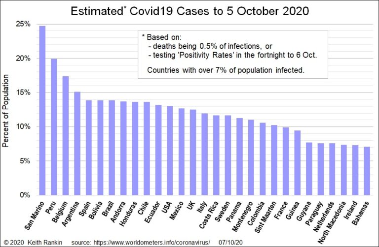
October 8, 2020
Analysis by Keith Rankin. This week the World Health Organisation (WHO) suggested that ten percent of the world’s population may have been infected with Covid19. While my estimates fall well short of this number for the world as a whole, they certainly show many countries with higher infection rates to date than ten percent. The ... <a title="Keith Rankin Chart Analysis: Covid-19 Case Estimates" class="read-more" href="https://eveningreport.nz/2020/10/08/keith-rankin-chart-analysis-covid-19-case-estimates/" aria-label="Read more about Keith Rankin Chart Analysis: Covid-19 Case Estimates">Read more</a>
CoveragePost
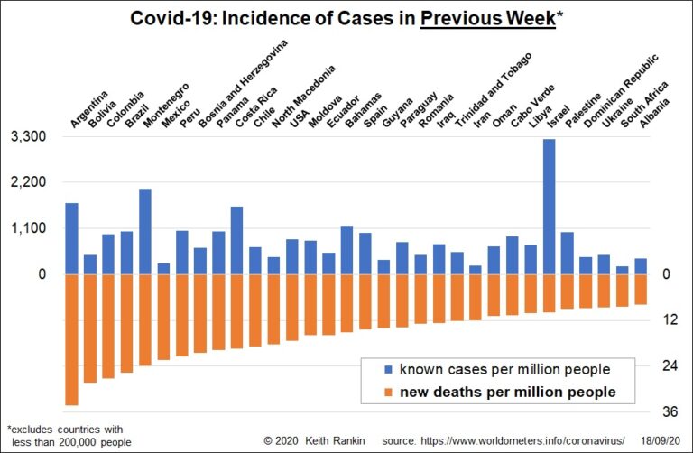
September 18, 2020
Analysis by Keith Rankin. In mid-September, new cases of Covid19 are higher than they have ever been. (See here for previous weekly charts, which included the ‘little’ countries.) While this still-rising incidence is partly due to more testing, it is also due to significant new outbreaks in the Levant (Israel, Palestine, Lebanon) and in Europe. ... <a title="Keith Rankin Chart Analysis – Covid-19 in mid-September: New Cases, Worst Cases" class="read-more" href="https://eveningreport.nz/2020/09/18/keith-rankin-chart-analysis-covid-19-in-mid-september-new-cases-worst-cases/" aria-label="Read more about Keith Rankin Chart Analysis – Covid-19 in mid-September: New Cases, Worst Cases">Read more</a>
CoveragePost
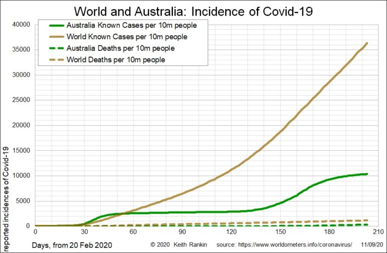
September 11, 2020
Analysis by Keith Rankin. The first chart shows the growth of Covid19 in Australia using an arithmetic scale. This means the axis labels on the left increase by a given number of cases; in this chart it is increments of 5,000 cases per 10 million people. Australia is currently sitting on just over 10,000 cases ... <a title="Keith Rankin Chart Analysis – Covid-19: Australia to Scale" class="read-more" href="https://eveningreport.nz/2020/09/11/keith-rankin-chart-analysis-covid-19-australia-to-scale/" aria-label="Read more about Keith Rankin Chart Analysis – Covid-19: Australia to Scale">Read more</a>
CoveragePost
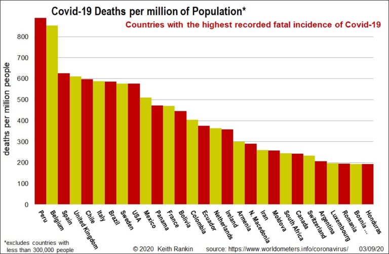
September 4, 2020
Analysis by Keith Rankin. Since its first death (in China) in January, 873 thousand people worldwide have died from Covid19. The chart shows the population-adjusted death tolls for the most-affected countries (excluding countries with less than 300,000 people. (San Marino – with 34,000 people – actually has the highest death rate.) In recent days, Peru ... <a title="Keith Rankin Chart Analysis – Covid-19: Countries with most Deaths and Cases to date" class="read-more" href="https://eveningreport.nz/2020/09/04/keith-rankin-chart-analysis-covid-19-countries-with-most-deaths-and-cases-to-date/" aria-label="Read more about Keith Rankin Chart Analysis – Covid-19: Countries with most Deaths and Cases to date">Read more</a>
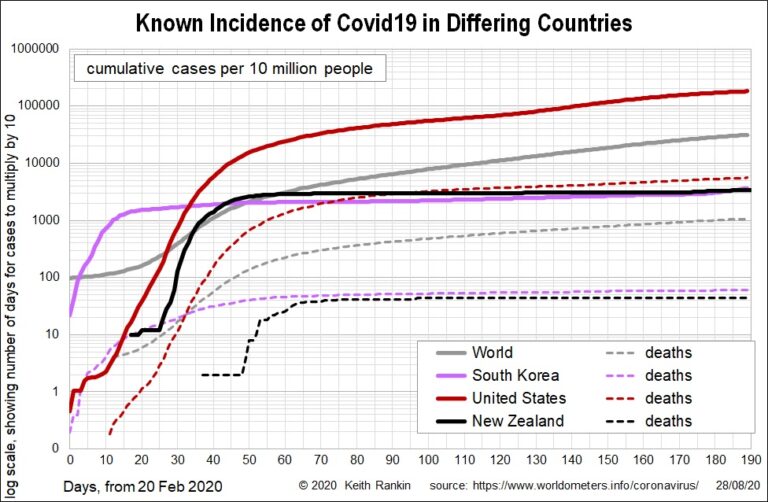
CoveragePost
August 28, 2020
Analysis by Keith Rankin. Global variation These two charts show Covid19 incidence in the world as a whole, in an American country (USA), an Asian country (South Korea), and New Zealand. The first chart shows cumulative cases, with the United States being about six times worse (close to an order of magnitude, which usually means ... <a title="Keith Rankin Chart Analysis – Covid19 towards the end of August 2020" class="read-more" href="https://eveningreport.nz/2020/08/28/keith-rankin-chart-analysis-covid19-towards-the-end-of-august-2020/" aria-label="Read more about Keith Rankin Chart Analysis – Covid19 towards the end of August 2020">Read more</a>
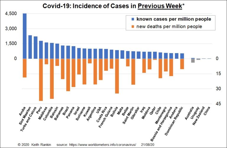
CoveragePost
August 21, 2020
Analysis by Keith Rankin. This week’s chart shows the most current Covid19 outbreaks, including all the little countries. As in March 2020, some of these are the worst affected. It also gives lie to the claim that New Zealand is advantaged by being an island country. In the gold and silver position are Aruba and ... <a title="Keith Rankin Chart Analysis – Covid19: Covid-19 in the Peak of the Northern Hemisphere Tourist Season" class="read-more" href="https://eveningreport.nz/2020/08/21/keith-rankin-chart-analysis-covid19-covid-19-in-the-peak-of-the-northern-hemisphere-tourist-season/" aria-label="Read more about Keith Rankin Chart Analysis – Covid19: Covid-19 in the Peak of the Northern Hemisphere Tourist Season">Read more</a>
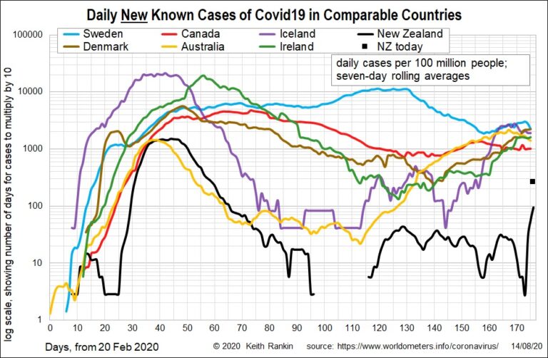
CoveragePost
August 14, 2020
Analysis by Keith Rankin. Today’s chart compares this week’s Covid-19 outbreak in New Zealand with the latest case-data from other comparable countries. Note that the data plots new daily cases, smoothed using seven-day averages. However, the ‘black square’ represents New Zealand’s most recent daily total of new cases, at 260 per 100 million people (which ... <a title="Keith Rankin Chart Analysis – Covid19: Comparing New Zealand’s Outbreak with Comparable Countries" class="read-more" href="https://eveningreport.nz/2020/08/14/keith-rankin-chart-analysis-covid19-comparing-new-zealands-outbreak-with-comparable-countries/" aria-label="Read more about Keith Rankin Chart Analysis – Covid19: Comparing New Zealand’s Outbreak with Comparable Countries">Read more</a>
CoveragePost
August 7, 2020
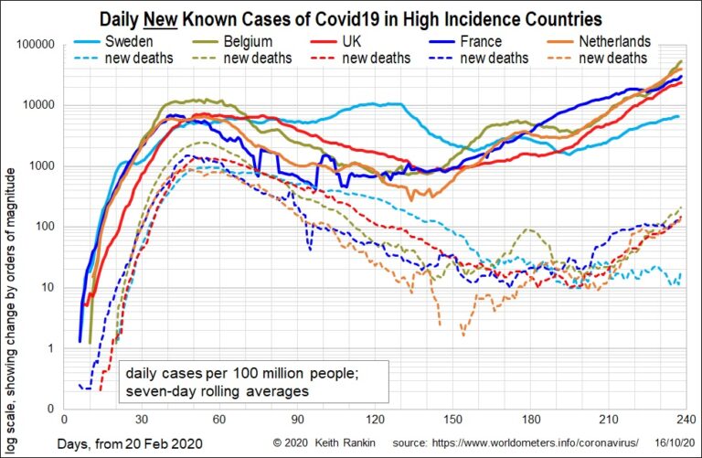
Analysis by Keith Rankin. The known incidences of Covid19 in Spain, Belgium and Sweden are similar, although Sweden lagged for a while before overtaking the other two. In deaths, Sweden is slightly lower than Spain and about 30% lower than Belgium. Belgium, after little San Marino, is still the country with the highest deaths per ... <a title="Keith Rankin’s Chart Analysis – Covid19: Comparing Australian Outbreak with High Incidence European Countries" class="read-more" href="https://eveningreport.nz/2020/08/07/keith-rankins-chart-analysis-covid19-comparing-australian-outbreak-with-high-incidence-european-countries/" aria-label="Read more about Keith Rankin’s Chart Analysis – Covid19: Comparing Australian Outbreak with High Incidence European Countries">Read more</a>