Analysis by Keith Rankin.
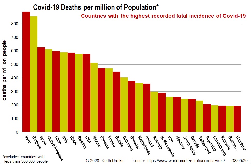
Since its first death (in China) in January, 873 thousand people worldwide have died from Covid19. The chart shows the population-adjusted death tolls for the most-affected countries (excluding countries with less than 300,000 people. (San Marino – with 34,000 people – actually has the highest death rate.)
In recent days, Peru has overtaken Belgium as the worst affected country in the world from Covid19. It’s hard to say why Peru is easily the worst affected country in the Americas – because Peru did go into early lockdowns.
Nevertheless, the city of Lima was severely affected, probably due to a mix of weak border quarantines at Lima’s airport, and the inability of the people to sustain a harsh and lengthy lockdown. (We see similar problems with South Africa.)
The European countries most affected initially continue to be among those with the most tragic outcomes, in part because of rising cases from July. Europe’s people are at their most mobile in the July and August summer months.
Other than Peru and Belgium, the lead countries are showing a consistent 600 per million deaths; equivalent to 3,000 deaths in New Zealand. (Contrast New Zealand’s actual 22 deaths; 4.4 deaths per million people.)
The next block of countries – from Mexico to South Africa in the chart – probably have actual Covid19 death rates also approaching 600 per million; some of these have marked discrepancies between official deaths and ‘excess deaths’ recorded. (The Economist has been keeping tagson ‘excess deaths’; and see Measuring the true toll of the pandemic; April 25.)
Mexico may well be closer to Peru’s statistic than to that of the USA.
Two very prosperous smaller European countries make it onto the chart: Switzerland and Luxembourg. (Re Luxembourg, see my ‘Europia’ and the Spread of Covid19.)
Switzerland now has a sustained ‘second wave’ of Covid19 cases, though these have barely shown up yet in its death statistics.
The third major region of the world to suffer Covid19 deaths is Eastern Europe. No Asian countries (except Iran) appear on the chart, and only one African country (South Africa).
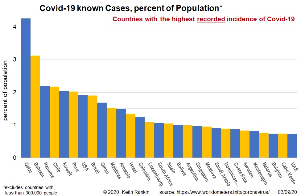
This chart, shows recorded (ie known) Covid19 cases as a percent of each country’s population.
When looking at these cumulative case statistics, we see that the Arabian countries dominate; and Singapore – which has an economy much like those of the Arabian Gulf States – also features. These countries – especially UAE, Qatar and Singapore – have early diagnoses, good quality health care, and high proportions of young immigrant workers. They also identify greater proportions of actual cases than do the countries which dominate the ‘deaths’ chart.
The countries in this chart which also feature in the ‘deaths’ chart most likely have actual infection rates similar to Qatar; probably actual cases around seven percent of the population.