Analysis by Keith Rankin.
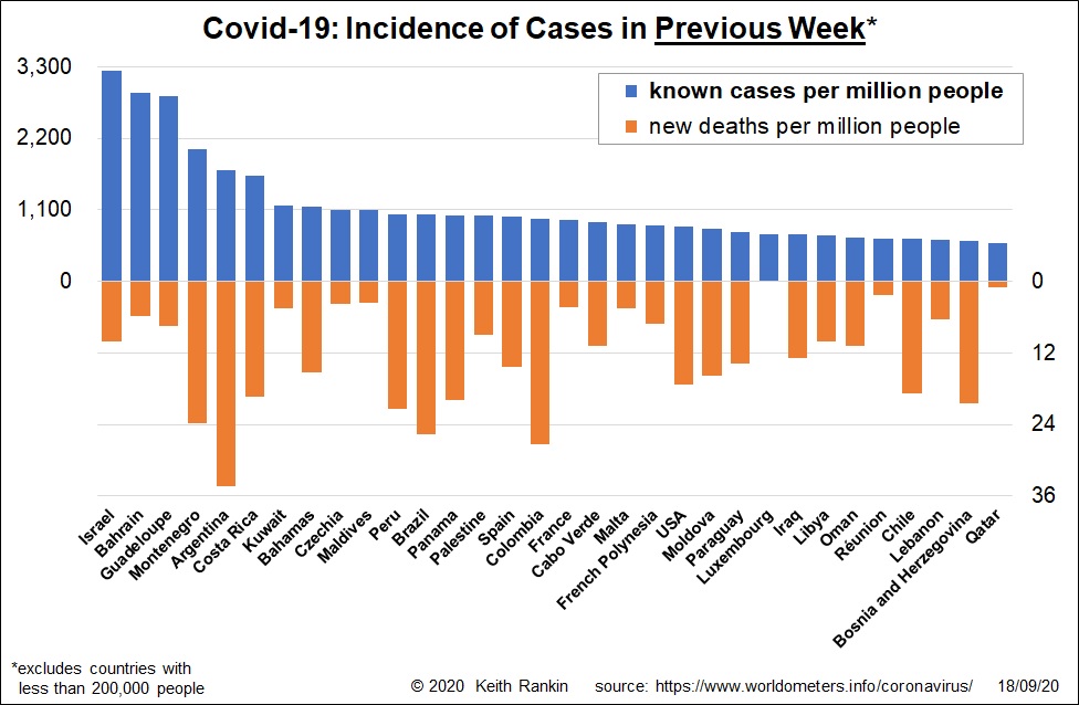
In mid-September, new cases of Covid19 are higher than they have ever been. (See here for previous weekly charts, which included the ‘little’ countries.) While this still-rising incidence is partly due to more testing, it is also due to significant new outbreaks in the Levant (Israel, Palestine, Lebanon) and in Europe. And it is due to an aggressive persistence of Covid19 in the Americas.
In Europe, Czechia – aka the Czech Republic – is the newcomer to the chart. It’s an important tourist destination, with Prague being (like Barcelona) a European city very popular with young visitors. (By the way, the flow of European tourists has been large this year, despite Covid19. I suspect that the main reason is the high level of non-refundable flight bookings made months ago, before Covid19 took hold. My sense is that the northern summer of 2021 will prove to be a much more muted affair; that there will be relatively few flight bookings in 2021 to major tourist destinations.)
Also important in Europe is Spain and France. For both countries, case numbers are worse in this outbreak than in the huge March outbreak; though with a younger age profile of cases, meaning fewer deaths. France is the premier tourist destination for Americans. And French dependencies are important tourist destinations for French people. So we see Guadeloupe, French Polynesia, and Reunion facing significant new outbreaks of Covid19. Also, we note Malta, an important Eurozone tourist destination in the Mediterranean Sea that had a very low incidence of Covid19 in March and April.
This time, summer ‘package’ tourism seems to have been the major new vector for Covid19. In March, the main virus transmission vectors were people returning to their home countries after family or business-related travel, well-heeled people (including bureaucrats and conference-goers) gathering in airports, business-places and apres-business hospitality places, and ski-related tourism.
The biggest gap in our statistics of past Covid19 cases is ‘socio-economic status’. Statistics on age, sex and ethnicity have been fully compiled. The importance of physical mobility – which is strongly correlated with socio-economic status – and business hospitality (as distinct from package tourist hospitality) as vectors in the initial European outbreak has not been adequately investigated.
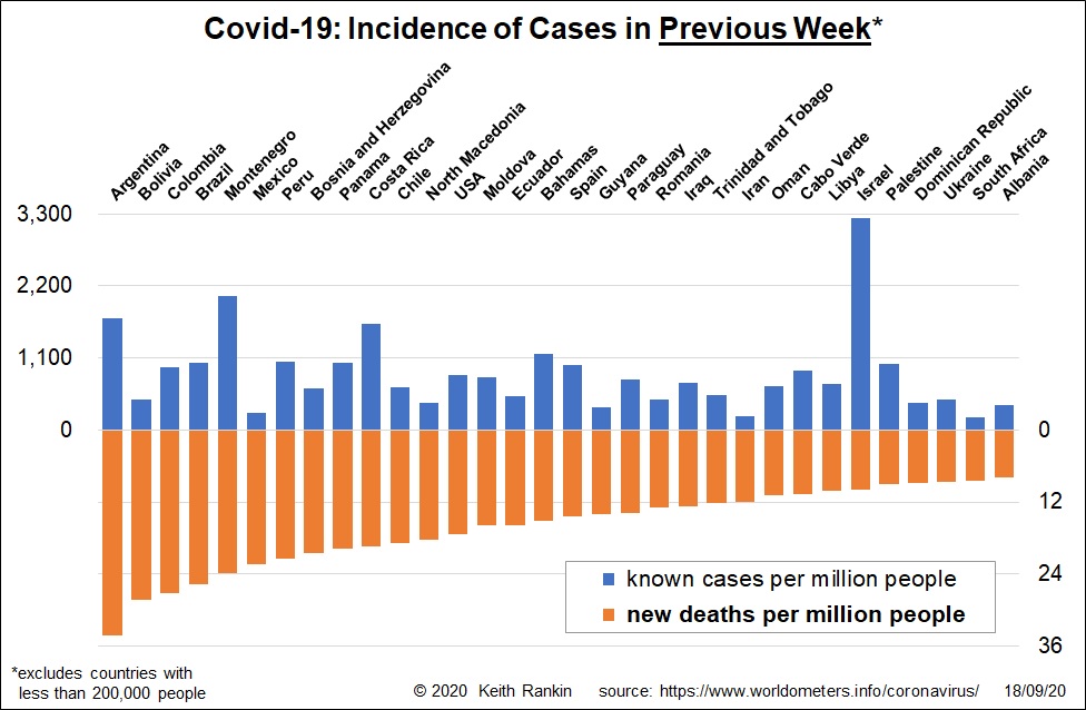
Deaths are highest in countries where new outbreaks took hold one to two months prior. So, we see Argentina topping the deaths’ chart this time; Argentina had been one of the South American countries least affected in April and May. Other South American countries remain prominent, indicating the tragic persistence of Covid19 in that region.
A number of southeast European countries are showing strongly in the September death statistics, reflecting the strength of the outbreaks in that region in July and August. One – Montenegro – was looking very good in June; it had an election recently, which may have been one contributing cause to its present outbreak.
The Caribbean region also shows up strongly, despite many Caribbean countries having been omitted from the chart this time, on account of them having fewer than 200,000 people. Indeed Aruba – which topped the ‘cases’ chart last time – has the highest case rate and death rate this month; it’s just that Aruba only has a population of 107,000. Places on the Caribbean close to Aruba that have made this chart for the first time are Guyana and Trinidad. Other countries on the Caribbean included in this chart are Colombia, Panama, Costa Rica, Mexico, Dominican Republic and the Bahamas; all are important visitor destinations. In general, the poorer countries in the Caribbean are the least affected by Covid19, although that may be in part because some of these countries have had little testing.
Finally, it is good to see South Africa close to falling off the deaths’ chart. Covid19 took a high toll in South Africa in July and August; both its cases and its deaths closely matched those of the United States. Now we see that the USA still remains high up both charts. South Africa has been doing the ‘hard yards’ much better than the Americas. Let’s hope that a new liberalisation of restrictions in South Africa doesn’t lead to a further Covid wave.