
Analysis by Keith Rankin.
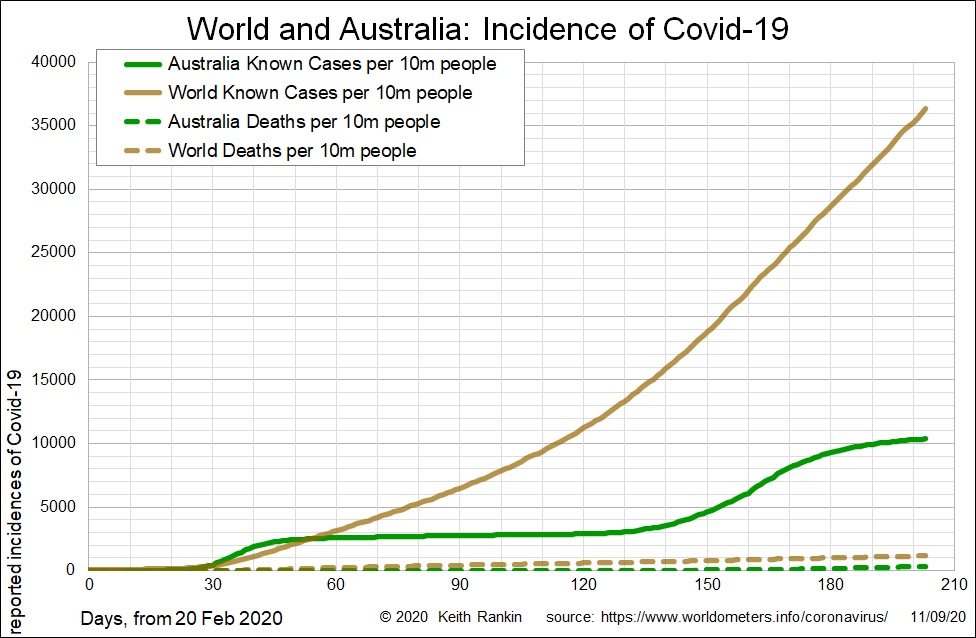
The first chart shows the growth of Covid19 in Australia using an arithmetic scale. This means the axis labels on the left increase by a given number of cases; in this chart it is increments of 5,000 cases per 10 million people. Australia is currently sitting on just over 10,000 cases of Covid19 per 10 million people; that translates to 26,000 cases, given that Australia has a population of about 25 million.
The world presently has over 36,000 known cases per 10 million people; so, Australia’s incidence of Covid19 is 28% of the global average.
While this chart is quite good at showing Australia’s two waves of Covid19 infection, it does little to tell the unfolding story of the world’s outbreak, and shows no detail at all in relation to the deaths.
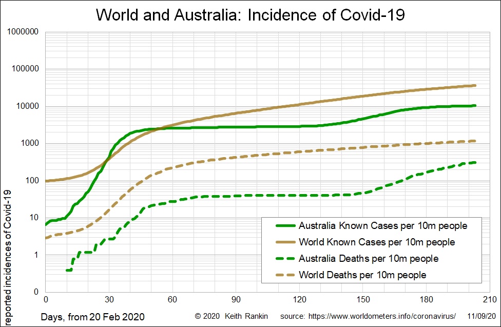
Much better is the second chart, which uses a logarithmic scale (as all my previous Covi19 line charts have done.) While this second chart shows exactly the same information, it represents the beginning of the pandemic much more clearly. And it clearly shows the relationships between deaths and known cases. The only disadvantage about the use of this scale is that it understates the second wave in Australia, especially in the solid-line plot of known cases.
In general, arithmetic scales – which most chartmakers use – exaggerate recent growth data, and may render important early data invisible. Also, when charting lower-value data against higher-value data – as in deaths (lower numbers) and known cases (higher numbers) –using an arithmetic scale deamplifies the lower-value data, maybe to the point of drowning it out.
The other advantage of using a logarithmic scale is that a straight line represents exponential growth; consistent exponential growth means growth at a specified percentage rate, as we come to expect with price increases (inflation), and with population and economic growth. (With the arithmetic scale, consistent exponential growth is depicted by a rising curve, which makes it look like accelerating growth.)
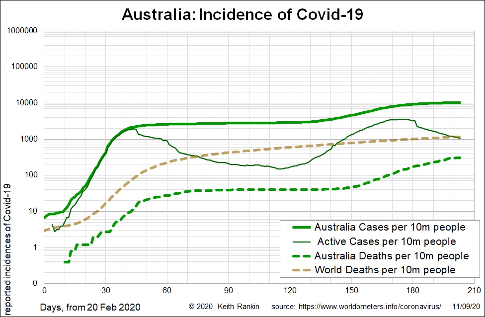
Here the Australian chart uses the logarithmic scale, with an added plot for ‘active cases’. (And without the plot for global known cases; a plot that has a relationship to actual cases that changes over time.) The plot for active cases is not perfect; countries are less careful about maintaining accurate recovery data than they are about new cases and new deaths. So, we see the odd kink in the ‘active case’ data series, a result of some recovery data being delayed. For some countries, low-quality recovery data makes the important ‘active case’ series too unreliable to tell the story accurately.
In this chart, the shortcoming of the previous logarithmic chart – the understatement of the second wave of cases – is overcome by showing ‘active cases’. The plot for active cases clearly shows that the second wave – the Victoria wave – was bigger than the first wave (which was mainly in Queensland and New South Wales).
The plot for global deaths is enough to place the Australian outbreaks into their global context. While Australian death rates per capita have always been below global death rates, we do see a bit of a catch up in Australia – towards the global average – in the last couple of months.
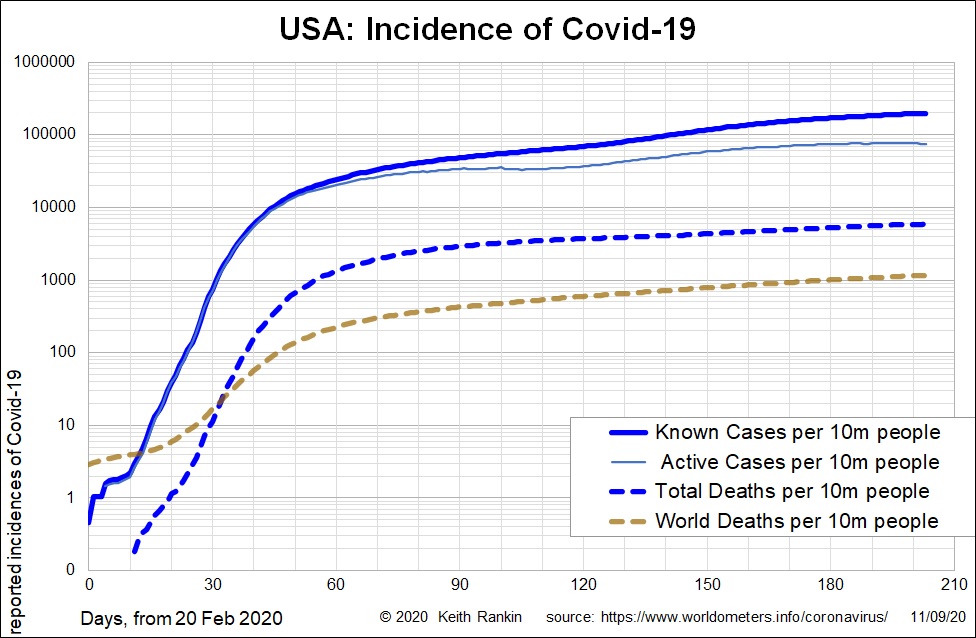
Finally, this most useful of Australian charts is compared to the equivalent chart for the United States. We see that the United States’ incidence of Covid19 has been well above the world average since the beginning of March, in complete contrast to Australia. We also see that there are no distinct waves of Covid19 in the USA. Rather, in the United States there was a period of rapid exponential growth in March, and then a long period of slower exponential growth from May to August.
The world still appears to be experiencing slow exponential growth of Covid19, at a rate that dates back to April.