CoveragePost
July 31, 2020
Analysis by Keith Rankin. This week’s first chart shows the incidence of new Covid19 cases in countries with more than 7,500,000 people. (Hong Kong is the smallest country to feature.) It shows that, while very serious, the Australian outbreak is far from unique. The outbreak in Israel, for example, is much worse. Generally, countries with ... <a title="Keith Rankin Chart Analysis – Covid19: Latest Incidences for Large Countries" class="read-more" href="https://eveningreport.nz/2020/07/31/keith-rankin-chart-analysis-covid19-latest-incidences-for-large-countries/" aria-label="Read more about Keith Rankin Chart Analysis – Covid19: Latest Incidences for Large Countries">Read more</a>
CoveragePost
July 23, 2020
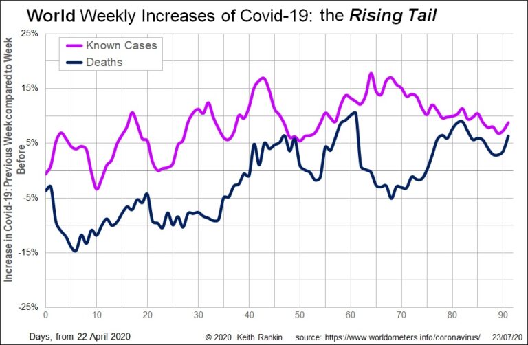
Analysis by Keith Rankin. This week’s first chart shows the huge European wave of Covid-19 in March. At its exponential peak, the chart shows world Covid19 weekly deaths increasing by 260 percent in the second week of March, compared to March’s first week. This European wave contrasts sharply with the last week of February, when ... <a title="Keith Rankin Chart Analysis – Global Covid19: European Wave and Rising Tail" class="read-more" href="https://eveningreport.nz/2020/07/23/keith-rankin-chart-analysis-global-covid19-european-wave-and-rising-tail/" aria-label="Read more about Keith Rankin Chart Analysis – Global Covid19: European Wave and Rising Tail">Read more</a>
CoveragePost
July 17, 2020
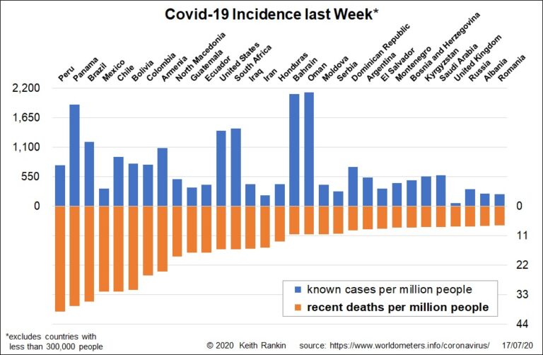
Analysis by Keith Rankin. This chart orders countries by their Covid19 death rates in the seven days to 16 July. The seven worst countries are in Latin America; all except Panama being large countries. Two other large Latin American countries (Guatemala and Ecuador) are in the top 11 for recent Covid19 deaths. Of the larger countries ... <a title="Keith Rankin Chart Analysis – Covid19: Recent Cases and Deaths" class="read-more" href="https://eveningreport.nz/2020/07/17/keith-rankin-chart-analysis-covid19-recent-cases-and-deaths/" aria-label="Read more about Keith Rankin Chart Analysis – Covid19: Recent Cases and Deaths">Read more</a>
CoveragePost
July 10, 2020
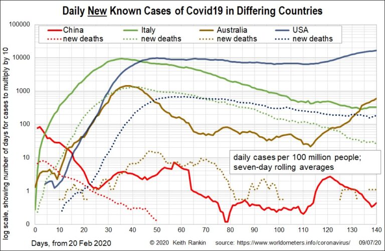
Analysis by Keith Rankin. These charts look at Covid19 incidence in China (the most important first-wave country, with a limited second wave), Italy (the lead second-wave country), and USA and Australia (second-wave countries – drawing their caseload from Europe – with limited first-wave exposure from Asia in January and February). Chart 1 shows the first-wave in ... <a title="Keith Rankin Chart Analysis – Covid19: Comparing China, Italy, USA and Australia" class="read-more" href="https://eveningreport.nz/2020/07/10/keith-rankin-chart-analysis-covid19-comparing-china-italy-usa-and-australia/" aria-label="Read more about Keith Rankin Chart Analysis – Covid19: Comparing China, Italy, USA and Australia">Read more</a>
CoveragePost
June 30, 2020
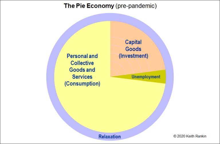
These charts tell a simple story about how the coronavirus pandemic could be a catalyst for the transition to a more sustainable economic future. Looking at Chart 1, the gross domestic product (GDP) of the economy is shown as the combination of yellow and orange. (We note that these charts represent another aspect of pie ... <a title="Keith Rankin Chart Analysis – Pandemic as a Catalyst for a New Economic Normal" class="read-more" href="https://eveningreport.nz/2020/06/30/keith-rankin-chart-analysis-pandemic-as-a-catalyst-for-a-new-economic-normal/" aria-label="Read more about Keith Rankin Chart Analysis – Pandemic as a Catalyst for a New Economic Normal">Read more</a>
CoveragePost
June 25, 2020
Analysis by Keith Rankin. We get a very biased picture of which countries have had the most experience of Covid19. It’s because the mainstream media almost never adjust their figures for population. So, in June, we keep hearing about United States and Brazil, but that’s mainly because they are very populous countries. It’s also because they ... <a title="Keith Rankin’s Chart Analysis – Covid19: Summary of Covid19 Incidence as of mid-June 2020" class="read-more" href="https://eveningreport.nz/2020/06/25/keith-rankins-chart-analysis-covid19-summary-of-covid19-incidence-as-of-mid-june-2020/" aria-label="Read more about Keith Rankin’s Chart Analysis – Covid19: Summary of Covid19 Incidence as of mid-June 2020">Read more</a>
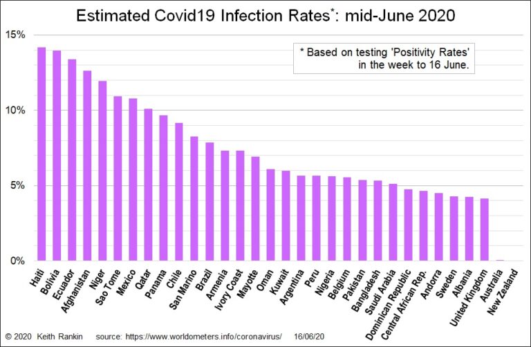
CoveragePost
June 17, 2020
Analysis by Keith Rankin. The above chart shows my estimates for the actual infection rates of Covid19 for all countries with an (estimated) infection rate of above four percent of their population. Plus, Australia and New Zealand. The principal method of estimation is to use the testing ‘positivity rate’. If the average positivity rate over the ... <a title="Keith Rankin Chart Analysis – Covid19: Estimates of Covid19 Incidence as of mid-June 2020" class="read-more" href="https://eveningreport.nz/2020/06/17/keith-rankin-chart-analysis-covid19-estimates-of-covid19-incidence-as-of-mid-june-2020/" aria-label="Read more about Keith Rankin Chart Analysis – Covid19: Estimates of Covid19 Incidence as of mid-June 2020">Read more</a>
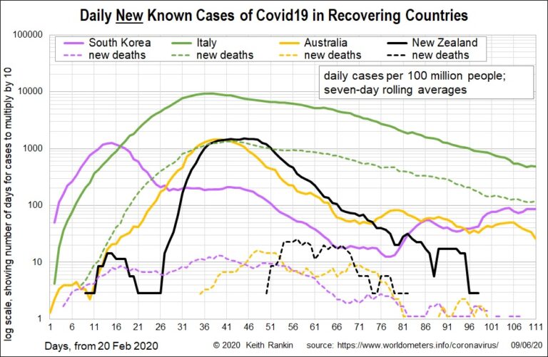
CoveragePost
June 10, 2020
Analysis by Keith Rankin. These charts plot seven-day rolling averages. It means that the most recent death and case incidences of Covid19 is the average of new cases for the seven days ended 9 June 2020. The New Zealand data looks incomplete, but that’s because it is now zero; New Zealand is recovered, not recovering. Contrast ... <a title="Keith Rankin Chart Analysis – Covid19: Cases and Deaths over Time for Recovering and High-Incidence Countries" class="read-more" href="https://eveningreport.nz/2020/06/10/keith-rankin-chart-analysis-covid19-cases-and-deaths-over-time-for-recovering-and-high-incidence-countries/" aria-label="Read more about Keith Rankin Chart Analysis – Covid19: Cases and Deaths over Time for Recovering and High-Incidence Countries">Read more</a>
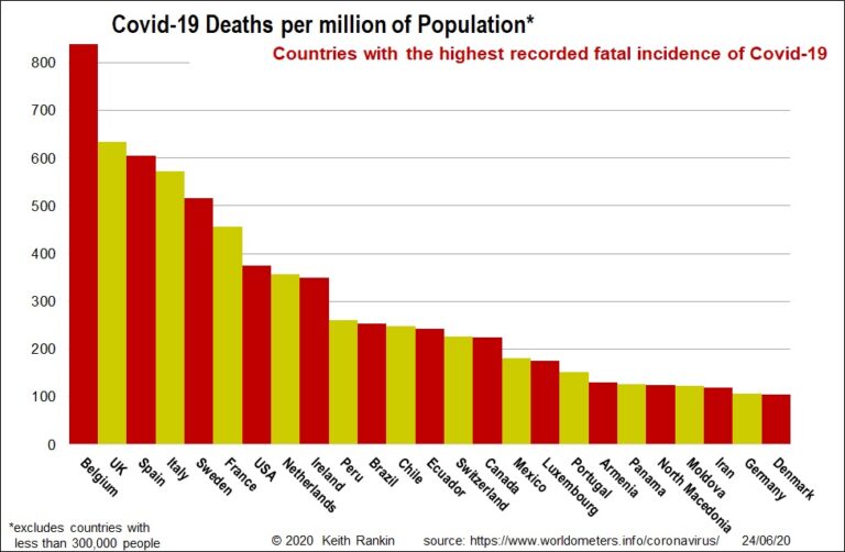
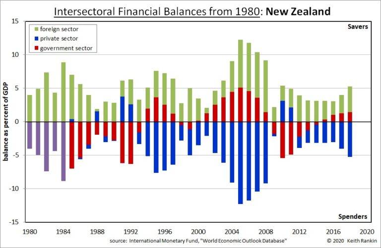
CoveragePost
June 8, 2020
Analysis by Keith Rankin. Good or Bad? Are there good or bad signature patterns for countries. The most obvious answer is that every country should ideally look like Portugal in 2019. Government sector and foreign sector balances would be close to zero. Private sector balances would also be close to zero, with household surpluses (net household ... <a title="Keith Rankin Chart Analysis – Financial Signatures: Portugal and New Zealand compared" class="read-more" href="https://eveningreport.nz/2020/06/08/keith-rankin-chart-analysis-financial-signatures-portugal-and-new-zealand-compared/" aria-label="Read more about Keith Rankin Chart Analysis – Financial Signatures: Portugal and New Zealand compared">Read more</a>
CoveragePost
May 31, 2020
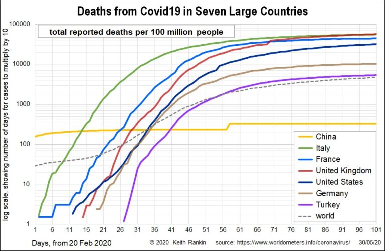
Analysis by Keith Rankin. The large western economies account for by far the most covid19 deaths in the world. Even Germany, with a covid19 death incidence of 100 per million is well above the world average to date of 50 deaths per million people. Of these large countries, only the United States looks likely to ... <a title="Keith Rankin Chart Analysis – Covid19: Deaths and Cases to the end of May 2020" class="read-more" href="https://eveningreport.nz/2020/05/31/keith-rankin-chart-analysis-covid19-deaths-and-cases-to-the-end-of-may-2020/" aria-label="Read more about Keith Rankin Chart Analysis – Covid19: Deaths and Cases to the end of May 2020">Read more</a>
CoveragePost
May 30, 2020
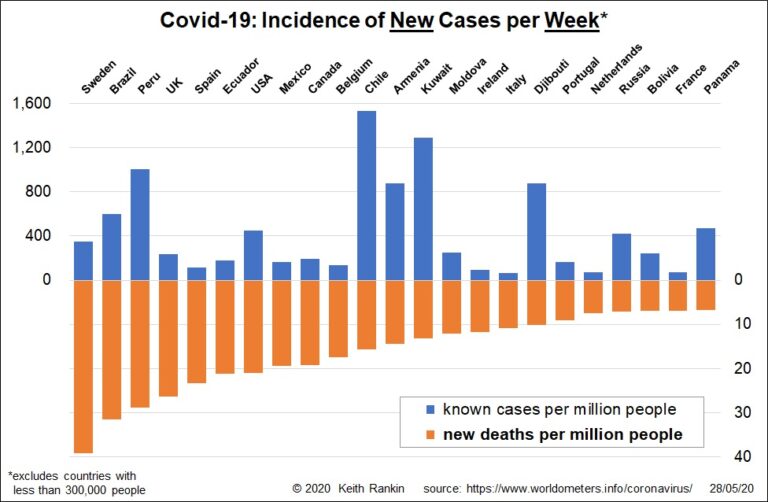
Analysis by Keith Rankin. Sweden has lost 400 of its ten million people to Covid 19 in the week to 28 May. And there is little sign, yet, of a significant slowdown in deaths. Sweden’s weekly death rate has been this high for the last eight weeks; ie since the beginning of April. It would ... <a title="Keith Rankin Chart Analysis – Covid19: Deaths and Cases in the last week of May 2020" class="read-more" href="https://eveningreport.nz/2020/05/30/keith-rankin-chart-analysis-covid19-deaths-and-cases-in-the-last-week-of-may-2020/" aria-label="Read more about Keith Rankin Chart Analysis – Covid19: Deaths and Cases in the last week of May 2020">Read more</a>
CoveragePost
May 27, 2020
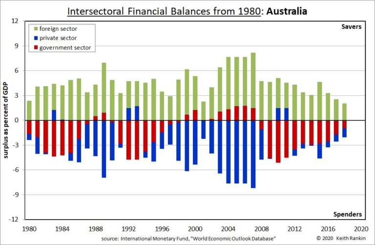
Analysis by Keith Rankin. 1980s: Sweden like New Zealand and Australia Sweden in the 1980s, financially speaking, looked something like New Zealand and Australia. It was a period of stress from high oil prices, and global inflation. Governments ‘took up the slack’, running deficit balances. In Sweden, the slack was caused mainly by private-sector surpluses. ... <a title="Keith Rankin’s Chart Analysis – Financial Signatures: Sweden and Australia" class="read-more" href="https://eveningreport.nz/2020/05/27/keith-rankins-chart-analysis-financial-signatures-sweden-and-australia/" aria-label="Read more about Keith Rankin’s Chart Analysis – Financial Signatures: Sweden and Australia">Read more</a>