Analysis by Keith Rankin.
Global variation
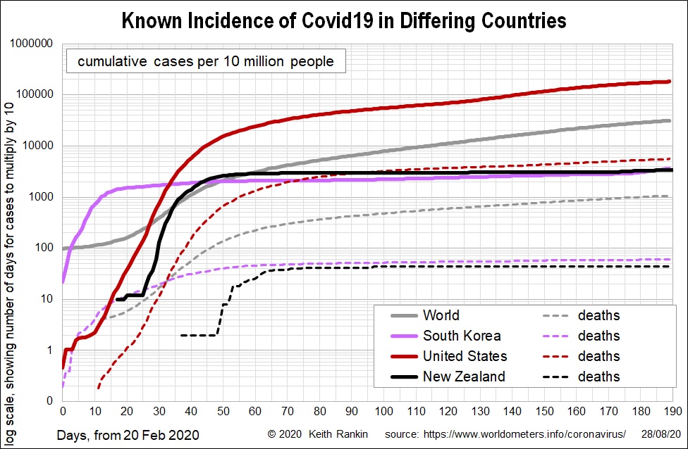
These two charts show Covid19 incidence in the world as a whole, in an American country (USA), an Asian country (South Korea), and New Zealand.
The first chart shows cumulative cases, with the United States being about six times worse (close to an order of magnitude, which usually means ‘ten times’) than the world as a whole, both in recorded cases and in deaths. By contrast, South Korea and New Zealand, following a similar pattern, have Covid19 incidence and deaths an order of magnitude less than the world average.
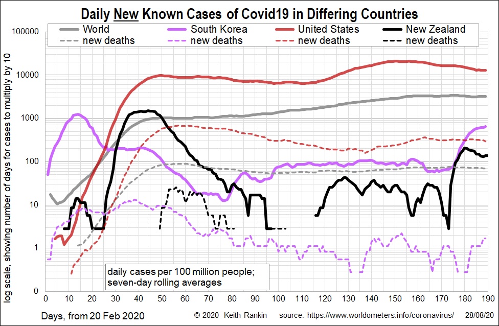
In terms of recent cases – second chart – we see that recent Covid19 outbreaks in New Zealand and South Korea still show New Zealand with recorded rates less than one tenth of recent world averages; and South Korea falls roughly between New Zealand and the world average. Recent United States rates of Covid19 diagnosis are still well above the world average; currently about four times higher. Fortunately, both the United States and the world show signs of stabilising.
Europe and Australia.
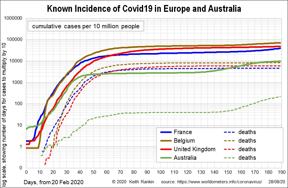
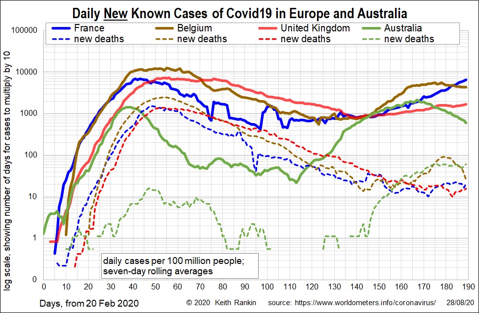
Some European countries still have higher cumulative death rates than any other part of the world – especially Belgium – and have case histories still above the world average. United States (see first charts) however now substantially outstrips Europe for recorded cases. Australia continues to be much better, on deaths and cases, than France, Belgium and the United Kingdom.
When we look at recent outbreaks, we see that the Australian outbreak is comparable in scale with August outbreaks in Europe, with the current French outbreak now being that of most concern. Indeed, Australian Covid19 deaths over the last week exceed such deaths – per capita – in all three European countries shown. Australia’s current outbreak – centred on Melbourne – is now clearly much worse than its March outbreak.
From the first set of charts, that Australian feature looks unlikely to be replicated in New Zealand, in relation to the outbreak that began on day 174. Further, the best news for New Zealand is that there have been no deaths so far in the present outbreak.