CoveragePost
March 25, 2020
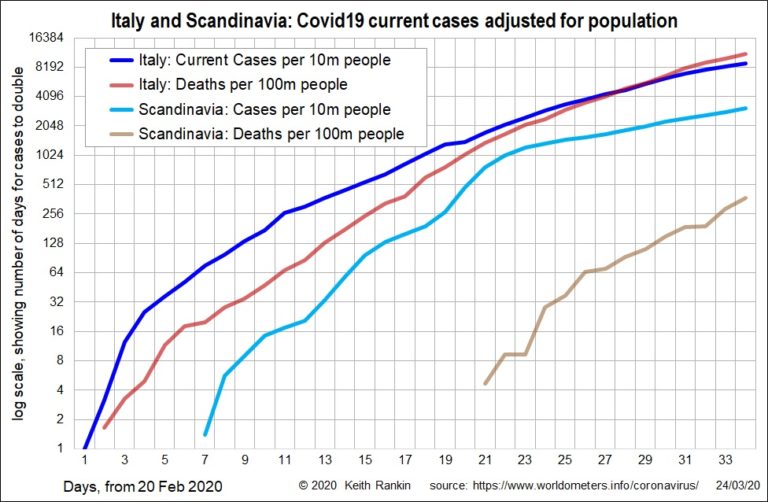
Analysis by Keith Rankin In today’s first chart, of daily new cases in Italy and Scandinavia (Norway, Sweden, Denmark), we see that, at its peak in days 20 and 21 (March 10 and 11), the incidence of known new cases in Scandinavia matched that in Italy. The difference is that new cases stabilised immediately afterwards ... <a title="Keith Rankin Chart Analysis – COVID-19: Exponential Growth in Italy and Scandinavia" class="read-more" href="https://eveningreport.nz/2020/03/25/keith-rankin-chart-analysis-covid-19-exponential-growth-in-italy-and-scandinavia/" aria-label="Read more about Keith Rankin Chart Analysis – COVID-19: Exponential Growth in Italy and Scandinavia">Read more</a>
CoveragePost
March 24, 2020
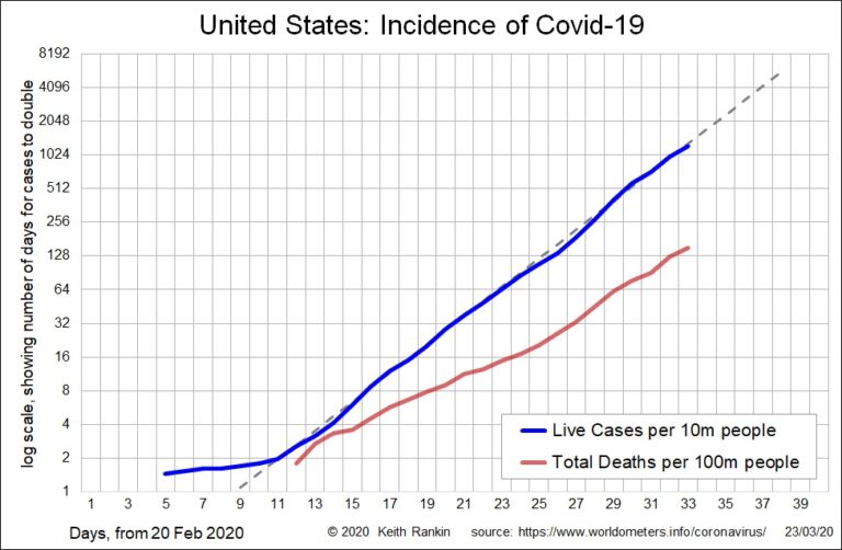
Analysis by Keith Rankin The USA has been on a consisted exponential growth path since day 11 (March 1). Italian Covid‑19 incidence levels – currently just over 8,000 known cases per 10 million people on 23 March – will be reached in the United States by day 39 (Sunday, March 29) if there is no ... <a title="Keith Rankin Chart Analysis – Covid-19 Virus: Exponential Growth in United States and United Kingdom" class="read-more" href="https://eveningreport.nz/2020/03/24/keith-rankin-chart-analysis-covid-19-virus-exponential-growth-in-united-states-and-united-kingdom/" aria-label="Read more about Keith Rankin Chart Analysis – Covid-19 Virus: Exponential Growth in United States and United Kingdom">Read more</a>
CoveragePost
March 23, 2020
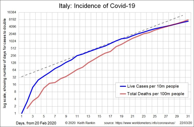
Analysis by Keith Rankin. The two charts here are presented using a ‘logarithmic’ scale. This is the appropriate way of representing any data time series that would normally exhibit exponential growth. ‘Exponential growth’ means that normal growth is measured in percentage terms rather than actual numbers. Common measures that grow exponentially are consumer prices (this ... <a title="Keith Rankin Chart Analysis – Covid-19 Virus: Slowing Exponential Growth in Italy" class="read-more" href="https://eveningreport.nz/2020/03/23/keith-rankin-chart-analysis-covid-19-virus-slowing-exponential-growth-in-italy/" aria-label="Read more about Keith Rankin Chart Analysis – Covid-19 Virus: Slowing Exponential Growth in Italy">Read more</a>
CoveragePost
March 22, 2020
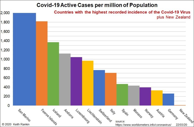
Analysis by Keith Rankin. While the number of cases of Covid-19 remains very small relative to the world’s population, a number of prominent people have been caught up in it. It seems to be very much an international travellers’ disease, with people who travel the most being at highest risk. The highest incidences of Covid‑19 ... <a title="Keith Rankin Chart Analysis – Covid-19 Virus: A Jetsetter Disease?" class="read-more" href="https://eveningreport.nz/2020/03/22/keith-rankin-chart-analysis-covid-19-virus-a-jetsetter-disease/" aria-label="Read more about Keith Rankin Chart Analysis – Covid-19 Virus: A Jetsetter Disease?">Read more</a>
CoveragePost
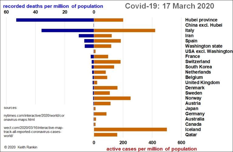
March 17, 2020
This chart shows the extent that the initial Chinese outbreak of Covid-19 was confined to Hubei province, a province with a population similar to that of Italy. And it shows that, while Hubei still has more recorded deaths per capita than Italy, Italy has more than twice as many active (unrecovered) cases per person. Italy’s ... <a title="Keith Rankin Graph Analysis – Covid-19 Virus: West is Worst" class="read-more" href="https://eveningreport.nz/2020/03/17/keith-rankin-graph-analysis-covid-19-virus-west-is-worst/" aria-label="Read more about Keith Rankin Graph Analysis – Covid-19 Virus: West is Worst">Read more</a>
CoveragePost
March 11, 2020
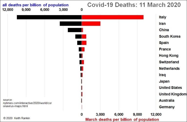
EDITOR’S NOTE: Click here for a previous chart analysis by Keith Rankin on this issue. Chart analysis by Keith Rankin This chart of deaths by coronavirus (March deaths in red) clearly shows just how much worse this epidemic is in Italy than anywhere else. And the vast majority of these deaths are in Northern Italy. ... <a title="Keith Rankin Chart Analysis – UPDATE Covid-19 Virus: Deaths" class="read-more" href="https://eveningreport.nz/2020/03/11/keith-rankin-chart-analysis-update-covid-19-virus-deaths/" aria-label="Read more about Keith Rankin Chart Analysis – UPDATE Covid-19 Virus: Deaths">Read more</a>
CoveragePost
March 9, 2020
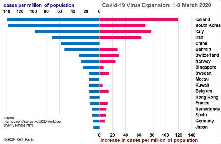
Chart analysis by Keith Rankin EDITOR’S NOTE: Click here for an updated chart and analysis dated March 11, 2020 – This chart update shows different measures of the problem than did my chart posted three days ago. Here we see the total number of recorded cases of Covid-19, per million of the worst affected countries’ ... <a title="Keith Rankin Chart Analysis – Covid-19 Virus: the Reality a week into March 2020" class="read-more" href="https://eveningreport.nz/2020/03/09/keith-rankin-chart-analysis-covid-19-virus-the-reality-a-week-into-march-2020/" aria-label="Read more about Keith Rankin Chart Analysis – Covid-19 Virus: the Reality a week into March 2020">Read more</a>
CoveragePost
March 5, 2020
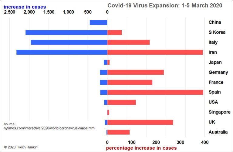
Chart analysis by Keith Rankin – The 2020 news cycle has become completely dominated by (probably unintentional, but certainly careless) fearmongering about ‘corona‑virus’. What is the reality in early March? The chart looks at new cases in the 10 countries with the most cases, plus United Kingdom and Australia. We see that the outbreak is essentially ... <a title="Keith Rankin’s Chart Analysis – Covid-19 Virus: the Reality in early March 2020" class="read-more" href="https://eveningreport.nz/2020/03/05/keith-rankins-chart-analysis-covid-19-virus-the-reality-in-early-march-2020/" aria-label="Read more about Keith Rankin’s Chart Analysis – Covid-19 Virus: the Reality in early March 2020">Read more</a>
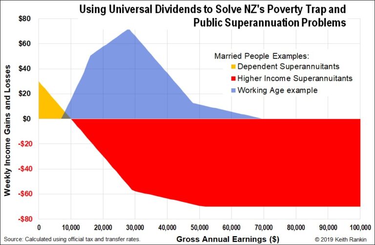
CoveragePost
December 10, 2019
I have written elsewhere (see reference list below) about the important principles that suggest all enfranchised residents should receive a share of public income, and how the realisation of this is essentially a matter of reformed public accounting. Here I just consider two typical New Zealanders of different generations, and two policy options. And no ... <a title="Keith Rankin’s Chart Analysis – Universal Dividends and Universal Superannuation" class="read-more" href="https://eveningreport.nz/2019/12/10/keith-rankins-chart-analysis-universal-dividends-and-universal-superannuation/" aria-label="Read more about Keith Rankin’s Chart Analysis – Universal Dividends and Universal Superannuation">Read more</a>
CoveragePost
November 27, 2019
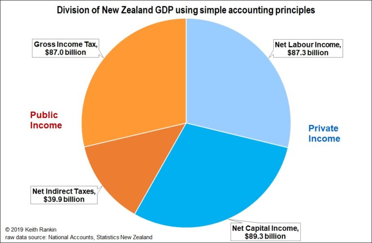
When the annual national accounts were released by Statistics New Zealand, the $300 billion milestone was released. New Zealand now produces, for sale, goods and services valued at more than $300 billion in one year. Ownership of the gross domestic product (GDP) is called ‘income’. Deciding who, at first cut, owns those goods and services ... <a title="Keith Rankin’s Chart Analysis: Division of New Zealand’s $300 billion GDP" class="read-more" href="https://eveningreport.nz/2019/11/27/keith-rankins-chart-analysis-division-of-new-zealands-300-billion-gdp/" aria-label="Read more about Keith Rankin’s Chart Analysis: Division of New Zealand’s $300 billion GDP">Read more</a>
CoveragePost
October 30, 2019
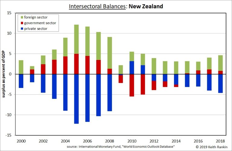
Chart Analysis by Keith Rankin. Most countries’ economies have financial signatures that reflect their cultures and histories. We may, in a binary sense, call these surplus and deficit signatures. But there are a number of important nuances. For these four developed countries, Germany and Japan would be classed as having ‘surplus’ economies, while New Zealand ... <a title="Keith Rankin’s Chart Analysis: Financial Signatures of Four Countries" class="read-more" href="https://eveningreport.nz/2019/10/30/keith-rankins-chart-analysis-financial-signatures-of-four-countries/" aria-label="Read more about Keith Rankin’s Chart Analysis: Financial Signatures of Four Countries">Read more</a>
CoveragePost
September 24, 2019
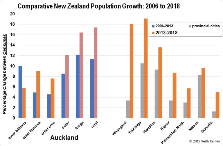
Last month I noted that Māori voter growth in Auckland (Tāmaki Makaurau) was slower than in all the other Māori electoral districts, and that this almost certainly reflected very low Māori population growth in Auckland. I also argued that Pakeha as well as Māori were leaving (or not arriving in) Auckland in larger numbers than ... <a title="Keith Rankin’s Chart Analysis – Auckland’s Population and the 2018 New Zealand Census" class="read-more" href="https://eveningreport.nz/2019/09/24/keith-rankins-chart-analysis-aucklands-population-and-the-2018-new-zealand-census/" aria-label="Read more about Keith Rankin’s Chart Analysis – Auckland’s Population and the 2018 New Zealand Census">Read more</a>