
Last month I noted that Māori voter growth in Auckland (Tāmaki Makaurau) was slower than in all the other Māori electoral districts, and that this almost certainly reflected very low Māori population growth in Auckland. I also argued that Pakeha as well as Māori were leaving (or not arriving in) Auckland in larger numbers than in the past. And I said that the census data would show that Auckland’s population (excluding the former Rodney and Franklin Districts) would be less than 30 percent of the national total.
This month’s chart comes the day after the census data was released. Because the infill process – filling in for census non‑participation – was more comprehensive than for past censuses, the population growth data overall may be slightly inflated. But, on the whole, these growth data are probably as reliable as in the past.
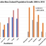
The chart shows that, in Auckland’s inner isthmus suburbs (from Mt Albert and Point Chevalier through to St Heliers, and including the central business district), population growth in 2013‑18 was comparable to Palmerston North and Dunedin. This is in contrast with 2006‑13 when central Auckland grew by ten percent. We may note that residential property prices in these years grew much faster in central Auckland than Dunedin, suggesting that population pressure was not the driving force behind these rising prices. Rather, people responded to inflated property prices by leaving inner Auckland (or not coming).
The rest of the isthmus grew faster in 2013‑18, compared to inner Auckland and compared to 2006‑13. But the growth was not remarkable; it was comparable with Napier and Nelson. Likewise the ‘outer core’ – which includes much of North Shore and Manukau had population growth after 2013 that was well below the New Zealand average of 10.8 percent.
Auckland’s ‘less unaffordable’ outer suburbs grew faster. The ‘outer’ axis includes areas like Henderson and Massey in the northwest, and Manurewa, Otara and Howick in the southeast. In those areas, population growth was comparable with Hamilton.
In the super‑’city’, the fastest growing areas were the fringe – Papakura, Upper Harbour, Hibiscus and East Coast Bays, and Waitakere Ranges – and Rodney and Franklin. Growth there was comparable with Northland (which includs Whangarei) and Bay of Plenty (which includes Tauranga).
The census data confirms the election data, showing a substantial demographic shift from core Auckland to (and beyond) Auckland’s fringe. Although Auckland City is growing relatively slowly, the historic Auckland Province now holds 54.6 percent of New Zealand’s population, up from 53.8 percent.
Auckland excluding rural Rodney and Franklin had 30.4 percent of New Zealand’s resident population. This includes the ‘Hibiscus’ area of Orewa which was in Rodney District before the super‑city was formed in 2010. So it looks like I am correct, the combined population of the former Auckland, North Shore, Waitakere, Manukau and Papakura – what most people have thought of as Auckland – is below 30 percent of the national total. The rest of the country continues to have much life and soul.
Auckland’s 2012‑16 real estate bubble was just that, a bubble. It had the substantial consequence of revitalising much of the rest of the country, though creating many of the same social problems as Auckland (especially relating to unaffordable rental housing) in many other cities.
As a final note, Auckland’s unoccupied dwelling count increased by over 6,000 to 39,393. 97 percent of the national increase in empty dwellings was in Auckland. And Auckland province registered a 9,363 increase in empty properties, 151 percent of the New Zealand net increase of 6,201 unoccupied homes.