Analysis by Keith Rankin.
The two charts here are presented using a ‘logarithmic’ scale. This is the appropriate way of representing any data time series that would normally exhibit exponential growth. ‘Exponential growth’ means that normal growth is measured in percentage terms rather than actual numbers. Common measures that grow exponentially are consumer prices (this exponential growth is called ‘inflation’) and gross domestic product (where exponential growth is called ‘economic growth’).
Normal exponential growth, in this type of chart, is represented as a straight line.
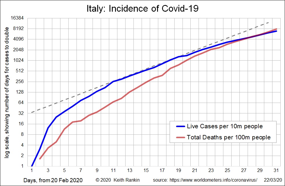
The first chart here shows known unresolved cases of Covid‑19 in Italy, and total deaths. The reference here is the dashed line. In the early days (late February), cases were increasing at an accelerating rate, with the plot of live cases climbing towards the reference line. From day 11 (March 1) to day 24, live cases closely followed a consistent exponential growth pattern. Since then the rate of growth of live cases has slowed down.
Each horizontal gridline on the chart represents a doubling of cases. From day 11 to day 24 we saw live cases doubling every 3.5 days. The most recent doubling of live cases is more like 5.5 days. Had this growth slowing not taken place, Italy would have had twice as many live cases in day 30 than it actually had (comparing the blue line with the dashed line).
We expect deaths to lag cases, by about a week on average. In this chart we see the growth of deaths is faster than the benchmark until day 23. Recent death rates, however, fall below the benchmark growth rate. This also is a good sign. Re deaths, we note that death numbers (measured per 100m of the Italian population) are about 10 percent of known live cases. This does not necessarily mean that the disease is more lethal in Italy than in China. Rather it suggests that the actual ‘live case’ data for Italy is actually an order of magnitude larger than the known data; in that case we should read the live cases as per million of the population, not as per 10 million. Thus, we can infer that just over one percent of the population of Italy are at present ‘live cases’; probably two percent of Italians either have the virus, or have recovered from it.
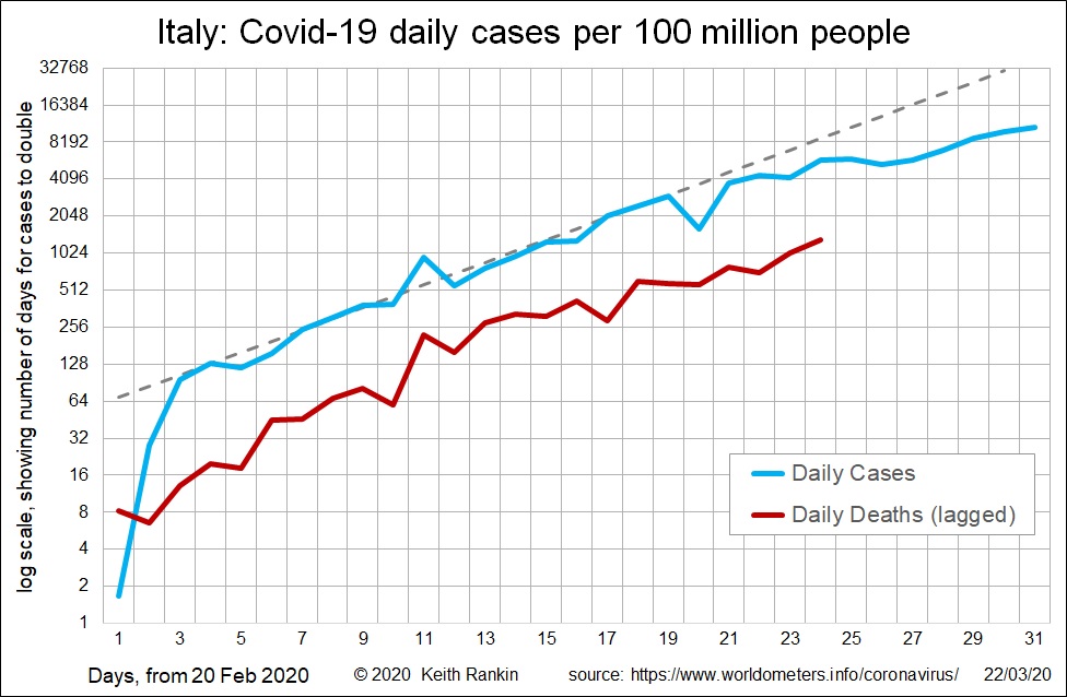
The second chart shows daily ‘new cases’ of Covid‑19 in Italy. We can see that the recorded rate of growth of new cases has declined since day 22 (12 March). If Italy had followed the benchmark exponential line, there would have been four times as many daily new cases yesterday than there actually were.
The daily deaths are shown with a one‑week lag. They follow the same pattern as daily new cases a week previous. So, this week, we can expect a slowing of the rate of growth of deaths in Italy.
On the basis of what I see here, and given the high level of quarantine in Italy at present, my sense is that no more than five percent of Italians will be infected by Covid‑19. That’s many people, but not nearly as bad as the fifty percent projections that we are hearing for some countries.
Given that New Zealand has taken measures early and sensibly, my sense is that New Zealand’s eventual incidence of Covid‑19 will be less than 10% of Italy’s, and that the eventual New Zealand death rate will be no higher than 0.5% of cases. That translates to no more than 25,000 cases in New Zealand, and no more than 125 deaths (eg 100 deaths in total). This is of course a back‑of‑the envelope guess, not a worst‑case projection.