CoveragePost
September 4, 2020
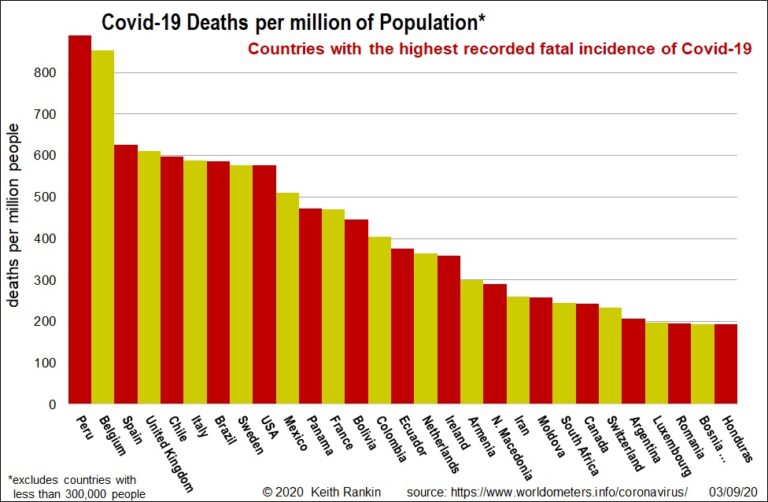
Analysis by Keith Rankin. Since its first death (in China) in January, 873 thousand people worldwide have died from Covid19. The chart shows the population-adjusted death tolls for the most-affected countries (excluding countries with less than 300,000 people. (San Marino – with 34,000 people – actually has the highest death rate.) In recent days, Peru ... <a title="Keith Rankin Chart Analysis – Covid-19: Countries with most Deaths and Cases to date" class="read-more" href="https://eveningreport.nz/2020/09/04/keith-rankin-chart-analysis-covid-19-countries-with-most-deaths-and-cases-to-date/" aria-label="Read more about Keith Rankin Chart Analysis – Covid-19: Countries with most Deaths and Cases to date">Read more</a>
CoveragePost
August 28, 2020
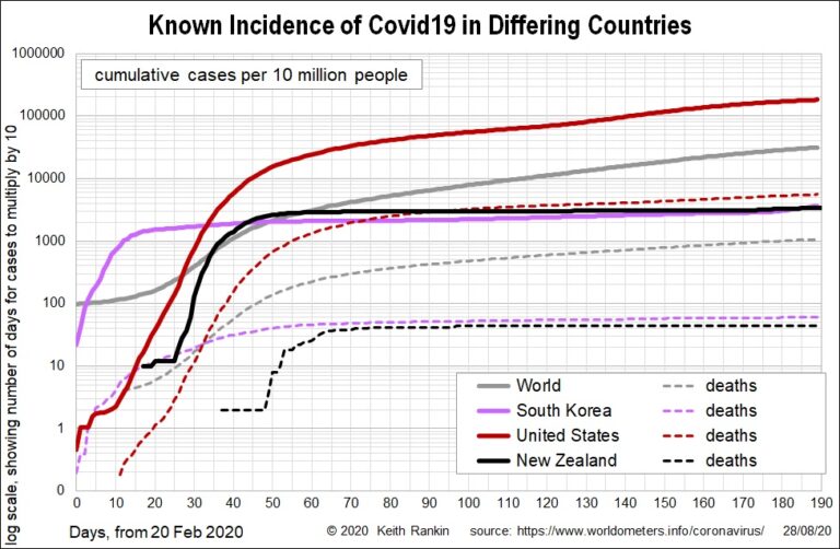
Analysis by Keith Rankin. Global variation These two charts show Covid19 incidence in the world as a whole, in an American country (USA), an Asian country (South Korea), and New Zealand. The first chart shows cumulative cases, with the United States being about six times worse (close to an order of magnitude, which usually means ... <a title="Keith Rankin Chart Analysis – Covid19 towards the end of August 2020" class="read-more" href="https://eveningreport.nz/2020/08/28/keith-rankin-chart-analysis-covid19-towards-the-end-of-august-2020/" aria-label="Read more about Keith Rankin Chart Analysis – Covid19 towards the end of August 2020">Read more</a>
CoveragePost
August 21, 2020
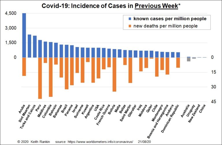
Analysis by Keith Rankin. This week’s chart shows the most current Covid19 outbreaks, including all the little countries. As in March 2020, some of these are the worst affected. It also gives lie to the claim that New Zealand is advantaged by being an island country. In the gold and silver position are Aruba and ... <a title="Keith Rankin Chart Analysis – Covid19: Covid-19 in the Peak of the Northern Hemisphere Tourist Season" class="read-more" href="https://eveningreport.nz/2020/08/21/keith-rankin-chart-analysis-covid19-covid-19-in-the-peak-of-the-northern-hemisphere-tourist-season/" aria-label="Read more about Keith Rankin Chart Analysis – Covid19: Covid-19 in the Peak of the Northern Hemisphere Tourist Season">Read more</a>
CoveragePost
August 7, 2020
Analysis by Keith Rankin. The known incidences of Covid19 in Spain, Belgium and Sweden are similar, although Sweden lagged for a while before overtaking the other two. In deaths, Sweden is slightly lower than Spain and about 30% lower than Belgium. Belgium, after little San Marino, is still the country with the highest deaths per ... <a title="Keith Rankin’s Chart Analysis – Covid19: Comparing Australian Outbreak with High Incidence European Countries" class="read-more" href="https://eveningreport.nz/2020/08/07/keith-rankins-chart-analysis-covid19-comparing-australian-outbreak-with-high-incidence-european-countries/" aria-label="Read more about Keith Rankin’s Chart Analysis – Covid19: Comparing Australian Outbreak with High Incidence European Countries">Read more</a>
CoveragePost
July 31, 2020
Analysis by Keith Rankin. This week’s first chart shows the incidence of new Covid19 cases in countries with more than 7,500,000 people. (Hong Kong is the smallest country to feature.) It shows that, while very serious, the Australian outbreak is far from unique. The outbreak in Israel, for example, is much worse. Generally, countries with ... <a title="Keith Rankin Chart Analysis – Covid19: Latest Incidences for Large Countries" class="read-more" href="https://eveningreport.nz/2020/07/31/keith-rankin-chart-analysis-covid19-latest-incidences-for-large-countries/" aria-label="Read more about Keith Rankin Chart Analysis – Covid19: Latest Incidences for Large Countries">Read more</a>
CoveragePost
July 24, 2020
Analysis by Keith Rankin. Changing Income-Relaxation Balance as a sequence of Pie Charts On June 30 (Chart Analysis on Evening Report) I promised to elaborate on the economic policies that would underpin the new optimisation of work-life balance. I argued that economic optimisation means a balance between income and leisure, and that the Covid19 pandemic ... <a title="Keith Rankin Analysis – Optimising Work-Life Balance in the wake of Covid-19" class="read-more" href="https://eveningreport.nz/2020/07/24/keith-rankin-analysis-optimising-work-life-balance-in-the-wake-of-covid-19/" aria-label="Read more about Keith Rankin Analysis – Optimising Work-Life Balance in the wake of Covid-19">Read more</a>
CoveragePost
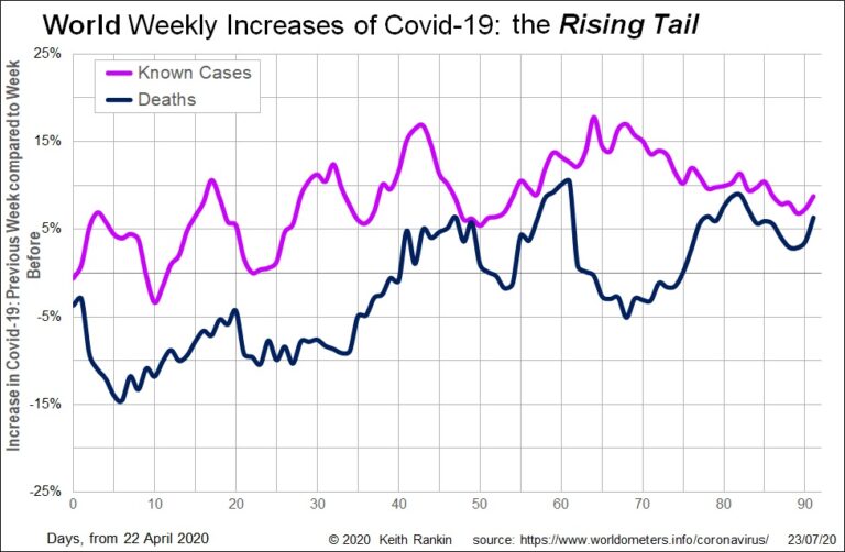
July 23, 2020
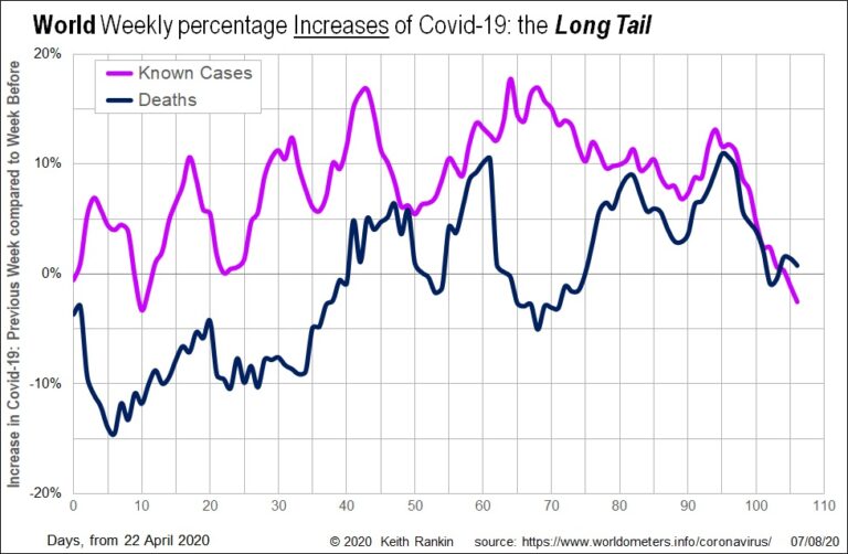
Analysis by Keith Rankin. This week’s first chart shows the huge European wave of Covid-19 in March. At its exponential peak, the chart shows world Covid19 weekly deaths increasing by 260 percent in the second week of March, compared to March’s first week. This European wave contrasts sharply with the last week of February, when ... <a title="Keith Rankin Chart Analysis – Global Covid19: European Wave and Rising Tail" class="read-more" href="https://eveningreport.nz/2020/07/23/keith-rankin-chart-analysis-global-covid19-european-wave-and-rising-tail/" aria-label="Read more about Keith Rankin Chart Analysis – Global Covid19: European Wave and Rising Tail">Read more</a>
CoveragePost
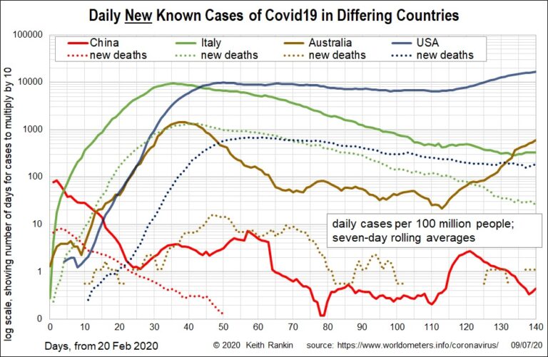
July 10, 2020
Analysis by Keith Rankin. These charts look at Covid19 incidence in China (the most important first-wave country, with a limited second wave), Italy (the lead second-wave country), and USA and Australia (second-wave countries – drawing their caseload from Europe – with limited first-wave exposure from Asia in January and February). Chart 1 shows the first-wave in ... <a title="Keith Rankin Chart Analysis – Covid19: Comparing China, Italy, USA and Australia" class="read-more" href="https://eveningreport.nz/2020/07/10/keith-rankin-chart-analysis-covid19-comparing-china-italy-usa-and-australia/" aria-label="Read more about Keith Rankin Chart Analysis – Covid19: Comparing China, Italy, USA and Australia">Read more</a>
CoveragePost
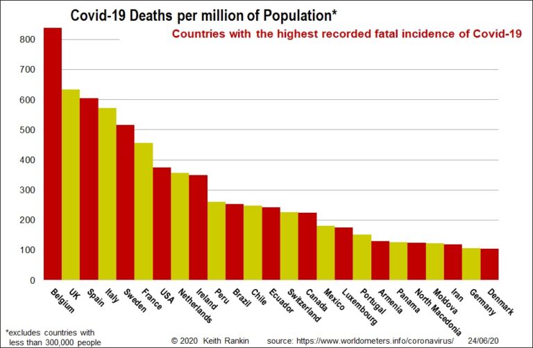
June 25, 2020
Analysis by Keith Rankin. We get a very biased picture of which countries have had the most experience of Covid19. It’s because the mainstream media almost never adjust their figures for population. So, in June, we keep hearing about United States and Brazil, but that’s mainly because they are very populous countries. It’s also because they ... <a title="Keith Rankin’s Chart Analysis – Covid19: Summary of Covid19 Incidence as of mid-June 2020" class="read-more" href="https://eveningreport.nz/2020/06/25/keith-rankins-chart-analysis-covid19-summary-of-covid19-incidence-as-of-mid-june-2020/" aria-label="Read more about Keith Rankin’s Chart Analysis – Covid19: Summary of Covid19 Incidence as of mid-June 2020">Read more</a>
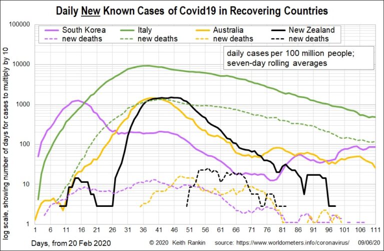
CoveragePost
June 10, 2020
Analysis by Keith Rankin. These charts plot seven-day rolling averages. It means that the most recent death and case incidences of Covid19 is the average of new cases for the seven days ended 9 June 2020. The New Zealand data looks incomplete, but that’s because it is now zero; New Zealand is recovered, not recovering. Contrast ... <a title="Keith Rankin Chart Analysis – Covid19: Cases and Deaths over Time for Recovering and High-Incidence Countries" class="read-more" href="https://eveningreport.nz/2020/06/10/keith-rankin-chart-analysis-covid19-cases-and-deaths-over-time-for-recovering-and-high-incidence-countries/" aria-label="Read more about Keith Rankin Chart Analysis – Covid19: Cases and Deaths over Time for Recovering and High-Incidence Countries">Read more</a>
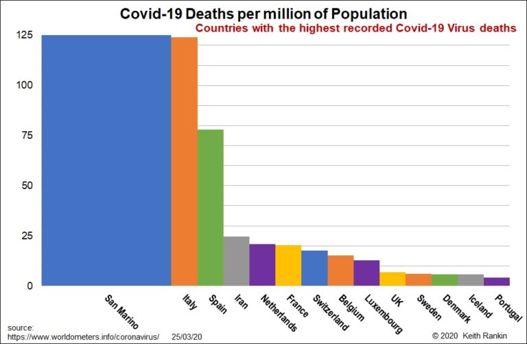
CoveragePost
March 26, 2020
Analysis by Keith Rankin In today’s first chart, which excludes countries with a single death, only Iran features as a country outside of Western Europe. In Europe, worst hit is the ‘Latin’ group in the southwest. I include Switzerland here, which has large Italian‑speaking and French‑speaking components. Next are the Benelux countries – Netherlands, Belgium ... <a title="Keith Rankin Chart Analysis – Covid-19 Virus: Countries with Highest Death Rates" class="read-more" href="https://eveningreport.nz/2020/03/26/keith-rankin-chart-analysis-covid-19-virus-countries-with-highest-death-rates/" aria-label="Read more about Keith Rankin Chart Analysis – Covid-19 Virus: Countries with Highest Death Rates">Read more</a>
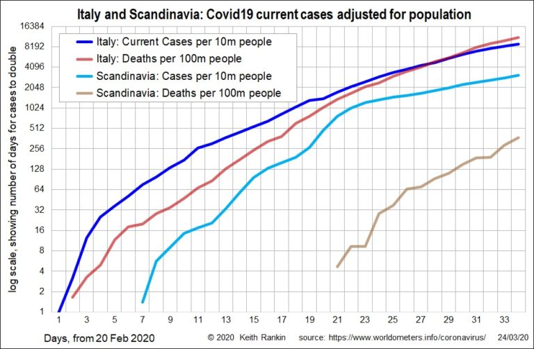
CoveragePost
March 25, 2020
Analysis by Keith Rankin In today’s first chart, of daily new cases in Italy and Scandinavia (Norway, Sweden, Denmark), we see that, at its peak in days 20 and 21 (March 10 and 11), the incidence of known new cases in Scandinavia matched that in Italy. The difference is that new cases stabilised immediately afterwards ... <a title="Keith Rankin Chart Analysis – COVID-19: Exponential Growth in Italy and Scandinavia" class="read-more" href="https://eveningreport.nz/2020/03/25/keith-rankin-chart-analysis-covid-19-exponential-growth-in-italy-and-scandinavia/" aria-label="Read more about Keith Rankin Chart Analysis – COVID-19: Exponential Growth in Italy and Scandinavia">Read more</a>