CoveragePost
August 26, 2021
Analysis by Keith Rankin. The first chart shows the three largest western countries: United States, United Kingdom, and Germany. The solid line plots represent quarterly average rates of excess death. It is clear that the United Kingdom copped Covid19 very early and very hard. The mid-June peak represents the period from mid-March to mid-June. It is ... <a title="Keith Rankin Chart Analysis – Covid19: Excess Deaths in New Zealand and Comparator Countries" class="read-more" href="https://eveningreport.nz/2021/08/26/keith-rankin-chart-analysis-covid19-excess-deaths-in-new-zealand-and-comparator-countries/" aria-label="Read more about Keith Rankin Chart Analysis – Covid19: Excess Deaths in New Zealand and Comparator Countries">Read more</a>
CoveragePost
August 6, 2021
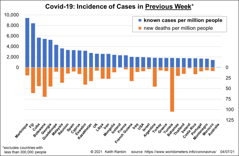
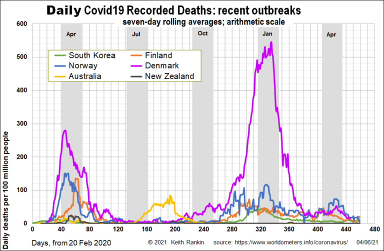
Analysis by Keith Rankin. The issues to watch out for now are the extent to which countries with high vaccination rates are (1) getting positive cases, and (2) getting Covid19 deaths. And one particular point to watch out for is the extent to which early vaccinator countries show signs of relapse, as immunity levels wane ... <a title="Keith Rankin Chart Analysis – Covid19: Latest Covid19 Statistics, in the Northern Hemisphere Summer" class="read-more" href="https://eveningreport.nz/2021/08/06/keith-rankin-chart-analysis-covid19-latest-covid19-statistics-in-the-northern-hemisphere-summer/" aria-label="Read more about Keith Rankin Chart Analysis – Covid19: Latest Covid19 Statistics, in the Northern Hemisphere Summer">Read more</a>
CoveragePost
July 23, 2021
Analysis by Keith Rankin. Finland and Greece are in the East of Europe, but generally thought of as western countries, having not been behind the ‘Iron Curtain’ during the Cold War. They can be seen as a benchmark to help understand the other Eastern European countries. And, like other eastern countries, they had low levels ... <a title="Keith Rankin Chart Analysis – Covid19: East Europe in the European Union, Excess Deaths in Context" class="read-more" href="https://eveningreport.nz/2021/07/23/keith-rankin-chart-analysis-covid19-east-europe-in-the-european-union-excess-deaths-in-context/" aria-label="Read more about Keith Rankin Chart Analysis – Covid19: East Europe in the European Union, Excess Deaths in Context">Read more</a>
CoveragePost
July 13, 2021
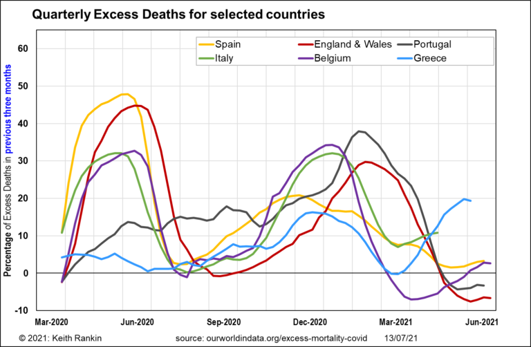
Analysis by Keith Rankin. We now have excess death data for most of western Europe, until the end of June 2021. The peaks are all due to Covid19. We can see clearly that the pandemic in Europe began simultaneously in Italy and Spain, and almost certainly in January 2020. While we are yet to even ... <a title="Keith Rankin Chart Analysis – Covid19: West Europe at the onset of a New Wave of Cases" class="read-more" href="https://eveningreport.nz/2021/07/13/keith-rankin-chart-analysis-covid19-west-europe-at-the-onset-of-a-new-wave-of-cases/" aria-label="Read more about Keith Rankin Chart Analysis – Covid19: West Europe at the onset of a New Wave of Cases">Read more</a>
CoveragePost
July 9, 2021
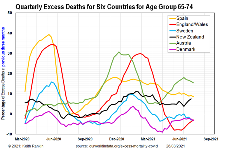
Analysis by Keith Rankin. The latest excess mortality data shows all the countries of the British Isles, and the United States, have fewer excess deaths than New Zealand in the three months to the end of May 2021. England/Wales was looking particularly good in the three months to June. (Excess mortality data for the United ... <a title="Keith Rankin Chart Analysis – Covid19: United Kingdom and Herd Immunity" class="read-more" href="https://eveningreport.nz/2021/07/09/keith-rankin-chart-analysis-covid19-united-kingdom-and-herd-immunity/" aria-label="Read more about Keith Rankin Chart Analysis – Covid19: United Kingdom and Herd Immunity">Read more</a>
CoveragePost
July 7, 2021
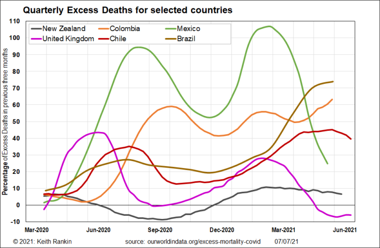
Analysis by Keith Rankin. Chile is our neighbour over the ditch; the ‘big ditch’, that is, the Pacific Ocean. And it’s a country with much in common with Aotearoa New Zealand. Until Covid19, Latam flew daily flights between Auckland and Santiago. Chile is regarded as the richest country in Latin America, and it certainly keeps ... <a title="Keith Rankin Chart Analysis – Chile – Revolution?" class="read-more" href="https://eveningreport.nz/2021/07/07/keith-rankin-chart-analysis-chile-revolution/" aria-label="Read more about Keith Rankin Chart Analysis – Chile – Revolution?">Read more</a>
CoveragePost
July 2, 2021
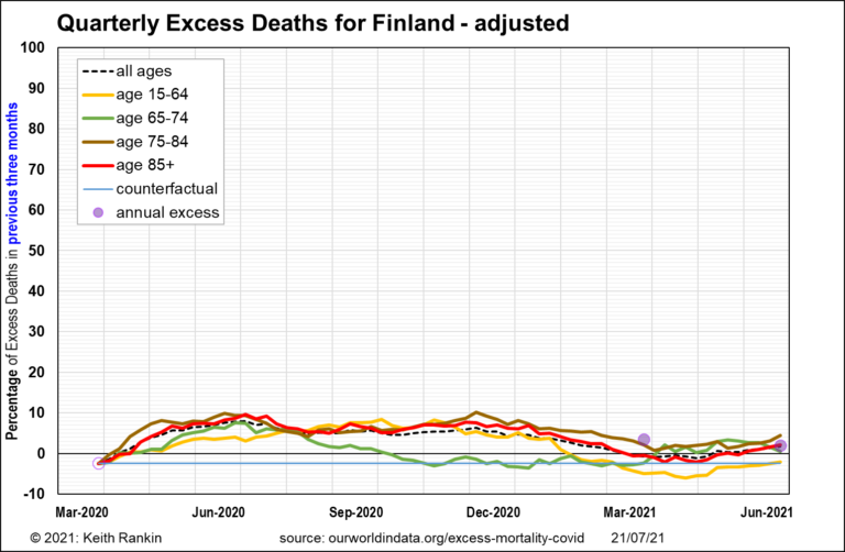
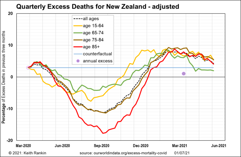
Analysis by Keith Rankin. On 21 June 2021 I published this chart, showing high levels of excess deaths in Aotearoa, for all age groups. However, the source data provide a somewhat crude measure of excess deaths. The measure may be distorted by demographic changes; the rate of population growth, and changes to the age distribution ... <a title="Keith Rankin Chart Analysis – Excess Deaths by Age Cohort, Adjusted" class="read-more" href="https://eveningreport.nz/2021/07/02/keith-rankin-chart-analysis-excess-deaths-by-age-cohort-adjusted/" aria-label="Read more about Keith Rankin Chart Analysis – Excess Deaths by Age Cohort, Adjusted">Read more</a>
CoveragePost
June 23, 2021
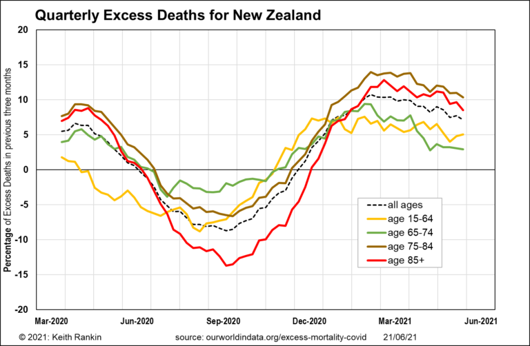
Analysis by Keith Rankin. The international source for these data calculates the percentage increase (decrease if negative) of deaths compared to ‘expected deaths’. There is a weakness in the data, in that ‘expected deaths’ is simply the average for 2015 to 2019. Thus, it does not account for rising populations in the various age cohorts. ... <a title="Keith Rankin Chart Analysis – Excess Deaths by Age Cohort: New Zealand and comparator countries" class="read-more" href="https://eveningreport.nz/2021/06/23/keith-rankin-chart-analysis-excess-deaths-by-age-cohort-new-zealand-and-comparator-countries/" aria-label="Read more about Keith Rankin Chart Analysis – Excess Deaths by Age Cohort: New Zealand and comparator countries">Read more</a>
CoveragePost
June 19, 2021
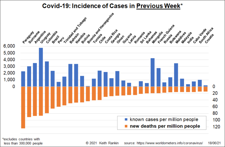
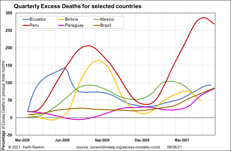
Analysis by Keith Rankin. While India’s well-publicised Covid19 outbreak came quickly and is well on its way out, South America continues to show the greatest difficulty in throwing off this disease. Some of the most prominent South American countries this year were not prominent in 2020. Of particular note are the ‘Guianas’: Dutch (Suriname), British ... <a title="Keith Rankin Chart Analysis – Covid-19 in June 2021" class="read-more" href="https://eveningreport.nz/2021/06/19/keith-rankin-chart-analysis-covid-19-in-june-2021/" aria-label="Read more about Keith Rankin Chart Analysis – Covid-19 in June 2021">Read more</a>
CoveragePost
June 9, 2021
Analysis by Keith Rankin. Covid-19: Excess Deaths, the picture in Europe and the Americas – Last Friday I posted this chart showing ‘excess deaths’ in 2020 and early 2021, as quarterly averages. The chart showed New Zealand and Australia alongside three Scandinavian countries and South Korea. These are all countries with low Covid19 death tolls, and ... <a title="Keith Rankin Chart Analysis – Charts on excess deaths in the era of Covid19" class="read-more" href="https://eveningreport.nz/2021/06/09/keith-rankin-chart-analysis-charts-on-excess-deaths-in-the-era-of-covid19/" aria-label="Read more about Keith Rankin Chart Analysis – Charts on excess deaths in the era of Covid19">Read more</a>
CoveragePost
June 4, 2021
Analysis by Keith Rankin. New Zealand’s rosy Covid19 picture does not look so good, once we do an analysis of excess deaths. Calculating excess deaths is the new statistical procedure to evaluate the true toll of Covid19. (I did an excess deaths’ Smithometer analysis of the 1918 influenza pandemic in New Zealand.) For this chart, ... <a title="Keith Rankin Chart Analysis: Covid19 and excess deaths" class="read-more" href="https://eveningreport.nz/2021/06/04/keith-rankin-chart-analysis-covid19-and-excess-deaths/" aria-label="Read more about Keith Rankin Chart Analysis: Covid19 and excess deaths">Read more</a>
CoveragePost
May 28, 2021
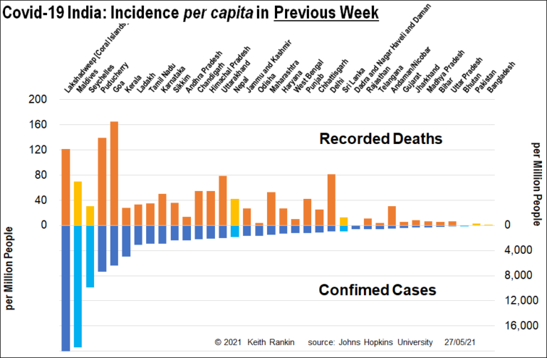
Covid-19: Covid19 India update – Analysis by Keith Rankin. India’s reported cases of Covid19, though still high, are well down on early May (see my India charts from three weeks ago). Maharashtra (Mumbai) and Delhi have markedly fewer cases than at their peaks. West Bengal (with Kolkata) is showing more cases, though not dramatically so ... <a title="Keith Rankin Chart Analysis – Covid-19 India update (compare with three weeks ago)" class="read-more" href="https://eveningreport.nz/2021/05/28/keith-rankin-chart-analysis-covid-19-india-update-compare-with-three-weeks-ago/" aria-label="Read more about Keith Rankin Chart Analysis – Covid-19 India update (compare with three weeks ago)">Read more</a>