Analysis by Keith Rankin.

New Zealand’s rosy Covid19 picture does not look so good, once we do an analysis of excess deaths. Calculating excess deaths is the new statistical procedure to evaluate the true toll of Covid19. (I did an excess deaths’ Smithometer analysis of the 1918 influenza pandemic in New Zealand.)
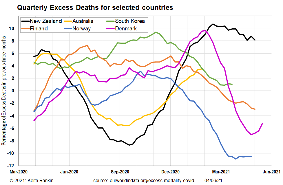
For this chart, I have selected countries comparable to New Zealand, and for which the excess deaths analysis has been done. Australia, unfortunately, seems to be slower than the others in releasing its death statistics.
The first thing to note is that New Zealand, Australia and South Korea all had significant numbers of excess deaths pre-pandemic (although South Korea was getting some Covid19 deaths in March 2020). This suggests that both New Zealand and Australia have a social (or socio-economic) problem that is causing death rates to increase. While an aging population is probably part of the reason, this does not show up in Scandinavian countries which also have aging populations.
Norway had an early Covid19 outbreak, but got it under better control than European Union countries. So, in the second quarter of 2020, Norway had negative excess deaths despite having significant numbers of Covid19 deaths. Excess deaths plunged in New Zealand and Australia, thanks to the lockdowns in both countries; there were very few deaths resulting from winter influenza, and Covid19 deaths barely registered. It was only the big winter outbreak in Melbourne that caused Australia’s reduction in winter deaths to be less than New Zealand’s.
The most alarming feature of the chart is New Zealand’s huge resurgence in deaths in the spring and summer; a resurgence that barely abated in the autumn of 2021. New Zealand – essentially free of Covid19 – outstripped Denmark, which had a major Covid19 outbreak in the northern autumn.
New Zealand’s death surge will have been in part due to deaths postponed by the 2020 lockdown (lockdowns for Auckland). But, this is clearly only a part of the story. New Zealand’s significant socio-economic problems – especially inequality and housing – are almost certainly taking their toll. While something similar may be also happening in Australia, it would appear to be to a lesser extent there.

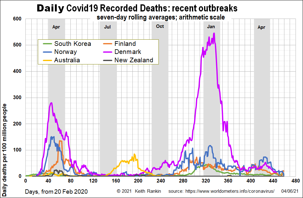
We compare the first chart with the chart that shows the official Covid19 death rates, for these countries.
We can see the deaths in the Scandinavian countries in the early days of the pandemic. And we can see Denmark’s huge December-January spike in Covid19 deaths. Yet that spike was matched in New Zealand by excess non-Covid19 deaths.
For Australia, we can see the early death toll (April 2020) and the much bigger August toll. And, unlike the other four countries in the charts, we see that both Australia and New Zealand had minimal contribution of Covid19 to its death statistics.
New Zealand has big problems which are being reflected in our mortality statistics. And that alarming death data would have been worse were it not for Covid19.

