Analysis by Keith Rankin.
Covid-19: Excess Deaths, the picture in Europe and the Americas – Last Friday I posted this chart showing ‘excess deaths’ in 2020 and early 2021, as quarterly averages. The chart showed New Zealand and Australia alongside three Scandinavian countries and South Korea. These are all countries with low Covid19 death tolls, and are countries which have been assiduous in collecting accurate statistics. In the process, the chart analysis revealed that New Zealand has been performing poorly on the non-covid front, with many excess deaths not attributable to Covid19.
The charts I am posting today look at:
- North Atlantic countries with much higher levels of Covid19 mortality
- Eastern Europe
- Latin America
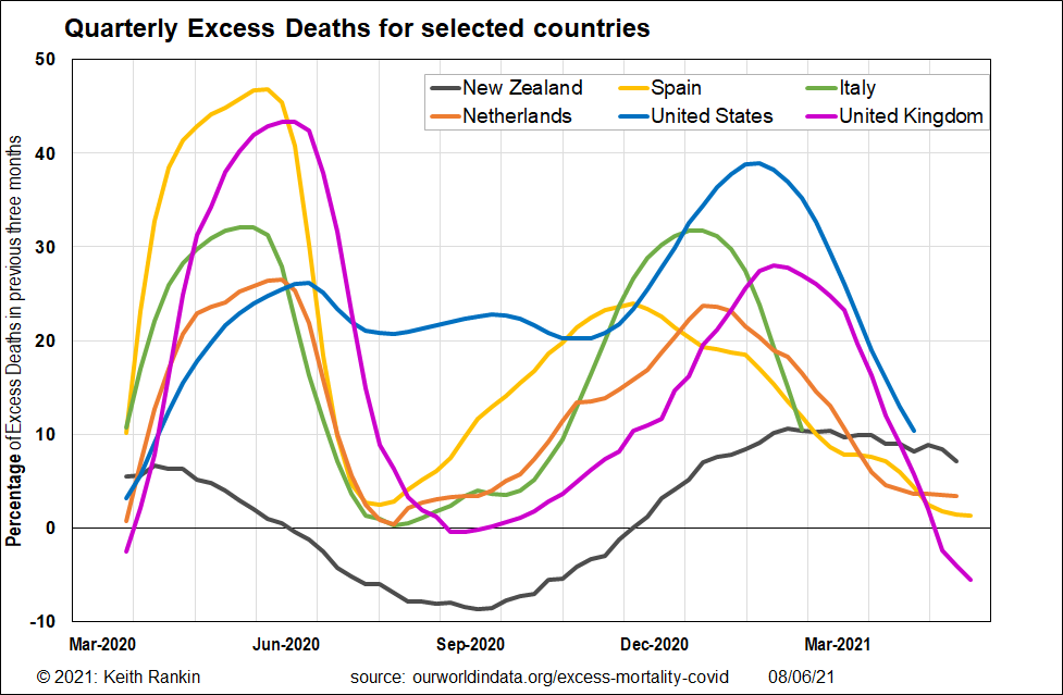
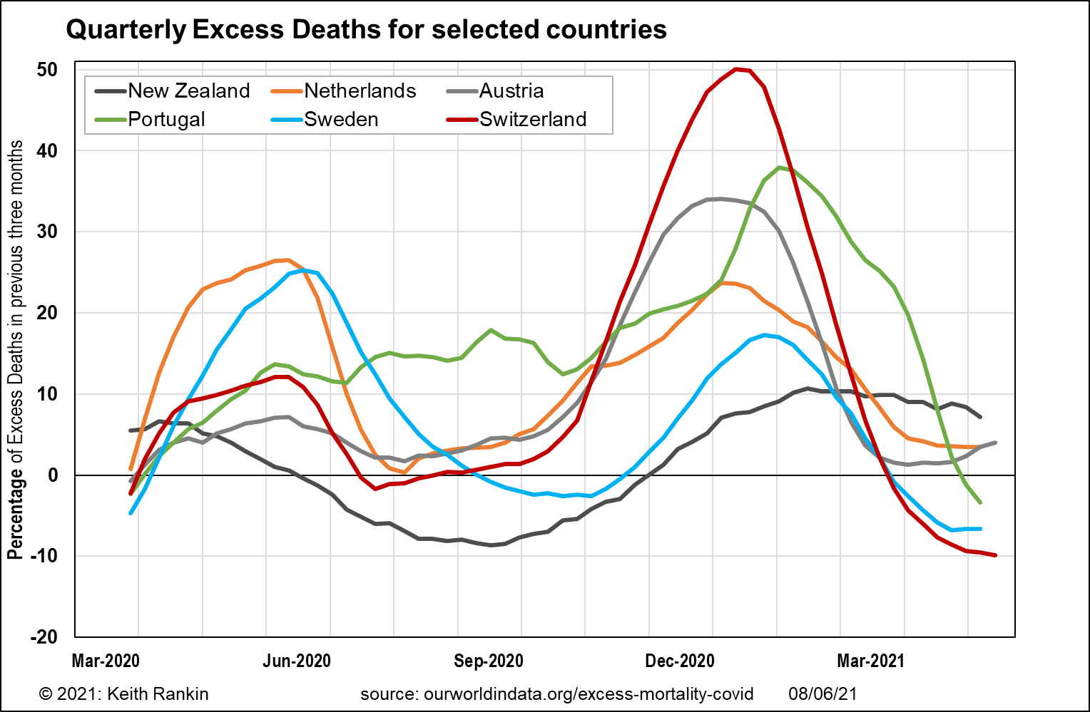
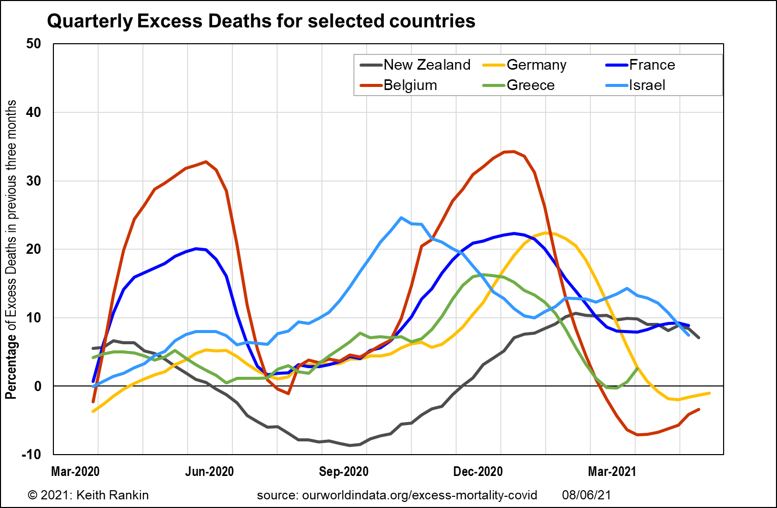
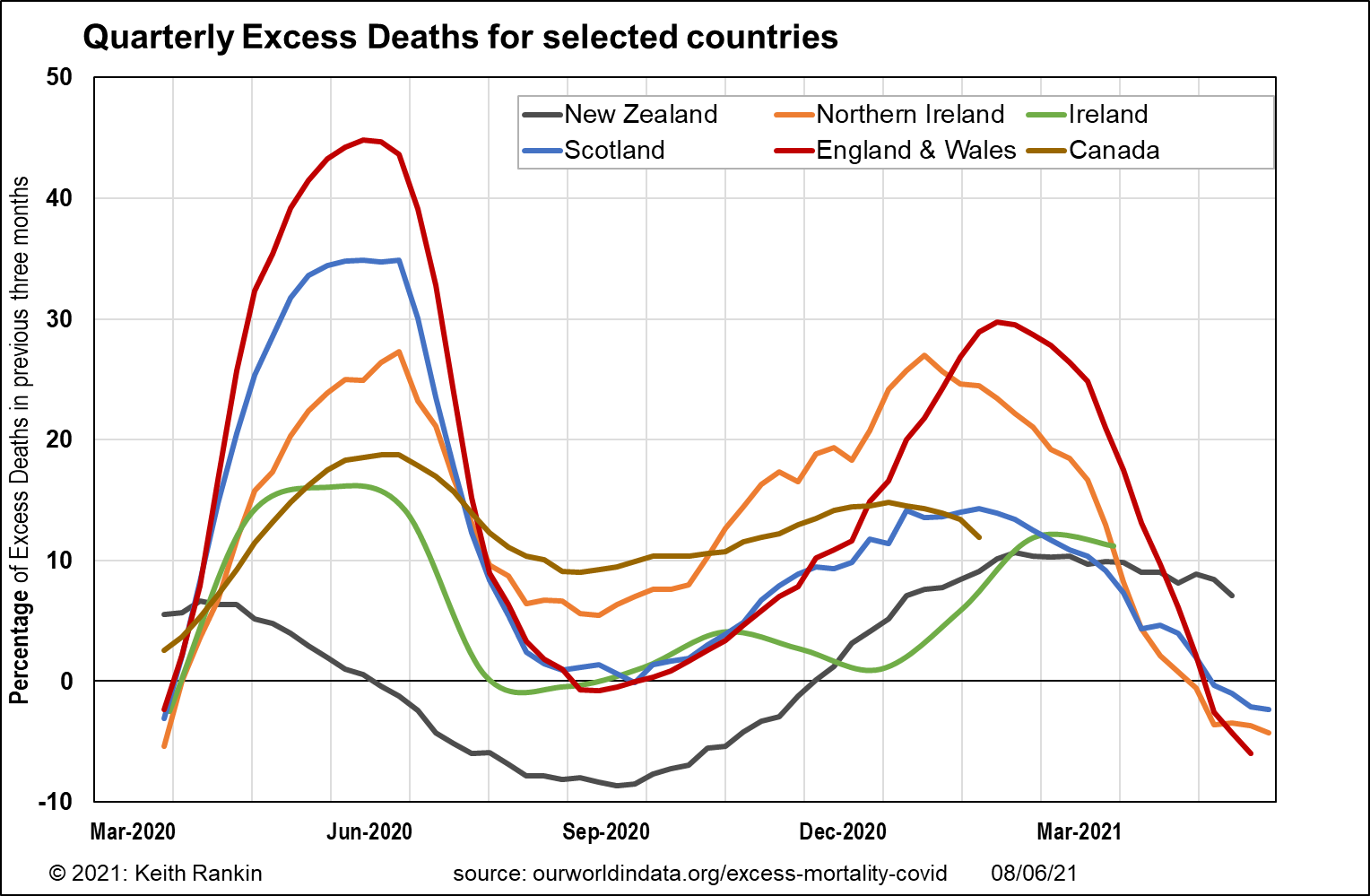
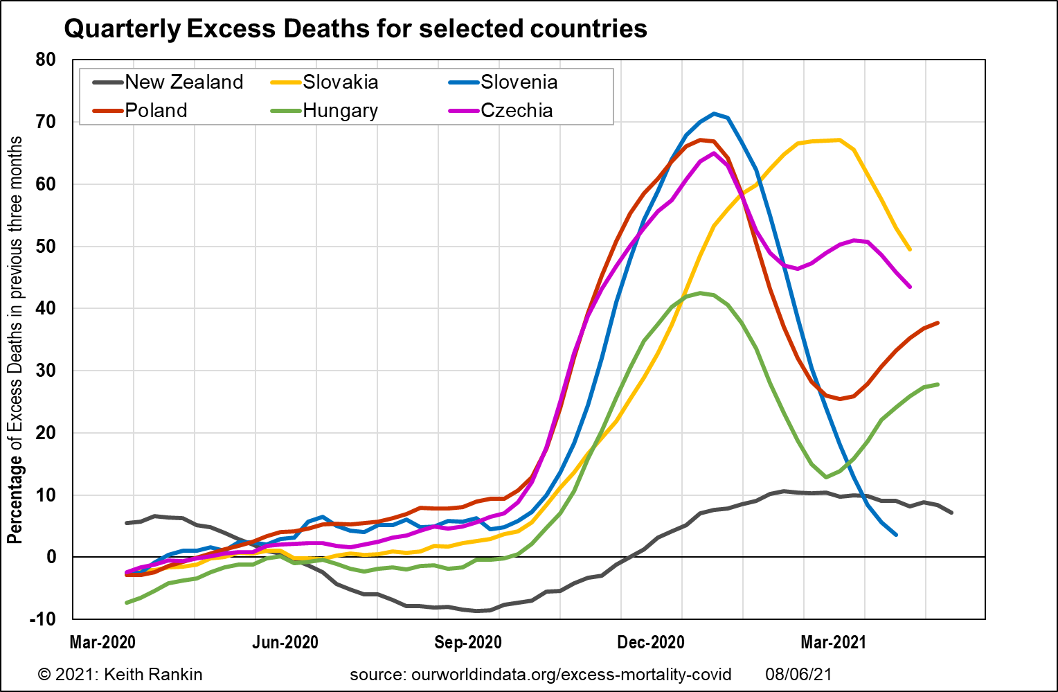
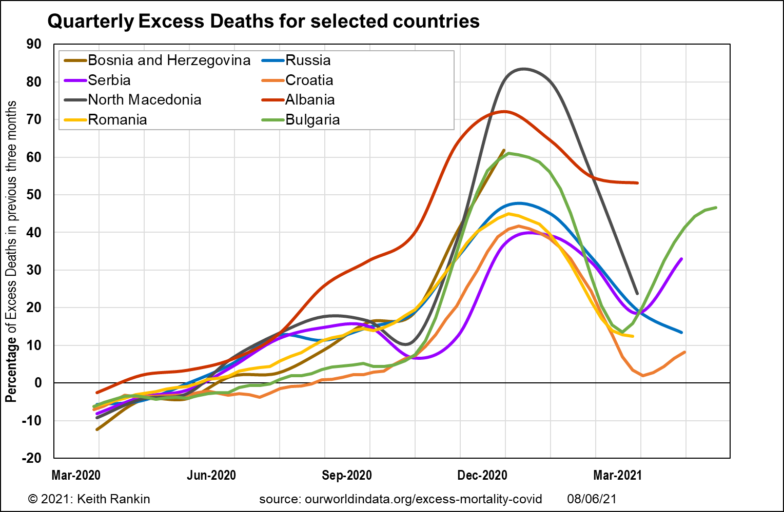
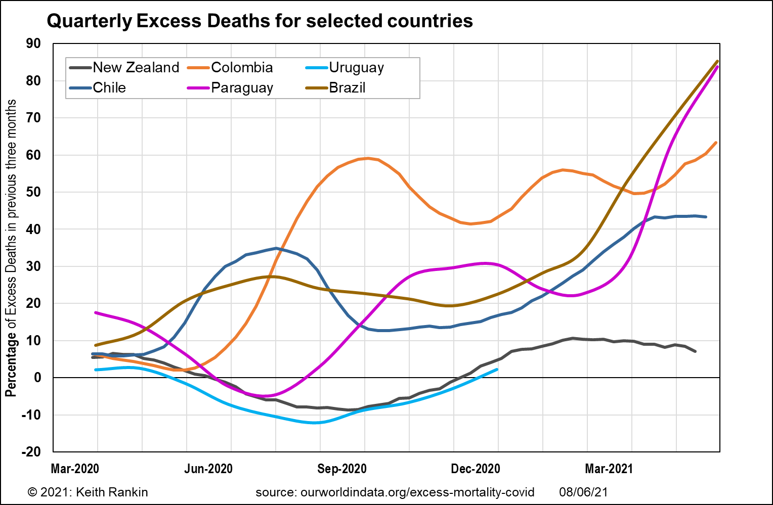
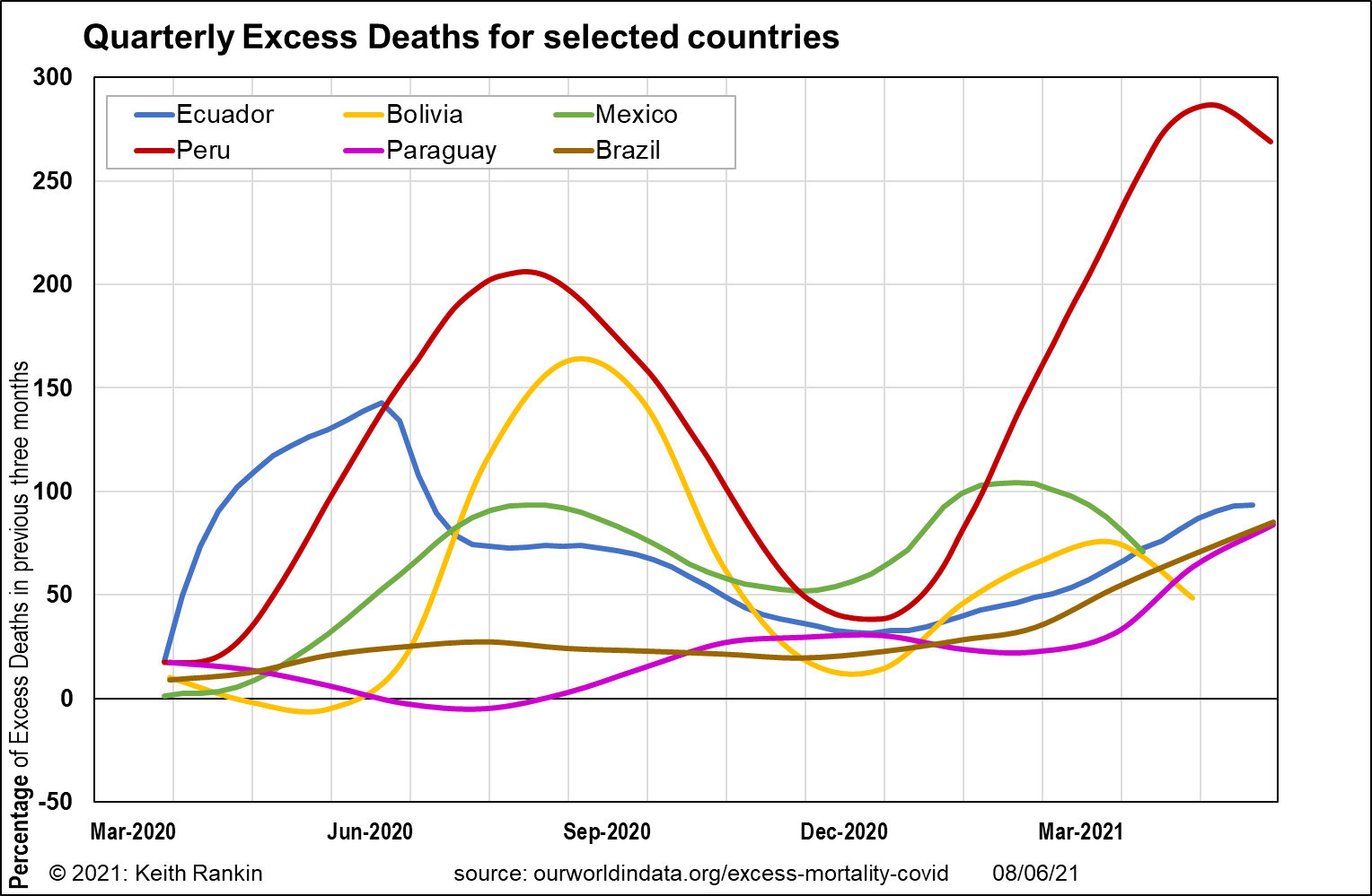
The charts are generally self-explanatory, though I will make a few points.
Firstly, the first data point on each chart covers the three months ending 31 March 2020; so, with a few early exceptions, this data point represents a pre-covid benchmark, providing context for the subsequent datapoints.
Secondly, a chart value of 100% means that – for that three-month period – total deaths were double the normal level of deaths; ie that ‘at least’ half the deaths were due to Covid19, and the remainder to other causes. I say ‘at least’, because the lockdowns and other restrictions clearly reduced other-cause mortality in all countries/
Thirdly, some countries keep very poor death records, so adequate data on excess deaths is not available. India is a country that falls into this category. Other countries are slow to report their death data; Australia, Canada, and Uruguay fall into this ‘late reporting’ category.
On individual countries, we may note that Hungary – worst in the world for official Covid19 death statistics in the first quarter of 2021 – was not as bad as some of its neighbours. (This is also true for Ireland.) It means that Hungary was more assiduous in counting Covid19 deaths than were many other countries. Another country to note is Uruguay, which on the statistics presented (2020 only) performed better than New Zealand. However, in the second quarter of 2021, Uruguay surpassed Hungary as the worst country in the world for Covid19 deaths; for Uruguay from April 2021, look at Paraguay and then add some.
Finally, we need to note that – of countries for which good death statistics are available – by far the worst affected country in the world has been Peru, a country I enjoyed the hospitality of over Christmas and New Year in 2016/17. I really feel for Peru, and believe that no other country (eg India) will come close to having suffered so much.