CoveragePost
May 25, 2020
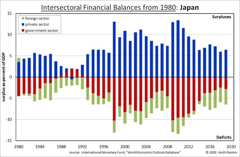
Analysis by Keith Rankin. Surpluses and Deficits of Different Economic Sectors This new series of weekly charts looks at forty years of surpluses and deficits in different countries, showing what makes these countries tick, and why they were where they were – financially speaking – at the end of the 2010s. (We may note, for ... <a title="Keith Rankin Chart Analysis – Financial Signatures: Japan" class="read-more" href="https://eveningreport.nz/2020/05/25/keith-rankin-chart-analysis-financial-signatures-japan/" aria-label="Read more about Keith Rankin Chart Analysis – Financial Signatures: Japan">Read more</a>
CoveragePost
May 22, 2020
Analysis by Keith Rankin. Covid19 case incidence is a reflection of both the actual infection rate, and the extent to which infections have been reported. Thus, countries like Sweden and Brazil with low testing rates have actual infection rates substantially higher than reported. Qatar is so high in part because, like Iceland, testing rates have ... <a title="Keith Rankin Chart Analysis – Covid19: Cumulative Cases and Deaths" class="read-more" href="https://eveningreport.nz/2020/05/22/keith-rankin-chart-analysis-covid19-cumulative-cases-and-deaths/" aria-label="Read more about Keith Rankin Chart Analysis – Covid19: Cumulative Cases and Deaths">Read more</a>
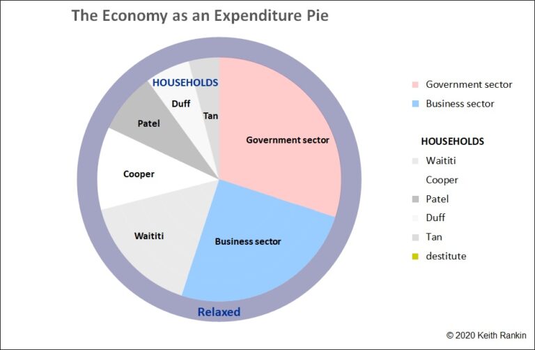
CoveragePost
May 21, 2020
Analysis by Keith Rankin. The chart above shows how a spending pie-chart may differ for a closed economy, compared to its income chart. For this example, the government sector has a financial deficit (ie a budget deficit) while the household sector has a financial surplus. In this case the government sector slice is 30% of ... <a title="Keith Rankin Chart Analysis – National Income, Spending and Debt" class="read-more" href="https://eveningreport.nz/2020/05/21/keith-rankin-chart-analysis-national-income-spending-and-debt/" aria-label="Read more about Keith Rankin Chart Analysis – National Income, Spending and Debt">Read more</a>
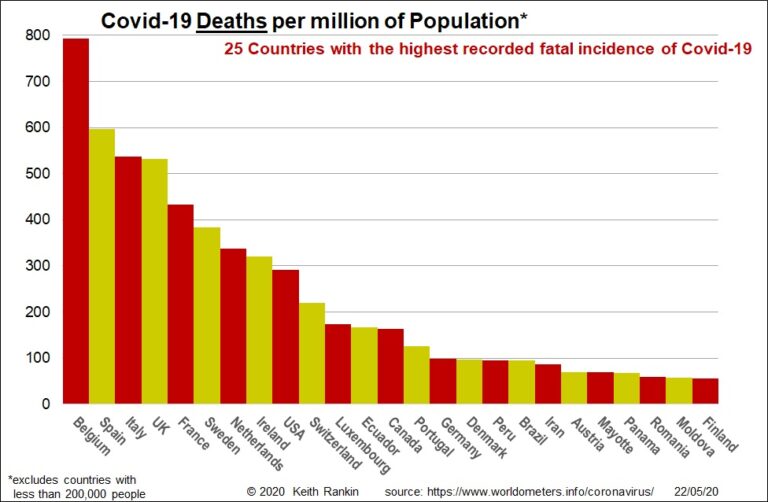
CoveragePost
May 15, 2020
Analysis by Keith Rankin. Today’s first summary chart looks at reported Covid19 cases and deaths over the seven days to 14 May. It is sorted into a Covid19 ‘deaths league’. Sweden now leads the world for acknowledged Covid19 deaths, closely followed by United Kingdom and Belgium. While Netherlands is showing well below Sweden and Belgium, ... <a title="Keith Rankin’s Chart Analysis – Covid19: Weekly Summary" class="read-more" href="https://eveningreport.nz/2020/05/15/keith-rankins-chart-analysis-covid19-weekly-summary/" aria-label="Read more about Keith Rankin’s Chart Analysis – Covid19: Weekly Summary">Read more</a>
CoveragePost
May 12, 2020
Analysis by Keith Rankin. Income in an Economy The chart above shows how income is distributed in an economy. It shows three major sectors: Government, Business and Households. Households are the principal sector; governments and businesses serve households, and are accountable to households. The chart is a pie chart, representing the economic pie. (For now, ... <a title="Keith Rankin Chart Analysis – National Income: the Pie Chart" class="read-more" href="https://eveningreport.nz/2020/05/12/keith-rankin-chart-analysis-national-income-the-pie-chart/" aria-label="Read more about Keith Rankin Chart Analysis – National Income: the Pie Chart">Read more</a>
CoveragePost
May 11, 2020
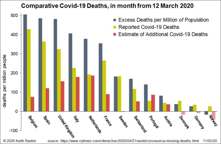
Analysis by Keith Rankin. Today’s chart shows (in grey) the estimated impact of Covid-19 on mortality rates in the selected countries. For most of these countries, the ‘excess death’ procedure provides an estimate of underreporting in underreporting countries compared to those with the most comprehensive reporting. Some of these extra deaths may have occurred as ... <a title="Keith Rankin Chart Analysis – Estimating the true death tolls from Covid19" class="read-more" href="https://eveningreport.nz/2020/05/11/keith-rankin-chart-analysis-estimating-the-true-death-tolls-from-covid19/" aria-label="Read more about Keith Rankin Chart Analysis – Estimating the true death tolls from Covid19">Read more</a>
CoveragePost
May 8, 2020
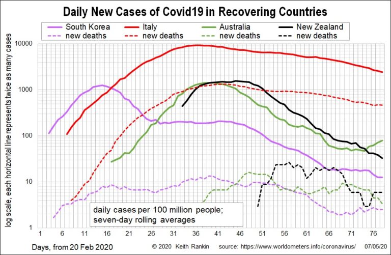
Analysis by Keith Rankin. This chart shows four recovering countries, including two of the first major outbreaks after China (South Korea and Italy), and the putative Australasian bubble. The chart shows daily average new cases, using seven-day rolling averages. Thus Italy is approaching 2000 new cases a day per 100 million people. Because Italy has ... <a title="Keith Rankin’s Chart Analysis – Covid19: Long Tail and Long Head" class="read-more" href="https://eveningreport.nz/2020/05/08/keith-rankins-chart-analysis-covid19-long-tail-and-long-head/" aria-label="Read more about Keith Rankin’s Chart Analysis – Covid19: Long Tail and Long Head">Read more</a>
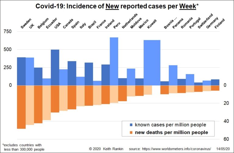
CoveragePost
May 4, 2020
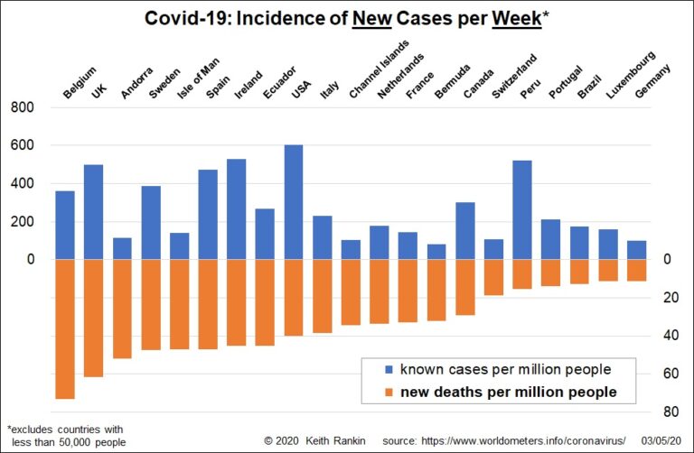
Analysis by Keith Rankin. These two charts show the total number of cases and deaths, by country, over the seven days ended 2 May 2020. In these charts a number of countries with populations below 50,000 have been omitted; countries which have shown in earlier charts. The first chart is sequenced by death rates (orange). ... <a title="Keith Rankin Chart Analysis – Covid19: New Cases and Casualties" class="read-more" href="https://eveningreport.nz/2020/05/04/keith-rankin-chart-analysis-covid19-new-cases-and-casualties/" aria-label="Read more about Keith Rankin Chart Analysis – Covid19: New Cases and Casualties">Read more</a>
CoveragePost
May 1, 2020
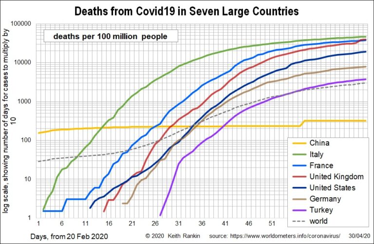
Analysis by Keith Rankin. At the end of this week, I have represented the latest summary charts with a log 10 scale, rather than the previous log 2 scale. This means that, as well as accurately showing the exponential growth pattern, the charts now emphasise ten-fold increases of Covid19 fatalities. At the top of the ... <a title="Keith Rankin Chart Analysis – Covid19: April Summary Charts" class="read-more" href="https://eveningreport.nz/2020/05/01/keith-rankin-chart-analysis-covid19-april-summary-charts/" aria-label="Read more about Keith Rankin Chart Analysis – Covid19: April Summary Charts">Read more</a>
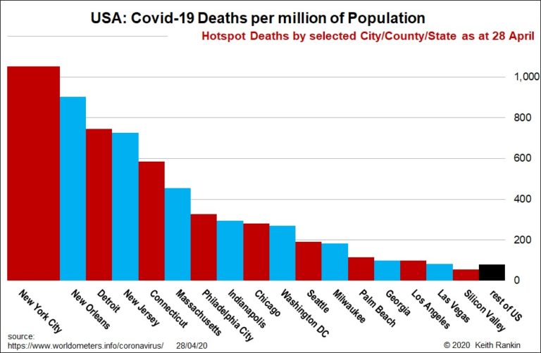
CoveragePost
April 29, 2020
Analysis by Keith Rankin. At the end of last month I published a chart showing the main features of Covid19 deaths in the United States. Today I publish an update, which has most of the same American places. At the end of last month, New Orleans (125 deaths per million people) had the worst outbreak, ... <a title="Keith Rankin Chart Analysis – Covid19: United States’ Update" class="read-more" href="https://eveningreport.nz/2020/04/29/keith-rankin-chart-analysis-covid19-united-states-update/" aria-label="Read more about Keith Rankin Chart Analysis – Covid19: United States’ Update">Read more</a>
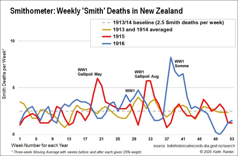
CoveragePost
April 24, 2020
Analysis by Keith Rankin. Today’s Anzac Day Smithometer Chart shows the fatal impact in New Zealand of World War 1 battles at Gallipoli and on the Somme in France. (Earlier this week the Smithometer showed the impact of 1917 WW1 battles in Belgium – Messines and Passchendaele – and the dramatic, though short-lived, impact of ... <a title="Keith Rankin’s Chart Analysis – Smithometer: New Zealand’s World War 1 Mortality Peaks 1915-16" class="read-more" href="https://eveningreport.nz/2020/04/24/keith-rankins-chart-analysis-smithometer-new-zealands-world-war-1-mortality-peaks-1915-16/" aria-label="Read more about Keith Rankin’s Chart Analysis – Smithometer: New Zealand’s World War 1 Mortality Peaks 1915-16">Read more</a>
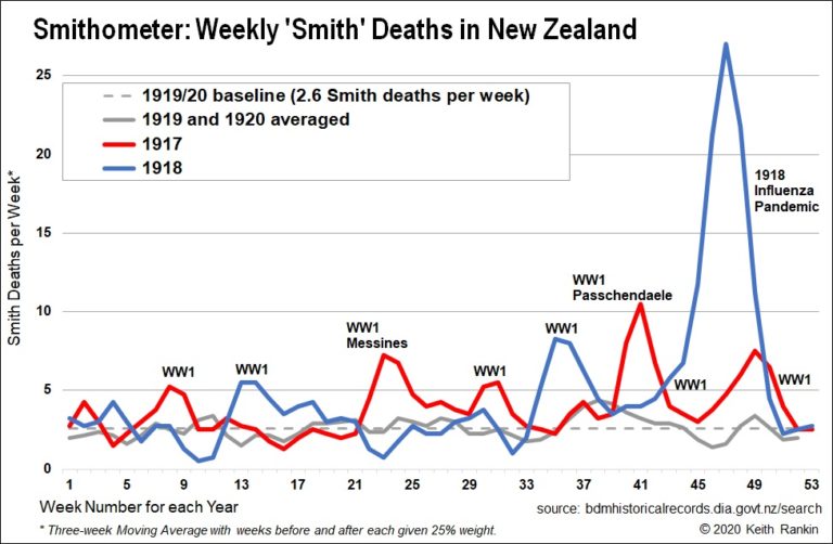
CoveragePost
April 21, 2020
Analysis by Keith Rankin Today’s chart looks back to the years 1917 to 1920, using a sampling device I call the ‘Smithometer’. I have counted the weekly deaths of all people named Smith, from the beginning of 1917 to the end of 1920. At that time New Zealand was a country of 1.2 million people. ... <a title="Keith Rankin’s Chart Analysis – The Smithometer: New Zealand’s mortality during the 1918 Influenza Pandemic" class="read-more" href="https://eveningreport.nz/2020/04/21/keith-rankins-chart-analysis-the-smithometer-new-zealands-mortality-during-the-1918-influenza-pandemic/" aria-label="Read more about Keith Rankin’s Chart Analysis – The Smithometer: New Zealand’s mortality during the 1918 Influenza Pandemic">Read more</a>