Analysis by Keith Rankin.
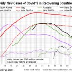
This chart shows four recovering countries, including two of the first major outbreaks after China (South Korea and Italy), and the putative Australasian bubble.
The chart shows daily average new cases, using seven-day rolling averages. Thus Italy is approaching 2000 new cases a day per 100 million people. Because Italy has a population of 60 million, this translates to 1,200 new daily cases. This is still alarmingly high for a country which has had falling daily cases for 40 days.
South Korea started its exponential path four days before Italy, but turned the growth down after 12 days. Thus, its slow long tail has a much lower daily caseload than does Italy’s.
New Zealand and Australia both look much like South Korea. One concern, however, is a recent rise in cases in Australia; I understand it’s mainly a new cluster in Melbourne. (I also note that Australia’s Covid19 testing per person is now significantly lower than New Zealand’s, despite Australia initially leading the way. I detect some complacency across the Tasman.
I am not sure that New Zealand should open up to Australia first. Further, I am nervous about opening up the Queenstown ski-fields to Australians. My preference would be for New Zealand to first open up to the ‘clean’ Pacific countries, including Fiji which has had no new cases since 20 April (though excluding French Polynesia). (As a form of self-interested aid, New Zealand should extend its Covid19 testing regime to these countries.) Only after that should New Zealand consider offering to join with Australia to form an Oceanian bubble; that is, a conditional offer based on Australia proving that it is safe.
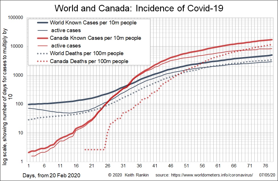
The second chart suggests that the world as a whole has yet to reach its tail. The rate of exponential growth has not changed in the last four weeks. Canada is representative of this problem, with a much higher caseload and an exponential death rate of increase clearly higher than the world’s rate. (For Canada’s above average death rate, note that the red dotted line is higher than the indigo dotted line. And for Canada’s higher growth rate of Covid19 deaths, we note that the red dotted line is steeper than its indigo counterpart.)
Canada is showing what might have happened in New Zealand, just as Italy shows what might have happened in South Korea. Canada serves as a counterfactual for Australia and New Zealand. Canada is the evidence that New Zealand’s Level 4 shutdown was needed.
South Korea gives New Zealand the evidence that a shift down to smart restrictions – using a Level 2 ‘hammer’ rather than a Level 4 ‘sledgehammer’ – can be effective from now, even if there are some new cases. South Korea was even able to hold a general election recently.
Canada is New Zealand’s rear-vision counterfactual. South Korea can be New Zealand’s fore-vision crystal ball, so long as New Zealand plays its policy cards right. South Korea is a month ahead. The most important difference though is that Korea is not moving into winter. I think New Zealand should keep its ski-season domestic, and keep close tabs on the après-ski. After all, much of the European Covid19 epidemic seems to have spread from the skifields of The Alps.