Analysis by Keith Rankin.
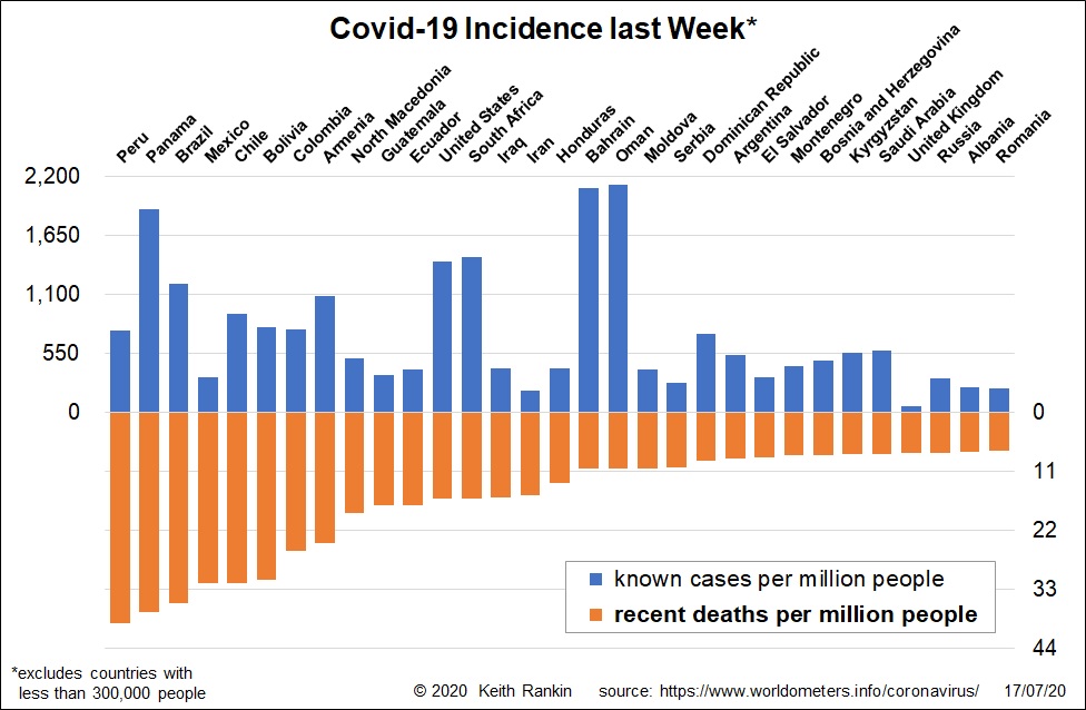
This chart orders countries by their Covid19 death rates in the seven days to 16 July. The seven worst countries are in Latin America; all except Panama being large countries. Two other large Latin American countries (Guatemala and Ecuador) are in the top 11 for recent Covid19 deaths. Of the larger countries in South America, only Venezuela is not in the top 23, though Argentina is much better than its neighbours. The top 23 countries include 13 from Latin America.
Mixing it with these, in the top 25, are some small countries (under 10 million people) in the ‘greater Middle East’, plus Iran, Iraq, South Africa and the United States. Nothing east of Iran, though Kyrgyzstan comes in at number 26. With the exception of the United Kingdom and Russia, the remainder of the countries in the chart are also in the greater Middle East (that includes the Balkans).
In Peru, the worst affected country over the last week, two-thirds of cases are in Greater Lima, which has one third of Peru’s population. While Peru had a very strong initial lockdown, it looks as though the main source of runaway coronavirus infection has been Peruvians returning from Europe and North America via Lima (Callao) Airport.
Peru has a lower incidence of new infections than Brazil, which suggests that Brazil will overtake Peru – ie exceed Peru’s death rate – in the next week or so.
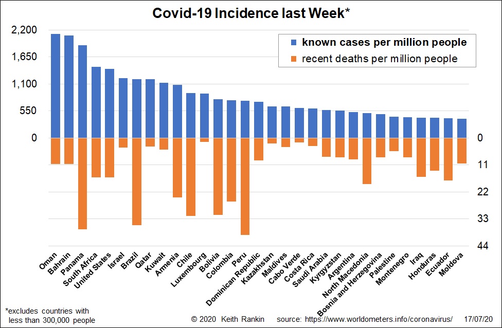
Looking as the data sorted by identified cases rather than by deaths, we see countries with low death rates (mainly because they have younger populations and/or better resourced hospitals), countries with recent outbreaks, and countries which have substantially increased their level of testing.
The Arabian countries continue to show strongly. But note Israel (and Palestine), South Africa and the United States. In western Europe, only Luxembourg shows up, suggesting a combination of an Australian-style outbreak and increased testing. We also note that Costa Rica – with the same population as New Zealand, and a popular destination for New Zealand travellers – has many cases of Covid19 (though not many deaths).
Although Kazakhstan and Kyrgyzstan show up in this chart (and the Maldives), no country in South Asia or East Asia shows in the chart. While it is true that most of the few cases being caught at Auckland Airport originated in South Asia, we should note that by far the majority of people in South Asia – and people travelling from South Asia – are not infected with SARS-Cov2, the virus that causes Covid19.
We also note that the only country from continental Africa that shows in either chart is South Africa. On March 27 I wrote: “I have some confidence that Asia and Africa will end up with much lower rates of infection than Europe. I am much less confident about Latin America” (Covid-19 Virus: Australia, Canada, New Zealand, the World). So far, my prediction has been correct. Let’s keep hoping for Africa and India.