Analysis by Keith Rankin.


Good or Bad?
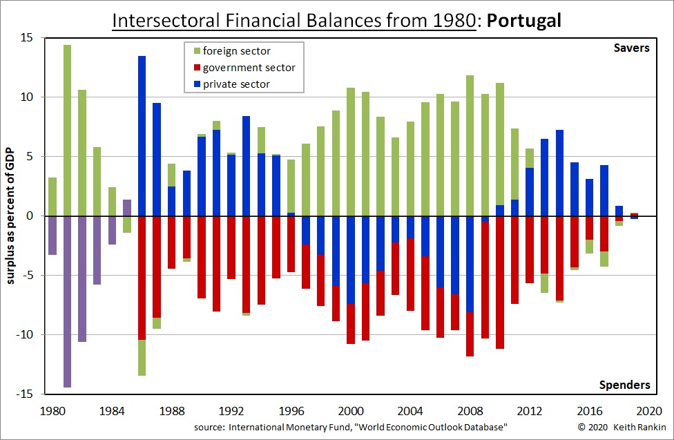
Are there good or bad signature patterns for countries. The most obvious answer is that every country should ideally look like Portugal in 2019. Government sector and foreign sector balances would be close to zero. Private sector balances would also be close to zero, with household surpluses (net household saving) offset by business deficits (borrowing and investment spending). We cannot be sure that the private sector was actually like that in 2019; in the years before the global financial crisis there was actually a common pattern in some countries of business saving offset by substantial extensions to household debt.
In reality, the perfect signature combination for a growing economy is closest to those of Portugal in 1989 or 1992: private surpluses at about four percent of gross domestic product (GDP), with government deficits also about four percent of GDP. Further, while foreign balances are ideally about zero, foreign surpluses of upto five percent of GDP are not necessarily a problem.
In normal years in most of our lifetimes, GDP has grown by about five percent a year – three percentage points on average due to economic growth and two percentage points on average due to inflation. So signature imbalances that are within five percent should not be seen as a problem.
What is interesting from these charts is to see what is the historical norm for a country, and then to see departures from that norm as an important economic story for that country, and maybe for the world economy as a whole. Major world events should show up in all capitalist economies’ charts, as deviations from their normal financial signatures. For example, the Covid19 pandemic will show up as a significant government deficit event for all countries, regardless of what came before.
For Portugal we can see that government deficits and private surpluses are normal, but that a big change occurred from the late 1990s to the early 2010s
Early 1980s
Before 1985, for both countries there is no IMF data available for government deficits that was collected on the same basis as post-1985 data. But we do know that the early 1980s were years of very high oil prices, though ameliorated each year from 1982 by general inflation exceeding oil inflation. (The early 1980s was also a time in which, in most countries, interest rates were lower than inflation; meaning negative effective interest rates.)
Large foreign sector surpluses were normal for all oil-importing countries in the early 1980s. This meant that oil-exporting countries were lending heavily to oil-importing countries; that is, much oil was being purchased ‘on credit’ and not being paid for by commensurate imports.
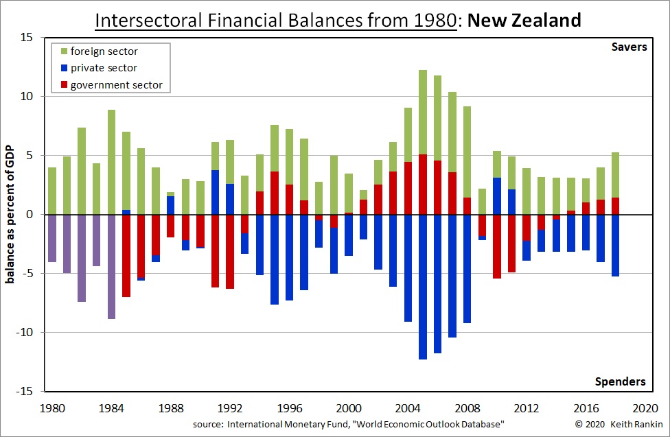
In New Zealand we know of this time as the ‘late-Muldoon period’. The purple columns represent New Zealand domestic balances – private and government combined into one. We know enough about that time in New Zealand to be sure that, if we had the full information, the purple would have been essentially red.
For Portugal that is also almost certainly true until 1983 (and for the same reasons as in New Zealand), with 1984 being much like 2012 and 1985 looking more like 2013; ie blue above the zero line and plenty of red below it.
The 1990s
New Zealand’s crisis of the 1987 to 1992 period is understated by the chart. It is most evidenced by the few years of private sector surpluses; unusual for New Zealand though normal for most countries.
Portugal shows signs of a financial crisis in 1985 and 1986; after that, until 1996, it looks like a picture of normality. New Zealand moved to its new normal in 1993. Indeed Portugal joined the European Union in 1986, so it was a period of uncertainty that soon eased. In 1996 Portugal had a change of government, and took major steps towards fuller integration into the European Union; and integration that would see Portugal as an enthusiastic adopter of the Euro currency in 1999.
So, what was happening in Portugal from 1996 was a substantial inflow of ‘investment’ mainly from the richer northern European Union countries. We see that this intra-EU investment is partly supporting government spending in Portugal, and partly supporting private spending.
The 2000s and 2010s
This was a period in which Portugal’s private sector emulated New Zealand’s, but without having a floating currency. New Zealand always had the ability to rebalance through a substantial adjustment to its currency, as indeed occurred in the global financial crisis of 2008-09. Further, much of the ‘offshore funding’ to New Zealand’s private sector was conducted in New Zealand dollars, so a fall in the New Zealand dollar would not create an aggravated crisis of foreign debt. New Zealand had found a way to live with private sector deficits as its norm. Few countries have ever been able to do that.
In the 2000s, Portugal experienced about three percent inflation every year, about the norm for any advanced capitalist country. The problem was that it was part of a fixed currency zone in which the dominant country – Germany – had annual inflation rates of under two percent. (So, the easiest way to read the green in Portugal’s chart is to think ‘Germany’.)
Portugal’s economy was becoming mortgaged to, in particular, Germany’s private sector. The forces bringing this about were coming mainly from Germany; Germany’s savers were seeing Portugal as an excellent ‘investment opportunity’. Portugal could not really stop this, even if it had wanted to.
As the 2000s progressed, Portugal’s ‘real exchange rate’ increased relative to Germany’s. This situation meant that economic resources in Portugal shifted towards its non-tradable sectors (most services, and construction) whereas economic resources in Germany shifted towards its tradable sectors (especially manufacturing and tradable services). So, it meant Portugal kept importing more from Germany, and exporting less to Germany, making Portugal’s private and public sectors evermore indebted to German investors.
This situation put Portugal into deflation in 2009 and 2014, and recession from 2009 to 2014.
After that, Portugal returned to its normal signature pattern of balances. Then, from 2018, near zero inflation, slow growth and Eurozone policy seem have modified that norm, creating less willingness from government to run deficit balances.
In the meantime, New Zealand remains a darling of the foreign creditor community, with that community happy to keep enabling substantial private sector deficit spending. That community is safe in the knowledge that New Zealand poses few risks, even when New Zealand makes economic and political reforms.
2020-21
All countries will show government financial deficits in 2020 and most likely 2021. Economic crises always lead to private sector surpluses. So, both Portugal and New Zealand will show blue balances much higher than usual, and red balances much more negative than usual. Because Portugal’s normal private balance is higher than New Zealand’s, so will its Covid19 private balance be higher than New Zealand’s. And because Portugal’s normal government deficit is bigger than New Zealand’s, then Portugal’s Covid19 government deficit will be bigger than New Zealand’s. Further, although Portugal has managed Covid19 better than most of the Eurozone countries, it has still a much greater pandemic problem than New Zealand. Portugal can expect balances like 1987 or 2014 for a few years. New Zealand may have a year with a balance like 1991, then a year with a balance like 1988, and then maybe a few years like 2015.
Both Portugal’s and New Zealand’s economies have similar-sized economies, though Portugal’s GDP is less per person. The countries have very different histories, though both are renowned for their maritime trade. Portugal will continue to have to fall into line with European Union norms. New Zealand will continue to have the freedom to follow its own path, and with the benefit of a more vibrant Asia to trade with.


