Analysis by Keith Rankin.
Quantity of Life
With mortality data now available for many countries to the end of 2022 (and, for a few countries, for a month into 2023), we are now able to properly assess the demographic cost of the Covid19 pandemic. There is a proviso, in that for a number of countries, December 2022 experienced substantial covid-related mortality, suggesting that the demographic consequences will last into 2023 and probably 2024. The demographic cost includes mortality indirectly caused by both the disease itself and unintended consequences of the public health measures taken to contain the covid coronavirus.
It is important to note that there is an additional impact – the socio-economic impact – arising from the pandemic; a disruptive impact on the living, adverse on balance, that cannot be measured by death tolls, though which may be reflected if life expectancies beyond 2023 fall below previous projections. This is a ‘quality of life’ rather than a ‘quantity of life’ consequence of the public health events of 2020 and 2020.
We also need to note that, with eight years of data shown, we can compare the death tally for the second four years’ [2019‑22] directly with the first four years [2015‑18] (both representing ‘quadrennial’ periods of 209 weeks). It is appropriate that 2019 is included with the subsequent pandemic years, because events in 2019 may contribute to 2020 death numbers; in particular, if 2019 had lower than usual seasonal illnesses, then many people who would normally have died in the winter of 2019 would have died in of 2020 or 2021 instead.) We note that, for the pre-covid years in the 2010s’ decade, the winter death peaks (typically late winter in the northern hemisphere) mainly relate to influenza, with a more general seasonal mortality effect triggered by ‘common colds’ and the like.
(And one piece of technical information. The weekly death tolls charted have been ‘smoothed’ to reduce the effects of random variation. Thus, the peak numbers for Australia and New Zealand – in July 2022 – each represent a weighted average of the deaths for that actual week and the deaths for the weeks immediately before and after. It means that the actual numbers of deaths in the peak weeks were higher than shown.)
Australia and New Zealand
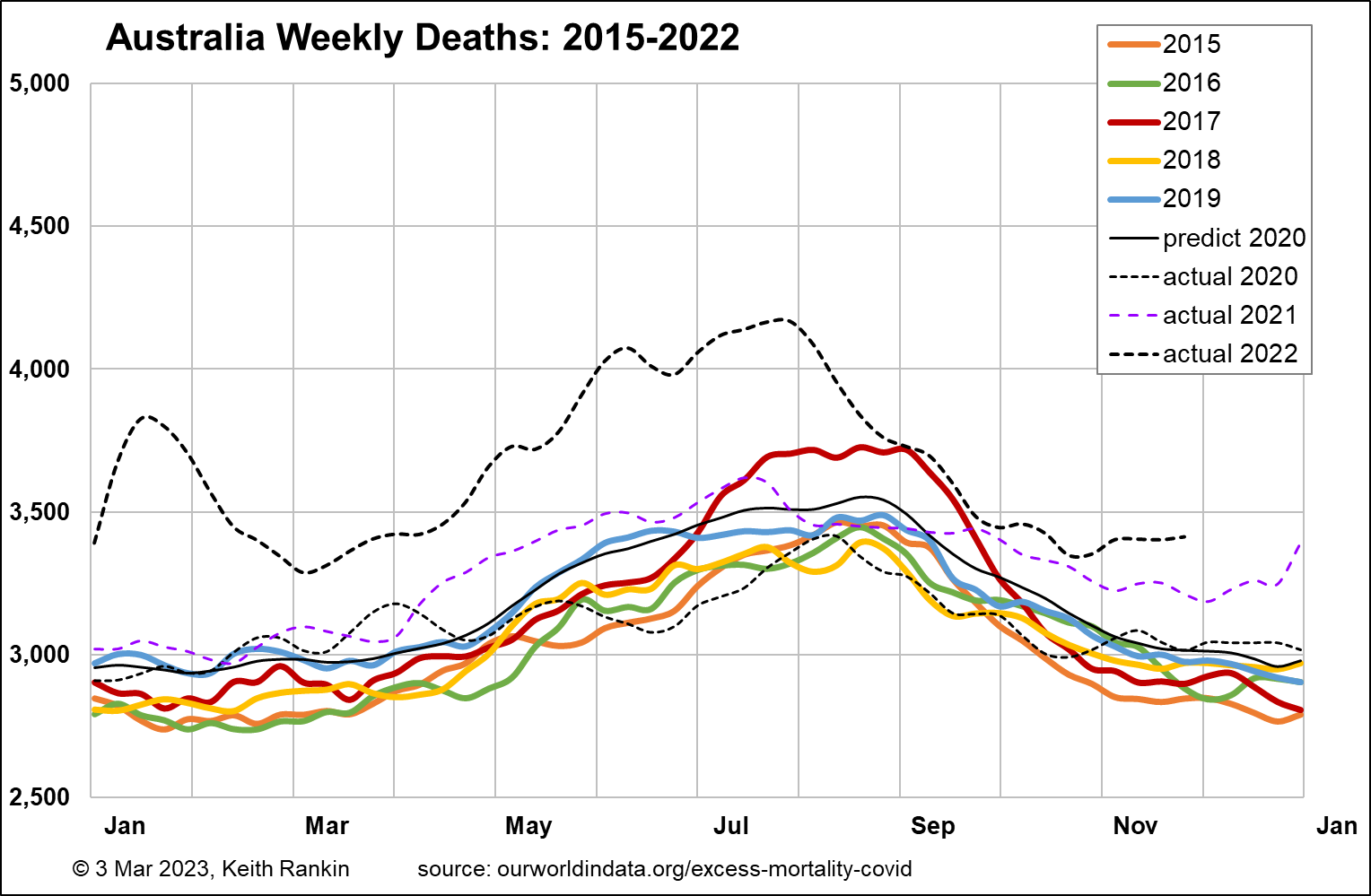
I start with Australia, which in the past I have been unable to chart very well because the Australian authorities are unnecessarily slow to release mortality data, and when they do it’s typically up to ten weeks of data at a time. We note, with reference to the New Zealand chart, that Australia’s population is slightly more than five times more than New Zealand’s, and has a similar age structure.
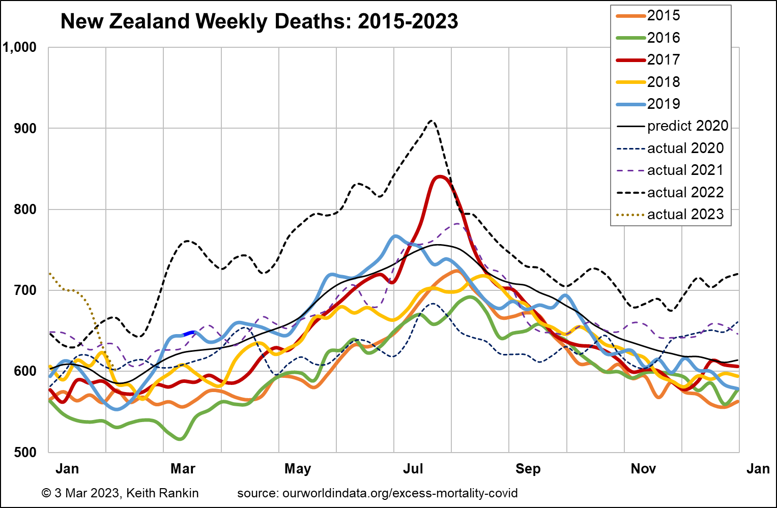
A baseline mortality toll for Australia in the early 2020s would be 3,000 deaths per week; it is shown by the black ‘predict 2020’ plot on the chart. The pattern of increasing deaths from 2015 to 2019 is mainly due to population increase; particularly, increased numbers of people aged over 70. (Baseline pre-pandemic weekly mortality for New Zealand is about 600.)
The scale of these charts is (approximately) with the top number (eg 5,000 for Australia) being double the bottom number (eg 2,500). In the first year of the pandemic, 2020, Australia’s weekly death tallies were much like what would have been expected in a non-covid year, but with lower winter deaths. That 2020 experience reflects the public health restrictions which were imposed, with the international travel restrictions probably being most important.
The demographic cost – in deaths – really begins in Australia in April 2021, and clearly persists to the end of (and most likely beyond) 2022. (A look at my previous set of chartssuggests that, based on northern hemisphere experiences of late 2022, mid-2023 – winter – could be particularly bad in the southern hemisphere; although taking advantage of the seasonal time-lag to get suitable vaccination programs in place may help the ‘lucky south’.)
New Zealand data reveal a broadly similar pattern to Australia, though the 2020 shortfall of deaths was more accentuated, and the more general appearance of excess deaths began seven moths later than in Australia, in November 2021. New Zealand, having a much smaller population than Australia, shows more exaggerated peaks and troughs; and generally more ‘random noise’, more random variability, from week to week.
Australia’s pre-covid estimated life expectancy (source: IMF database) was 83.4, with a median population age of 37.9. For New Zealand, the comparable numbers were 82.3 and 37.9; so, both countries have very similar demographics.
I have calculated the increase in quadrennial (ie four-yearly) total deaths for 2019‑22 compared to 2015‑18. For Australia, with December 2022 data still missing, it’s an estimated 7.9% increase in deaths. For New Zealand it’s 8.2%, slightly higher. For both countries, 2022 is the year that most contributed to the 2019-22 excess deaths’ toll. In addition to Covid19, increases in these countries’ populations of elderly will have contributed to higher mortality this decade.
Finland and Sweden
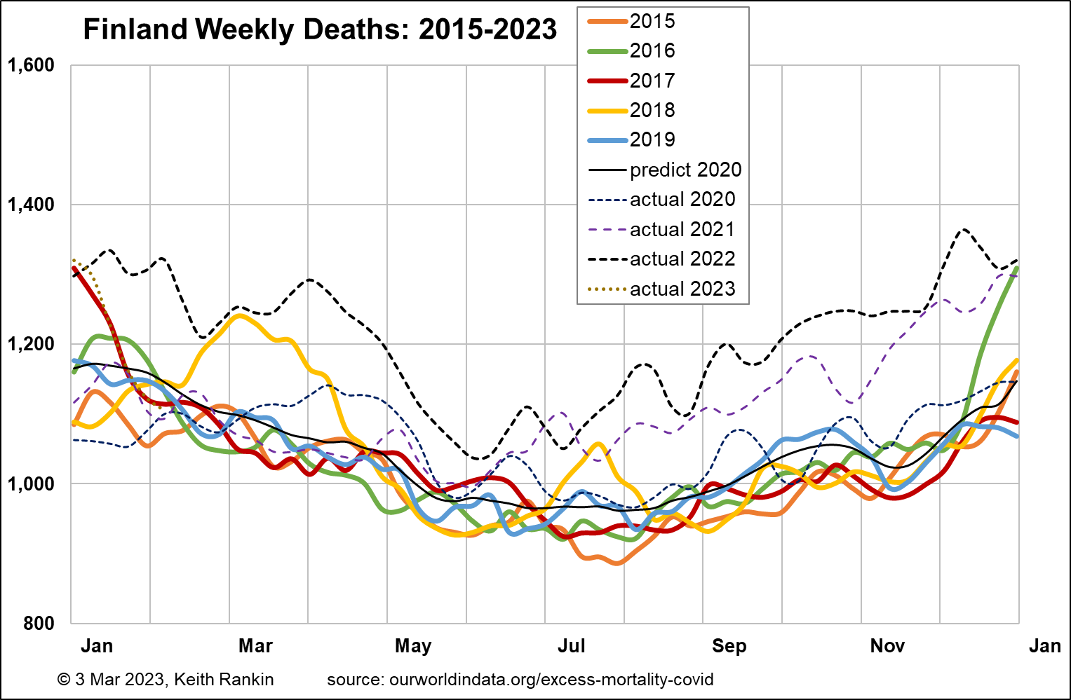
Finland has just a few hundred thousand more people than New Zealand. Its 2019 estimated life expectancy was lower than Australia’s and New Zealand’s, at 81.9. And its median age, at 42.8, suggests that Finland should have a significantly higher base rate of deaths per week. Indeed, the chart shows a base weekly tally of about 950, substantially higher than New Zealand’s 600.
Finland was the most restrictive of the Nordic countries, with respect to public health management of Covid19. It’s pattern of weekly deaths looks very similar to New Zealand’s, with New Zealand having a six-month (seasonal) lag. This means that the extent that Finland’s deaths are above baseline from July 2022 seems likely to be a good predictor for New Zealand in the first half of 2023.
Finland had 7.2% more deaths in 2019‑22, compared to the previous four years. The main explanation for its lower mortality increase (than Australasia) is likely to be due to a lower rate of increase in the size of its elderly population.
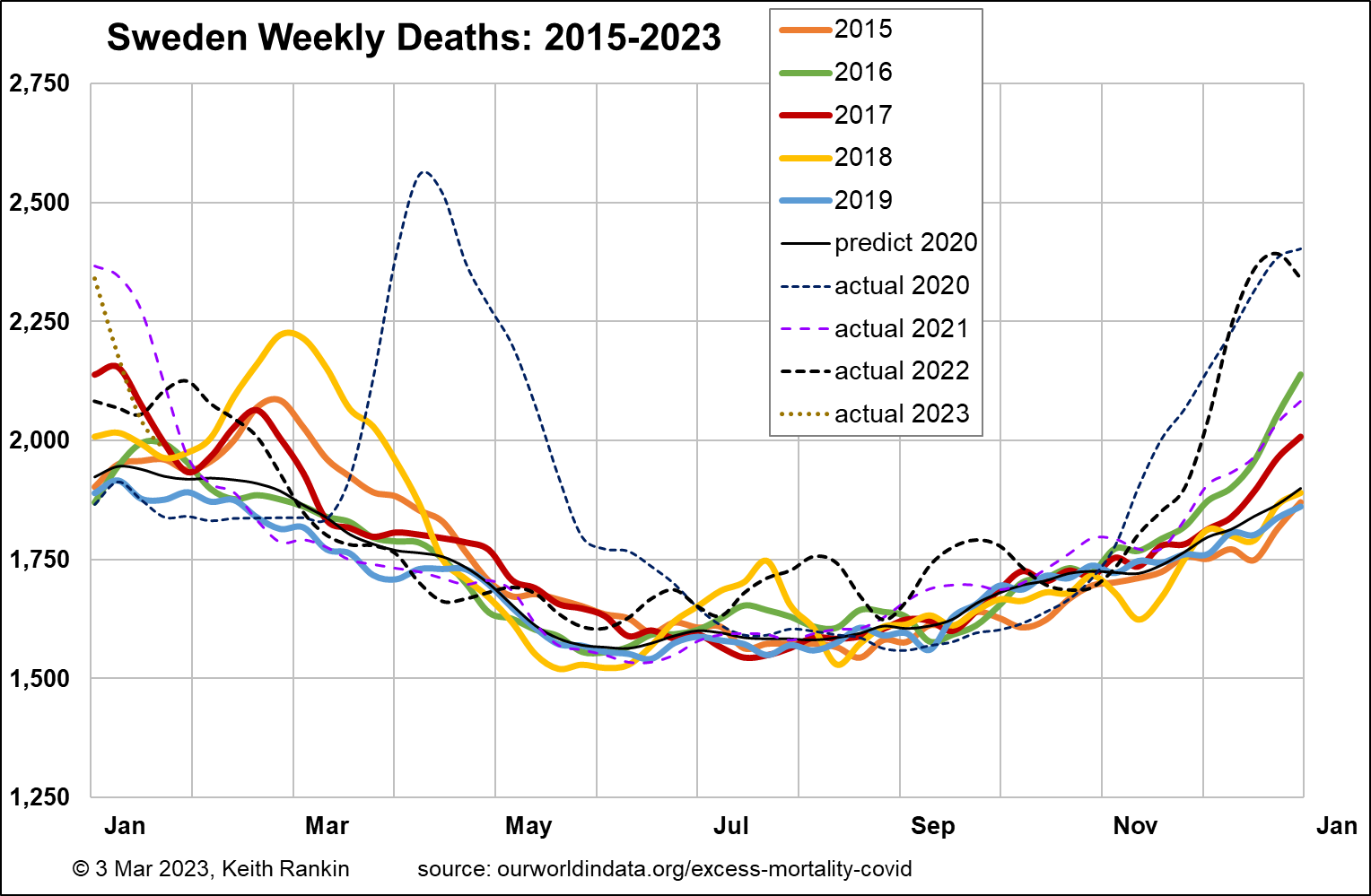
Sweden has close to double New Zealand’s population, and had almost the same pre-covid life expectancy as Australia and New Zealand (82.8). Its median age was 41.0; lower than Finland’s, probably due to both more immigration (especially refugees) and (given Finland’s membership of the Eurozone) less emigration than Finland to places like Berlin and Brussels. As Sweden’s chart shows, Sweden’s pre-covid baseline mortality was about 1,600 deaths per week, equivalent to 800 in New Zealand; again, higher due to Sweden having relatively more older people than Australia or New Zealand.
Unlike the other countries mentioned so far, Sweden had almost all its pandemic excess mortality in the year commencing March 2020. One important reason for this was Sweden’s unexpectedly low mortality in the year-and-a-half prior (especially in the winters of 2018/19 and 2019/20) to Covid19, meaning that many of the covid deaths of the frail elderly in Sweden in 2020 were people who, based on statistical expectation, would normally have died before the pandemic struck. The other main reason for Sweden’s high early toll was its classically liberal public health policy approach.
2021 in Sweden looks very much like a normal pre-covid year in Sweden. In the second half of 2022, all west European countries had significantly elevated mortality, mainly it would seem associated with renewed Covid19 outbreaks. Comparing Finland and Sweden, both had December mortality peaks about 50% above baseline weekly death tallies. But Finland clearly had much worse autumns than Sweden, in both 2021 and 2022.
In an important sense, many people died in Finland in 2021 and 2022 who would have died in 2020 were it not for the public health mandates then operating in Finland but not Sweden.
There’s more to it than that though. Sweden’s increase in deaths for 2019‑22 compared to the previous four years was just 2.2% compared to Finland’s 7.2%. It looks as though Sweden’s population had a significantly higher level of general immunity in 2021 and 2022 than did Finland’s. Finland experienced a greater overall demographic cost from the pandemic – presumably in large part because of its different policy choices – than did Sweden.
Both of these Nordic countries (and the other Nordic countries too) had a lower increase in deaths than did Australia and New Zealand. But the Australasian countries probably had bigger increases in the elderly populations (defining ‘elderly’ as over 70); nevertheless, Australia and New Zealand most definitely should not be congratulating themselves on having ‘done better in the Covid19 pandemic’ than Sweden.
Greece
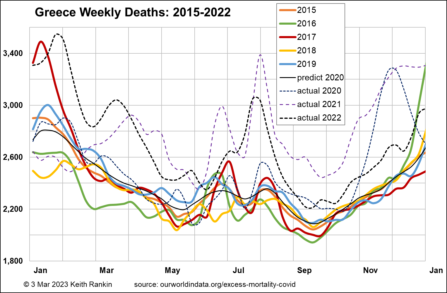
Greece is a European Union country with essentially the same population size as Sweden. It has the same pre-pandemic estimated life expectancy as the other countries charted so far (82.2), but has a significantly older population structure (pre-covid median age of 45.3), almost certainly due to a substantial depopulation of young adults in the wake of the Eurozone crisis which peaked in 2012. So we expect baseline weekly deaths to be substantially higher in Greece than in Sweden. Indeed, that is so. Pre-pandemic baseline weekly deaths in Greece stand at 2,200 compared to 1,600 in Sweden. (We note that much of this depopulation of young adults from Greece will have occurred before 2015, so we have no reason to believe that there has been a significant change in the age structure of Greece that would contribute to the pandemic-era death experience. Hence, the dominant reason for increased deaths in Greece will be Covid19.)
The chart for Greece shows no impact arising from Covid19 until October 2020. While this will be due to restrictive public health measures in the first half of 2020, it may also be due to high levels of influenza that seem to have been generally the case in southeast Europe in February 2020. This will mean that more vulnerable older Greeks will have died just before the pandemic, rather than in its early phase. And it means that Greeks will have had higher levels of general immunity in those early months.
The second European wave of Covid19, in late 2020, substantially impacted Greece, as it did all other European countries. In general, it had a disproportionate impact on vulnerable Eastern Europeans, with less natural immunity than their western co-Europeans. Greece had 11.1% more deaths in 2019‑22 compared to 2015‑18.
We see that Greece has had an unusually high level of summer epidemic death, almost certainly due to its status as a tourist destination. In 2021 Greece was a substantial victim during the ‘Delta’ outbreak; based on comparative analysis this toll was due mainly to compromised immunity (including inadequate vaccination) and not to any specifically deadly features of the ‘Delta’ variant of the Covid19 coronavirus. We see Greece with the same 50%-above-baseline mortality in December 2022 as other European countries. Southern hemisphere countries can expect this sort of peak around June 2023, though preventable by mass vaccination this April.
Chile
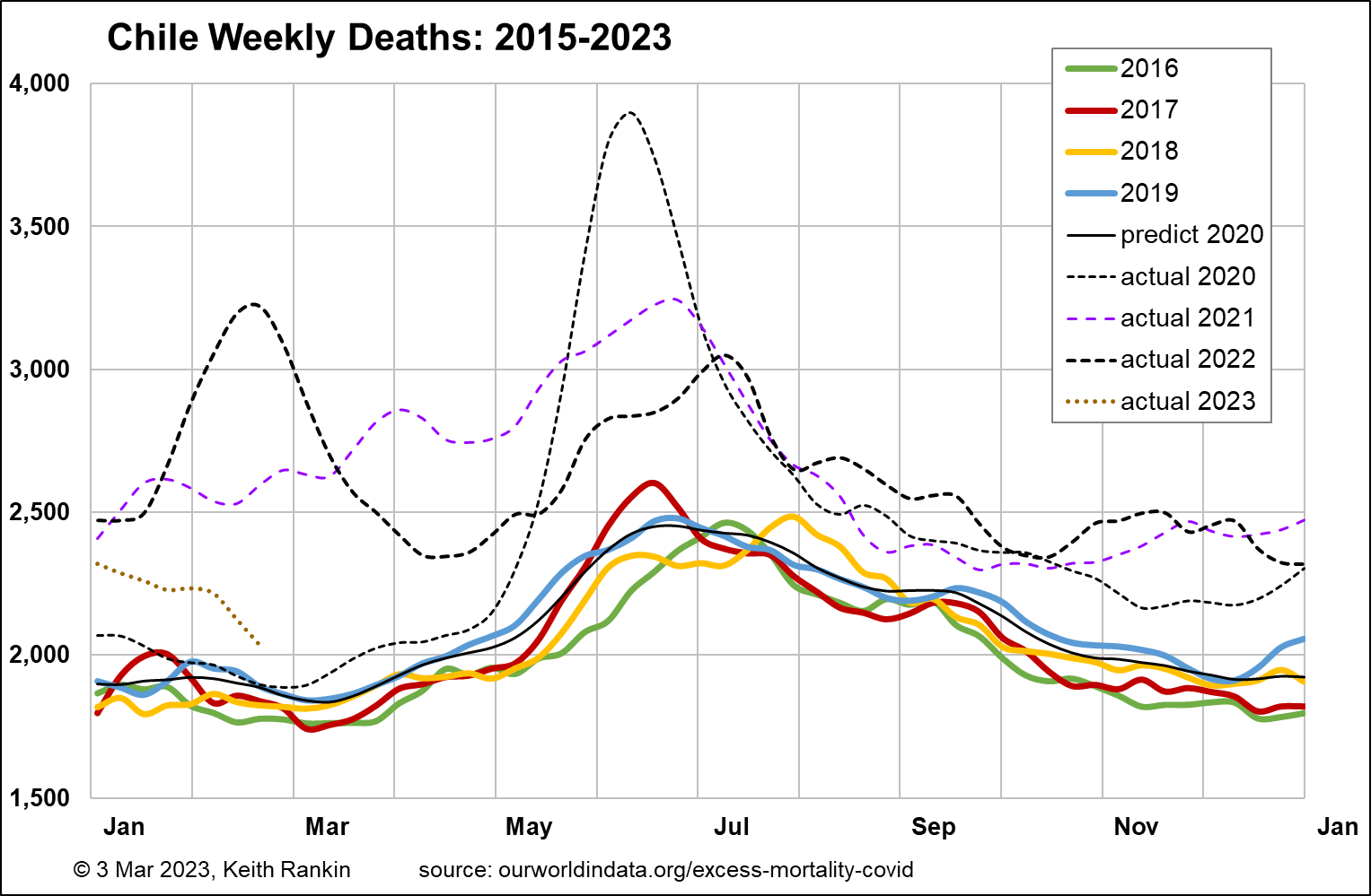
Chile is of interest as an alternative southern hemisphere country. It has almost exactly four times New Zealand’s population. It has a pre-pandemic baseline death rate of 1,900 which would be equivalent to 475 in New Zealand; that is, well below New Zealand’s baseline weekly death tally of 600. While this is due to Chile’s lower pre-pandemic median age (35.4 compared to Australasia’s 37.9), it also reflects Chile’s high – for the Americas – pre-pandemic life expectancy estimate of 80.2.
We see that Chile was largely successful at keeping Covid19 at bay until May 2020. But it was always more challenging in a country with land borders to three other countries, with the Peruvian and Bolivian border most significant at that stage. And clearly the international airport in Santiago was not as well sealed as those in Australasia. Unlike Australia and New Zealand, Chile was hit hard in the first half of 2021, and had a much bigger (‘Omicron’ variant) peak mortality in early 2022. Other than that, its experience in late 2021 and late 2022 was similar to Australia’s. Overall, Chile saw a 20.1% increase in mortality in 2019‑22 compared to 2015‑18, accentuated by its surprisingly low pre-pandemic base. Low pandemic mortality for South America, but high for the world as a whole. Undoubtedly Chile has also had a substantial increase in its older population, though maybe not as marked as in those countries whose birth rates were most affected by World War II.
United States
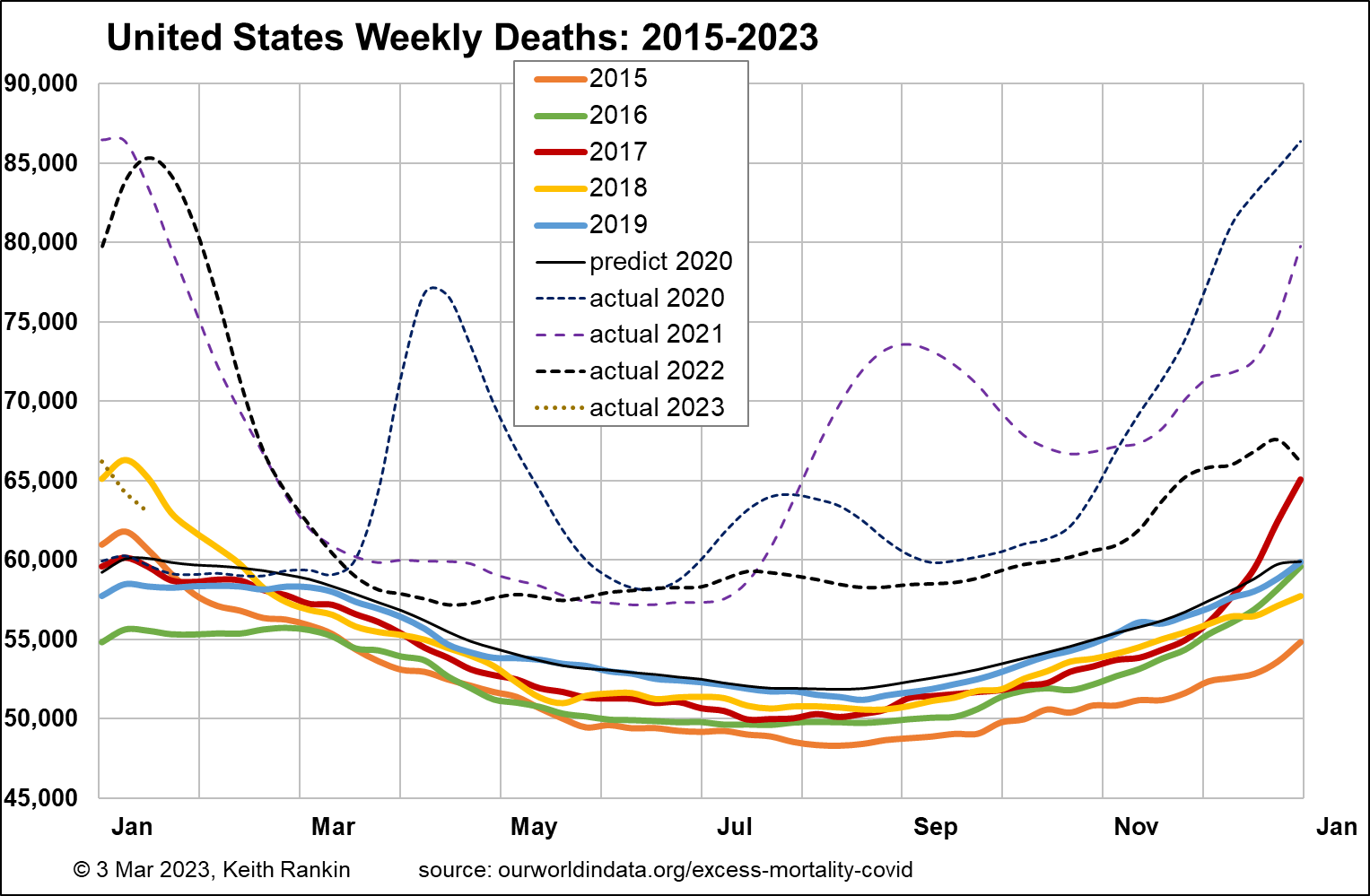
The United States is like a mix of Australia and Chile. It had a pre-pandemic estimated life expectancy of 78.9, well below both Chile and Australia; indeed a ‘third world’ life-expectancy. The median age pre-covid was 38.3, very similar to Australia and New Zealand; so having a similar age structure to the Australasian countries.
USA has a population 66 times that of New Zealand. It’s base pre-pandemic weekly mortality of 52,000 is equivalent to a high 790 for New Zealand, much higher than New Zealand’s actual 600 baseline. Given the similar age structures of United States and New Zealand, this has to be due to a generally higher pre-pandemic risk of death from all causes in the United States.
Overall, the chart for USA is comparable with the chart for Chile. Deaths in the United States increased by 16.8% over the two periods; like Chile but without the low base that might have inflated this statistic for Chile. Covid19 was clearly a big disaster for the United States, though I suspect that high levels of comorbidity – including obesity, diabetes, drug misuse, mental unwellness – contributed more than public policy. Indeed, USA had a younger profile of Covid19 mortality than most other countries.
United Kingdom
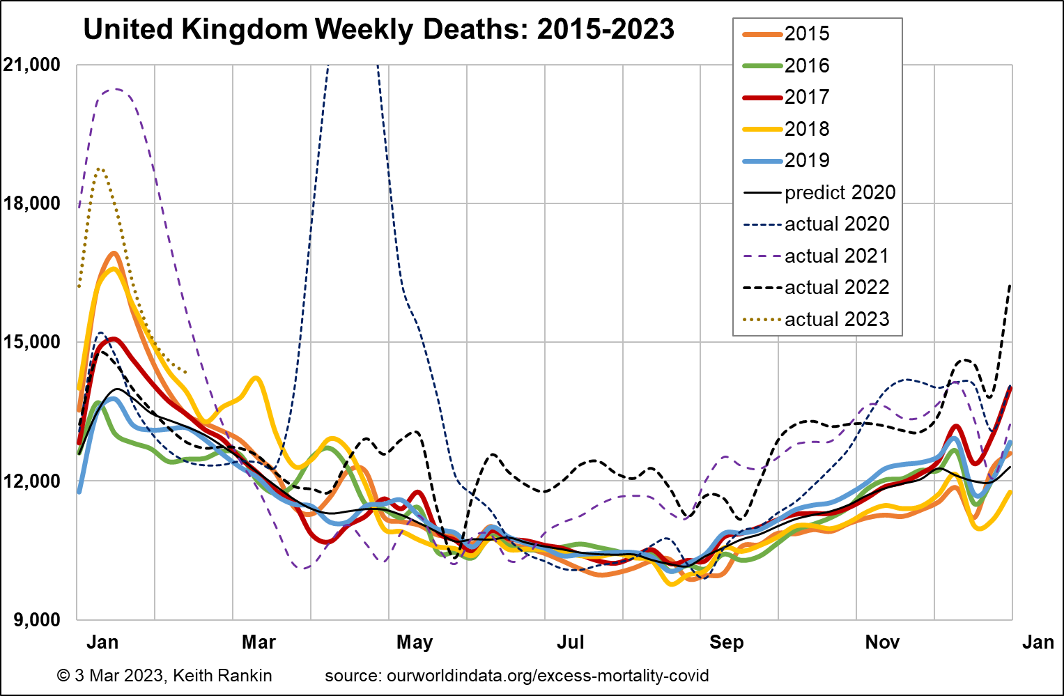
Finally, we look at the United Kingdom, with a baseline pre-pandemic death tally of 10,500 per week. That translates to 775 in New Zealand. The United Kingdom had a median age of 40.8 pre-pandemic, similar to Sweden. And a life expectancy of 81.3, similar to Finland. This older population structure largely explains Britain’s higher (than Australasia and Chile) level of baseline mortality.
Mortality patterns in the United Kingdom were most like that of Sweden, except generally higher, and significantly worse in 2021. We should also notice Britain’s huge peak in January 2023, probably partly due to Britain’s unique way of reporting death statistics. (Many late December deaths are recorded in the following year; this seems to be true for each year.)
Overall, the United Kingdom’s increase in deaths for 2019‑22 over 2015‑18 was 7.9%, same as Australia and less than New Zealand. However, we cannot claim that the demographic impact in the United Kingdom, so far, is less than in New Zealand. In the absence of the Covid19 pandemic, New Zealand’s deaths would have increased by more. This is because New Zealand’s increase in the number of people aged over 70 is more pronounced than is Britain’s. It may also be due to a worrying rate of increase in New Zealand of sub-70 non-covid mortality; that is, of mortality of people aged under 70 with American-style comorbidities. We note this already, in that the average age of people in New Zealand who die with Covid19 is significantly younger than the average age of those who die of Covid19.
Brief Conclusion
Sweden, with its more classically liberal public health approach, has had easily the lowest pandemic and post-pandemic mortality increases so far.
Data from other countries suggests that factors around general immunity and comorbidity are the major determinants of pandemic mortality; that is, neither infection rates nor viral mutation rates. And we should note that Covid19 vaccinations also probably improve general immunity, and not just immunity to the covid virus.
Re Australia and New Zealand, the lessons are two: the severe Covid19 winter of 2022/23 in (especially western) Europe will likely be replicated in Australia, New Zealand and Chile if mass revaccination does not take place this April. And that these southern countries may have unaddressed comorbidity problems, not unlike the problem in clear sight in the United States; in New Zealand this problem is by no means confined to people of Māori and Pasifika ethnicity.
______________
Keith Rankin (keith at rankin dot nz), trained as an economic historian, is a retired lecturer in Economics and Statistics. He lives in Auckland, New Zealand.