Influenza et.al.; charting normal to see Covid19 in context
Analysis by Keith Rankin.
So much of our analysis of the public health impact of Covid19 has been taken out of context. The officially reported case data are incomplete, and take little account of how these health impacts deviate from normal, or even what ‘normal’ is. Re deaths, many people who deaths were attributed to Covid19 in fact died from a mix of causes of which covid was but one. (A prominent recent example was the former United States Secretary of State, Colin Powell, who died recently as a result of a mix of cancer, covid, and what might previously have been called ‘old age’.) We all die sometime, and most of us die when we are old. (Because age at death is negatively skewed, well over half of us die at above the mean age of death.)
The charts below attempt to reveal, for six more countries, mortality ‘normal’, with the usual messy-ness that applies to human lives. In addition, I have already posted seasonal mortality charts for New Zealand and for Germany; and charts with essentially the same data can be found on Our World in Data.
Sweden
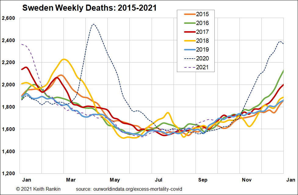
Sweden provides us with a statistical baseline, for an economically developed high latitude northern hemisphere country with a rule-abiding and trusting population. Sweden differs from most other such countries, because it introduced no public health mandates, and its covid vaccination rates are about average for such countries. Sweden is also a useful benchmark, in that it’s population is growing slowly, and that, as a neutral country, World War 2 had a relatively small impact on the age structure of its people.
To find normal, we look at the coloured plots on the chart.
We see that from December to March, there was much variety in Sweden’s experience of mortality. Also, July. The reason for this variation is quite straightforward; December to March are the main months when people die of ‘old age’, and ‘old age’ remains the most significant predictor of mortality. (This is true, whether we think of ‘old age’ as being in one’s nineties, as in Sweden; or one’s seventies, as in, say, Russia.)
The main determinant of when – ie which month – older people die is seasonal respiratory viruses, the most potent of which is influenza. Each year’s ‘influenza season’ is different, making it hard to establish a ‘normal level of mortality’ during the influenza season (December to March in Sweden). Difficultly is establishing normal makes it difficult to determine what constitutes ‘excess’, ie what constitutes ‘above normal’.
Nevertheless, charting the five years – 2015, 2016, 2017, 2018, 2019 – separately gives a vivid picture of approximate seasonal norms. Every year more people die in the winter ‘flu season’.
It is tempting to call 2019 a ‘good year’ in Sweden, but it should really be called a ‘low flu’ year. It means that many Swedes who might normally have died that year, did not (meaning that therefore they would die in another year). A similar low flu year was 2016, although Sweden clearly had a ‘normal’ bout of flu (or something similar) in January 2016, and clearly had a more substantial outbreak at the end of that year.
The most prominent flu bulges are in February (2015, 2017, 2018). 2020 started out like 2019, as another low flu year. For the second February in a row, there were no outbreak flu deaths in Sweden. Thus, there was an unusually large number of older people alive in Sweden in early March 2020; people who in many other years would have already died from influenza complications.
When Covid19 hit Sweden, in late February 2020, it killed many people aged over 85; many of these people were only alive as a result of two low flu winters. Thus, Sweden’s high covid mortality in the spring of 2020 can be substantially attributed to those two low flu winters. We saw something very similar in Germany; the main difference is that Germany responded much more aggressively towards defending itself from the Covid19 outbreak in Italy and The Alps. So, Germany’s mortality that spring was much less than Sweden’s. (This will not only be due to Germany’s restrictions; it’s also because Germany, unlike Sweden, had a normal year in 2019.)
Germany has mortality blips in its summers, that look like infectious disease because the timing is different each summer. And Germany also has a covid blip in its first covid summer. The reason for the summer blips would appear to be the high level of human mobility in summer. Germany’s August 2020 covid-blip most likely reflects a more vulnerable population; vulnerable as a result of its spring’s covid-restrictions, with some older people in Germany dying who would otherwise have died earlier that year.
Sweden’s second wave in the winter of 2020/21 almost exactly parallels that in Germany. So, if we look back from March 2021, Germany’s public health policy looks to have been preferrable to Sweden’s. While both countries shared the winter mortality wave, Sweden’s overall toll looks greater. Germany was seen to have provided best practice in Europe, while Sweden was condemned for worst practice.
After March 2021 is a different story. Arguably the most important bit of the Sweden chart is the 2021 line after March. Sweden’s mortality experience has reverted to ‘absolutely normal’, though with a small Delta hiccough in September 2021. Germany is quite different, with 2021 mortality consistently above normal since March 2021.
What we see is a classic debt profile, with Sweden (as ‘lender’) taking an initial hit in 2020, and with Germany (as ‘borrower’) avoiding the 2020 hit, but, from March 2021, servicing its ‘immunity debt’. (Covid-Delta in Germany appears to have a higher ‘R-value’ [reproductive value] than it does in Sweden.) This is despite higher vaccination rates in Germany; on 1 June Germany had a vaccination rate of 31.5% [half-weight for ‘one dose only’], and Sweden was 26%. We also note that Sweden started vaccinating before Germany, so, when Delta hit Europe in June 2021, Germany’s rate of recently vaccinated people was significantly higher than Sweden’s. (Also, we should note that AstraZeneca is an Anglo-Swedish company; hence Sweden’s relatively early vaccine rollout.) Vaccinations can be understood as reducing the interest rate on a country’s immunity debt.
My sense is that, while Sweden may have an immunity credit with respect to Covid19, and probably coronaviruses in general, it may be becoming quite vulnerable to influenza, having had minimal influenza since 2018.
To better establish the context within which Covid19 pandemic mortality should be understood, the following charts are provided:
Denmark
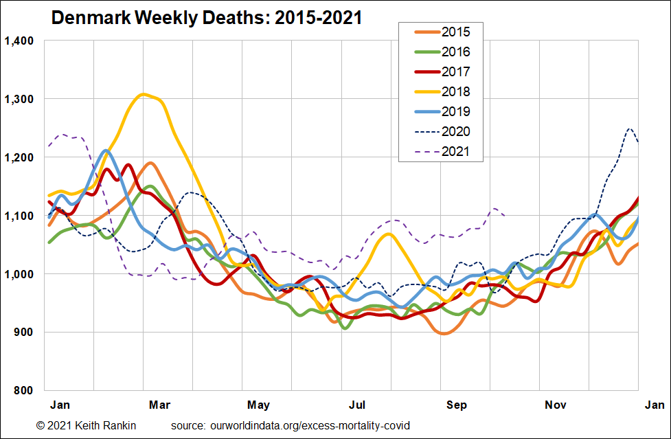
Denmark’s experience is much closer to that of Germany than Sweden. Denmark had a substantial flu season early in 2019, and, therefore had a less vulnerable population than Sweden (ie fewer people whose deaths had been deferred on account of ‘low flu’ seasons) in March 2020. As in Sweden and Germany, there was minimal flu around in early 2020. The result was, and largely as a result of public health measures, that Denmark’s late winter mortality peak (covid in 2020, flu in other years) was lower in 2020 than in any of the previous five years.
Denmark clearly shows the same ‘immunity debt’ profile after March 2021 that Germany shows, but that Sweden does not show. Denmark is also interesting in that, even the huge 2020/21 covid mortality peak is less than the 2018 influenza peak.
Greece
Greece is interesting in that it was barely mentioned in 2020 in relation to Covid19.
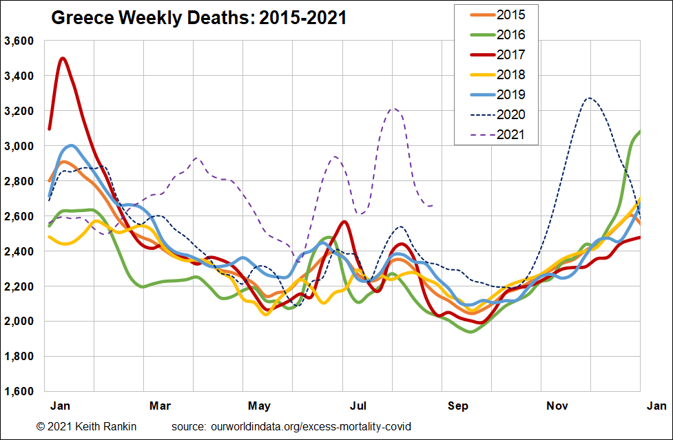
Greece clearly has had its flu seasons, but the years differ from those of the northern countries show. Also, it has bigger summer viral outbreaks, reflecting the role of tourism in Greece.
Of particular note is that Greece had substantial flu death episodes in January 2019 and January 2020. The result is that nothing out of the ordinary shows up in Greece until July 2020. Winter ‘flu’ seems to have trumped spring covid. (See my 8 April Covid-19 and the Common Cold, and the BBC story How the common cold can boot out Covid referred to.)
Greece’s July 2020 experience reflects much of Europe, and seems in particular to be related to Americans bring Covid19 back to Europe, with tourist hotspots disproportionately affected. Greece then follows Europe’s general ‘second [autumn] wave’ for which mortality peaked in November and December. Then, throughout 2021 so far, Greece appears to have suffered substantially from an immunity debt. (Greece, at 27.5%, was slightly more vaccinated than Sweden on 1 June, and ‘delta’ arrived later, in July 2021 rather than June. Currently Greece is vaccinated at 62%, compared to 67% in Germany, 70% in Sweden, 71% in New Zealand, and 76% in Denmark.) Greece’s peak mortality, for any outbreak of covid, has yet to reach its flu peak of January 2017.
Italy
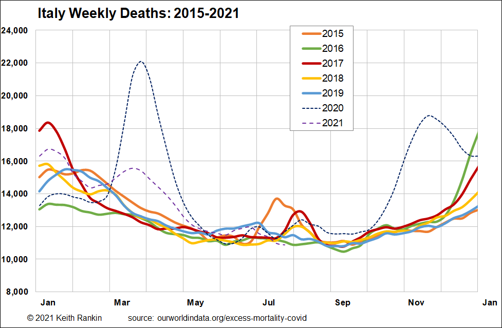
Italy had ‘normal’ flu winters in 2018 and 2019, but, as with all others mentioned except Greece, a very light flu winter in 2020. Thus it was largely unprepared for a late-winter novel respiratory viral outbreak, and its March and April 2020 mortality experience shows. Further, Italy – along with Spain – were Europe’s introductory cases; Italy had least time to decide on policy responses and least ‘runway’ to consider proactive rather than reactive policy.
Italy then got the Europe-wide second wave, and – like Greece – the ‘alpha-variant’ third wave in March 2021. After that, Italy looks normal; ie with no sign of an immunity debt. But it’s too early to say; Italy’s 2021 mortality data is slow to be published. Of note for future reference are the big flu winter outbreaks in 2016/17 and 2017/18, and the summer outbreak of 2017. (It turns out that these outbreaks were parts of a global influenza epidemic, that was a pandemic in all but name; noting that most pandemics in history were never declared ‘pandemics’ by a global bureaucracy.)
Australia
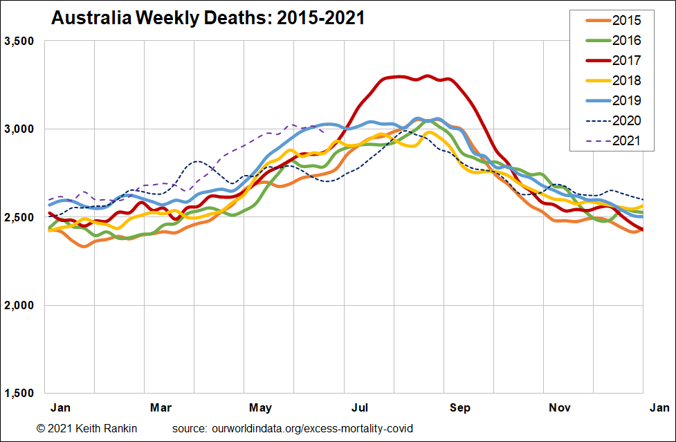
Australia, with a faster growing population than Europe, has higher death numbers in more recent years as well as a clear seasonal mortality pattern. And, like Italy, Australia is slow to release its mortality data. 2019 was by no means a low flu mortality year, in contrast to Sweden. Winter 2017 was clearly a particularly high mortality flu season. It looks as though the highly virulent 2017 flu strain came into Australia via Greece. (And, while New Zealand got it from Australia, and it was nasty in New Zealand, it didn’t last for nearly as long in New Zealand as Australia.)
Unlike Europe, Australia did not cop Covid19 at the end of the winter flu season. So there is no ‘flu context’ ahead of Australia’s March 2020 covid mortality peak. Since then, in 2020, and with comparatively few public health restrictions, except a closed international border that almost certainly kept influenza out, Australia had a low mortality winter.
The summer though, of 2020/21, and the subsequent autumn, were months of relatively high mortality, though. There are definite signs of immunity debt-servicing in Australia in early 2021. And we know that the spring of 2021 will be ugly, by Australian norms.
United States of America
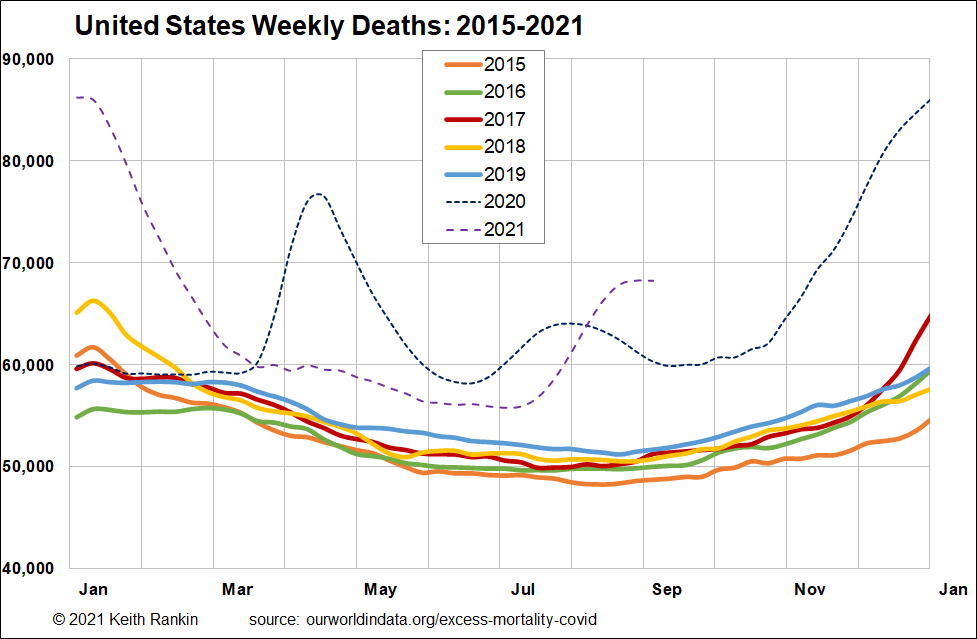
It’s only in the United States that Covid19 is persistently prominent, relative to 2015-19 norms. The norms in USA clearly show the pattern of a country with a rising population, unlike Europe.
We also note that, in USA, both early 2019 and early 2020 represented ‘low flu’ seasons. So the United States was clearly epidemiologically vulnerable in the spring of 2020.
We also note that the 2017 influenza ‘pandemic’ hit USA late, in 2017/18; indeed that wave of influenza – in taking more Americans than usual – paved the way for a light mortality season in 2019.
While early covid mortality in the United States is comparable to that of Sweden, the United States – mainly through its states – took many reactive public health measures that Sweden did not take (especially facemask-mandating, which in many states was more mandatory in USA than in Europe, and became more politicised). These measures could be called ‘ad hoc’, unlike those in another federal country, Germany.
The result was that, despite these measures, Covid19 stayed around in USA at much higher levels in June 2020 than in Europe. And summer mobility in the United States created both a new covid wave there, and transmitted Covid19 to Europe, creating Europe’s devastating second wave. Then, in the winter of 2020/21, a combination of political activity and early winter festivities that are central to the American psyche created a huge wave of Covid19 that paralleled the European wave.
From March 2021, we can see that the United States is servicing a particularly large immunity debt. The immunity debt service rate – analogous to the interest rate for a financial debt – is clearly higher in the United States than in western Europe, presumably due to lower vaccination rates in America.
Conclusion
The developed western world is now servicing its immunity debt incurred in 2020. The debt-servicing ‘interest rates’ markedly differ between countries, with Sweden and Italy coming out best (so far) since March 2021.
The Covid19 outcomes in the developed world are interconnected with the outbreaks of seasonal influenza. The global influenza epidemic of 2017 – an undeclared pandemic – clearly needs more analytical attention. Coming soon.
Keith Rankin (keith at rankin dot nz), trained as an economic historian, is a retired lecturer in Economics and Statistics. He lives in Auckland, New Zealand.


