Analysis by Keith Rankin.
In my latest charts, I include a robust set of estimates of actual proportion of people who have – or have had – Covid19. The principal basis for these estimates is the number of deaths being recorded.
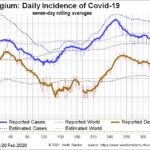
Using the appropriate log scale for such charts, we can see that Belgium’s ‘second wave’ began around Day 140, and continued into Day 250, with a pause in the peak July and August holiday period, when many people were on prepaid holidays abroad. The second wave peaked at the end of October.
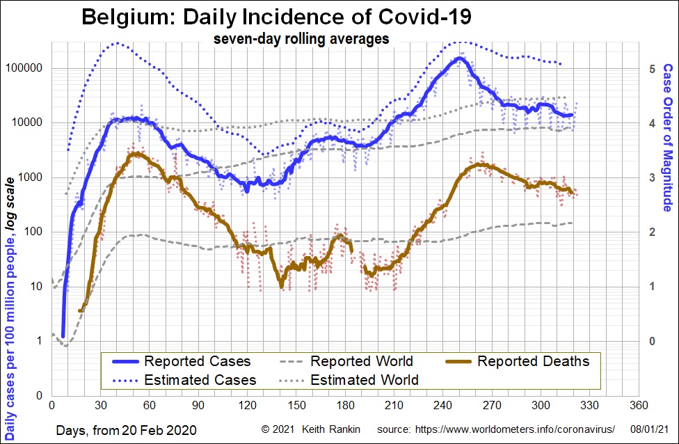
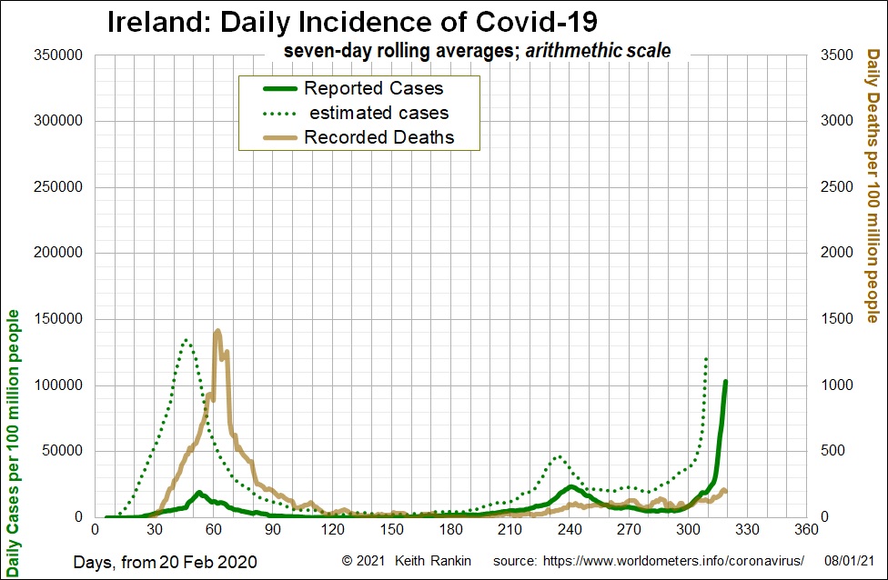
In Ireland we see a similar story, although the peaks were lower and the August pause much less apparent. Ireland showed persistent exponential growth of cases from Day 120 to Day 240, a period of four months before action was taken to ‘flatten the curve’. Ireland is particularly interesting because it is now on an exponential third wave that’s as rapid – but ten times worse in scale – than its first wave growth in March. Deaths will soon follow, as they have done in the United Kingdom.
Ireland has fewer people than New Zealand. But on 6 January it had 7,800 new reported cases; ten times higher than Victoria had at its peak.
Why did it take so long for the Irish authorities to act to address the second wave, waiting until well into autumn when the exponential trend was apparent in the summer? It’s partly because the death rate kept falling, indicating a younger demographic. And partly because more tests were finding more cases that would otherwise have been unreported.
But another important reason is that the way most people chart this kind of data is different from the way I have charted it. Most charts are presented in an ‘arithmetic’ rather than a ‘logarithmic’ scale. Below I have presented the same national data (omitting the global reference data) using an arithmetic scale.
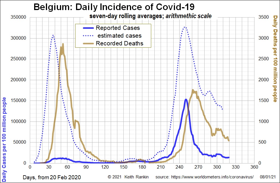
The arithmetic scale does convey the true scale of each countries’ second wave. But only after the event. The first Belgian chart showed – to a person viewing such a chart on Day 160 – that a new exponential wave of Covid19 was well under way. But the second chart looks to an observer on Day 160 as if nothing much has happened. On Day 160, the important death numbers are dwarfed by those of the first wave, and the public health bureaucrats will have been well aware that true case numbers were at least then times higher than reported cases.
I would go as far as to say that the second wave of Covid19 in Europe – which began in June – was barely noticed until the beginning of October, thanks mainly to the failure of enough people to use charts with a logarithmic scale.
For Ireland, we can see, through the rear-view mirror, that the scale of its second wave was small compared to its first wave. And after action was taken, the second wave did subside. But Ireland’s dramatic third wave has only become visible in the ‘arithmetic’ chart this year. It was apparent, however, 20 days ago, to those tracking cases with a logarithmic chart (as mine all were last year).
By the end of this month, we can confidently predict that Covid19 deaths in Ireland will be comparable to those of Belgium’s second wave.
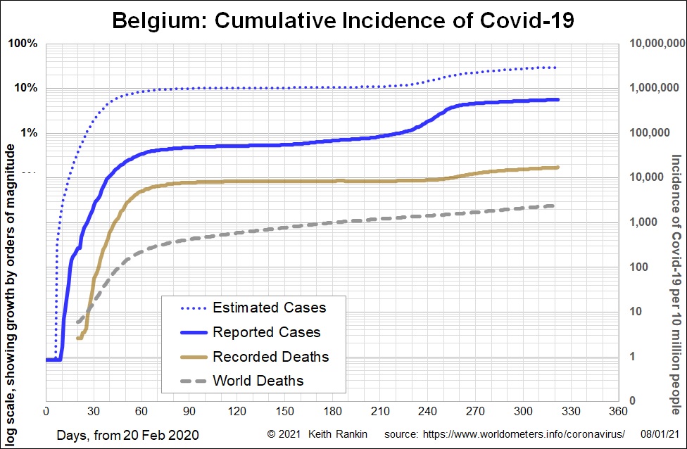
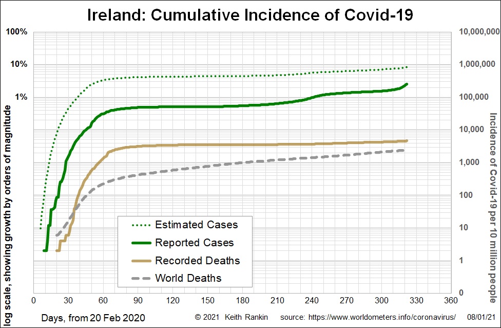
The final pair of charts shows accumulated cases (and deaths) for Belgium and Ireland. The most recent estimates show that 30 percent (possibly 35%) of Belgians have been afflicted with Covid19, many asymptomatic. Nearly six percent of Belgians are confirmed cases. And nearly two in a thousand Belgians have died from Covid19; equivalent to 10,000 New Zealanders (compared to New Zealand’s actual 25 deaths).
For Ireland, we are looking at nine percent of the population infected so far, but a number set to rise to perhaps 20 percent. While Ireland’s cumulative death rate from Covid19 remains low – about a quarter of Belgium’s rate – that statistic is also set to rise substantially, and soon.
While we don’t hear much about these small countries – the media chooses to focus on big countries – their tragedies and their successes are as important to take note of as are those in the countries that get most of the media oxygen.