Analysis by Keith Rankin.

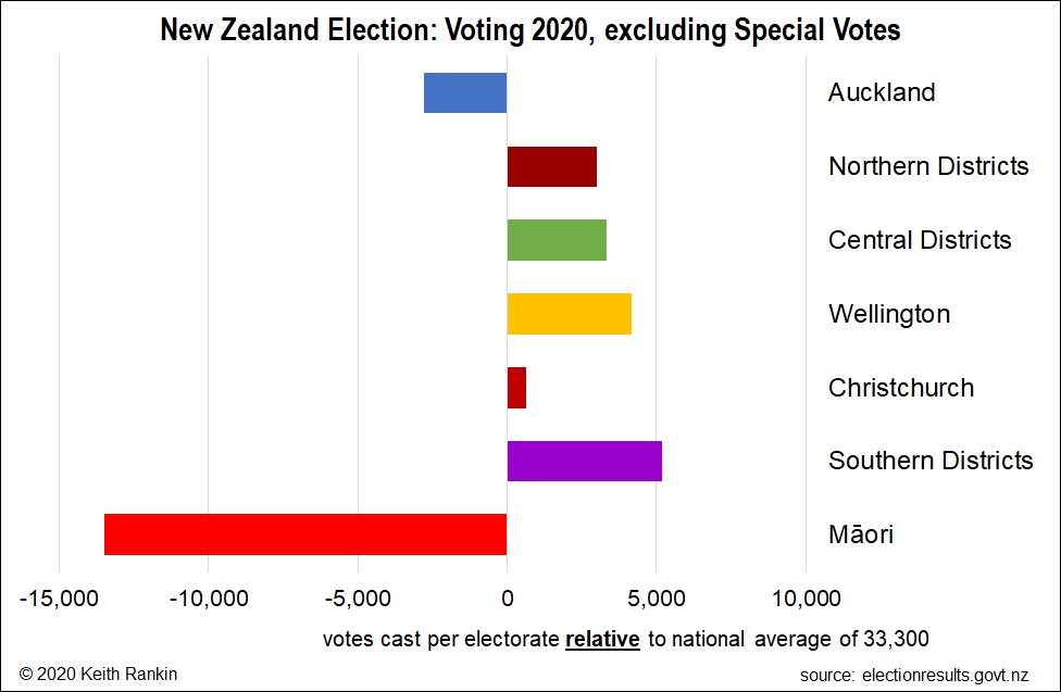
This week’s first chart shows the average numbers of votes cast – on and before election day – in New Zealand’s different regions.
In principle, all electorates have the same population, with electorate boundaries drawn with reference to population quotas based on census returns. However, each electorate may be up to five percentage points above quota, or down to five percentage points below quota. It is already a known fact that most Auckland electorates are below quota, some well below quota. Thus, the lower numbers of votes cast in Auckland electorates is in large part due to them having fewer people. (See similar analysis from 2017 election.)
Of the general electorates, Māngere [Auckland] had fewest votes cast (19,328) and Banks Peninsula [Southern Districts] had most (42,681). Of the Māori electorates, both Hauraki-Waikato and Tamaki Mākaurau registered even fewer votes in the preliminary count than Māngere.
There are six reasons for an electorate having fewer votes cast than the 33,300 electorate average:
- having a below quota census population
- migration within New Zealand after the 2018 census
- having a relatively high population not eligible to vote
- having a low turnout of registered voters
- having a relatively high population eligible to vote but not registered
- having a relatively high population out of the electorate over the two-week voting period
While the first two of these – taken together – are probably the most important, its worth considering the others. Auckland has fewer people than most people think Auckland has. The third reason is also demographic, and it reflects the numbers of people who are resident (or were resident in March 2018) but not permanent residents; for example high numbers of international students in the population explains why some University electorates (notably Hamilton East and Auckland Central) had lower vote counts.
Voter apathy – or disengagement – may be more pronounced in Auckland, especially in South Auckland (including Botany). Reason 5 may indicate a degree of late engagement; ie late enrolments which will show up as special votes. The final reason can also be expected to be remedied by special votes.
There are three main reasons for people casting special votes, which I understand are still high; ie special votes may be close to 70 percent of election day votes. First, is the people who are late to enrol. These will most likely vote for the parties most attractive to young voters; Green, Labour, and maybe Act, TOP and Māori. Second is people out of the electorate – the main type of special voters in the ‘old days’ when special votes favoured National (as in 1993 when a landslide vote for the left resulted in a National government). Third is the overseas voters who were not residents of their electorates in 2018, but who vote in the last electorate that they registered in. This group also disproportionately vote Green and to a lesser extent Labour.
The three regions of New Zealand with burgeoning voting populations are Northern, Central, and Southern Districts – the provinces. And Wellington, which most likely reflects the tendency towards higher numbers of public servants whenever there is a Labour or Labour-led government. I think we will hear much more about Wellington’s housing crisis this decade.

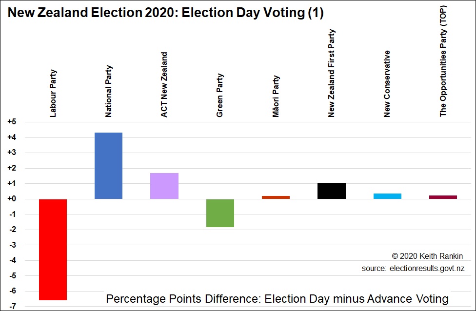
The second chart – Election Day Voting (1) – shows the election day Party Vote surpluses and deficits vis-à-vis advance votes. Thus, the National Party got 25.53 percent of advance votes and just under 29.85 percent of election day votes. This reflects – indeed accentuates – the pattern established in 2017. The chart plot for National shows the difference, which is 4.32 percentage points.
This chart really emphasises how it is Labour voters who are much more likely to vote early. The difference between National and Labour in this chart would have been quite a bit greater if most people who normally vote National had indeed voted National.
In this chart, the combined surpluses must equal the combined deficits; so the combined election day surpluses for National, Act, Māori, New Zealand First, New Conservative and The Opportunities Party are equal to the combined deficits of Labour and Green. (I have discounted all other parties as statistically insignificant.)

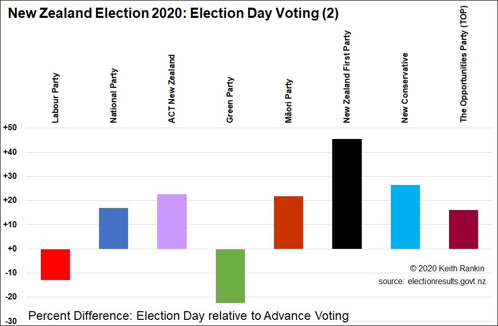
The third chart – Election Day Voting (2) – shows the same results in percentages rather than percentage points. It shows that Green voters are most likely to vote early, and that New Zealand First voters were least likely to vote early.
Voting on election day is traditional, so it is likely that conservative and older voters will have a reduced preference for early voting. Probably, too, smaller party voters are those more likely to be undecided, and to decide late. Also, in rural electorates, it may be less convenient to vote early.
It is my sense that these voting patterns will prove significant on election day 2023, or 2024 if Labour and National together vote for a four-year electoral term, as both party leaders have shown a preference for. An early lead for Labour in 2023 or 2024, from advance votes, may not end up being the final result.


