Analysis by Keith Rankin.

These three countries are very useful comparators because they have broadly similar demographics – especially population age structures – to each other. Further they have comparable living standards. The Republic of Ireland has a population the same size as New Zealand (and a similar climate); Australia has close to five times the population of each of the others.
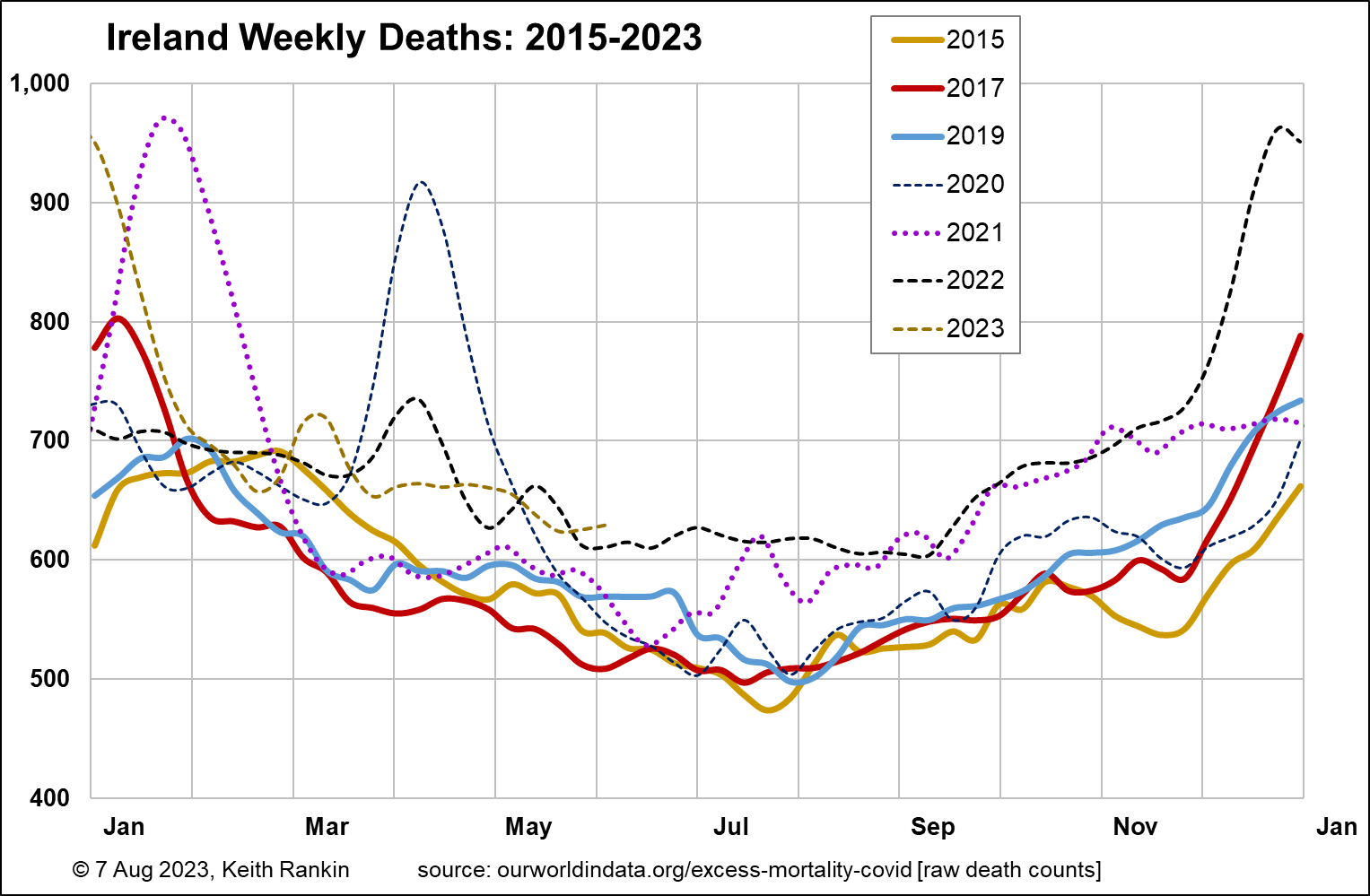
Of the above charts, Ireland best shows the three main waves of mortality in the Covid19 Pandemic. [Note that I will capitalise the word ‘pandemic’ for a WHO-declared pandemic. Otherwise uncapitalised.] There are very clear covid mortality peaks in Ireland in April 2020, January 2021, and December 2022. Other than these peaks there are clear periods of elevated mortality, the second half of 2021 and most of 2022. 2023 also, from March.
Ireland’s population has been growing more slowly this century than Australia’s and New Zealand’s. Death tallies before the Pandemic years were not noticeably growing from 2015 to 2019; compare Australia below. There was an influenza pandemic from late 2016 to about April 2018; the high numbers of deaths in Ireland in January 2017 and December 2017 reflect this. (I have omitted 2016 and 2018 to avoid chart clutter. For Ireland, influenza pandemic deaths actually peaked in January 2018, and extended into March of that year.)

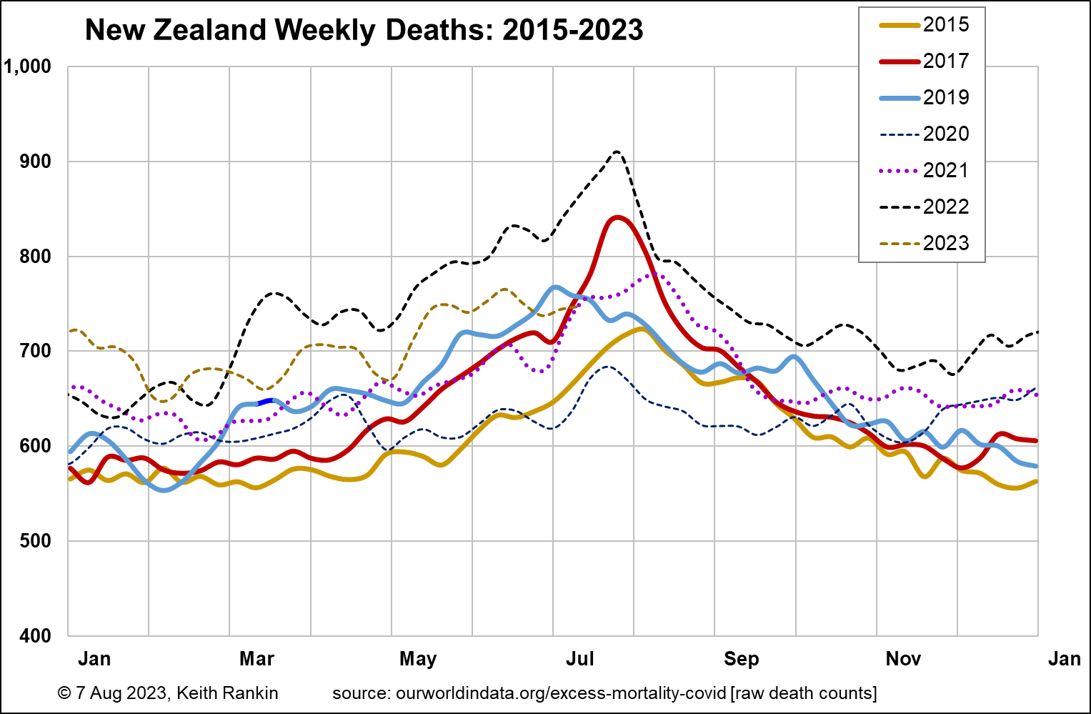
The most obvious difference in the New Zealand chart is the southern hemisphere seasons. The second most obvious difference in New Zealand is the lack of obvious Covid19 waves.
The scales of the two charts are fully comparable, because of the near-identical populations of each country. But a careful look will show that ‘normal’ – ie baseline – summer deaths in Ireland are lower than in New Zealand. Ireland’s population may have better baseline health than New Zealand’s. Or, New Zealand may have more deaths because it has a higher population of post-war ‘baby-boomers’ than Ireland; a population which is now starting to die in greater numbers.
The New Zealand data are worrying in other ways, however. While 2017 clearly shows the 2016-2018 influenza pandemic, with its July 2017 mortality peak, summer data for 2017 and 2019 don’t show large increases in deaths arising from population growth. The period from March to July 2019, in the absence of known epidemic illness, nevertheless looks like a protracted period of deaths triggered by early seasonal viruses. (Indeed, I recall from my former workplace that there were a lot of ‘bugs’ around for parts of 2019.)
If we regard the April to June periods in 2017 and 2019 as having elevated death tallies, then 2021 looks like a normal year in New Zealand, even allowing for population growth. Yet it wasn’t a normal year. It was the peak year of the Covid19 panic; the year of the most extreme public health mandates, with an effectively shut international border and with face-masking required in many settings. The big question is to ask why 2021 was not more like 2020. In the winter of 2021, New Zealand had no Covid19 to speak of, and no influenza.
Elevated death tallies reappeared in March 2022, continuing through to January 2023. While these were clearly linked to Covid19, there was no mortality peak anything like that which Ireland experienced in December that year. My guess is that the timing of mortality in New Zealand reflected the timing of booster vaccinations against Covid19, whereas Ireland was caught unawares that December.

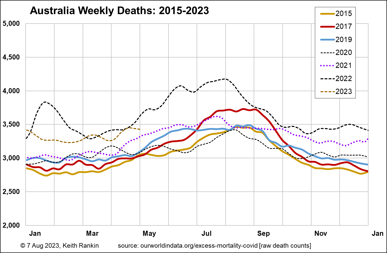
A good check on these tentative conclusions for New Zealand is Australia. (The scale is five times higher, reflecting that Australia’s population is five times greater.) Australia shows most of the same features as New Zealand in the years before 2020, though in a muted way. Australia shows more consistently than New Zealand the impact of population growth before 2020 being reflected in more deaths each year than the previous year. We see that in the spring months (September to November) Australian deaths are generally lower than New Zealand’s; probably because winter lingers for longer in New Zealand.
Australia shows the same problem in 2021 as New Zealand; normal winter deaths despite highly abnormal circumstances. As in New Zealand, there almost certainly were ‘killer viruses’ in both countries that year. Deaths to some extent will have been people who would otherwise have died in 2020, but avoided viruses then because of the lockdowns and physical distancing. Also, weakened immunity arising from the lack of normal exposure to respiratory viruses in 2020 will have increased the chances of vulnerable people dying in 2021 after contracting such a cold virus. The 2021 mortality peaks were higher in New Zealand than in Australia.
Australia shows a classic Covid19 mortality peak in January 2022, before the ‘Omicron’ variant of Covid19 was discovered in New Zealand. Australia had covid exposure peaks in December 2021, much of that being the Delta variant, pre-Omicron. In the autumn and early winter of 2022, Australian mortality data show a shorter and lower ‘Omicron wave’ than New Zealand data.
All three countries continue to show elevated levels of mortality this year, though this is obscured in New Zealand by the problematic numbers of deaths in the autumns and early winters of 2017 and 2019. New Zealanders in the first four months of this year have had slightly more deaths (adjusting for population) than Australians. This may reflect New Zealand’s relatively more overstretched healthcare system, noting from having myself spent some time in Australia this year that Australians also see their healthcare system as overstretched.
*******
Keith Rankin (keith at rankin dot nz), trained as an economic historian, is a retired lecturer in Economics and Statistics. He lives in Auckland, New Zealand.


