Analysis by Keith Rankin.
Chile is an important comparator country to New Zealand; in terms of physical geography, political economy, and demography (including conflict between indigenous peoples and ‘colonisers’). In terms of physical geography, it is mostly temperate; and, most importantly, it is in the southern hemisphere.
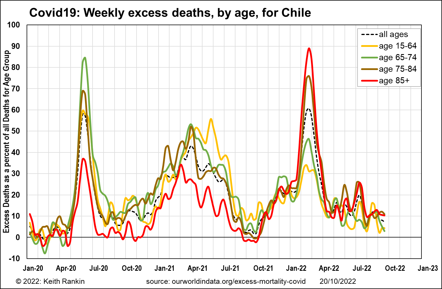
The above chart shows excess deaths in Chile since January 2020. (While I have a similar chart for New Zealand, it’s too ‘noisy’ to show here; this is due to New Zealand’s small population. Chile has four times as many people as New Zealand.)
This chart shows weekly peaks for excess death, by age group. (The data is slightly smoothed. To reduce random noise, it uses a kind of three-period centred moving average, in which the featured week has a 50% weight, and the weeks before and after each have a 25% weight.)
For Chile, we see two very sharp peaks of covid mortality, in May/June 2020 and February 2022. Neither of these should really be characterised as ‘winter outbreaks’ of Covid19. We also see a longer lasting outbreak in the first half of 2021, also not winter.
Chile did its best to suppress Covid19, but it was always harder to do this in a continental country than in an archipelago such as New Zealand. Chilean covid policy was more particular than most countries in trying to protect the elderly. This shows in the initial 2020 peak; and also in 2021 when Chile was one of the early vaccinators, and gave significant priority to its oldest citizens.
By 2022, much of the immunity – from vaccination, from the 2021 epidemic, and from other respiratory viruses – had clearly waned. So, when covid reappeared in the summer of 2021/22, there was a large cohort of particularly vulnerable older people, who died in huge numbers. We also see the second 2022 wave in Chile as in New Zealand, with winter deaths peaking in July; again mostly older people.
To understand what happens in winter, we need to take account of the other winter illnesses, of which influenza is epidemic and common colds are endemic.
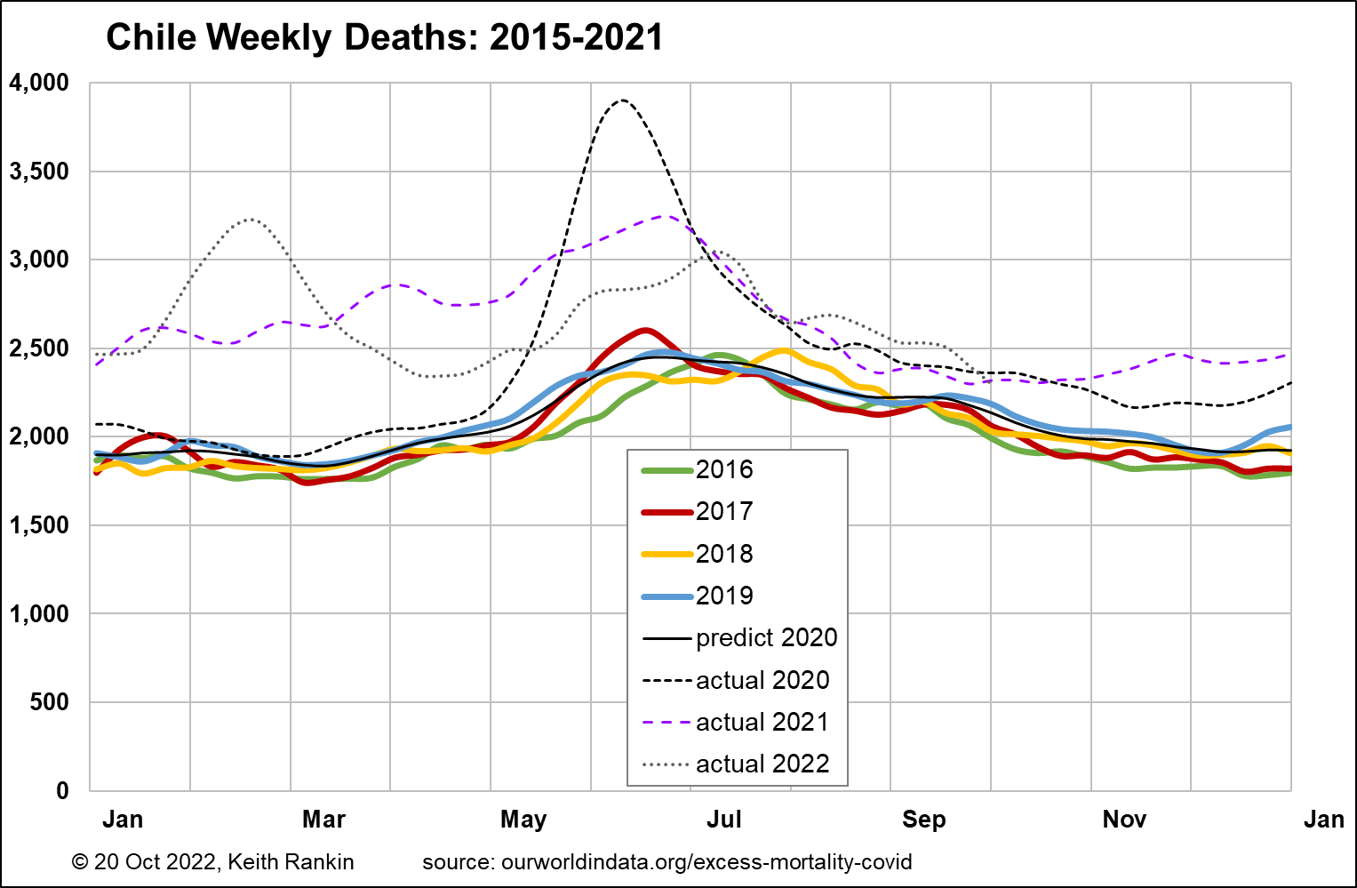
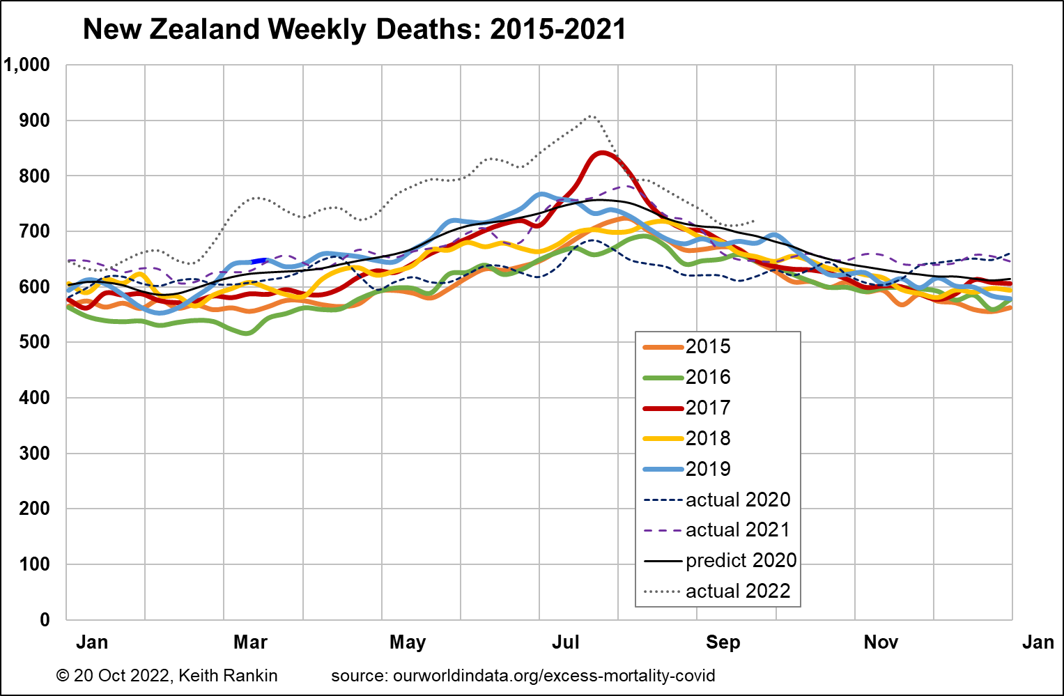
The above charts show this more contextualised picture, for Chile and for New Zealand. (Again, these charts use the centred moving average technique, which flattens the peaks in the charts.) Chile typically has 2,000 deaths per week, whereas New Zealand typically has 600. We also note that the plots for 2016 to 2019 in Chile are closer together than for New Zealand; suggesting that Chile is not aging as fast as New Zealand, and also that Chile’s annual population growth is less than New Zealand’s (reflecting New Zealand’s higher net immigration in the late 2010s).
In both charts the black line shows ‘expected deaths’ for 2020. (I have calculated this myself, and have shownthat my calculation is credible.) One problem with the age-based ‘excess deaths’ data from ourworldindata.org is that it is hard to check the validity of their estimates for expected deaths. I have also calculated expected (ie predicted) deaths for 2021 and 2022, though not shown these in order to keep the charts ‘clean’. (The annual percentage increase in predicted deaths for New Zealand was more than double the equivalent calculation for Chile, on account of New Zealand’s faster aging and faster general population growth.)
Chile’s first mortality peak, in 2020, was delayed until early winter thanks to public health measures. In Chile, June has been the peak month for mortality linked to influenza and common colds. Excess deaths (eg for 2020) is the difference between actual deaths and predicted deaths. Thus, in June 2020 in Chile, ‘excess deaths’ attributable to Covid19 understates actual ‘Covid19 deaths’, because we know that covid to a large extent displaced influenzas and common colds. This was different this year, however, with the peak of excess deaths being July rather than June. The most pertinent measure is ‘excess deaths for all seasonal illnesses’. By this measure we can see that excess weekly deaths, normally about 500 in June, grew to about 2,000 in June 2020.
In New Zealand, excess deaths were substantially negative in 2020, in the absence of deaths from influenza and covid. And common cold related deaths were less than usual. 2021 seasonal mortality was about normal, with certain unspecified ‘cold’ conditions being the main culprit that winter. December in 2020 and 2021 saw more total deaths than would normally have been expected. The 2022 (belated) outbreak in New Zealand saw substantial though not dramatic excess covid deaths from March to July.
Mortality data for New Zealand released to international databases shows a sharp decline in excess covid deaths from August this year. Some of this data may be upwardly revised in coming releases.
We should note that the actual weekly death peak for New Zealand is 965 (week ended 26 July 2022); it looks less than this on the chart due to the moving average ‘anti-noise’ technique used. That is the highest number of deaths in any week in New Zealand’s history since November 1918. (Before 2022, that record was 863 deaths in the week to 2 August 2017, a week of record influenza-caused deaths.)
The final two charts show excess deaths in both countries as percentages above ‘normal’ for each of the three covid years; we note that ‘normal’ is adjusted for each year, and it represents the absence of both covid and seasonal increments to the death rate. For New Zealand the main feature to look out for is whether the rapid drop-off in reported deaths from late July is confirmed.
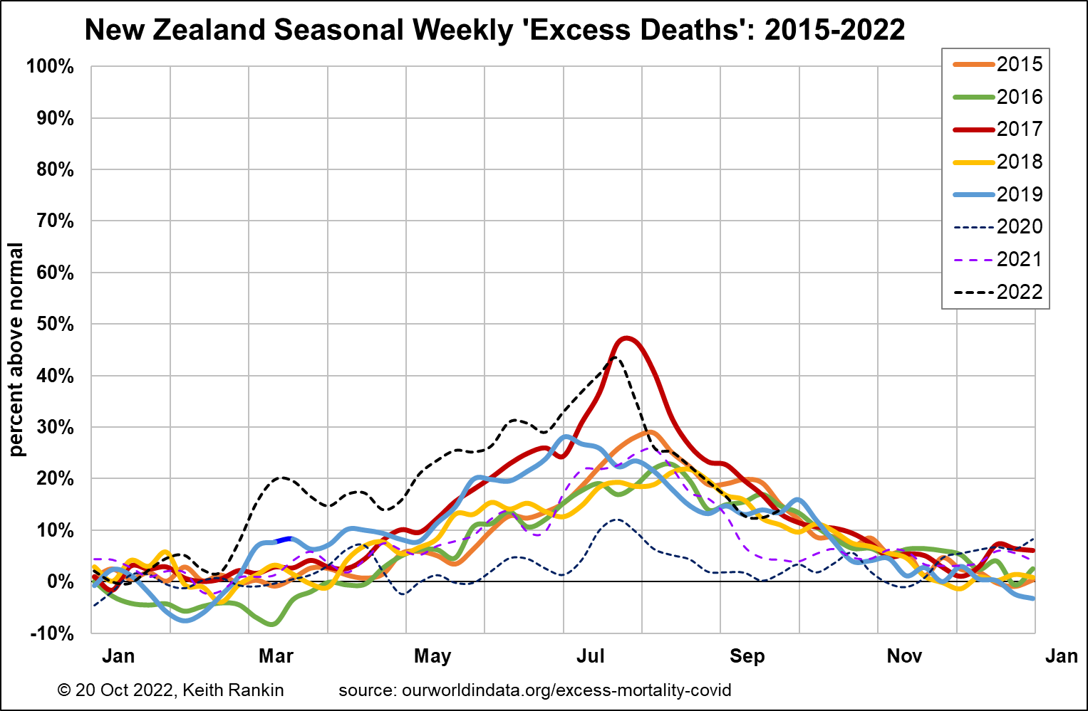
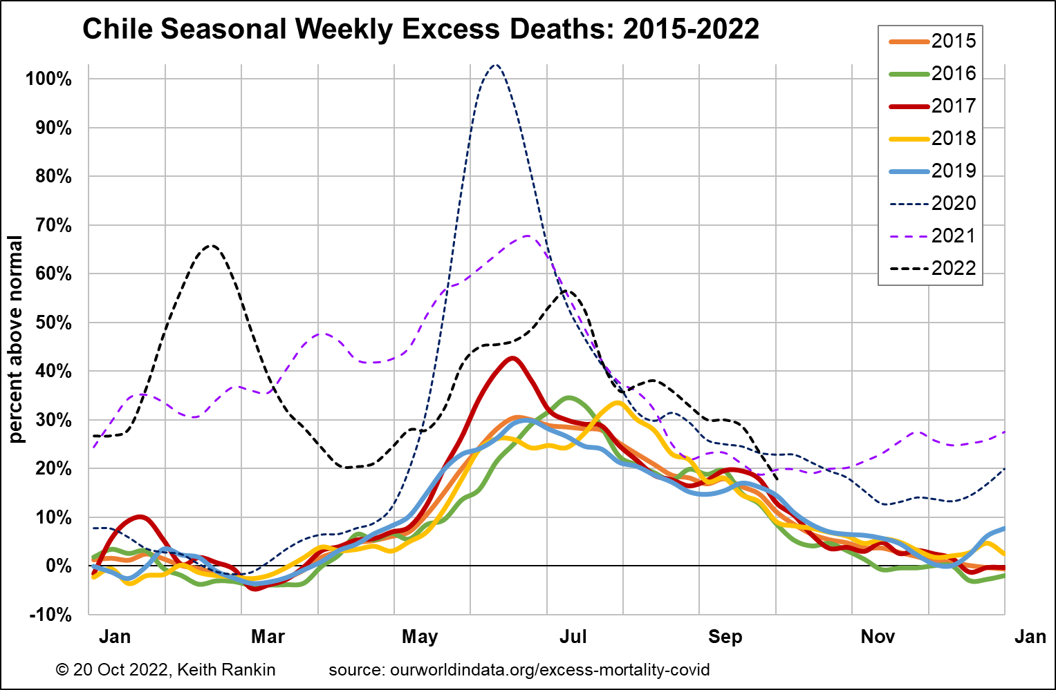
Chile’s excess deaths this winter have been significantly higher than New Zealand’s, with a July peak of 56% (covid and seasonal) and an August peak of 38%. New Zealand is not exceptional, however. My sense is that, this coming summer, excess deaths in New Zealand (in percentage terms) will exceed excess deaths in Chile.
*******
Keith Rankin (keith at rankin dot nz), trained as an economic historian, is a retired lecturer in Economics and Statistics. He lives in Auckland, New Zealand.


