Analysis by Keith Rankin.

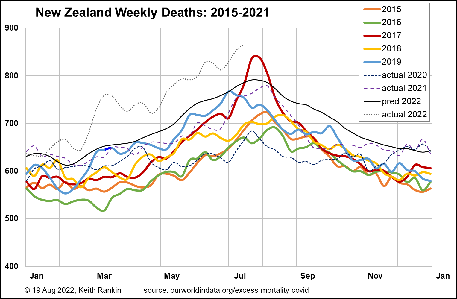
The chart above shows New Zealand’s aggregate weekly deaths from 2015. The normal winter experience is obvious, with 2015 to 2019 influenza peaks mainly in July and August, though in late June in 2019.
New Zealand is different from most European countries in that it has significantly faster population growth. (Although Scandinavian population growth is above average for Europe.) Thus, I have plotted a ‘black line’ to show normality; what mortality would have been like in New Zealand in 2022 had there been no covid pandemic, and no other unusual events impacting on mortality. (Note the dark blue segment that shows the 2019 Christchurch Mosque murders.)
(Note that New Zealand has a rising mortality trend, regardless of covid, due to: a rising population, an aging population; and also possibly due to increases in other ‘lifestyle’ chronic health problems such as diabetes. In Eastern Europe, where Covid19 has had its biggest demographic impact, the first of these three factors did not apply; so its projected mortality, had Covid19 not happened, was essentially the same as its actual 2015-19 mortality. That probably means that covid’s impact there was overstated, given East Europe’s increasing paucity of young people due to emigration and low birth rates, and its increasing recent exposure to chronic ‘lifestyle’ conditions. Demographics were dynamic long before Covid19 struck.)
While its not clear yet whether 2022 peak mortality will be as much above normal as it was in the 2017 influenza season, the important information shown is the extent to which mortality in New Zealand has been above normal since February. There was no simple mortality wave during and immediately after the March Omicron-covid wave. Rather, what we are seeing is a process in which many people who might otherwise have died in 2020 or 2021 have instead died in 2022, nudged in many cases by a covid or similar infection.

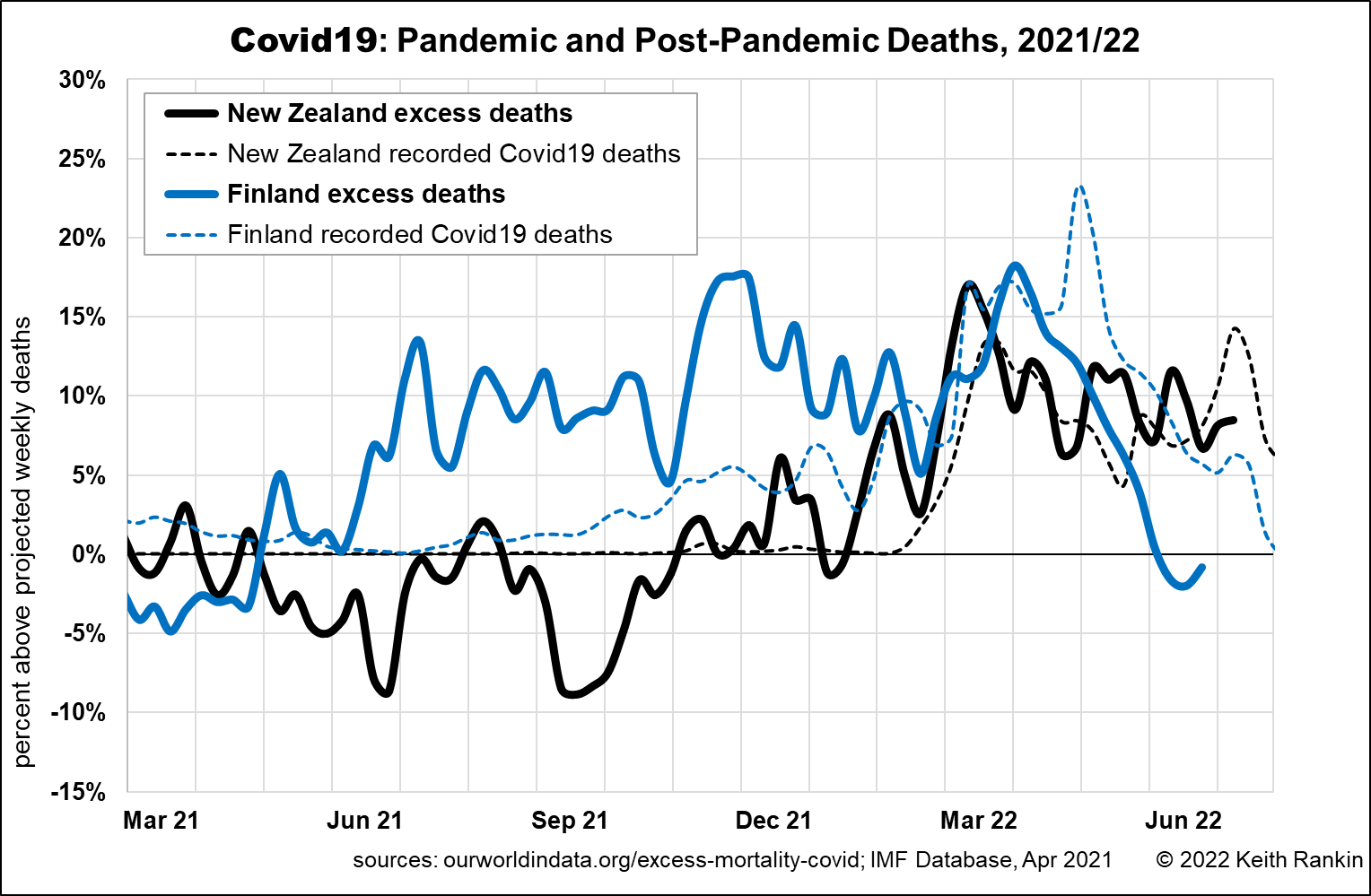
This next chart compares New Zealand with Finland, in the period from March 2021. This is excess deaths, not aggregate deaths; that is, this chart only shows deaths above the relevant ‘black lines’.
The first thing to note is that, for these countries each with about five million people, there is a degree of random ‘noise’ in the variation of weekly deaths. Having noted that, the most prominent feature of the chart is Finland’s long period of excess deaths in 2021 and early 2022. (Finland’s apparent mortality lull in the peak winter months is misleading; these are seasonal peak mortality months, so the extent that the deaths last winter were above normal was ameliorated by the high normal for that time. To some extent, covid deaths replaced influenza deaths.)
Finland is a country that took substantial public health measures to combat Covid19, so the deaths in 2021 can be to a large extent understood as postponed covid deaths. Except that very few of these excess deaths, especially in the third quarter of 2021, were actually diagnosed as covid deaths. The lack of diagnosis of covid may have been due to a lack of testing, on the supposition that the pandemic was over. Or it could be due to high rates of death from covid but not of covid; ie deaths arising from the massive disruption to normal life due to the public health measures, or from lower levels of general immunity to respiratory infections on account of distancing, masking and reduced contact with travellers.
I think it would be fair to hypothesise that the persistently high rate of excess deaths in New Zealand in 2022 suggests that New Zealand is now experiencing something akin to what Finland was experiencing in its last autumn and winter.

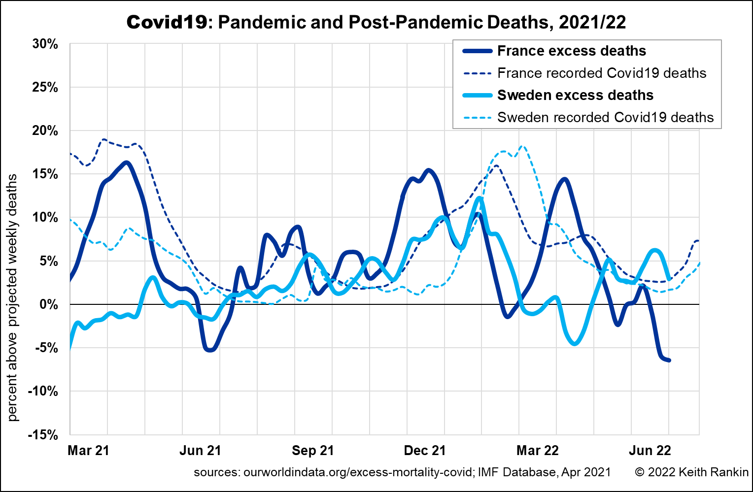
The above chart shows Sweden and France. These are the two countries in North/West Europe which least show the Finland mortality pattern, and are almost certainly the countries which retained and then attained the highest levels of general immunity. In Sweden’s case it was due to a public health approach that emphasised private responsibility over public mandates. In France’s case, the stronger public mandates did not linger on beyond the emergency periods.
Both countries had significant Covid19 mortality in 2020; they were hit full-on by the first and second waves. But both seem to have suffered only minimal amounts of waning general immunity as the pandemic progressed; and both suffered much less covid mortality in late 2020 than many other countries (with the USA coming mostly to mind).

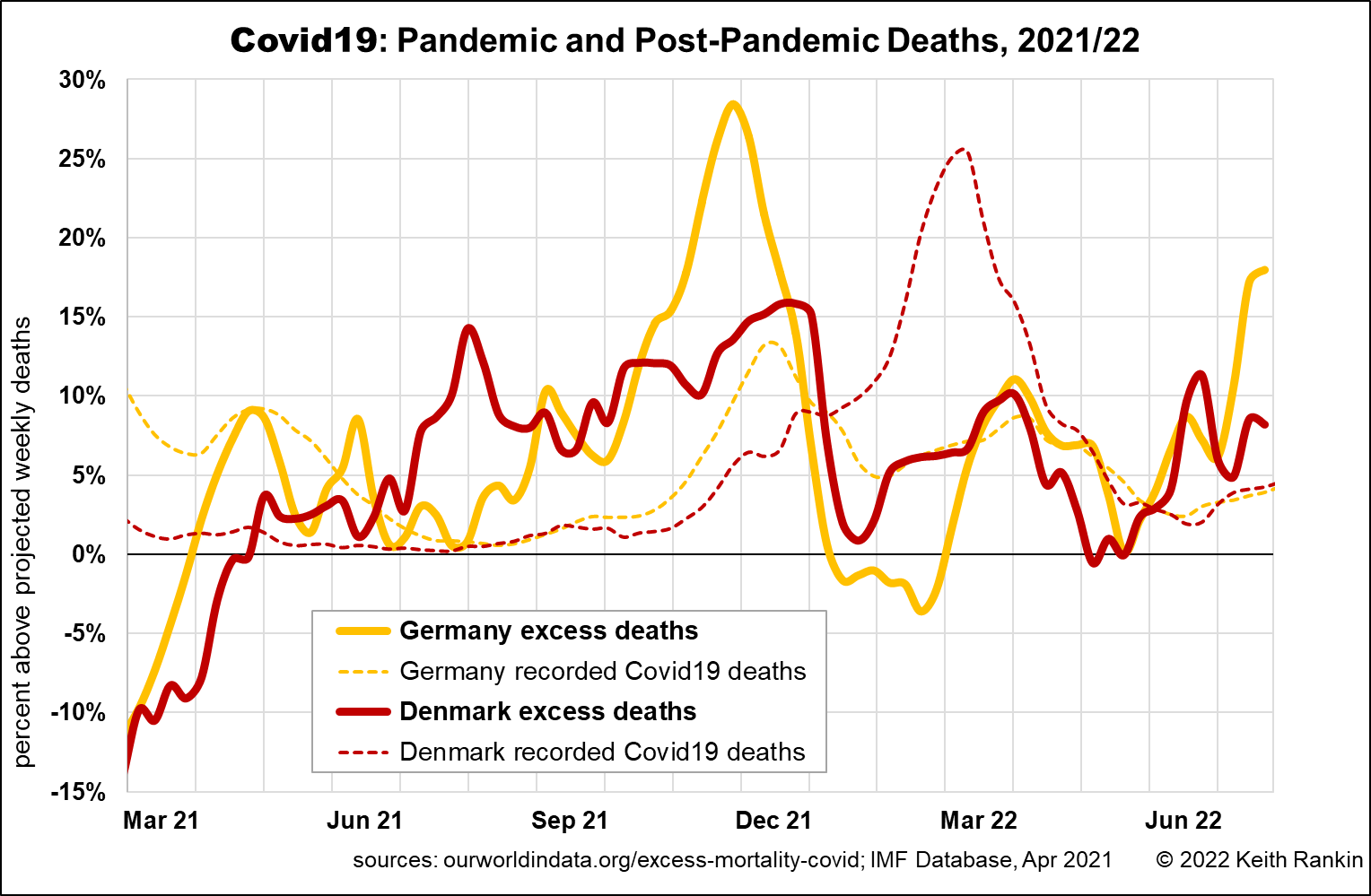
The final chart shows Germany and Denmark. Both of these had low levels of pandemic mortality in 2020, due to substantial mandated public health measures; much lower excess mortality than Sweden and France in 2020. But both also show the Finland pattern in late 2021, and in 2022 to date.
Another point of interest is to see how swiftly the arrival of the Omicron strain in Denmark curtailed winter deaths there. Omicron arrived just as the Delta-covid wave was peaking; whereas in Germany the delta-wave had peaked a month earlier. We may note that all five European countries shown here suffered substantial Delta-covid mortality around November-December, although Sweden much less than the others. This was almost certainly due to waning immunity from vaccinations, and the public health authorities being initially slow to understand the issue, and slow to make booster vaccinations available.
In Germany in particular, we see a substantial summer-wave of pandemic mortality in 2022. There is a clear pattern. Countries which tied down their populations the most in 2020 are experiencing these significant late bouts of pandemic mortality.
All this suggests that New Zealand still has a long way to go to return to some kind of demographic normality. This coming summer, excess pandemic (or post-pandemic) deaths, if they happen, will be exposed for all to see, because they will not be mixed in with deaths from ‘winter viruses’.
*******
Keith Rankin (keith at rankin dot nz), trained as an economic historian, is a retired lecturer in Economics and Statistics. He lives in Auckland, New Zealand.


