Analysis by Keith Rankin.
New Zealand’s Exceptional Economic Policy Fingerprint
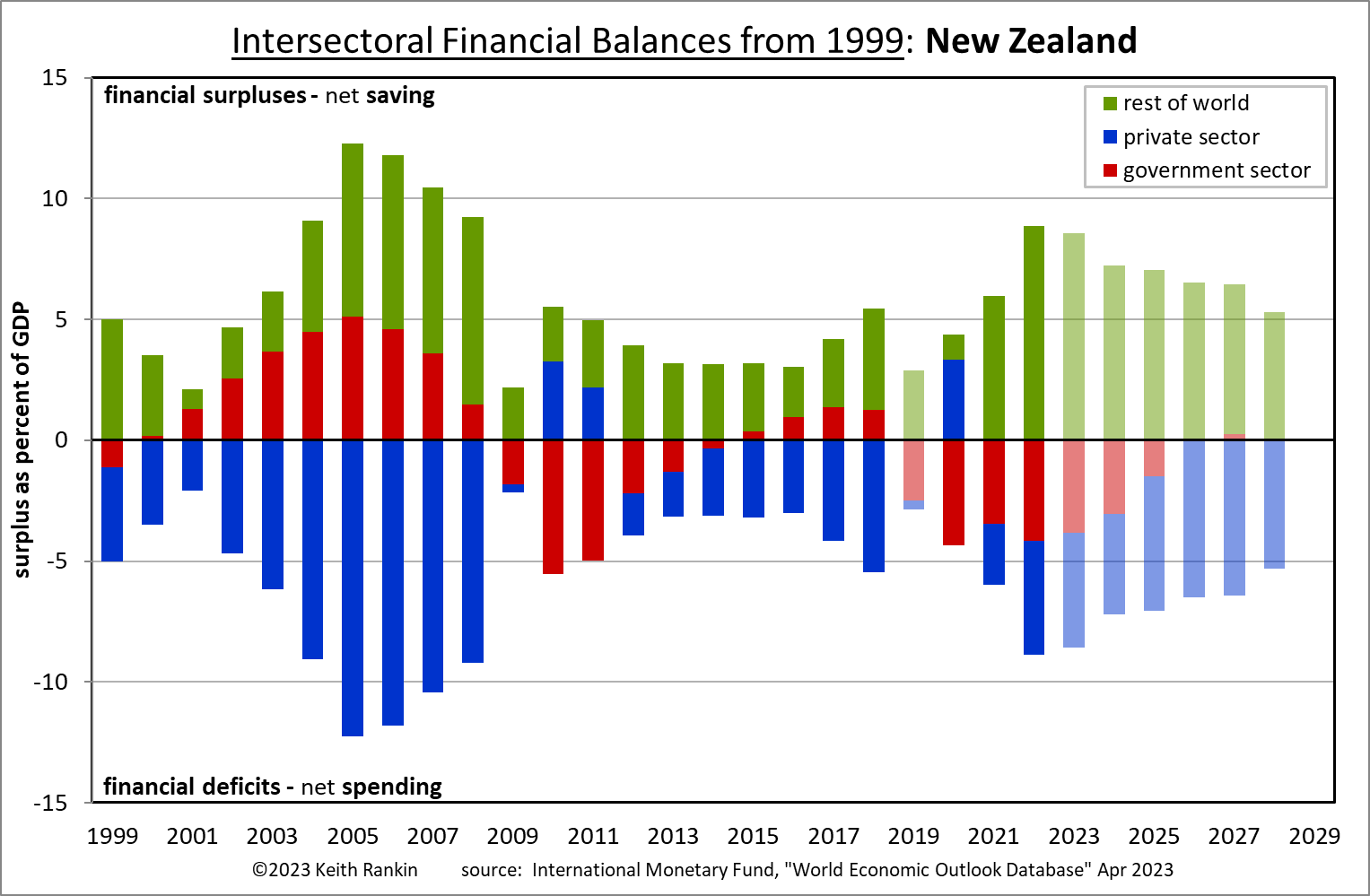
The above chart shows New Zealand’s financial (im)balances from 1999. What is truly exceptional is the number of years in which Aotearoa New Zealand has green and red together on the ‘surplus’ side of the chart. (I have discussed this in May in Visualising Countries’ Deficits and Debts, where the charts go back to 1980.)
Reading the Chart
A country’s economy can be divided into sectors. One important three-way split for which just about all countries have adequate published data is the division between the government, private, and foreign sectors. By definition the sum of the sectoral imbalances equals zero, because total purchases must equal total sales. Deficit sectors buy more than they sell (spend more than their revenue); surplus sectors buy less than they sell (spend less than their revenue).
The bottom half of the chart shows financial deficits, meaning that it shows the sectors which have spent more than they have earned. (We note that for the government sector, the principal form of earnings is taxation.) In New Zealand, this bottom (deficit) half is dominated by the private sector. New Zealand households and businesses spend more than they earn; private sector debt is a very big thing in New Zealand. This is very unusual; in most countries most of the time, the private sector is a surplus sector.
The top half of the chart shows the surplus sector(s) for each year. For New Zealand, the dominant surplus sector is the foreign sector; meaning that – with respect to Aotearoa New Zealand – foreigners (people and organisations resident in foreign countries) spend less than they earn. The long term picture for New Zealand is one of foreign underspending and private overspending. (It must be noted that ‘overspending’ should be understood neither as a bad thing nor a good thing; rather, it’s a mathematical necessity that someone – or some sector – must overspend if someone else underspends. For each year, the sum of the balances must equal zero. Also, we note that the foreign balance is minus the published ‘current account balance’.)
This relationship between the foreign sector and the private sector in New Zealand means that New Zealand may correctly be classed as a ‘debtor country’. But New Zealand does not have ‘debtor government’. Journalistic confusion on the meaning of a ‘debtor country’ is compounded by the fact that, in much media analysis, countries are called debtor countries because they have debtor governments. In fact, debtor countries generate much government revenue as a result of their high private spending, meaning that debtor countries are less likely to have debtor governments.
(Note that the plots for the years from 2023 are forecasts. Also, note, re 2019, that for New Zealand and Australia, which report their annual data for years ending June rather than December, the IMF – the source of my data – have averaged the 2018/19 and the 2019/20 balances; meaning that the 2019 data for New Zealand has been contaminated by the Covid19 government response in the months from March to June 2020.)
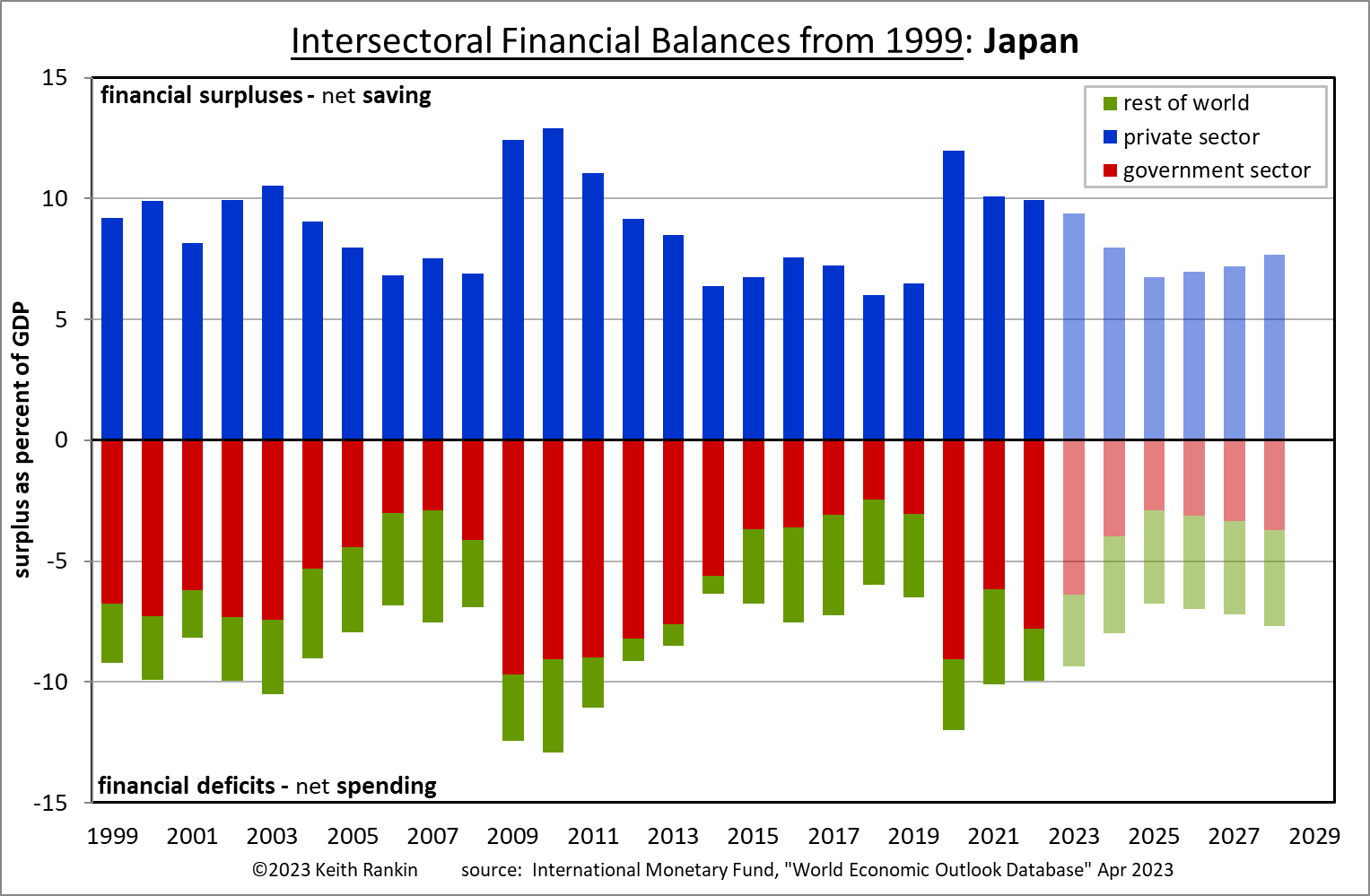
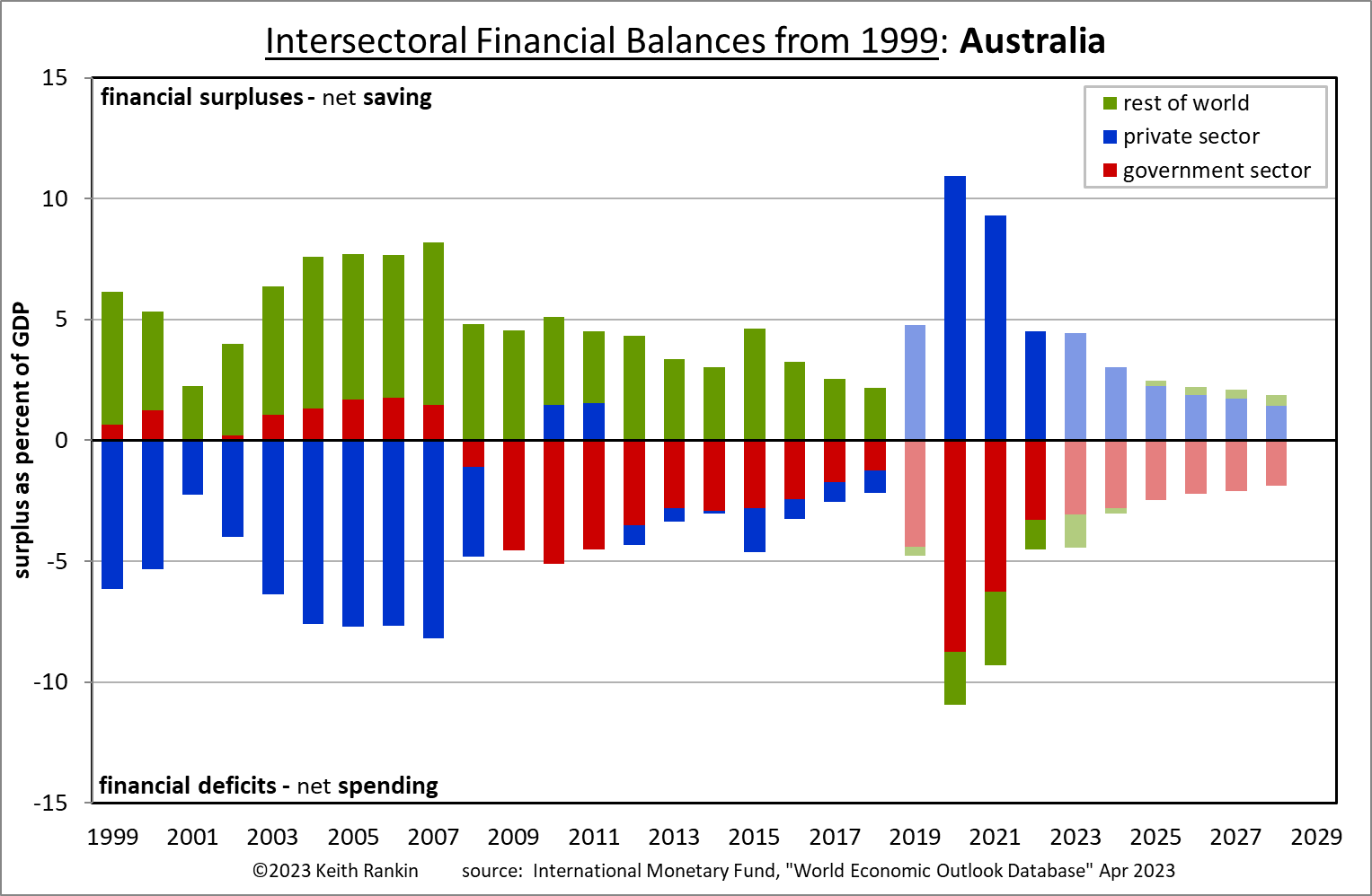
The exceptional opposite of New Zealand is Japan, which is a substantial creditor country with the world’s most indebted government. Japan, however, is an extreme example of a normal country. New Zealand on the other hand is truly an exceptional country. (The only other countries with financial fingerprints which come close to New Zealand’s fingerprint are Tonga, Lebanon, and Kazakhstan. Australia used to look like New Zealand, but not since the 2008/09 Global Financial Crisis. Australia has arguably gained financial maturity since then.)
Advanced and Emerging/Developing Economies
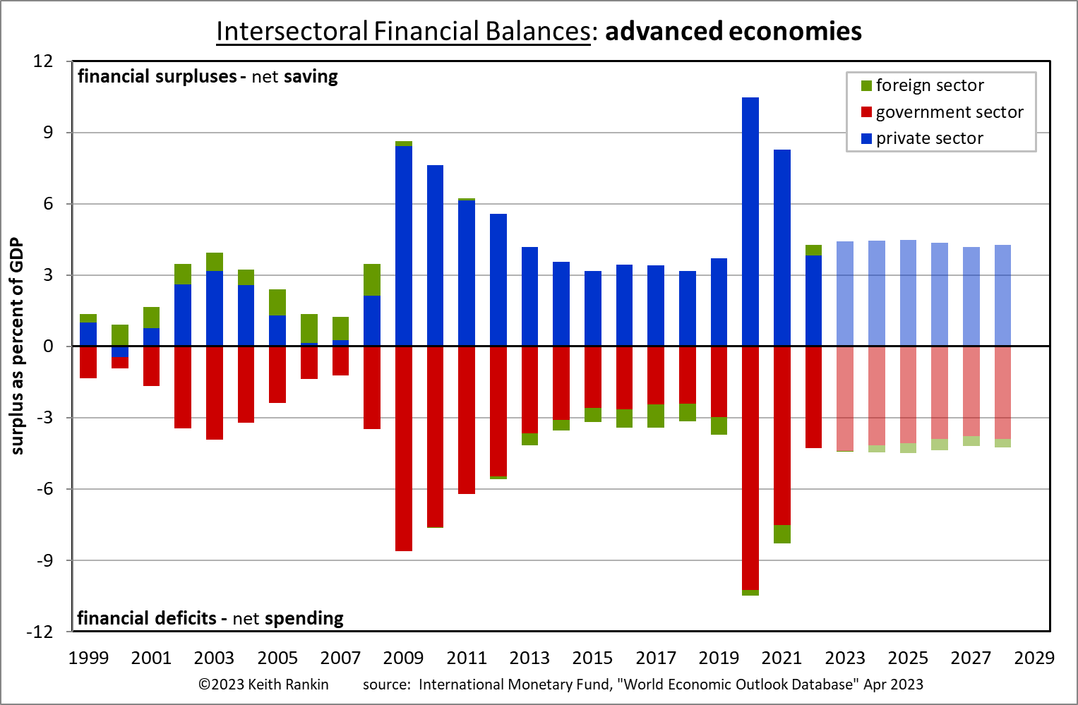
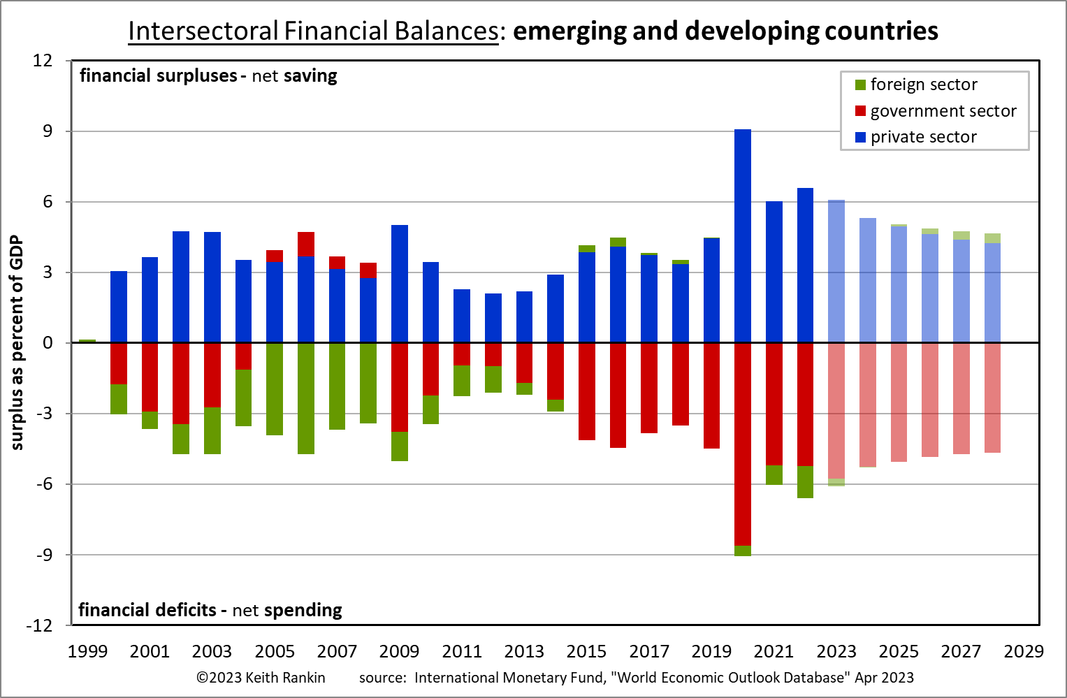
These two charts cover almost the entire world between them. The main absences, as far as I can tell, are the microstates which are linked to the United Kingdom, but not actually part of the United Kingdom (Jersey, Guernsey, Isle of Man, Cayman Islands, Virgin Islands, Gibraltar). These are tax havens, and therefore will have under-recorded and unusual financial imbalances. (Though not shown here, some other countries have unusual charts because of their exceptional financial roles in the global economy; notably Ireland, Switzerland, Cyprus, Panama.)
Both of these combined-country charts look much more like Japan’s chart than Aotearoa New Zealand’s.
The main point is that, for the world as a whole, the financial relationship that sustains global capitalism is one of annual government sector deficits, made necessary by global private sector surpluses. Indeed the financial signatures of advanced and emerging economies are converging to create an increasingly clear-cut normal, with government deficits becoming the principal driving force of capitalist economic growth. While New Zealand is very much out of step with this entrenching geo-capitalist normal, it doesn’t need to be. New Zealand’s unusual signature is a result of ultra-neoliberal domestic laws made in 1989 and 1994 – the Reserve Bank Act and the Fiscal Responsibility Act – ‘sacred cows’ which remain outside of the scope of Aotearoan political discourse.
————-
Keith Rankin (keith at rankin dot nz), trained as an economic historian, is a retired lecturer in Economics and Statistics. He lives in Auckland, New Zealand.


