Analysis by Keith Rankin.
In many ways the world has moved on from the Covid19 pandemic. And excess mortality from Covid19 mingles with excess mortality from other causes, from heatwaves to other diseases. The summer is useful because it is generally the low season for infectious respiratory illnesses.
Covid19 is a disease that is spread through air travel, and through air; not so much in airplanes or even airports, but by travellers and the people who mingle with them and who provide services to them. West Europe is the world’s preeminent tourist destination, especially in summer.
People come to the Mediterranean coastal tourist destinations in particular, but also to the places with spectacular mountain scenery. In addition, the United Kingdom, France and Germany are strong all-round summer tourist destinations. Of the Mediterranean destinations, Spain in particular has a strong ‘shoulder season’, especially for people travelling from or via the United Kingdom. Travel from North America to Europe surges in late June and peaks in July.
Travel by northern Europeans to southern Europe tends to peak in August, long regarded as the ‘silly season’ in Europe. We should note that, as a result of this ‘silly season’, the releases of mortality and other data are delayed, and data released in September may be revised upwards by more than data released in other months. So deaths in August in particular may be higher than is shown here for those countries which have released August data.
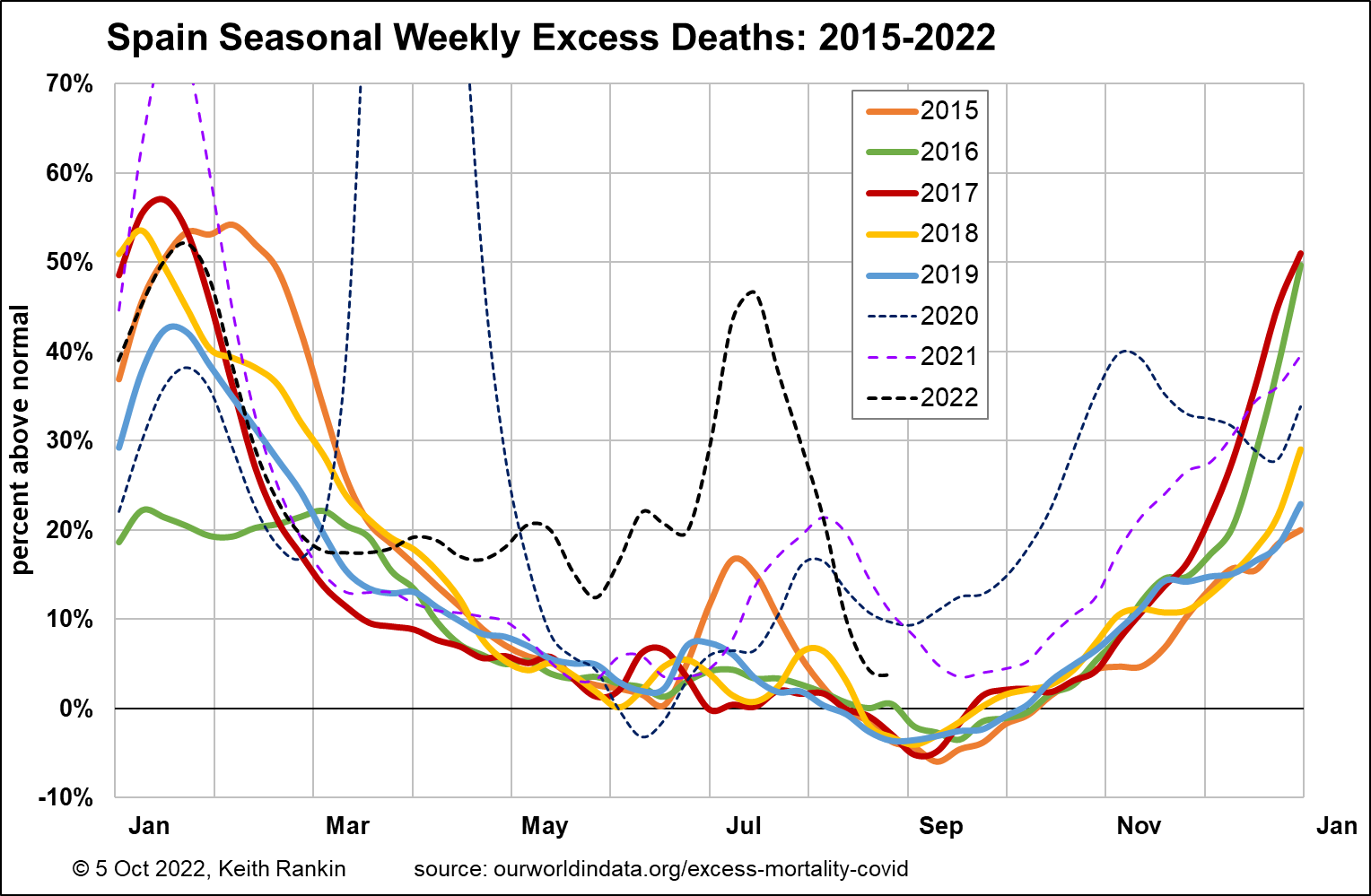
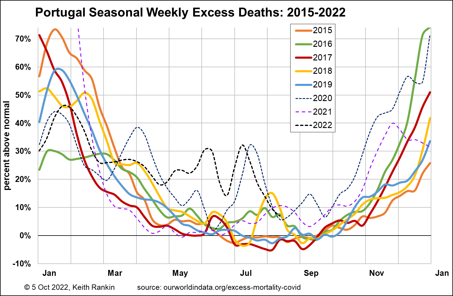
Looking at the Mediterranean countries, we see Spain with significant and unusual mortality since April 2022, with a substantial peak in early July, just before this summer’s big wildfire peak. The excess deaths look, in the main, more like Covid19 deaths than weather-related deaths. Portugal shows a similar (if less dramatic) pattern to Spain.
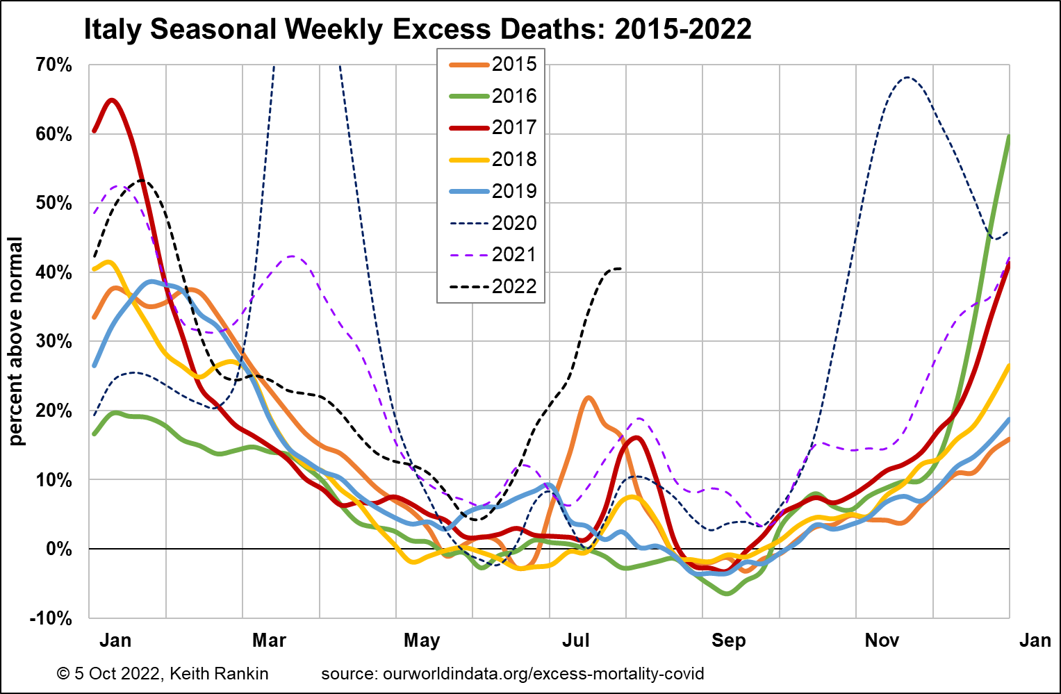
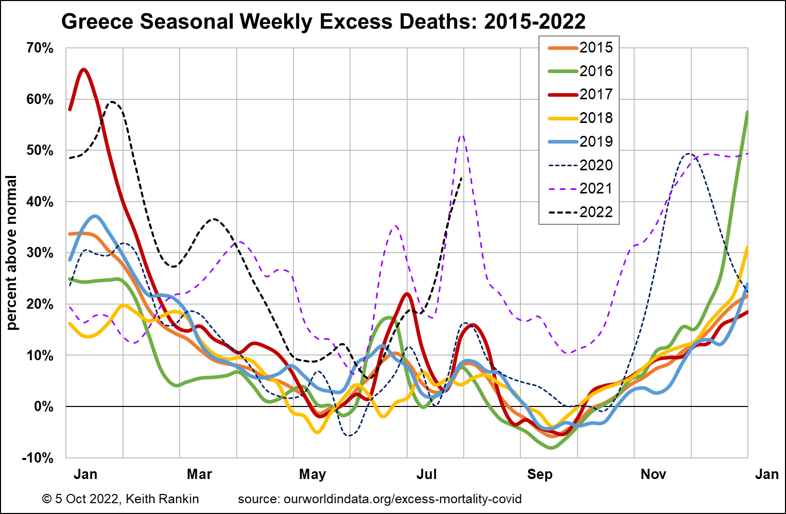
Italy is as dramatic as Spain, but peaking at the end of July, and without the earlier plateau of deaths from April to June. It has the look of a wave starting in Spain and moving on to Italy. The chart for Greece reinforces this perception. (And note how different Greece is from Spain and Italy in 2020 and 2021; Greece has been very vulnerable in the later part of the ongoing pandemic.) We should also note that Malta and Cyprus show the same patterns as Italy and Greece.
This pattern of west to east travel mortality suggests, in particular the impact of tourism from North America, and also tourism from places like Australia and South America. Trips to Europe from Australia and New Zealand tend to start in the United Kingdom in April and May, and then move to Spain (before it gets too hot) and then to other destinations in Europe.
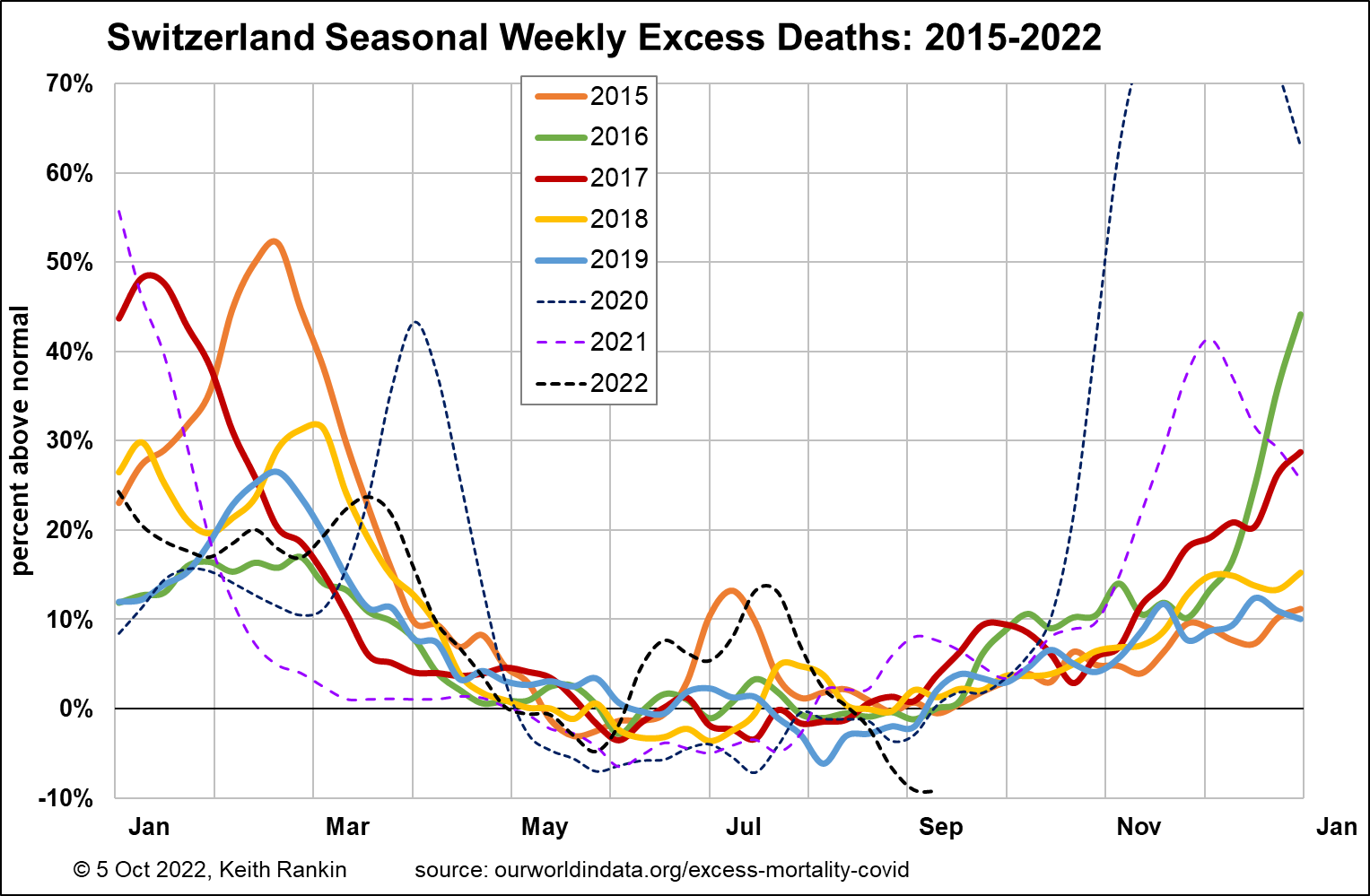
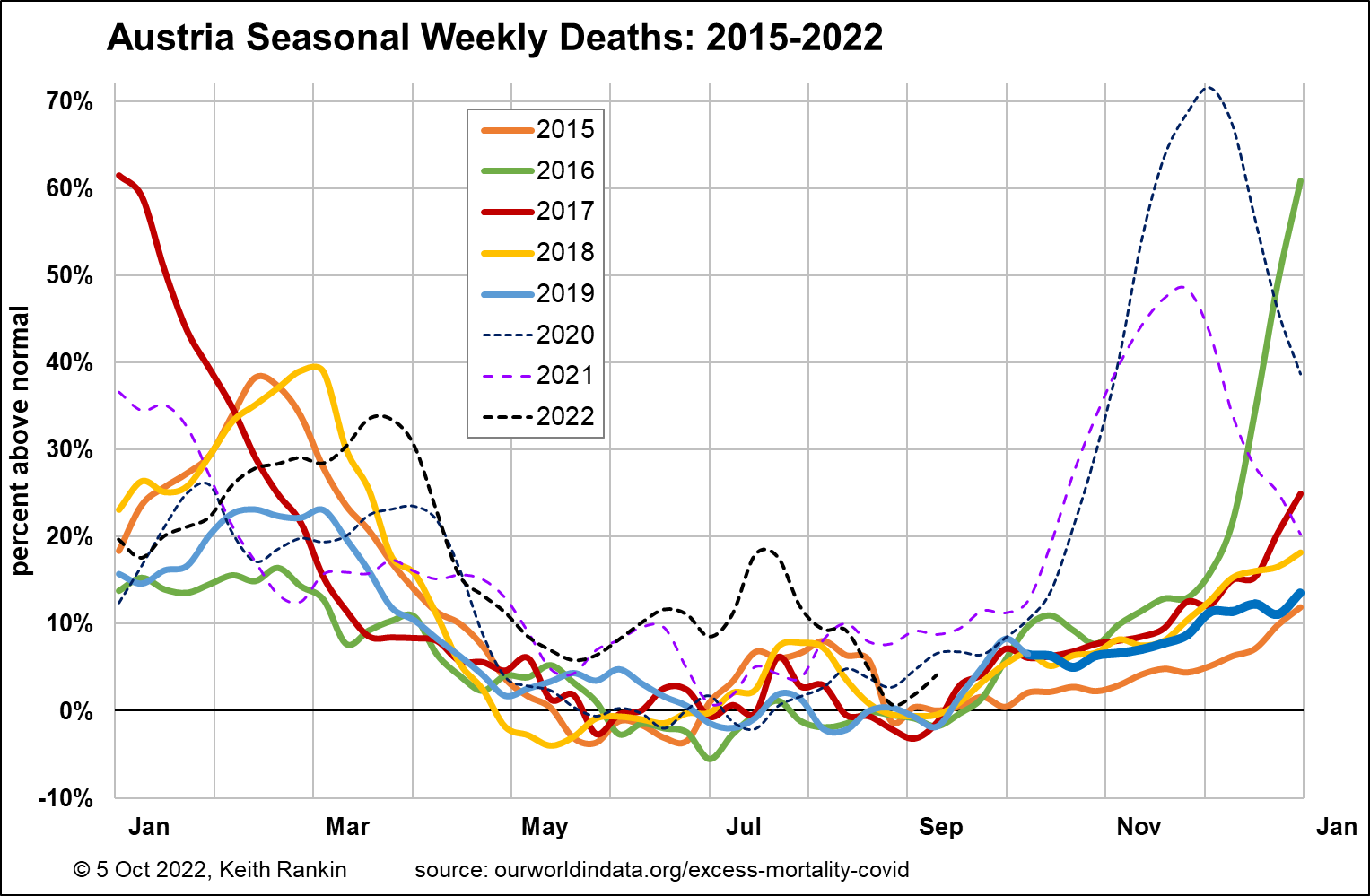
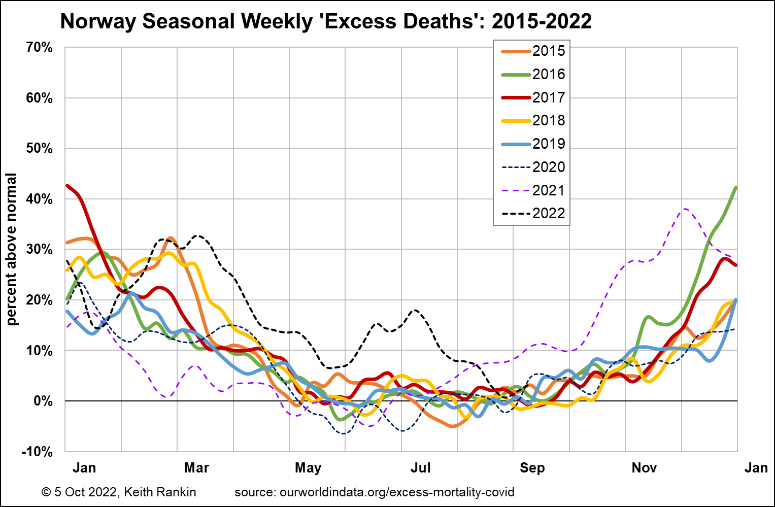
Looking at the mountain tourist countries, Switzerland certainly shows a July peak, and it looks (as in 2015) to be a bout of epidemic illnesses. Austria looks much like Switzerland this year. Finally, Norway also shows those same patterns (more like Switzerland than Sweden or Denmark). And we should note that Iceland, now a tourist darling, shows a similar pattern to Norway.
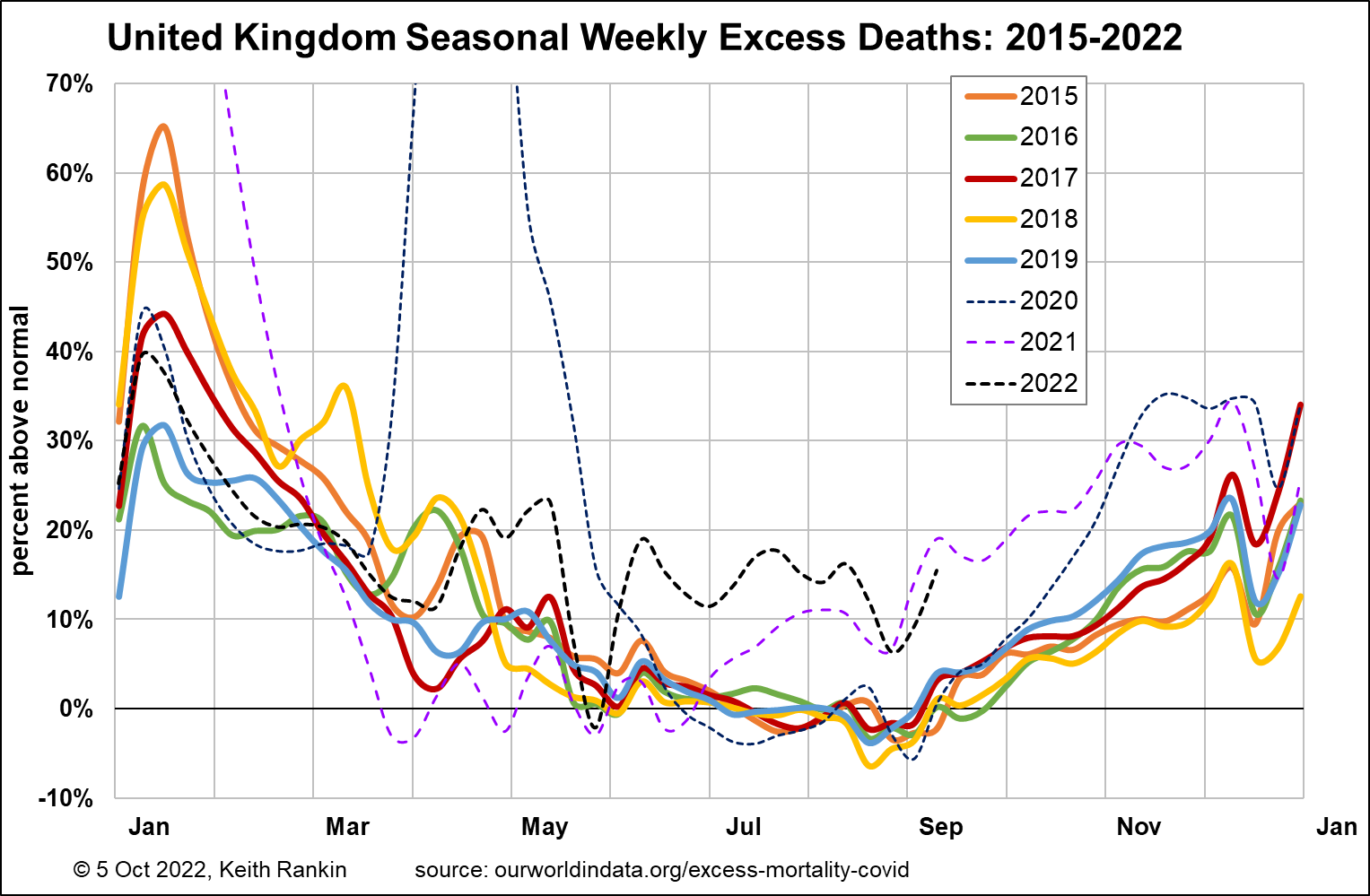
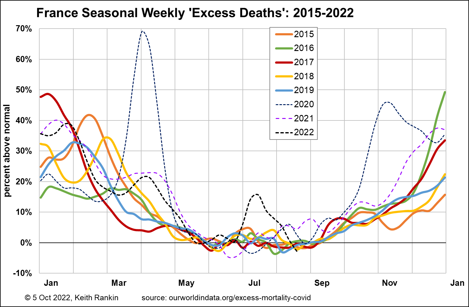
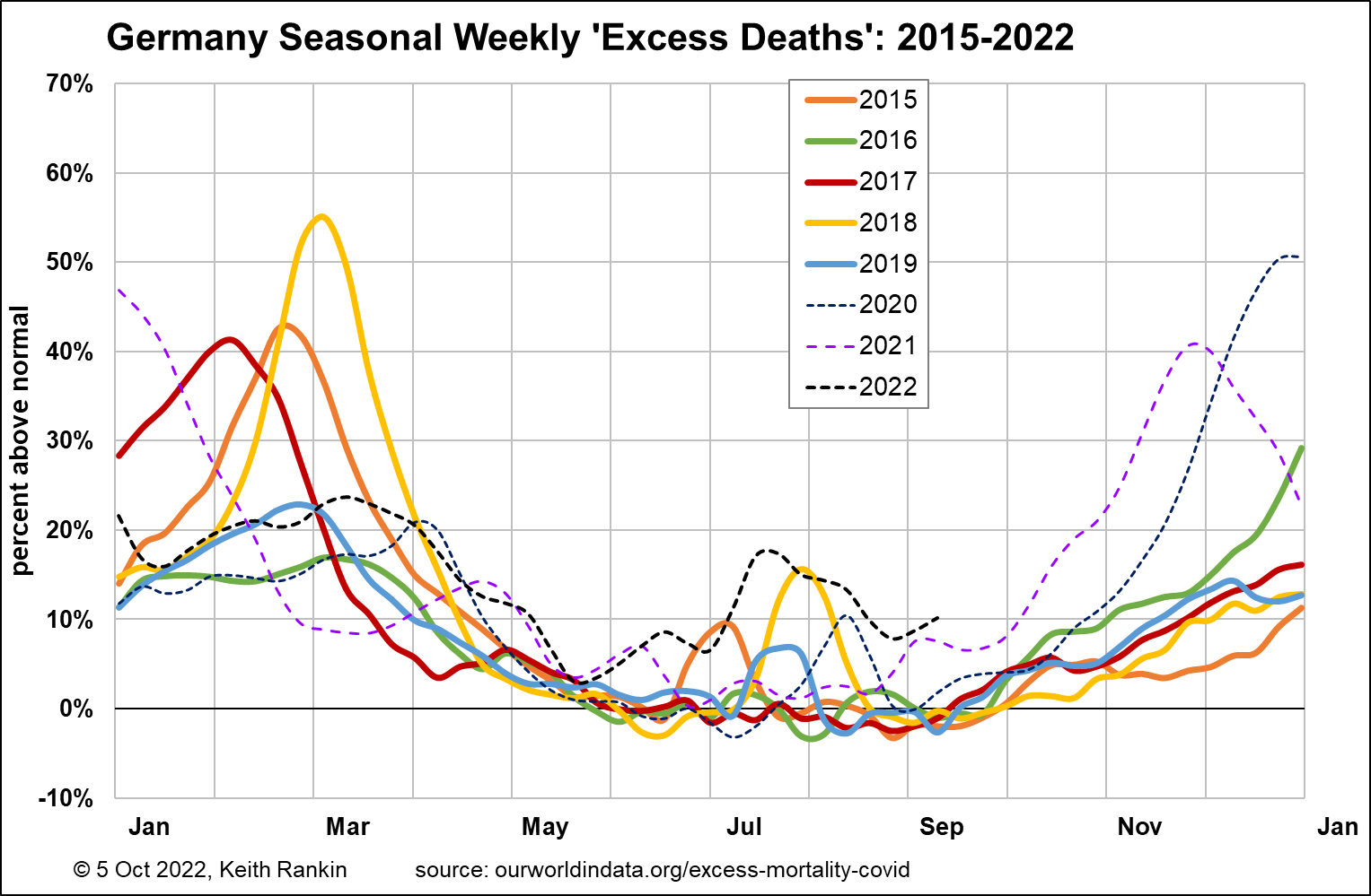
Looking at the big-three, the United Kingdom shows significant excess deaths from late April. United Kingdom data can be a bit hard to read, because it seems to show dates of registration of deaths rather than actual dates of death. The data shows lulls in the registration of deaths around public holidays, and especially the lead-up to Christmas. France shows the July mortality peak seen elsewhere (covering its peak tourism from United Kingdom and United States); otherwise, 2022 in France has been mainly a normal year. Germany also shows that peak, while showing signs that late summer deaths will also be higher in 2022 than in 2020 and 2021.
The charts overall suggest that travellers themselves may have been dying away from their home countries in significantly greater numbers than usual. And we should note that travellers include seasonal workers (including ‘backpackers’). Travellers face danger when populations in their countries of origin have reduced immunity from diseases endemic in destination countries.
This raises the issue of one big hole in demographic data, affecting the world as a whole, and especially countries (such as New Zealand) with large flows of people – as tourists and as migrants – relative to the normally resident population. For example, New Zealand’s ‘life expectancy at birth’ estimates (based on mortality data) cannot take into account many of the many New Zealand born people who die overseas. And they do include people – many people – not actually born in New Zealand.
*******
Keith Rankin (keith at rankin dot nz), trained as an economic historian, is a retired lecturer in Economics and Statistics. He lives in Auckland, New Zealand.


