Analysis by Keith Rankin.
United States of America
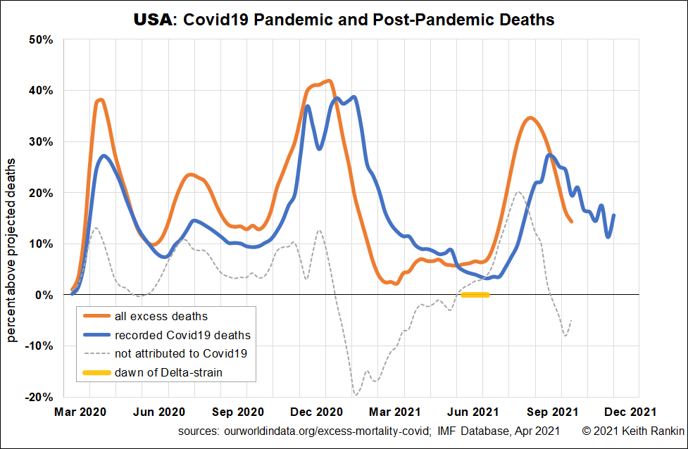
The first United States chart shows both recorded covid deaths and excess deaths. (For all countries more recent ‘recorded covid deaths’ data is available.) Generally we see a broad match between the two series in terms of timing, though for the first two United States covid waves we see a significant undercount of covid deaths.
For the winter of 2020/21, we see essentially the same thing, with the fall-off in excess deaths reflecting the reintroduction of widespread public health measures. (Generally, whenever deaths ‘not attributed to Covid19’ is negative, it means that public health measures are reducing or postponing non-covid deaths. This is marked in early 2021. When this statistic is positive, especially in the early stages of a pandemic, it generally indicates uncounted covid deaths. In May 2020, this ‘not attributed to Covid19′ statistic is about zero, meaning that a mix of uncounted covid deaths and reduction in non-covid deaths essentially cancel each other out.)
Of particular interest is August 2021, which shows a substantial death peak a full three weeks before the peak of recorded covid deaths. The issue here would appear to be that the United States’ fourth covid wave was well underway before there was a proper awareness of that wave.
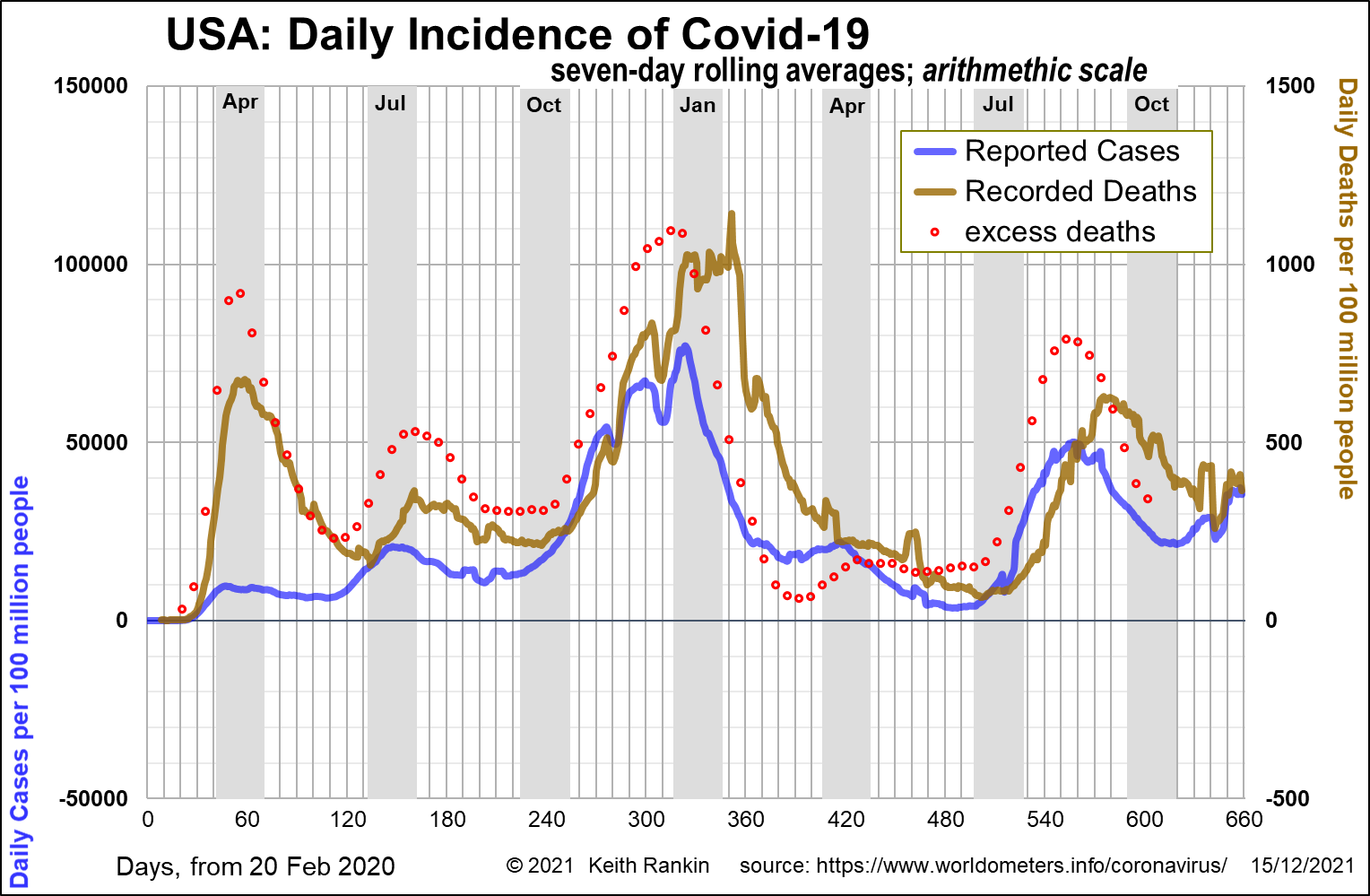
The second chart shows this more clearly, with a generally better correlation between excess deaths and covid cases, than between excess deaths and covid deaths. This then begs the question of the delay we should have between cases and deaths. Indeed it indicates that actual cases in each wave preceded our awareness of these cases; and this observation particularly relates to the first and fourth waves.
Looking back at the first chart, we can see that the fourth wave can truthfully be called the ‘American delta wave’, although we cannot be sure that correlation is causation. The United States – or at least parts of the United States – would appear to have had both many unvaccinated and undervaccinated people, and have lost much of the natural immunity gained during the previous winter. (Others, especially in the states that were less affected in 2020, will have become increasingly ‘naïve to the virus’ as a result of the early 2021 public health measures, including prolonged mask mandates.) The United States most likely would have had a covid outbreak in July 2021 regardless of which strain was circulating at the time.
The second chart also shows that a new ‘fifth wave’ is beginning. While already underway, this fifth wave – mostly in the north-eastern urban states that predominated in 2020 – has accelerated after Thanksgiving. This fifth wave cannot be attributed to a new strain of Covid19. Rather – as in places like Germany – it is due mainly to waning immunity in the vaccinated communities.
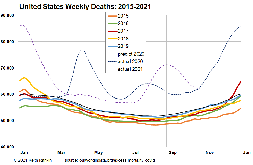
The third chart shows the extent of deaths in the USA in 2020 and 2021, compared to deaths in normal years. The death peaks clearly correspond to the four waves of the pandemic in the United States. (Note also the influenza epidemic in the winter of 2017/18.)
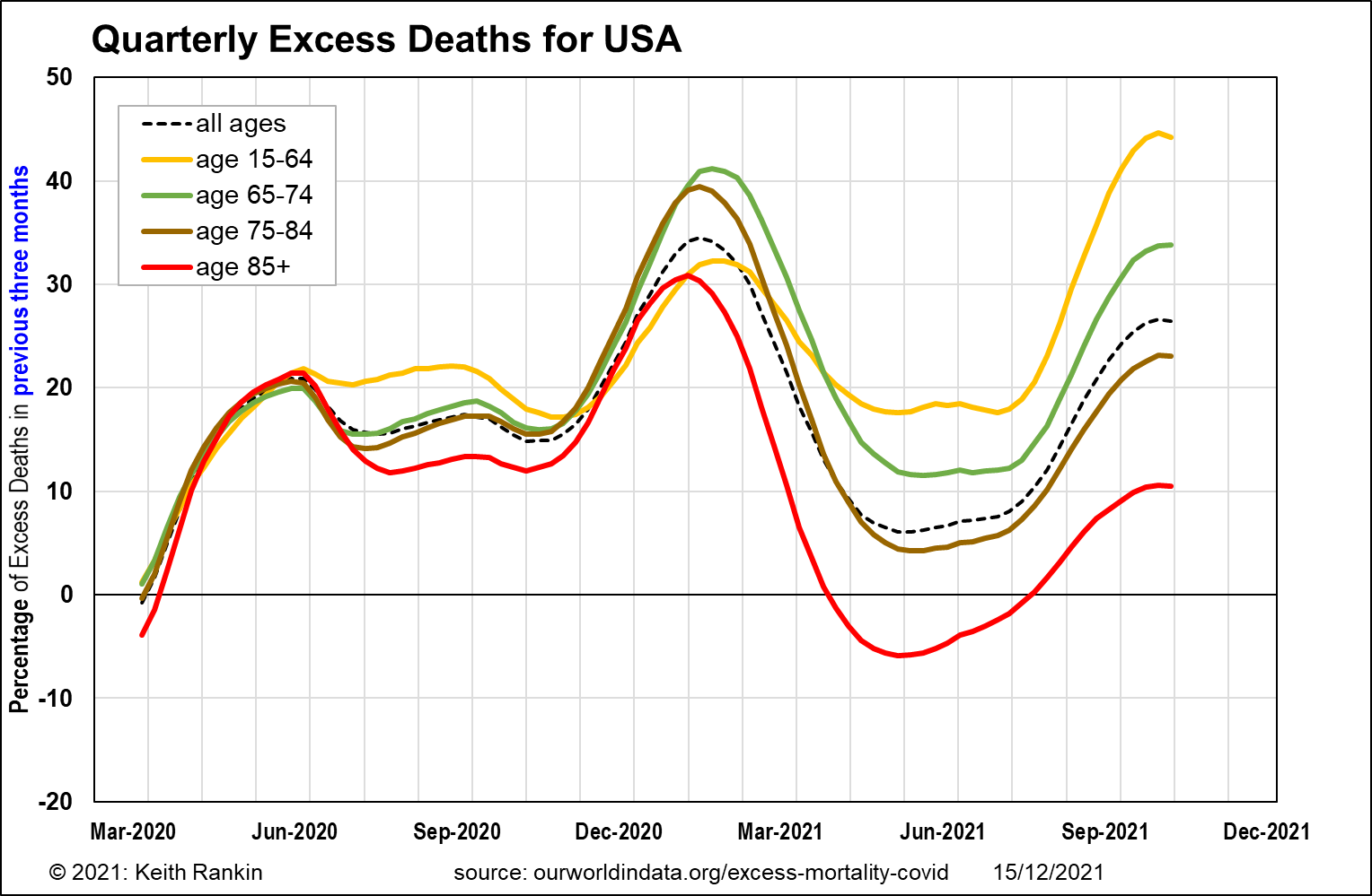
The fourth chart gives a degree of analysis of mortality in the United States by age. (See also As US nears 800,000 virus deaths, 1 of every 100 older Americans has perished, NZ Herald 13 Dec, first published in New York Times. This article defines ‘older’ as all people aged over 65, so it covers the green and brown plots, as well as the red.) We must note that this chart shows quarterly (13-week) averages so the peaks are not directly comparable with those of the previous charts. What we do find, however, is an unusually large number of excess deaths of people aged under 65; especially in 2021. This is likely to reflect the comorbidity epidemic in the United States – linked in particular to obesity, poverty, and prescription opioid addiction. (See Covid 19: The coronavirus attacks fat tissue, scientists find, NZ Herald 10 Dec, first published in New York Times.)
While death rates of younger people are clearly lower than for older people, the percentage of excess deaths of younger people is disturbingly high in the United States. Much of this mortality will be among the many Gen Jones (b.1956 to 1966) and Gen X (b.1967 to 1977) people who missed out on ‘getting ahead’ as per the dream of liberal aspiration; ‘losers’ as economic liberals think of them.
South Korea
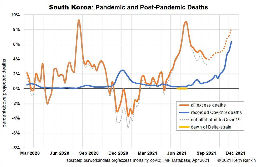
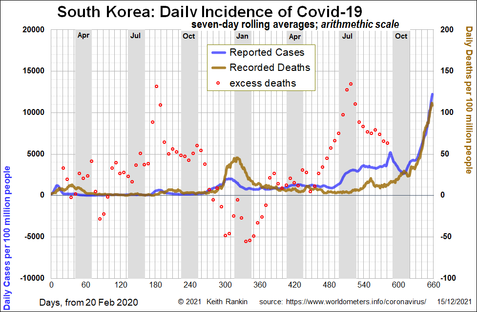
It’s also timely to revisit South Korea, one of the countries most affected by Covid19 in the early days of February 2020; and also a country whose policymakers responded in light of the SARS coronavirus near-pandemic of 2003.
The first point to note is that Korea has experienced – at least in mortality terms – a covid epidemic an order of magnitude less severe than the United States. Further, its public health policy ‘inconveniences’ have almost certainly been more coherent than those in the United States, mainly due to the highly decentralised political structure of the USA.
The first two Korea charts show a surprisingly poor correlation between excess deaths and recoded deaths. Generally, we can regard excess deaths within one percent – that is, plus or minus one percent – as random statistical noise. But, for a country of over 50 million people, even plus/minus two percent is significant. Deaths from mid-March to mid-November were clearly and significantly above normal, and can be attributed to the pandemic and its repercussions. South Korea can be said to have been underdiagnosing covid mortality. We may also note that the August mortality spike in Korea is matched by some countries in Europe. This is unlikely to be deaths ‘of covid’, but may be a short and sharp epidemic of another virus which found fertile human territory in the wake of the covid public health restrictions.
For Korea in the winter of 2020/21, while covid deaths spiked, excess deaths became significantly negative; quite unlike the experience of North America and Europe. This indicates very tight public health restrictions in Korea last winter.
Then there was a major death spike in Korea in July 2021. Superficially it looks like a ‘delta’ strike; but it’s too soon for that to be true. Further, Korea has had an unusual mix of Covid19 variants. While delta arrived in Korea in early May, both delta and alpha were pushed out by a Korean resurgence of (a version of) the original Wuhan strain. In mid-June 2021, 88% of cases in South Korea were of this local strain; the strain that caused Korea’s July 2021 mortality spike. Delta moved in subsequently. It looks like this outbreak caught the Korean authorities completely unaware. Also, the complete difference in strains between Korea and its neighbours attests to the strength of its international border restrictions. (In mid-June 2021, the alpha-strain was completely dominant in Japan, and the alpha and beta strains equally shared 95% of cases in Philippines, where many Koreans have traditionally taken their summer holidays. [A number of Korean corporates own resorts in Cebu, and their employees holidayed there, before covid.])
The final main point about Korea is that it is now undergoing its biggest ever wave of Covid19. While sufficiently recent excess death data is not available – I have shown my estimates as a plot of orange dots – the recent recorded death numbers are striking.
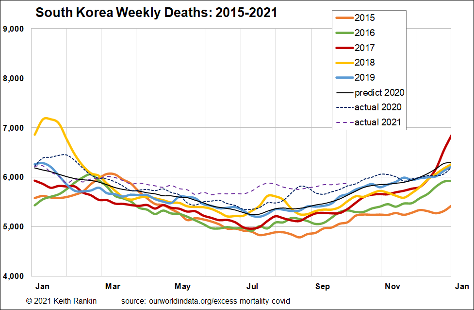
The third chart shows a general pattern in Korea of excess deaths in the autumn of 2020 and the summer of 2021. It also shows that there was a seasonal influenza outbreak in January 2020, and this probably protected many Koreans from getting covid in March and April of 2020.
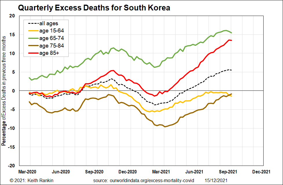
The final chart, like that for the United States, shows the age distribution of mortality in South Korea. We should note that, due to the Korean War, Korea’s ‘baby boom’ will have been at least ten years later than in most other developed economies. Thus the generation most adversely affected in Korea – people aged 65 to 74 – will not be an unusually large one, as it is in New Zealand. What we are seeing is that the oldest Koreans have recently been dying in unusually large numbers, almost certainly due to immunity deficits. Just eight percent of Koreans were fully vaccinated in mid-June.
Further, if we unpack the 15-64 age group, it is likely that Koreans aged 55-64 have been dying in large numbers by Korean standards; the death rates for 65-74 year-olds may be a strong indicator for 55-64 year olds. (I note that in Squid Game, a number of the contestants in game five were in that age group!) This may reflect that in South Korea, as in the USA, there may also be a ‘liberal-capitalism’ problem of losers in the older working-age group. While ‘equality of opportunity’ may have been much closer to reality in Korea than in USA, the ‘loser’ problem may have been comparable to that in the United States.
——-
Keith Rankin (keith at rankin dot nz), trained as an economic historian, is a retired lecturer in Economics and Statistics. He lives in Auckland, New Zealand.


