Analysis by Keith Rankin.
The following charts break the pandemic (23 months total; 21 months of mortality outside of China) into three 7-month periods: early, middle (covers the northern winter), and recent (mainly delta).
The countries included are those which report ‘total deaths’ on a weekly basis. Most of these have reported total deaths to the end of October 2021.

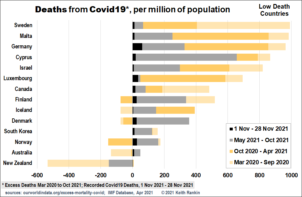
The first chart shows the ‘low death’ countries. Of the selected countries, only Australia and New Zealand have had a negative death impact so far.
The black and grey represents the most recent seven months. It is clear that some countries that initially did particularly well at keeping death at bay were much less successful in recent months; especially Norway, Denmark, Finland and Cyprus. Sweden on the other had had a problematic 2020 experience, but has outperformed all its Nordic neighbours since May 2021.
In Finland and Denmark in particular, there are significant numbers of excess deaths in recent months that were not recorded as Covid19 deaths.

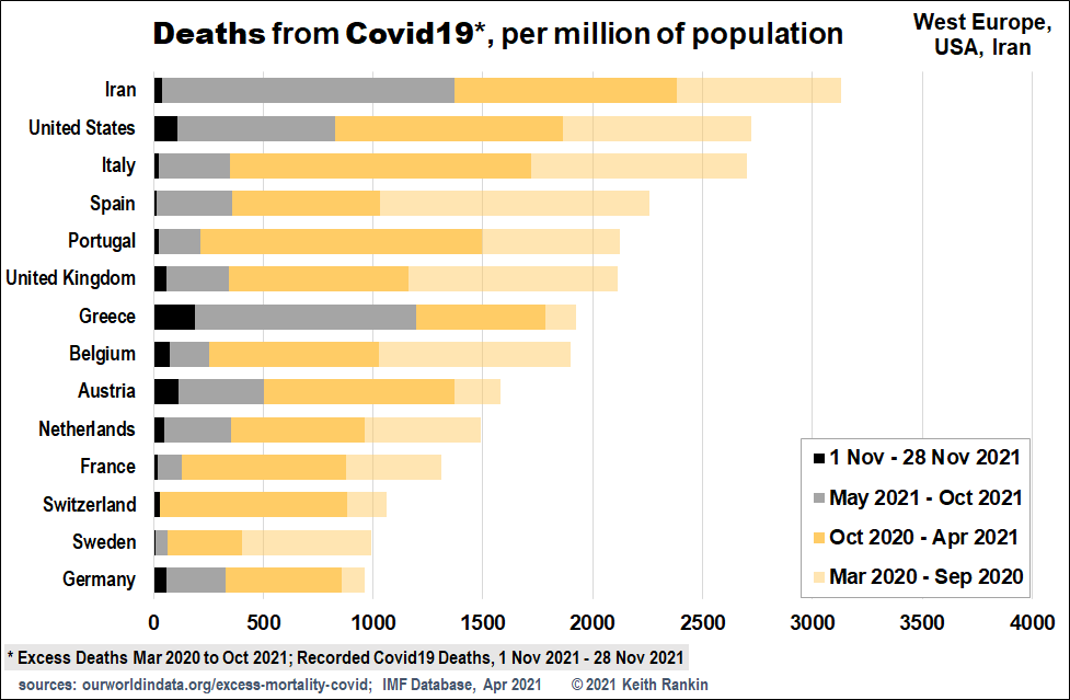
The second chart looks at West Europe, with Iran and United States for comparison.
Italy is worst in West Europe, mainly due to its early experience of the pandemic. Greece is its opposite, with a good 2020 but a very poor 2021.
Of this group, Germany and Sweden are best overall. But we notice that Germany’s recent experience is problematic, starting to look worse than Italy’s. In recent months, the best countries are Sweden, France, Switzerland, and Portugal.

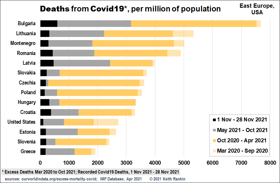
The third chart looks at Eastern Europe, with USA as a comparator. Of these European countries, only Montenegro is not in the European Union. What is most noticeable here is how much Covid19 death East Europe managed to avoid in the first seven death months of the pandemic (March to September 2020).
In the delta period – May to October 2021 – the countries bordering West Europe performed easily the best; presumably a mix of higher (but not high) vaccination rates, and natural immunity gained from their grim winter experiences.
We also note that the United States experience is comparable with that of East Europe’s European Union countries.

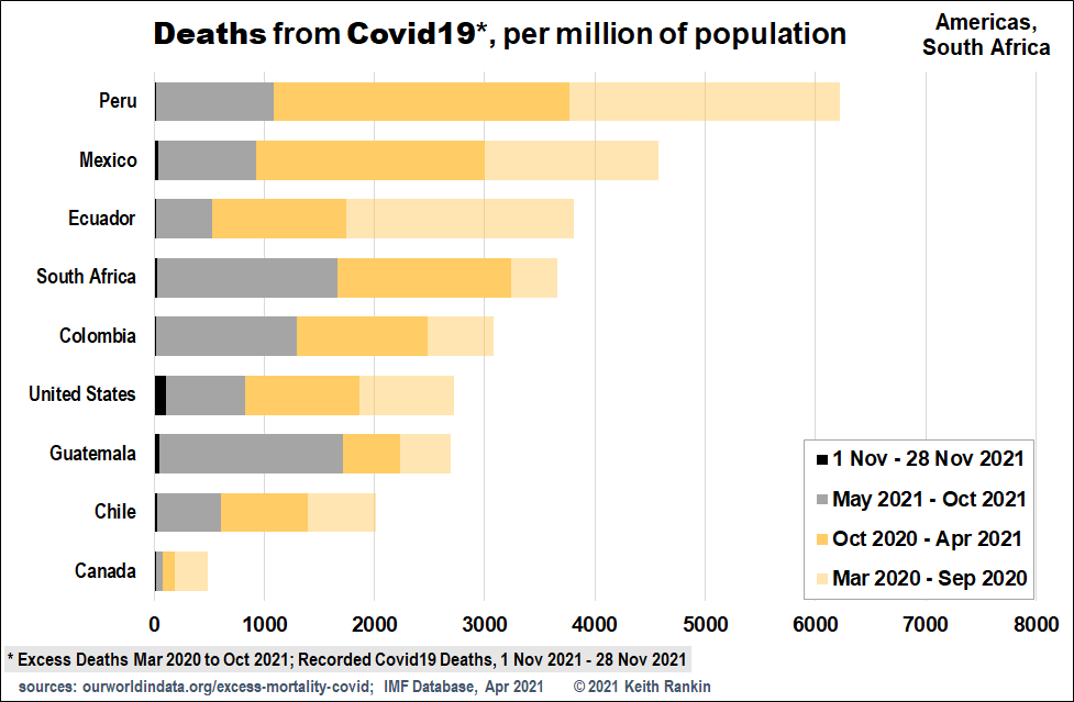
The final (Americas) chart is drawn on the same scale as the East European one. Again, we see that the United States’ experience is comparable with that of its southern ‘neighbours’. Peru, while worst overall because of its early experience, is consistent in recent months to the other large American nations shown. Guatemala’s recent experience reflects the generally problematic experience of the Caribbean region since May 2021. (Indeed the pandemic was still raging through Barbados in November; though that country still managed to celebrate becoming a republic.)
I have included South Africa as a comparator, and we can see that its covid experience was comparable with that of the American countries.
In general, we will need to monitor excess deaths at least until 2024, to get a realistic impression of the net loss of life due to the Covid19 virus, and our responses to it. Note the word ‘net’; just as the pandemic has cost lives, it has also saved lives. One reason for lives being saved is that we now know more about the impact on our lives of an unexpected silent pandemic, and our various under- and over-reactions to such an event, than we ever did before.
We should also note that the human impact – bad (mostly) and good – of Covid19 goes far beyond the pandemic’s mortality experience.
——-
Keith Rankin (keith at rankin dot nz), trained as an economic historian, is a retired lecturer in Economics and Statistics. He lives in Auckland, New Zealand.


