Analysis by Keith Rankin.
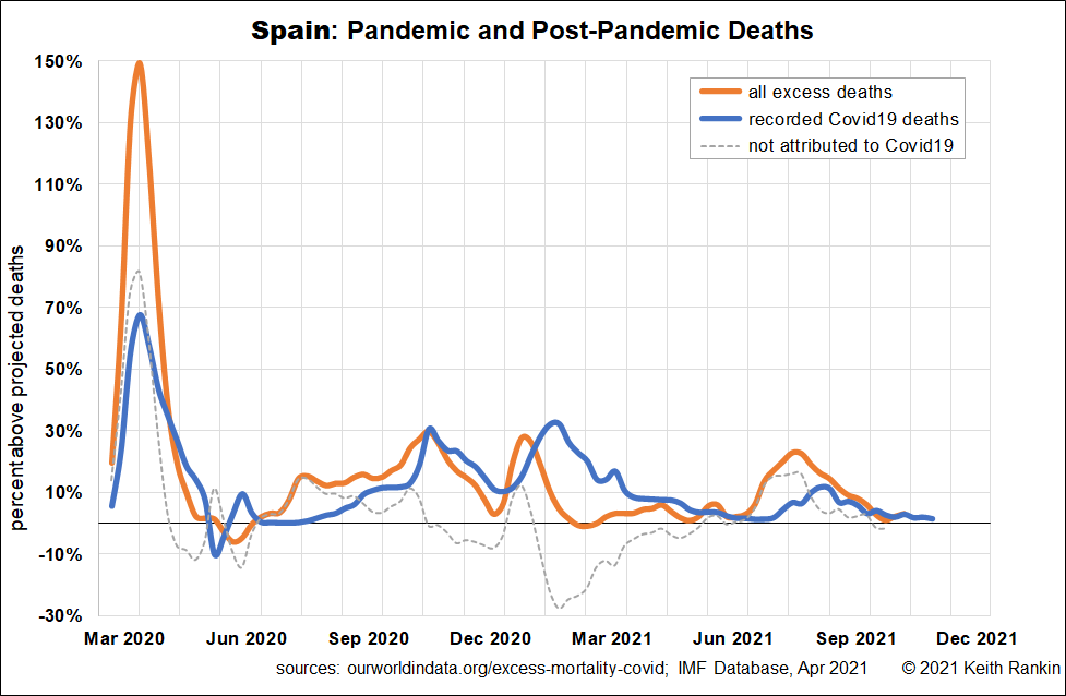
Spain copped Covid early; as early as Italy, presumably, like Italy, directly from Wuhan, China. While the main spread of Covid19 in Europe was via the Italian and Austrian alps, the early spread of covid to the United Kingdom may have been largely from Spain.
The first chart shows that for a brief period at the end of March 2020, deaths were 150% above normal. Actual covid deaths were more than double recorded deaths. Covid19 struck Spain, hard and early. Spain barely knew what hit it.
Since the first European wave of covid, Spain has continued to suffer, though not nearly as much as other countries. In each northern summer, excess deaths exceeded recorded covid deaths; these were a mix of post-covid deaths, and deaths due to covid in periods when testing rates were low. In the winter of 2020/21, generally excess deaths were lower than recorded covid deaths, meaning that public health restrictions were reducing (and postponing) non-covid deaths.
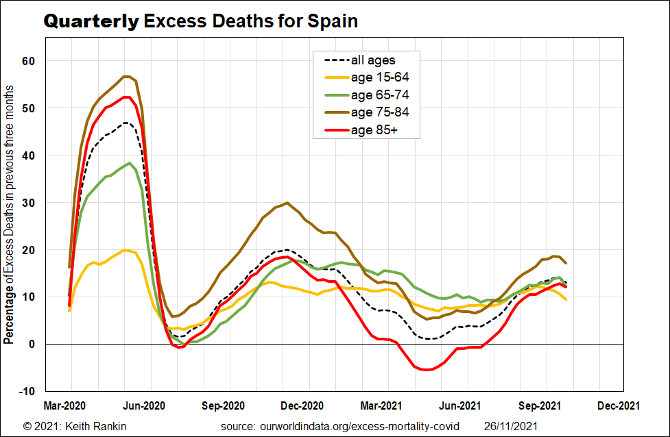
Looking at the ages of those who died, the initial hit was mainly to the old and very old, many of whom would have died had 2020 been an above-average influenza year. And many of whom were in nursing homes which let in the germ before they had time to raise the drawbridge. (Note that this chart plots data that is averaged over three months; so the peaks are not prominent, and they lag the actual peak dates.)
In the warmer months of 2021, however, it was the younger age groups which featured more prominently, in the post-covid toll. We now know that these deaths will include stroke victims, given the impact Covid19 infection has on a person’s propensity to suffer a stroke. (Refer, Covid-19: Stroke Foundation urging NZers to get vaccinated, RNZ, 26 November 2021.)
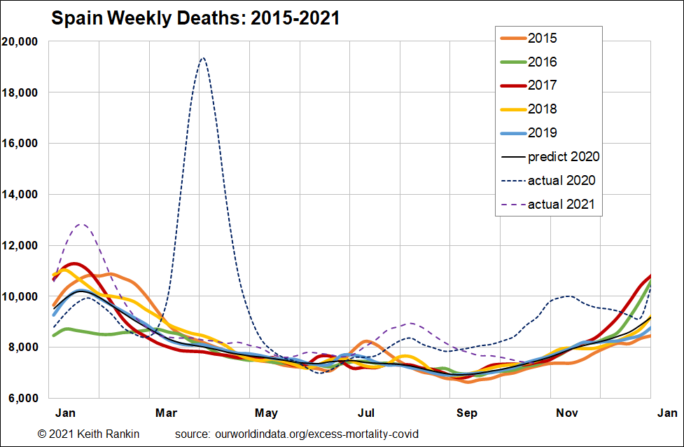
The third chart shows a normal mortality profile for Spain, with the dashed lines showing excess deaths. The normal peaks for January or February represent influenza, noting that the 2015/16 winter was a low flu season. In January 2021, we can see that Covid19 took lives – more lives – in lieu of flu.
The big 2020 spike is like the death spike in New Zealand from the ‘Spanish flu’ in November 1918; short and sharp. Though, in this case the spike was short because of the lockdown measures imposed, and not because the virus rapidly burnt itself out in that location.
July/August 2021 represents Spain’s latest full wave of Covid19. It’s the ‘delta strain’, and is muted because it was summer, and because of substantial immunity in the population from a mix of vaccines and natural exposure to the disease.
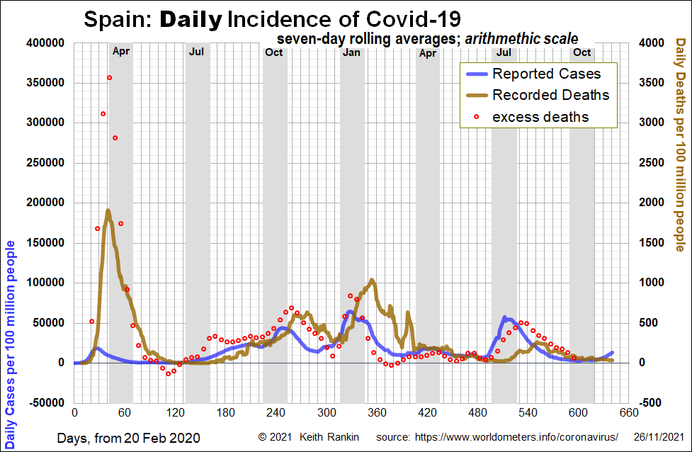
The fourth chart shows reported cases in addition to recorded and unrecorded deaths. It clearly shows the July/August 2021 wave of covid, and how covid deaths were substantially under-recorded during that wave. We also note a general pattern of cases, followed by unrecorded covid deaths, followed by a mix of recorded covid deaths and ‘saved’ non-covid deaths. (Saved non-covid deaths are non-covid deaths that did not happen because of public health restrictions.)
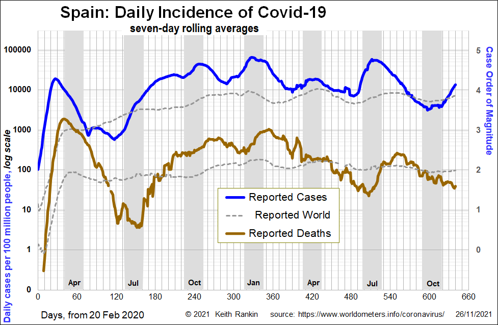
Finally, the logarithmic chart that gives us the best heads-up about what is coming. The major horizontal gridlines represent ‘orders of magnitude’, with magnitude four being ten times worse than magnitude three. Spain has stubbornly stuck at 10,000 daily identified covid cases per 100 million people in the population, which is the same as 100 daily cases per million people. For the most part, this has been above the world average. (Since May 2020, Spain has been a significantly below average covid victim nation, for Europe. Some countries which initially had very few covid deaths (eg in March to July 2020), have had covid death rates four or five times as high as Spain in 2021.
The general pattern is for recorded deaths to be one percent of reported cases. The truth is that actual covid cases are probably four times higher, and that actual covid deaths (based on excess deaths) are about double; meaning the true fatality rate of people with an active covid infection is half a percent of all cases. (This excludes post-covid fatalities.) It is also important to note that the case fatality rate seems to have not changed much during the course of the pandemic.
Spain is clearly starting its 2021 winter wave of covid, though later than most other countries in Europe. The straight line for November 2021 so far represents exponential growth of cases. (In a logarithmic chart, any straight upward line represents exponential growth. Some exponential growth lines are more rapid than others.) If vaccination rates are a good predictor, Spain’s winter 2021 wave will not be as severe as those of other European countries; or of the USA. Whereas, in July Spain’s vaccination rates were on a par with those of Germany, at the beginning of November Spain’s full vaccination rate was 80% of all its population, Germany was 66%, whereas New Zealand’s was 62%, and Austria was 62%. Compared to Germany and Austria, the current big-news sufferers, Spain and New Zealand can be regarded as having more people recently vaccinated.
What matters, looking forward, is when – not whether – people were vaccinated.
——-
Keith Rankin (keith at rankin dot nz), trained as an economic historian, is a retired lecturer in Economics and Statistics. He lives in Auckland, New Zealand.


