Analysis by Keith Rankin.

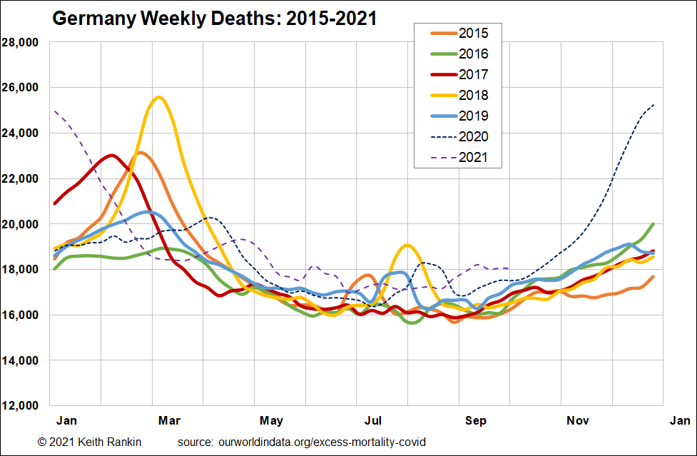
The first chart shows excess deaths in Germany for every year from 2015. (The chart is essentially the one that can be found here, on the Our World in Data website, though it uses three-period moving averages to smooth out some of the ‘random noise’ that inevitably accompanies such time-series data.
The first thing our eyes are drawn to in this chart is not the covid bulge; rather it’s the 2018 bulge. (Yes, the chart is in a sense biased against December-January bulges, and there could be an argument that the use of narrower dashed lines for the covid years is also a bias. Nevertheless, all charts seek to emphasise something, and the use of a January to December scale is default for any calendar-based analysis.)
Before looking at that 2018 bulge, the important thing to note is that from May to November the years 2015 to 2019 are broadly similar to each other; there is no obvious indication that death numbers are climbing because of increasing population size. Indeed Germany is a country with a stable population size, though not a stable age distribution. It is a country with an aging indigenous ‘Germanic’ population that is being offset by substantial immigration of younger people.
The main reason for differences year-to-year in the 2015-19 period is seasonal endemic disease, which has a disproportionate impact on the older ‘more-likely-to-die’ population. There are two mortality seasons: late winter, and summer. The lesser summer peaks, which are visible in other countries too, are most likely due to the heightened mobility of people – especially young people – given that mobility is the key vector of infectious diseases. This international mobility of young people was almost certainly the vector of Europe’s second Covid19 wave of 2020, as suggested by the August 2020 bulge in the chart.
For the late-winter mortality peak, we see that every year except 2016 and 2020 has a large number (of mainly older people) dying from influenzas and the like (and their complications such as pneumonia). 2018 was the worst such year, and it may indeed follow from a bad influenza strain in 2017 in the southern hemisphere. (See New Zealand chart, and story.)
For Germany, 2020 started out looking like a year comparatively free from the influenza reaper; then, anti-Covid19 public health restrictions reduced overall mortality, making the seasonal reaper – in this case, Covid19 – appear to be somewhat less malign than those of 2015, 2017, and 2018. Indeed, it is most likely that most of the covid deaths in Germany in April and May 2020 were the same older people who would have died at that time from respiratory infections had 2020 been a year like, say, 2015.
Germany’s big mortality wave from Covid19 clearly was in the winter of 2020/21, and it came much earlier than in previous winters.
What is significant in the above chart, but not prominent, is the consistently higher number of deaths since April 2021. This is indicative of Germany’s ongoing toll from Covid19.

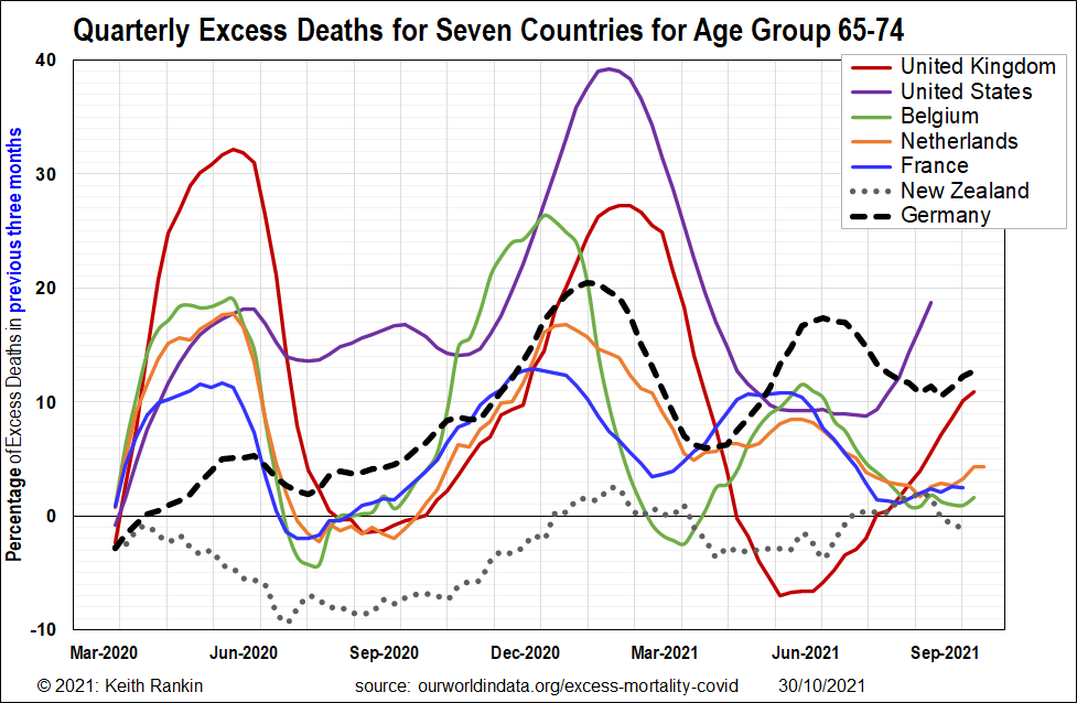
The second chart shows Germany in context with other northwest European countries, plus United Kingdom, United States, and New Zealand. And it shows ‘excess deaths’ for people born in the late 1940s and early 1950s; people still young in many respects (ie the young ‘elderly’!).
(A technical note; this data is quarterly, meaning that the German peak which looks like the end of January 2021 is really mid-December 2020. And the last German mortality peak shown is not due to ‘Delta’ Covid; it’s associated with ‘Alpha’ Covid.)
We clearly see that Germany’s public health policies performed an excellent job in fending-off Covid19 in the early months of the pandemic. (Sweden, and interesting case not shown, has, until early 2021, a profile similar to that of Netherlands.)
What is of concern for Germany is what looks like a rising mortality trend for this age group, which contrasts with France’s more stable trend. We know that mobile French people are substantial vectors of Covid19, simply by observing the tragic events in France’s many overseas territories. The look of the chart is that French people have a higher resistance to Covid19 than do German people (and a much higher resistance than service workers in the French Caribbean or the French Pacific).
In these last weeks of October, Germany is just starting its Delta outbreak, as winter comes and as vaccination potency wanes. As is Netherlands and Belgium. France is getting more cases too, though it is looking significantly better than these other three. I fear for Germany’s post-war baby-boom generation. And not only Germany’s. (For example, Austria, not shown, is looking ever worse than Germany.)
Keith Rankin (keith at rankin dot nz), trained as an economic historian, is a retired lecturer in Economics and Statistics. He lives in Auckland, New Zealand.


