Analysis by Keith Rankin.
New Zealand has, for the rest of this month, banned all people who have been in India this month from entry into New Zealand. The decision is based not on the incidence of Covid19 in India; rather it is based on the numbers of New Zealanders arriving from India.
This would be like saying that, among convicted felons, ‘most felons convicted for fraud are men, therefore we will only gaol male fraudsters’.
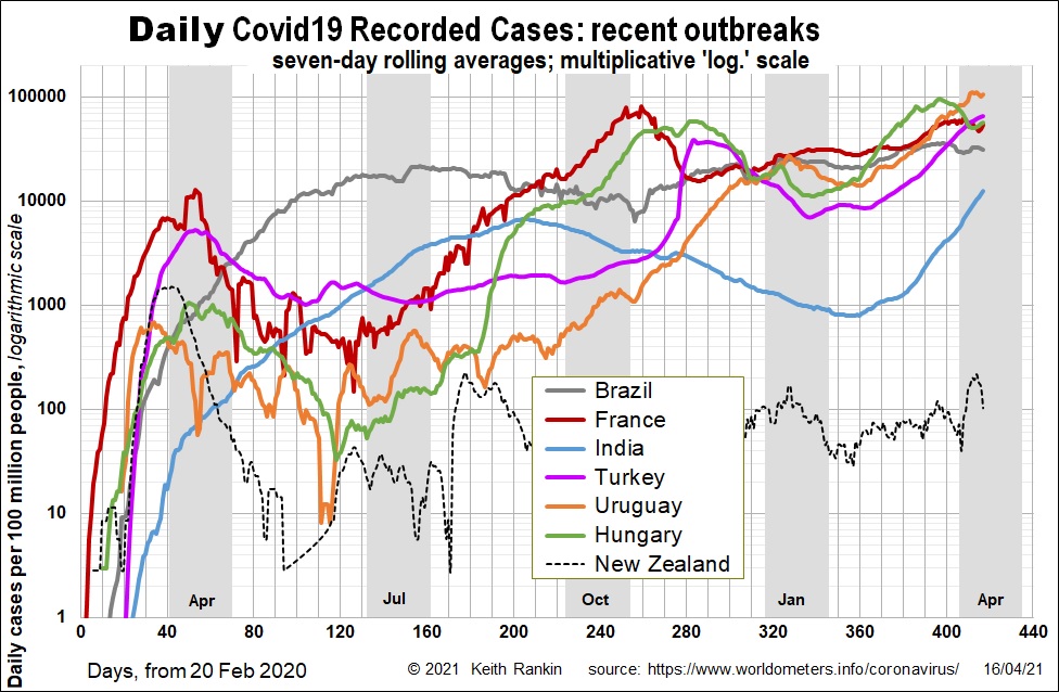
The chart includes five other countries which became Magnitude 5 (ie about 100,000 daily cases per 100 million people) in March. A random person living in Brazil, Uruguay, Turkey, France or Hungary is about five times more likely to have been tested positive for Covid19 than a random person in India. Thus people departing from these countries are not safer to let into New Zealand than are people departing from India.
There are in fact 73 countries with more reported positive Covid19 cases per capita in the last week. At present, a random person in Turkey is 5.3 times more likely to have tested positive for Covid19 than a random person in India. Yes, there is almost certainly an undercount in India; but also there is almost certainly an undercount in Turkey, and Germany for that matter.
New Zealand is shown in this chart for comparison. We note that, up to August 2020, Hungary and Uruguay had case numbers per capita comparable with New Zealand. Yet, of countries with more than 300,000 people, these two were worst in the world for reported incidence of Covid19 at the end of March 2021.
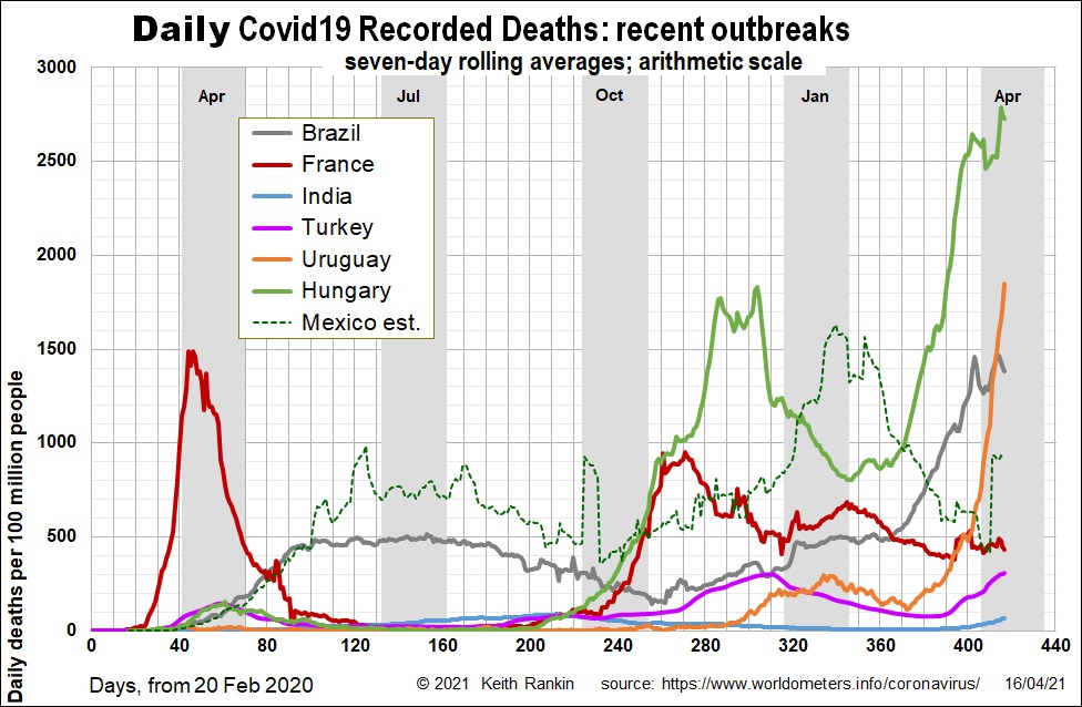
Recorded deaths is a better historical measure of the impact of a disease such as Covid19. Thus Hungary has been a covid disaster since November, and especially since March. Uruguay, which barely registered until December, now has a daily Covid19 death rate of 20 per million, equivalent to 100 deaths a day in New Zealand.
India comes in at 84th in the post-Easter death league; much lower than all the others on the chart. Indeed Germany, not shown, is 46th. Eastern Europe continues to be the part of the world that has suffered vastly more than any other part of the world. Not that we would know it, given the way that Covid19 is reported.
While it will be true that India’s true death toll is greater than recorded, this will also be true of many of the other countries.
One important country whose Covid19 status is not at all well revealed by the statistics is Mexico. In Mexico’s case, the undercount for cases is much greater than the undercount for deaths. I have shown my estimate for covid deaths in Mexico on this chart, based on reports that the true death toll is at least 60 percent higher than the recorded toll. (While there has been some recent adjustment to Mexican official figures, I have simply multiplied all the official figures by 1.6.) Mexico probably has a true daily death rate about five times higher than India, at present.
All countries shown in this chart flatlined in the northern Hemisphere summer, except for many of those in the Americas. While the March to May outbreak of Covid19 in the Americas came from Europe, almost certainly the larger wave of the northern autumn came back to Europe from the Americas. The present wave is affecting many countries that were barely affected ten months ago. Of particular concern now is Asia; indeed, Thailand has also had a very recent splurge of cases. India will almost certainly get Covid19 worse than at present.