Analysis by Keith Rankin.

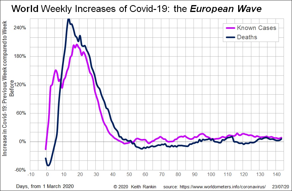
This week’s first chart shows the huge European wave of Covid-19 in March.
At its exponential peak, the chart shows world Covid19 weekly deaths increasing by 260 percent in the second week of March, compared to March’s first week. This European wave contrasts sharply with the last week of February, when weekly deaths more than halved (ie fell by more than 50%). That was the February end of the China wave.
The rise of known cases in Europe only precedes the death peak by a few days, indicating that in late February there were already substantial numbers of unknown cases. (The brief case drop after day six reflects South Korea, which – like China – took the disease seriously at that time.)
The peak in case growth around day 18 reflects much higher testing rates; that explains why case growth appears to have followed death growth in mid-March. The growth peak for actual cases in Europe will have been around the first of March.
The fall in case and death growth in the second half of March reflects the lockdowns that were belatedly implemented in Europe. Early April 2020 represents the beginning of Covid19’s long tail.

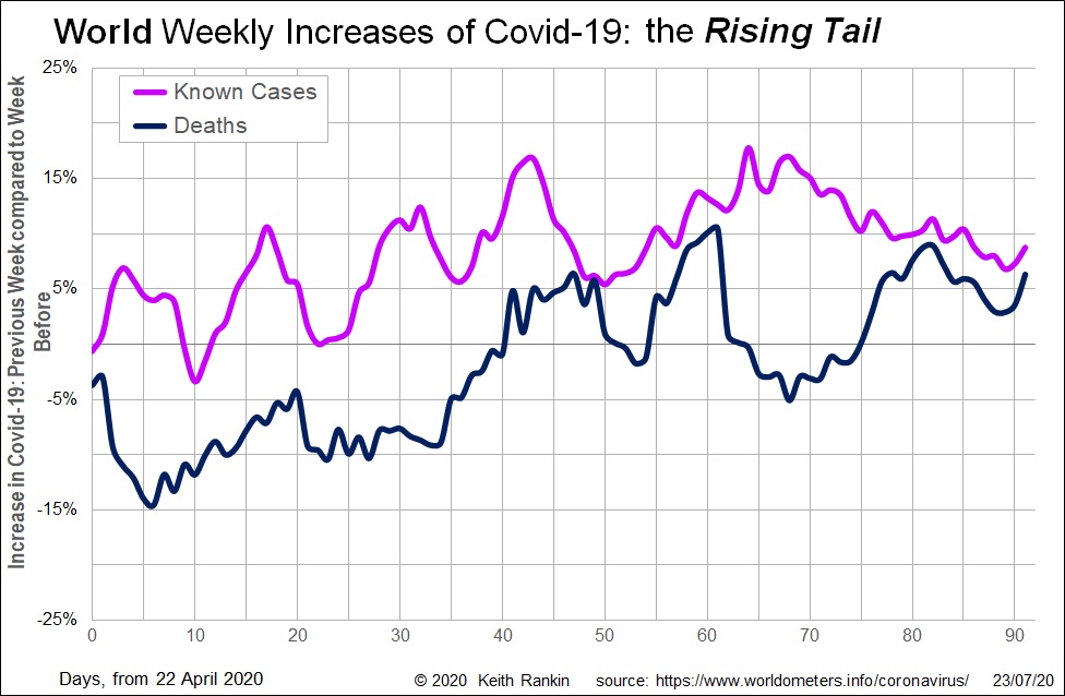
In late April the trend for slower Covid19 case growth reversed. This essentially reflects the shift of the pandemic epicentre to the United States. We note, though, that weekly global Covid19 deaths were falling from the fourth week of April until the end of May; negative growth. Within that, however, we see a ‘contest’ between rising deaths in New York and falling weekly deaths in Europe. We also note the rise in Covid19 cases in the Arabian Gulf states from May.
The huge upsurge in Covid19 deaths in June mainly reflected the American experience, increasingly the South American experience.
The higher growth in known cases at the end of June – day 55 to day 70 – reflects increased testing in the United States and the expansion of Covid19 in the southern states. If we mentally adjust for the effect of increased testing revealing cases that would otherwise have been missed, the magenta curve would be lower (and falling) from day 55 to day 70, and then rising after that. Once we make that mental adjustment, we can appreciate a general pattern of deaths rising one to two weeks after each resurgence in cases.
In July we see a stable pattern of about ten percent weekly case growth of Covid19; this includes recent statistical contributions from South Asia, South Africa and Southeast Europe. The death growth rate has caught up, also now sitting at over five percent more deaths last week compared to the week before.
My sense is that in August and September these data will ‘stabilise’, meaning that new cases and new deaths each week will be much as in the week before. India, however, remains highly unpredictable. Also, we know that Covid19 spreads fastest in winter (as well as in enclosed spaces); consider Melbourne, Cape Town, Santiago, and possibly Buenos Aires starting to catch up with other big South American cities.
My guess is that little will change for three months – ie Covid19 case and death growth rates will average around zero percent – and then in November there will be a new acceleration of case growth in Europe, Central Asia, and northern North America.


