Analysis by Keith Rankin.
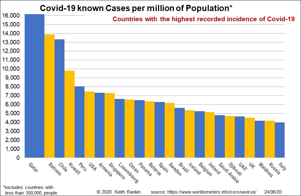
We get a very biased picture of which countries have had the most experience of Covid19. It’s because the mainstream media almost never adjust their figures for population. So, in June, we keep hearing about United States and Brazil, but that’s mainly because they are very populous countries. It’s also because they have controversial political leaders.
For known incidence, the Gulf states (Arabian Gulf) are worst, especially Qatar, which is now the world’s number one hub for intercontinental air travel. The Gulf states have high testing rates, and large young populations of migrant workers. So they have low death rates, and apparently high rates of asymptomatic and pre-symptomatic transmission. Singapore is similar. UAE, which has the most testing in the region, has the lowest incidence among the Gulf states shown here.
In Latin America – the present hot continent for Covid19 – Chile, Peru and Panama have more known cases than Brazil.
In Europe, Luxembourg, Belgium, Spain, Sweden and Iceland rate highest. Netherlands should be in this list; the main difference between Belgium and Netherlands is the greater level of testing in Belgium.) Iceland, which had many early cases, has eliminated Covid19 in the same sense that New Zealand has. It’s death rate (0.5%) is authentic, and may probably prove to be the eventual death rate for the world. (Based on a likely world infection rate of 10%, this would mean an eventual global covid death toll of four million.
We must note that all these charts omit countries with less than 300,000 people. Many such countries have been very badly affected by Covid19.
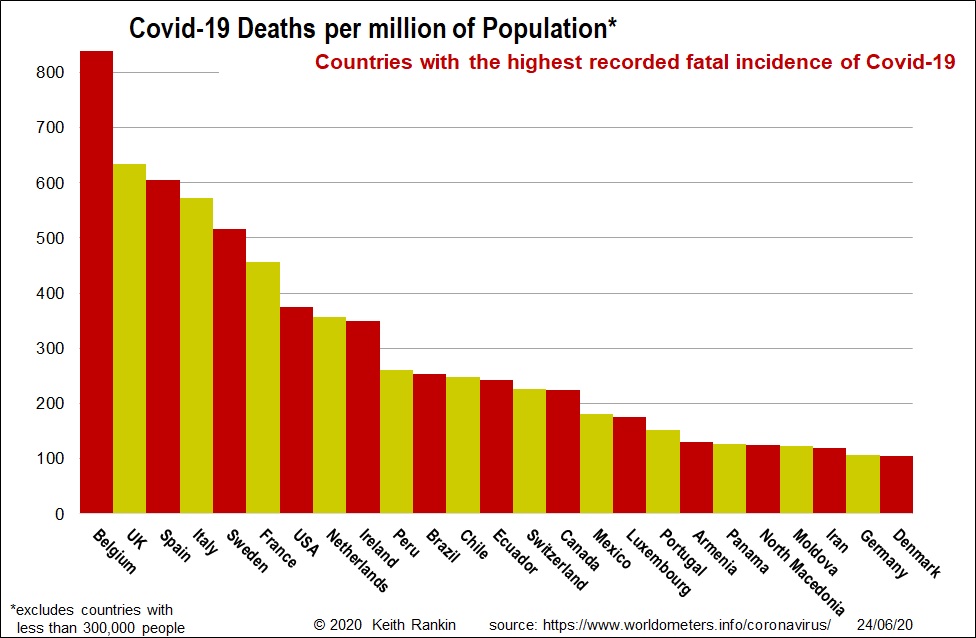
Belgium still has the most deaths, adjusted for population. Belgium’s political leader – Sophie Wilmès – can count herself lucky that Belgium is a small country, and that mistakes made there did not see her face plastered all over the world’s media. To Belgium’s credit, recent infections and deaths are much lower than, for example, Sweden. (Even Sweden’s politicians – as irresponsible as those in the United States – are not lambasted in the global media, despite their failure to look after their own people.)
Europe continue to dominate the mortality data, for various reasons. Europe is the continent from which the pandemic spread. And Europe has many elderly people. After Europe, the Americas are prominent. There is also a hint of Eastern Europe, with Iran having a high number of deaths in large part due to its early outbreak (February).
Because these are cumulative data (Charts 1 and 2), they will accentuate the earliest countries in the pandemic.
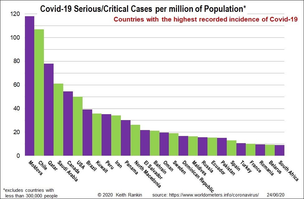
Serious and critical cases are an important guide to recent covid calamity. Moldova has led the way in Eastern Europe; presumably its low testing rate is a large part of its problem.
Chile is of particular concern in South America; it is a country with strong ties to New Zealand. Chile initially imposed some quite strong restrictions, but presumably not at its main border – Santiago Airport. Chile’s outbreak is predominantly in Santiago. It is astonishing in its scale, and in the lack of awareness in the rest of the world, which only sees Brazil. Peru’s situation seems similar to that of Chile, with a very large outbreak that has affected Lima at an order of magnitude higher than the rest of the country; though that may be in part due to more testing and better record-keeping in the capital city.
Canada remains a country of considerable concern. And note Pakistan, a country in Asia with a higher population than Brazil.
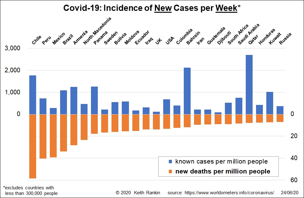
This chart shows the countries with the highest Covid19 death rates over the last week. I feel for Chile, Peru and Mexico, all countries I have fond memories of. The smaller central American countries are also starting to show up as having rising Covid19 mortality rates.
We also see the emergence of some Eastern European countries, though not the ones with the larger populations. The recent tennis debacle in Serbia suggests that Eastern Europe and the Caucasus will still become Covid19 hotspots.
In this chart, the only regions of the world conspicuous by their absence are East Asia and Oceania. For whatever cultural reason, these are the two regions which have been most committed to the elimination of the SARS-Cov2 virus which causes Covid19.
Africa only shows through Djibouti and South Africa. But it is likely to have much more infection than is known, and should continue to have low death rates due to its young population.
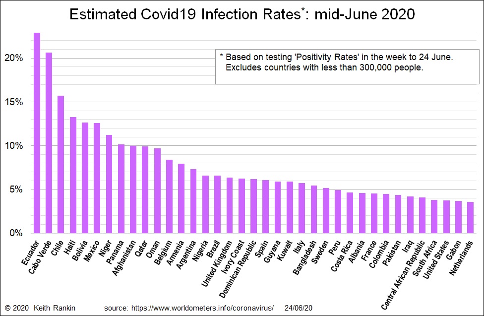
This chart is a revision of last week’s chart. It is a revision in that it uses data subsequent to that used last time. And, for countries with high known death rates, I have now divided the mortality rates by 1% (same as multiplying by 100) to estimate their true infection rates.
Once again, all regions show except East Asia and Oceania. This is the chart that shows the extent of the problem in Africa better than other charts; it makes use of high positivity rates in countries with lower testing rates.
I will note two countries here. I expect the estimates for Argentina to fall, as more testing should produce lower positivity rates in a country that has been quite strict in its lockdown regime. And I note that the Netherlands’ data almost certainly is too low, with many people who were infected never having been tested. This problem applies to other European countries too: eg Sweden, United Kingdom, France. In these countries present positivity rates are low.
One final note. While the country of Ecuador, and the cities of Santiago and Doha may in 2021 be in a position to attain ‘herd immunity’ (though that depends on the extent that exposure does indeed confer immunity), most countries and cities will fall short of achieving such immunity in the absence of a vaccine. Simply put, for most countries the price of attaining herd immunity will be an unacceptably high number of deaths.


