Analysis by Keith Rankin.

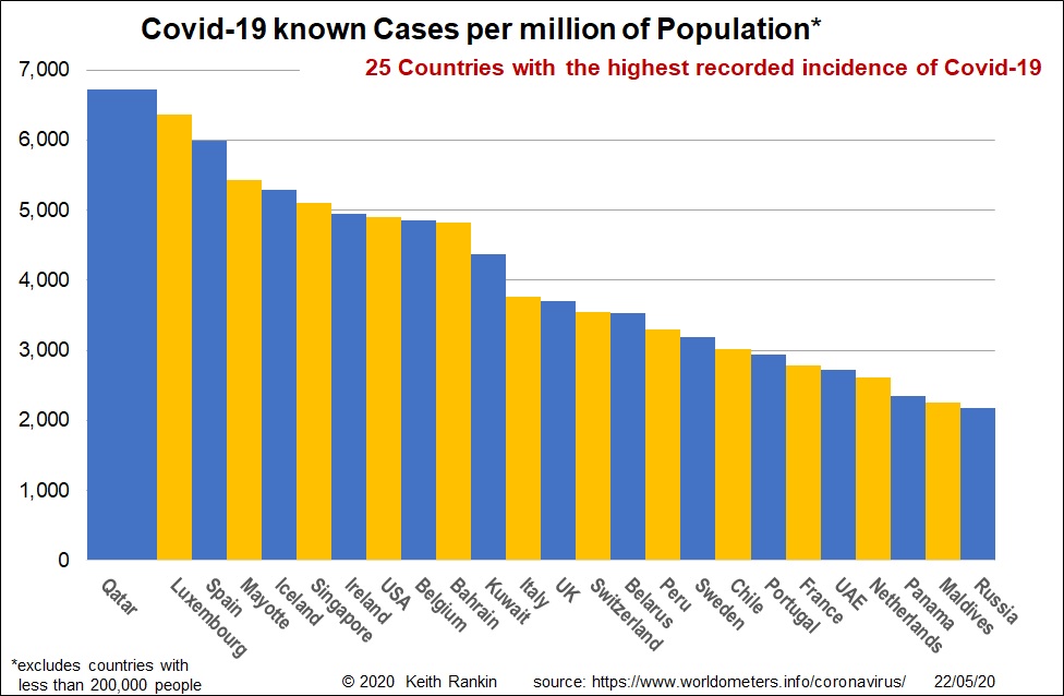
Covid19 case incidence is a reflection of both the actual infection rate, and the extent to which infections have been reported. Thus, countries like Sweden and Brazil with low testing rates have actual infection rates substantially higher than reported.
Qatar is so high in part because, like Iceland, testing rates have been very high. Nevertheless, Qatar does have a high number of cases in serious or critical condition in hospital, so is likely to show up in subsequent death statistics. Iceland is high because it tested widely, and has most likely already had all its cases.
For most of the countries shown here, the regional pattern of infection is very important; however good regional statistics are often lacking. Let’s consider Peru. Over 70% of its cases are in the capital city Lima, and its port Callao. Yet the main tourist destinations are Cusco and Puno, which have low infection rates. It looks as though incoming tourists have not been a major source of Covid19 infection. Rather, it is Peruvians who travelled overseas, and returned, who made Peru such a serious case, despite Peru having one of the strictest lockdowns in South America.
The same situations can be said for Spain, Italy, Sweden, Chile and France. And Brazil, which does not show on this chart due to its low testing rate. It is the economic and financial capitals (which may or may not be the political capitals) of these countries which have resident populations who travel the most overseas. I suspect that this is true for Qatar as well; well-travelled residents of Doha contracting Covid19 outside of their country, rather than visitors to that country.
We see this effect in places like Mayotte as well. Many of Mayotte’s residents regularly travel to France. In this context, we should note that I have omitted San Marino, Andorra, Gibraltar, Isle of Man, Faeroe Islands, Channel Islands, Falkland Islands, Vatican City, Monaco and Montserrat. All of these would have been in the chart if they had populations of over 200,000; and they all have resident populations who travel, in large proportions, to Europe’s major cities.
Something like the Peruvian situation applies to New Zealand too. Excluding Queenstown – a conference centre – the tourist areas have not been particularly badly affected. And, New Zealand differs from South America in that people from different parts of New Zealand travel overseas in proportionate numbers; eg a randomly chosen person resident in Christchurch is equally likely to have travelled overseas as a randomly chosen person resident in Auckland.

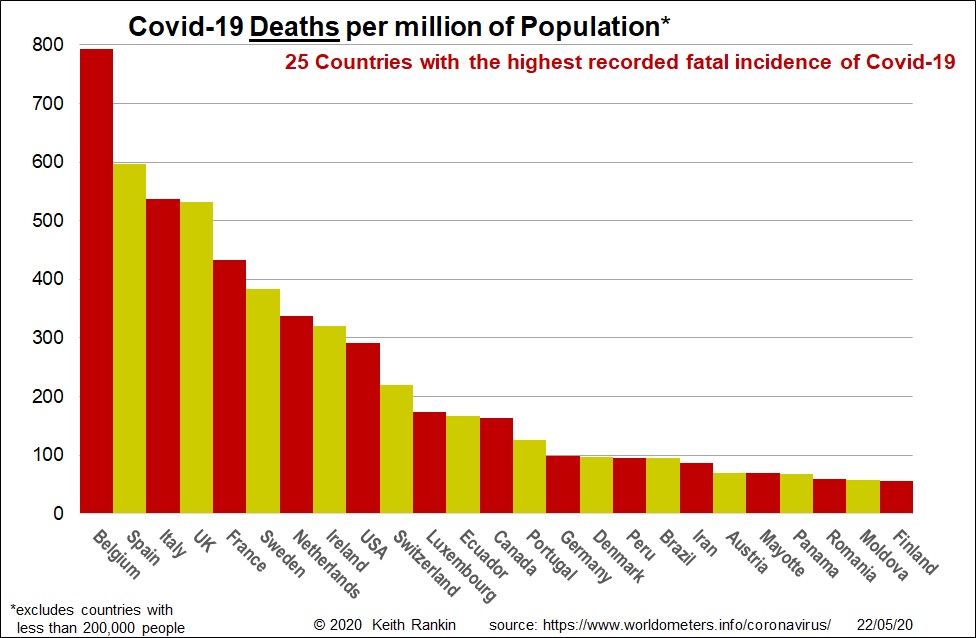
The worst affected countries so far are mainly the usual suspects. Death rates reflect the age structure of countries’ populations, their known and unknown case rates, and the treatment success rates of those infected persons requiring hospitalisation.
Brazil shows up here because its actual case incidence is much lower than its known case incidence; so it has a high death to case ratio.
Eastern Europe makes an appearance at the lower end of the scale, but has shown little sign that it will ‘advance’ up this league table. Rather, the countries which will show up more strongly in a few weeks will be countries from Latin America (including Mexico and Chile, but probably not Argentina), and possibly some of the Arabian countries (eg Qatar) which showed up strongly in the first chart.
Countries omitted from this ‘deaths’ chart because they are too small are San Marino, Monaco, Andorra, Bermuda, Isle of Man, Channel Islands, Montserrat, Saint Martin, and Sint Maarten. All of these little countries have a large proportion of residents who are well travelled.
As a matter of interest, New Zealand is 114th in the world for deaths, Australia is 117th, and China is 124th in the world.


