Analysis by Keith Rankin.
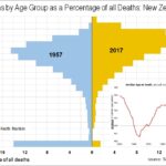
This month’s chart (a comparative histogram) shows the impact – of both an aging population and rising life expectancy – on ages at death. The percentages shown basically represent the probability that the next person to die in New Zealand will be in a given age bracket.
The biggest change over the last 60 years has been the reduced numbers of deaths of babies and very young children. While this reduction is the biggest single reason for increased life expectancy at birth, the number of deaths at this age in the 1950s also reflects the sheer numbers of children in New Zealand in that decade.
Birth numbers in New Zealand picked up after 1935, so all the age groups under 20 in 1957 show higher deaths in large part because of higher age-specific populations, especially higher numbers relative to the numbers of older adults. We might also note that there was, from a 1957 perspective, an unusually large cohort of people aged in their 70s.
We see that deaths of people in their 20s represented a similar proportion in 1957 to 2017, indicating that there is a problem today with that age group; a problem that may presage future adverse mortality.
Today, nearly one-third of registered deaths are of people in their 80s. More than half of deaths are of people over 80 years old, compared to 22 percent in 1957. The main reason so many people die in their 80s is that they didn’t die younger. It is not necessarily the case that people in their 80s are healthier today than they were in 1957. The numbers of deaths of people aged 45 to 70 remain high, reflecting that these age groups now represent a substantially greater portion of the total population.
The inset chart shows changes to the median age at death, from the mid-1950s to the mid-2010s, when the median age at death increased from about 70 to about 80. The inset makes it look as though most of the increase in life expectancy happened from 1980 to 2010. However, median age at death is very much a lagging indicator of the health of a population. It was only after 1980 that the ratio of older people to younger people in the population changed substantially.
The general impression is that health gains are tapering off. The median age at death has only increased annually by 0.1 years-of-age, this decade. That is entirely accountable by the aging of the 1940-75 baby boom generations.
We should not complacently assume that “we are all living longer”, as a number of commentators do to justify raising the age of entitlement to New Zealand Superannuation. Clearly many people still die at less than 70 years of age, and will continue to do so.
I am guessing that the age-at-death histogram for New Zealand will change very little over the next decade or so, despite a still-rising median age of the living population. Most of the reasons for higher life expectancy since the 1940s have already had their impact. The future contains more downside risk than upside.]]>