Analysis by Keith Rankin


Generally, more people die in winter. Not surprising, though some years have significantly more deaths than others, and the timing of ‘peak death’ each year varies between the wintery months. These charts show the deaths, determined from weekly data, of people named Smith, New Zealand’s most common surname last century.
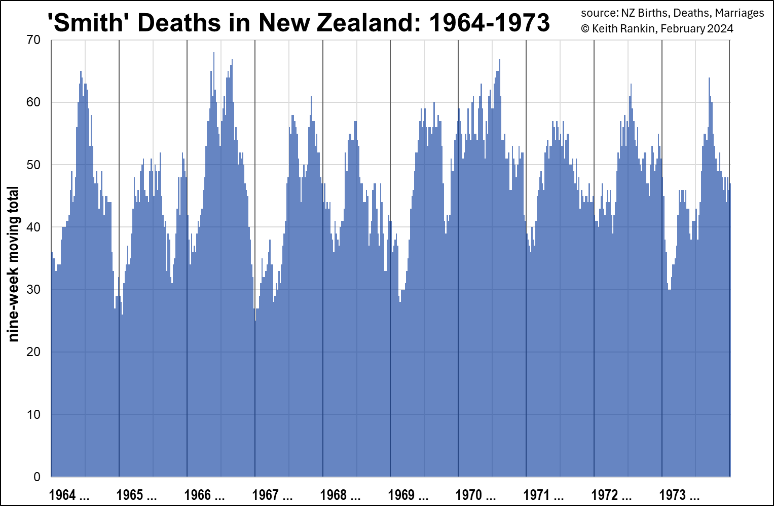
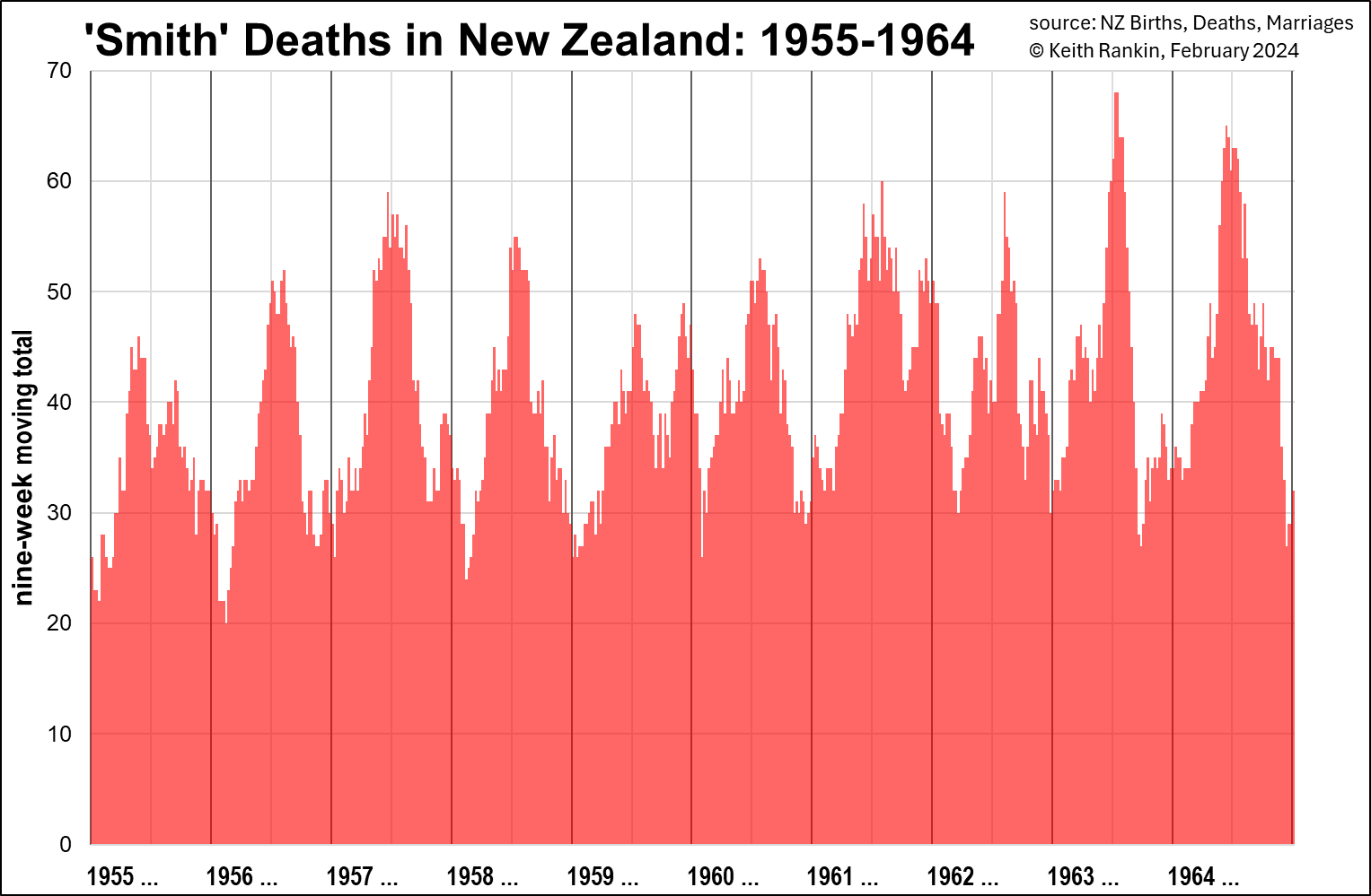
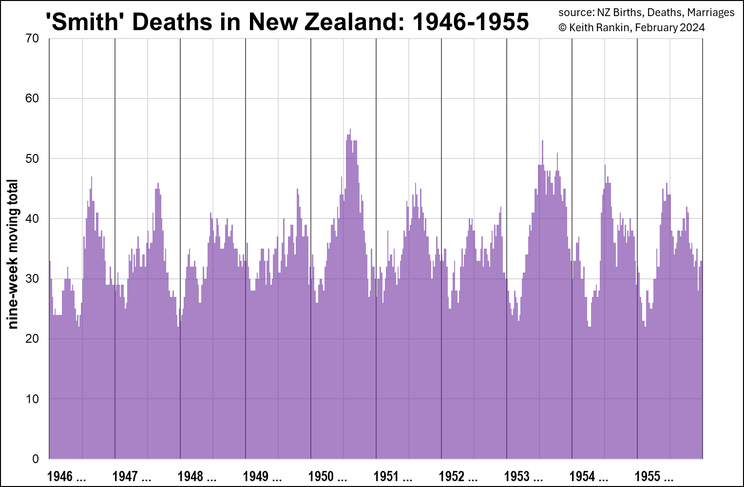
The numbers shown are nine-week moving totals, meaning that for the last week of July the data runs from the beginning of July to the end of August. The next datapoint drops the first week of July, and includes the first week of September. (This method addresses the randomness of death, and the randomness associated with the Smith sample.)
Secular Trend?
It is somewhat surprising that the numbers of deaths in 1973 were not much higher than in 1950. The population of New Zealand in 1973 was 3.0 million; in 1950 it was 1.9 million. More people should mean more deaths. But the age structures were quite different. In 1950, there were relatively many older people – thanks to the 1870 to 1895 baby boom. In 1973, there were fewer older men thanks to both World War One, and to the deceleration in birth numbers from the 1890s. With the partial exception of the early 1920s, that reduced birth rate lasted from around 1900 to 1945; though there was variation, with say the early 1940s having many more births than the early 1930s.
But, what goes around comes around. There was another baby boom from 1945 to 1975; a boom that is only just starting, in the 2020s, to markedly influence death tallies. So, as annual death numbers have been only on a slow incline in the lifetimes of those alive today, annual death numbers are set to increase dramatically. Just as individuals die, so do generations. And big generations die bigly.
(We also note that, in the 1940s and 1950s, infant mortality was much higher in New Zealand than in the 1970s.)
Mortality Peaks
The higher peaks in these charts can be attributed to influenza outbreaks. In addition, the winter seasonal highs are linked to the set of viruses – including coronaviruses – which we collectively know as the ‘common cold’.
Superficially, these charts suggest that ‘the flu’ and ‘the common cold’ are New Zealand’s grimmest reapers; are, together, New Zealand’s biggest public health nuisance. Further, the peaks in these charts seem to be getting higher relative to the troughs in the more recent data. Should this be a matter of concern? Didn’t we, by the 1970s, reach a state of hubris about infectious diseases?
Old Age
Death and taxes are (allegedly) the two principal certainties of life. If we don’t die of one thing, we die of something else. So, an increase of deaths triggered by ‘minor’ respiratory viruses can be explained, mainly, by a relative decrease in deaths from other causes such as heart disease and cancer.
And there may be more to it than that. The seasonal circulation of non-novel respiratory viruses may represent a kind of natural vaccination programme. So, at least for otherwise healthy working-age (and younger) people, the presence of these viruses in our temperate ecosystems may be contributing to our increased longevity. Less smoking and sugar, combined with more (not less) exposure to respiratory viruses, may be the essence of why life expectancies have risen in recent decades.
If so, then, the presence of highly seasonalised death patterns may represent a collective solution rather than a collective problem. On balance, influenza may be our friend, not our enemy. It may determine the timing of death in old-age rather than be a significant cause of premature death.
(Tactfully, Queen Elizabeth’s death certificate in 2022 simply attributed her death to ‘old age’. Old Age is a real thing, and not an expression of casual ageism. Indeed, ‘old age’ was the most important and truthful part of her death story; though, as is usual, a single attribution is not the whole story of a person’s death.)
Dry Tinder
Outbreaks of influenza (and other respiratory) viruses work like forest fires. Thus, after years with relatively few winter seasonal deaths, there is a build-up of ‘fuel’ meaning that there will soon be a year or two of higher numbers of seasonal deaths. Followed by years of below-average winter deaths. This is a normal pattern. When there is a large build-up of people of advanced age, there will be more deaths from old age. That’s the normal cycle of life. How do people die of old age? More often than not, such deaths are triggered by a seasonal infection.The aim of public health policy is to maximise the numbers of people who die of old age; minimising the numbers who die prematurely.
These charts, to a large extent, represent deaths due to old age. They also indicate years of more virulent strains of influenza.
The Charts
In the purple 1946-1955 chart, we see 1950 and 1953 as the years of elevated winter deaths, suggesting more dangerous influenza strains. We also notice secondary death peaks in late spring, early summer. In 1949 and 1952 these secondary peaks were higher than the primary winter peak for that year. Presumably, the end of the year is a time when people circulate more; and there will be more vulnerable people if the winter death tally was unusually low.
Looking at the red 1955-1964 chart we see 1956 looking much like 1950, suggesting two low-mortality years would be followed by a higher mortality year, presumably the ‘dry tinder’ effect.
1957 and 1958 were the years of the ‘Asian Flu’ pandemic (a novel strain of influenza), and it shows in the New Zealand data for both years; higher death tallies in years which would otherwise have had significantly fewer deaths. Many of these additional deaths will be of people who would otherwise have lived a few years longer. (Unlike the extremely lethal 1918 strain, most non-elderly people with good general health seem to have weathered this pandemic OK.)
As is normal after a respiratory pandemic (and this is certainly true in Eastern Europe after Covid19, where public health measures substantially subsided in the latter part of 2020), the death tallies for the next couple of years (1959, 1960) is significantly down. 1961 and 1964 were higher winter mortality years, as per the three-year pattern. (1963 had a sharp mortality peak, probably a nasty flu strain, followed by unusually low spring mortality.)
Looking at the blue 1964-1973 chart, 1968 to 1970 reflects the ‘Hong Kong Flu’ pandemic. Whereas the 1957 influenza strain was first reported around January of 1957, the 1968 pandemic strain was first reported in the middle of that year. There was no sign of it in New Zealand in 1968, or in early 1969. Then, in mid-1969, with a mix of ‘dry tinder’ and a lethal influenza strain, there was a longer than usual mortality peak. Then, after a short pause, the pandemic really hit in December, and lasted until August 1970. Like the 1918 pandemic influenza peak, and some of the Covid19 peaks, this was a summer shock.
1971 and 1972 were also high mortality years, suggesting that many who died from influenza in the early months of 1970 had been of working age rather than old age. There were still many frail old people in the population after 1970; people born during the first baby-boom era.
By 1973, we start to get the impact of diminishing relative numbers of older people; a combination of Word War and falling birth rates around the year 1900.
Prognostication
These charts show pandemic and substantial epidemic influenza outbreaks in New Zealand. And they show how ‘old age’ deaths follow a seasonal pattern; commonly triggered by a respiratory virus which would be weathered by the vast majority of people who did not have the characteristics of old age. These viruses are part of the wider ecosystem of which humans are very much a part. Further, the ecosystem of seasonal viruses is maintained by periodic appearances of virulent novel viruses.
There is no reason to believe that life expectancies could be raised by taking public health measures to eliminate influenza and ‘cold’ viruses. Rather, these viruses fine-tune our immune systems, and without that fine-tuning, average life-expectancy would probably fall. Indeed, one cannot imagine the possibility of healthy populations in the crowded metropolises of the world without regular exposures to non-lethal respiratory viruses; exposures tantamount to natural vaccination.
Note
From 1974, not all historical deaths can be accessed online. The rule is that, for today (13 February 2024), only deaths of people born on or before 13 February 1944 will be accessible. This means that 1974 data will not be comparable with 1973 data, because it will miss about a half of infant deaths. We should also note, however, that by 1974 infant mortality rates were substantially lower than they were in the 1940s and 1950s; meaning that late 1970s’ Smith data will remain broadly comparable. A substantial majority of the ‘Smithometer’ Smiths after 1973 will be older people.
*******
Keith Rankin (keith at rankin dot nz), trained as an economic historian, is a retired lecturer in Economics and Statistics. He lives in Auckland, New Zealand.


