Analysis by Keith Rankin.

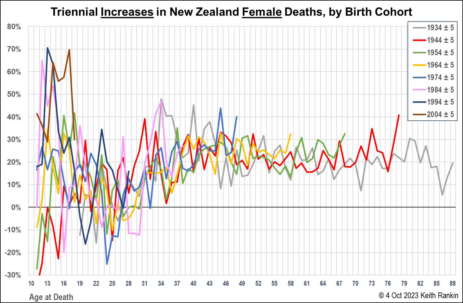
The above chart looks rather noisy, and so it should. Life and death are messy, and subject to random variations. But this chart, for females, and those that follow, are important charts. It’s worth looking through the ‘random noise’. These charts suggest that the cliché ‘we are all living longer’ is incorrect. Also, this representation of New Zealand’s mortality data highlights the experience of younger people, something hidden by most death and life expectancy data.
First, some technical information. Triennial death increases are three-yearly percentage increases in the actual number of deaths; in this case, the numbers of deaths for an age-cohort (aka. for a generation). These are 11-year age-cohorts; eg the 1970s’ age cohort here is made up of people born from 1969 to 1979. Hence it is listed as 1974±5 (where ± means ‘plus or minus’).
Consider the plot for people in the 1974±5 cohort who died aged 21. The number shown is 23%. Essentially, that means there were 23% more deaths of females in this 1970s’ birth cohort who died aged 21 compared to the number from that birth cohort who died aged 18. (This is equivalent to an annual increase in deaths of 7%. We note that the incidence of death among 18-21 year-olds remains very low, even if the numbers of deaths are increasing.)
The data has been ‘smoothed’ in the following way. The deaths of those aged 21 have been compared with the annual average of deaths for those people when they were aged 16 to 20. The reason for this smoothing is to remove distortion arising from random single-year impacts on comparison populations.
We note that, in the absence of immigration and emigration, each year the population of a birth cohort falls; the fall is slow when the birth cohort is young, and accelerates from middle-age. Certainly, from about age 30, the likelihood of death from natural causes increases, as the cohort population falls. Again ignoring net immigration for the time being, death increases with age should be positive (ie above zero percent); and approximately stable as the increased likelihood of death offsets the reduced cohort population size.
Adding emigration and immigration to the picture, for New Zealand at least, is likely to reduce the numbers of deaths of people aged in their early twenties (an age which typically features net emigration) and to raise the numbers of deaths of people in their thirties (an age which features net immigration).
A further point of interpretation. Where there are ‘spikes’ in the chart, it does not necessarily mean that death rates are falling in subsequent years. The spikes essentially show acceleration of death incidence. If death rates are high, then zero percent increases indicate that death rates are still high.
So, what does this first chart tell us?
First, we see that from age 30 onwards, each birth-cohort (ie each generation) has experienced about 20% more deaths every three years; this amounts to about a 6% annual increase in death numbers. The greater variability for women aged 30 to 50 most likely reflects variations in the rate of immigrant arrivals; and we should bear in mind that immigration in this age group includes large numbers of returnees, immigrants to New Zealand who were born in New Zealand.
There is no obvious sense that more-recently-born women are living longer or shorter than their elders. Though women born in the 1930s do seem to have been more likely to die age 35 to 45 than their daughters and granddaughters; probably a mix of aftereffects of childhood poverty in the Depression years, and of the high rates of smoking amongst that generation.
Second, all generation show at least one age from 20 to 25 where there were fewer deaths than three years previously. Emigration – in particular, extended ‘overseas experience’ – will have been one reason, though probably not the only reason.
Third, and perhaps most worrying, are the high increases in teenage death rates showing for people born after 1980. This will be partly due to falling death rates for people aged around ten. But is also likely to reflect the emergence of a growing underclass; child/teenage poverty in times in which underclass births have become a larger proportion of total births. While this data is for females, we’ll look at males shortly.

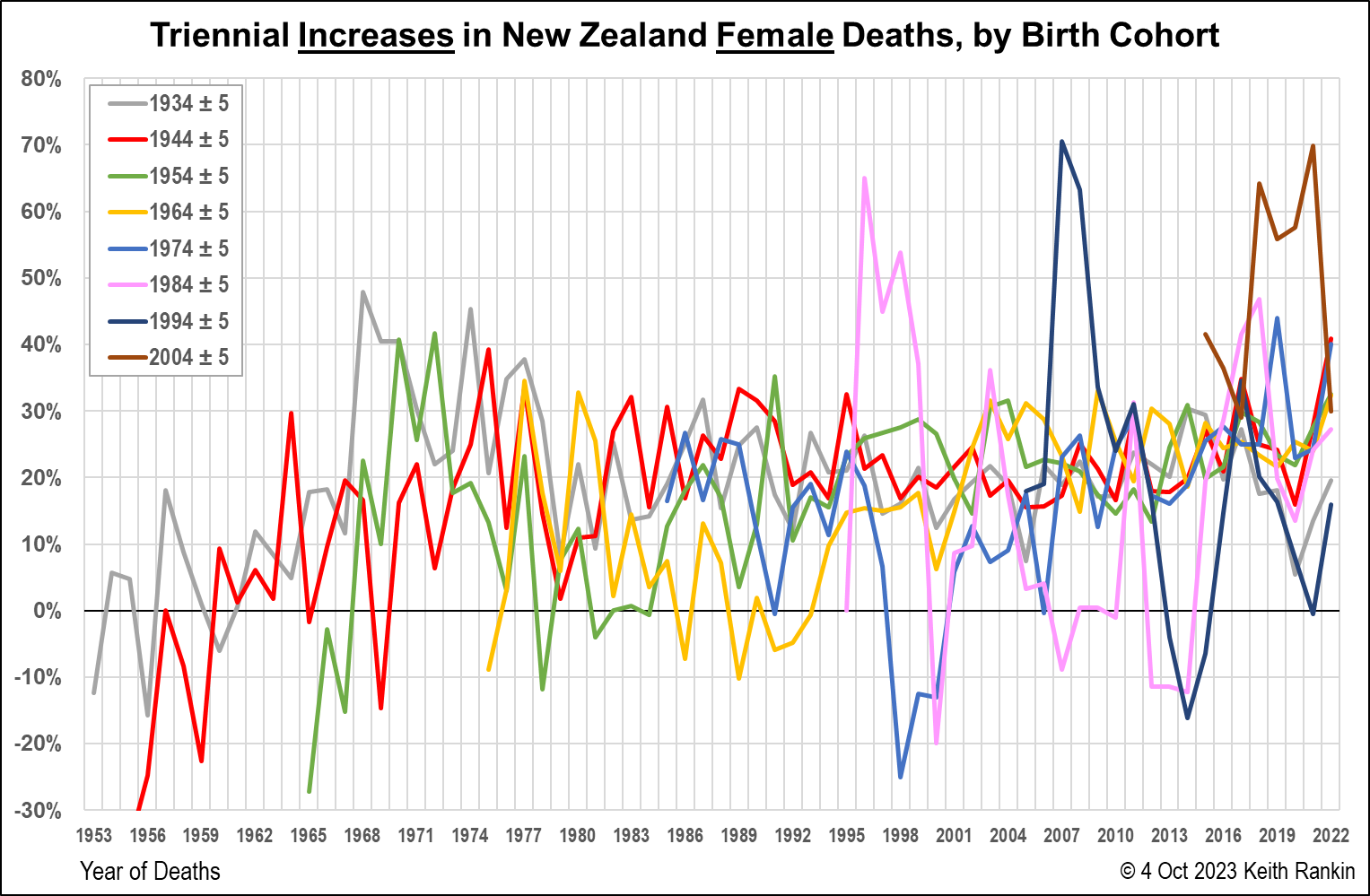
This second chart shows the same data as the first chart, though it’s plotted by year-of-death rather than age-at-death. This chart shows particular high-death or low-death years. 1957 and 1968 were influenza pandemic years, and it shows, especially for the 1930s-born age cohort. We can also see death peaks in 1977, 1980, 1987, 1995, 2003/04, 2011, 2017, and 2022.
We note the big fall in the late 1990s in deaths of the 1970s’ born. This will be due to particularly heavy emigration of young people in the 1990s; emigration resulting from the record-high unemployment levels in the early 1990s.
The other feature prominent in this chart is the experience of teenagers born from 1979 to 2009. These are most likely to be due to increased mental health issues faced by teenagers born from the 1980s, perhaps combined with other issues around childhood immunity to pathogens. Anecdotally, we do hear about increasing incidences of conditions such as asthma and allergies; conditions possibly due more to over-cleanliness than to exposure to pathogens.


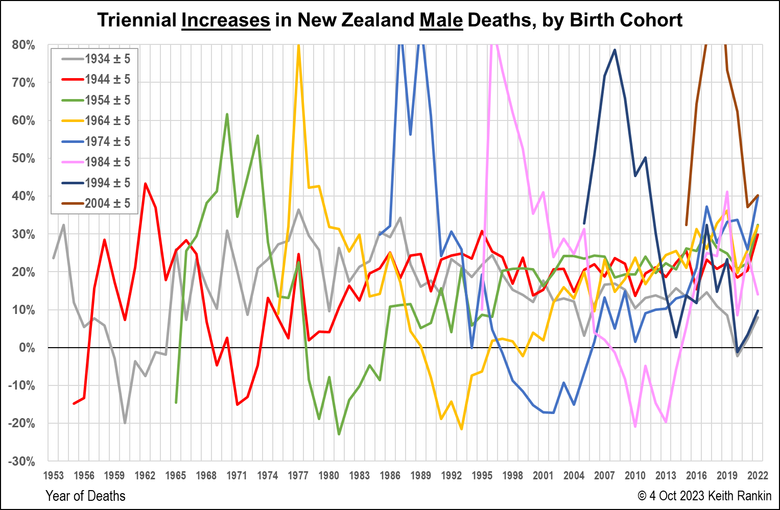
Comparing males with females, we see that the ‘teenage issue’ is substantially more prominent with males, and more clearly extends back to older generations. In the case of teenage males, we note a greater propensity to risky behaviours, and also the greater likelihood of death by suicide. On the matter of risky behaviours, the most prominent feature of risk-taking was vehicle crashes.
(A particular note re my own memories. 1973 was the worst year ever for road deaths in New Zealand, and one group overrepresented were motorcyclists aged around 18 to 20. Look at the green 1950s’ birth cohort. While I neither died nor got injured from such a crash, that was me; born in 1953, and an active student motorcyclist. I knew a number of people who did have serious crashes. And I attended two funerals in 1973; both born in 1952, one in a mountaineering accident and one suicide.)
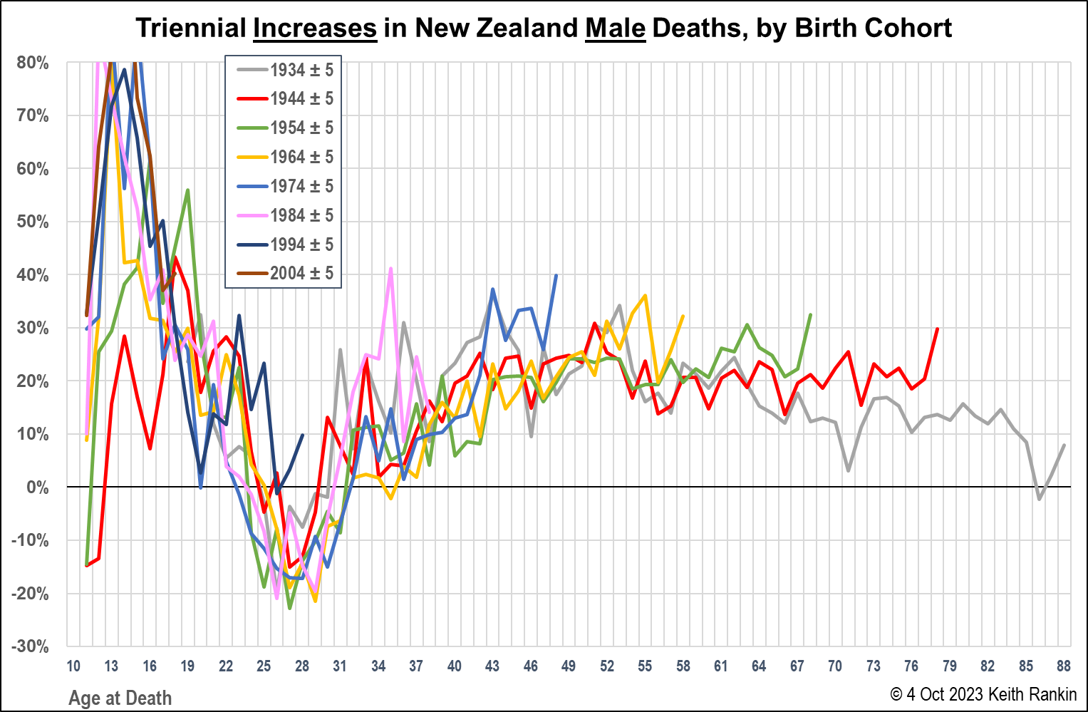
In the final chart, we again see no evidence that the younger generations are healthier – or more likely to be long-lived – than their parents’ generations. Further, those born in the 1990s are not showing the decline in deaths in their early 20s which characterised previous generations. Though this may be due to less emigration; ie to changes in the culture of ‘overseas experience’ with more young people taking short trips rather than an extended or indefinite period of absence from New Zealand.
The last year of data is 2022, the year of high Covid19 mortality in New Zealand. New Zealanders born in the 1970s appear to have been hard-hit by Covid19, whether by the infection itself, or as a result of other circumstances associated with the pandemic. A 40% triennial increase in deaths in 2022 cannot be explained entirely by immigration.
Finally, in terms of the charts, we see that for older people, cohort death increases have been less for males than for females. This is because there are fewer older men than older women; meaning that more ‘past deaths’ of older men means relatively fewer ‘present deaths’ of older men.
Explanatory Context
Finally, I should mention the work of prominent (and still living) twentieth-century demographer Richard Easterlin (b.1926). His central insights were that baby-bust generations have more successful life-outcomes, on average, than baby-boom generations. (This may be modified, by the conclusion that ‘trailing baby-boomers’ – eg Gen X – would do less well in life than ‘leading baby-boomers’.)
And that the advantages/disadvantages of each age-cohort would show up in death rates, and would persevere throughout their cohorts’ lives.
The recent data that I have shown here modifies the first insight. Young people born in the 1980s – a baby bust period – have higher teenage death rates than those born in the 1960s and 1970s. My modification to Easterlin’s conclusion is that increasing inequality and poverty within a nation-state will also have an adverse impact on the life outcomes of a generation; especially given that, for today’s younger generations, children are overrepresented in the poorest households.
On Easterlin’s second insight, it’s too early to tell if unusually high teenage death rates for recent birth cohorts will also translate to unusually high death rates for these generations when they reach middle-age and old-age. But it’s looking likely that triennial death toll increases for people born in New Zealand after (say) 1970 will continue higher than for people born in the 1940s, 1950s, and 1960s.
This means that I am questioning current official life-expectancy projections as too optimistic, given that they are biassed by the experiences of people born before 1970. Not only are we not all living longer, as the purveyors of retirement savings’ schemes claim, but my prediction is that true life-expectancy (an average) for people born after 1970 is actually lower than it is for people born between 1940 and 1970. Indeed, some United States data already shows this for that American country. I can see every reason to believe that New Zealand will follow this turning trend already apparent in official United States’ mortality data.
*******
Keith Rankin (keith at rankin dot nz), trained as an economic historian, is a retired lecturer in Economics and Statistics. He lives in Auckland, New Zealand.


