Analysis by Keith Rankin.

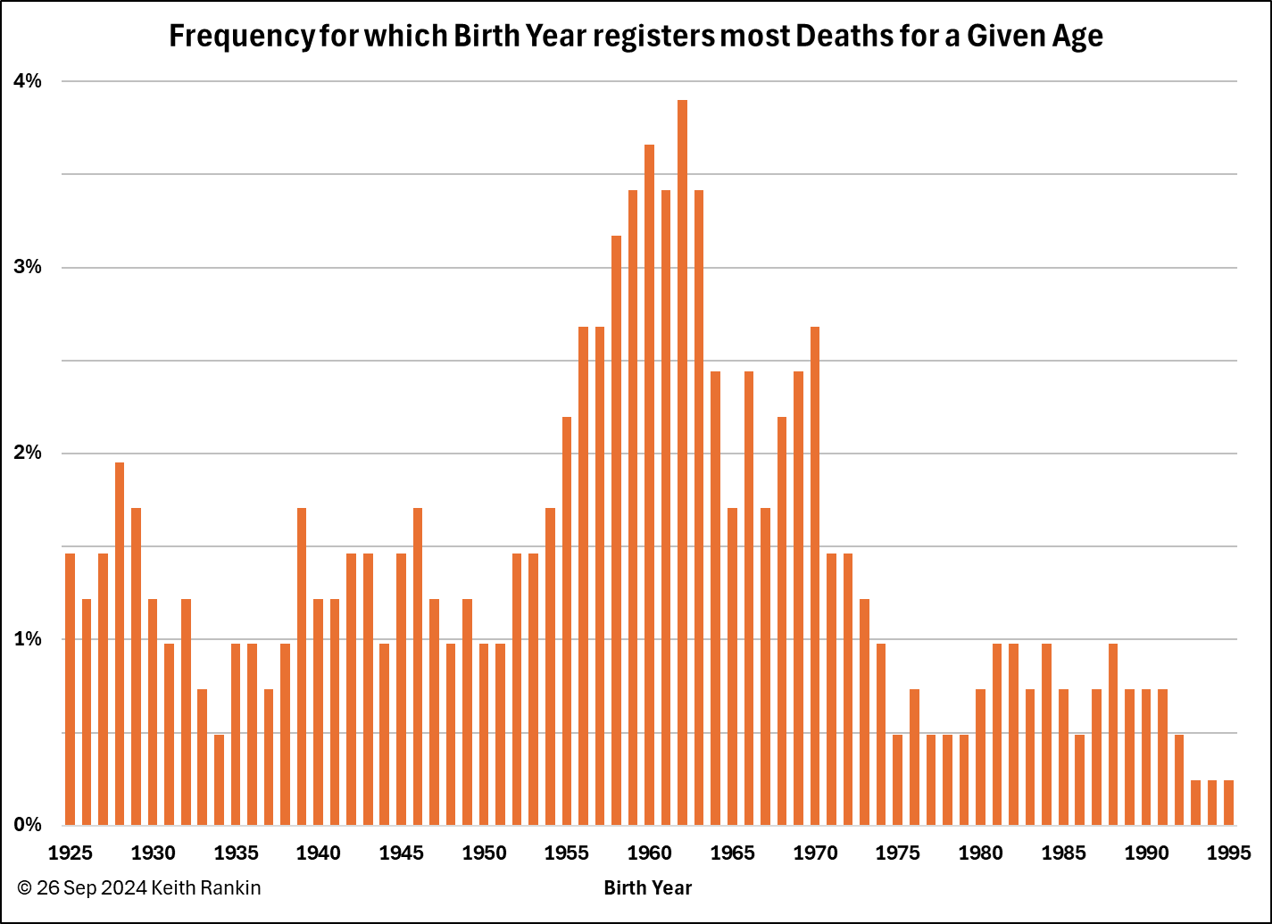
This chart essentially shows the stresses that New Zealand’s public health system can expect to face. I have analysed the death data by age, covering all deaths from July 1998 to June 2024. For those years (using June years) I have looked at every age of death from 16 to 99 and every birth year from 1900 to 2022, and counted deaths by birth-year.
For death-age 95, the most frequent birth year was 1928. As we would expect, most deaths at these high ages occurred in 2022 or 2023, thanks to Covid19. Thus, birth years in the 1920s feature in the chart.
Birth years in the early 1930s don’t feature so much because of the low birth numbers in those years. With fewer people born in say 1933, then 1933 will not often feature as the most frequent birth year for any given age.
Birth years around 1950 do not feature. This is both because the classic baby boomer generation is a healthy generation, and also because there were not as many births in the decade after World War Two as there were in the following two decades. So, while classic baby boomers will place an increasing burden on the public health system, the biggest burdens will come from those born between 1955 and 1975. (Also, classic baby boomers have high levels of private health insurance; this will be less affordable for subsequent generations as they age.)
Birth years from 1955 to 1964 feature most strongly, mainly because births in New Zealand peaked in those years. This birth cohort will place massive pressure on New Zealand’s public health system. People dying since 1998 between age 37 and age 67 are most likely to have been born in the years either side of 1960.
The cohort born 1966 to 1974 will also place huge pressures on Te Whatu Ora (Health New Zealand), in part because there are likely to be very many new Aotearoans in this birth cohort. By and large, immigrants are healthier than the New Zealand born population, because their health is considered before New Zealand residency can be granted.
The late 1970s represents a ‘baby-bust’ generation, like the early 1930s. Hence these ‘Gen-Y’ people don’t feature in this chart. The frequencies for the late 1980s’ and early 1990s’ birth years reflect the ‘baby blip’ which began in 1987. Also, these birth years relate to death of young people, which, being less frequent, can also be a bit more random.
People born in 1939 turn 85 this year. From 1938, birth numbers generally increased each year until the early 1960s. The impact of an aging population on New Zealand’s public healthcare system is certainly beginning. This impact will escalate each year for at least the next 25 years. People born in 1961 will turn 85 in 2046.
By contrast, we have been lulled into complacency because the unusually small early-1930s’ birth cohort placed a substantially below-average pressure on public healthcare.
We note that death numbers are a proxy for the demand for high-intensity healthcare. People born after 1955 are already making considerable demands on Aotearoa New Zealand’s health care.
*******
Keith Rankin (keith at rankin dot nz), trained as an economic historian, is a retired lecturer in Economics and Statistics. He lives in Auckland, New Zealand.


