Analysis by Keith Rankin.
The topic of financial debt is one of the hardest for humans to get their heads around. The normal understanding of a debt is a sacrifice made by one party (the owner of the debt) in favour of another party (the ower) which will be remedied some time in the future by the ower (ie debtor) making a sacrifice – repayment – in favour of the owner (ie creditor).
In the financial world it’s not so simple, in particular because the owners of debt (ie creditors) tend to see themselves as making a financial investment; a transaction which they do not regard as a sacrifice (or much of a sacrifice). What they seek is a reward in the form of interest, or as financial security; this latter reward is akin to insurance, money in the bank stashed away for a rainy day and most likely accruing interest in the meantime. Generally then, creditors to not want to be ‘paid back’, but they do want their ‘investments’ to be ‘serviced’. And while most debts have a ‘maturity date’, the normal desired result on the part of both debtor and creditor is to have maturing debts ‘rolled over’.
The first three charts show the debt context for United States, New Zealand and Australia from 1980 to 2022. They show changing surpluses (above the zero line) and deficits (below the zero line). These three countries are ‘debtor countries’ – ie with respect to other countries – although of these only United States has a substantial government debt. (Most people – and especially most mainstream media – confuse a country’s indebtedness with that country’s government debt.)
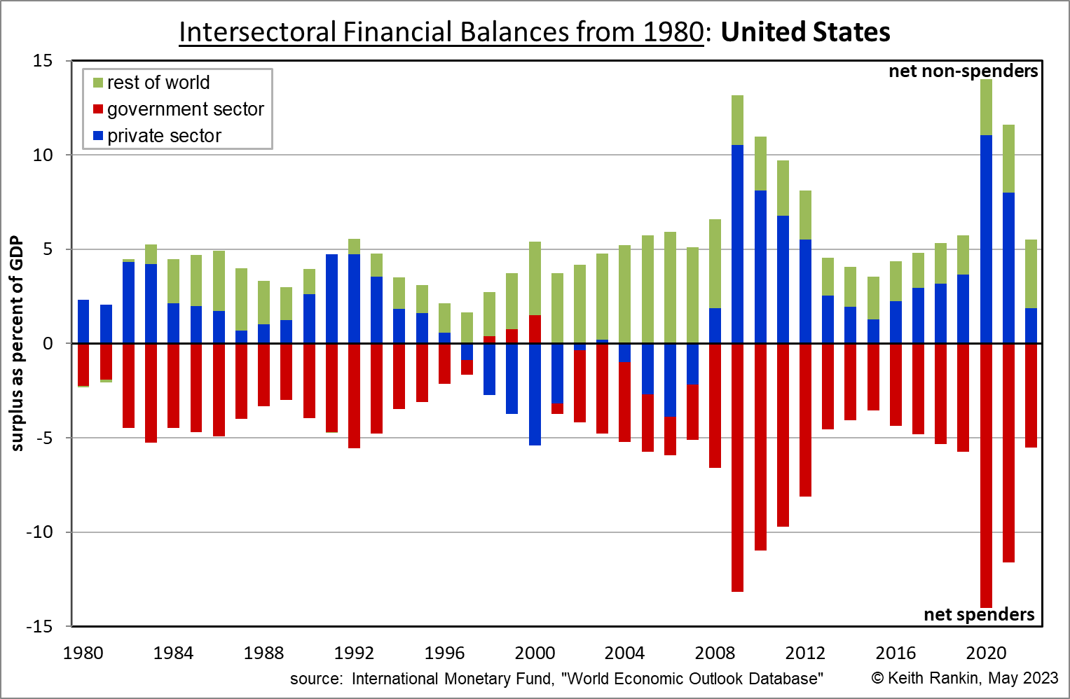
In the United States chart above, the green surplus plots indicate that, every year from 1982, the United States has incurred debts to the rest of the world. Hence we can say without equivocation that United States is a debtor country. Each year since 1982 the United States has spent more than it earned, and the rest of the world has spent less than it earned.
The other dominant feature of the United States chart is that in every year except 1998-2000, governments in the United States have run deficits, so have increased their debts. So the size of United States government debt today is at a record high, having increased just about every year. Many would regard this huge ‘rolled-over’ government debt as a sign of economic weakness, but in fact it’s the opposite. Further, this debt – this annual spending excess on the part of the United States government sector – is the single most important driver of growth of the world economy. It represents demand for American and other countries’ goods and services.
In the USA, the private sector – mainly businesses and households – is in most years a saving (ie non-spending) sector; although the private sector part of the chart masks some important detail. Since about 2000, businesses have been net savers most years while households have been net debtors in many years, especially in the early years of the century. This is the opposite of what most economists believe should be happening; the traditional economic model of finance shows growth as being driven by households lending their savings to businesses, typically through intermediaries such as banks.
We see sharp behaviour changes in 2008/09, the Global Financial Crisis; and 2020, the Covid19 pandemic. In 2008 it was largely the private sector that forced the change, whereas in 2020 it was mainly the government sector that had to borrow and spend on a massive scale both to fund public health measures and to compensate for an expected dramatic decrease in private spending.
The United States economy is very much defined by the process of government debt being both rolled-over and extended. Problems come when there emerge political impediments to this process. The politics around the United States debt ceiling represent the threat of such impediment.
Before going on to New Zealand and Australia, we need to note two rules that represent laws of arithmetic. The first of these is that the total net spending of the spenders must exactly equal the total non-spending of the non-spenders. We may think of, since 2008, that American governments are buyers while private Americans and foreigners are sellers. The arithmetic constraint is that the total amount of sales must exactly equal the total amount of purchases.
What this means is that if any sector successfully changes its financial behaviour, then at least one other sector must also change its behaviour. So, in 2008/09, the increase in private saving – mostly in the form of private debt repayment – could only have been achieved if the American governments spent more or if the rest of the world saved less. American government obliged by creating the money it needed to spend more.
The other arithmetic constraint is that the world as a whole can neither run a surplus nor a deficit. So if the ‘rest of the world’ changes its behaviour towards the United States, then it must also change its behaviour with respect to at least one other country. (The green plots of one country’s chart connect to the plots for other countries.)
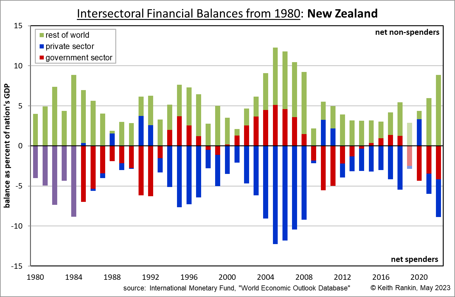
The New Zealand chart above shows that for New Zealand also – indeed since 1982 – the rest of the world has run financial surpluses every year. That makes New Zealand, unequivocally, a debtor nation. However the big difference, at least from 1991, is that New Zealand has a debtor private sector rather than a debtor government. Indeed the driving force of New Zealand Incorporated is private sector debt; business and household debt.
New Zealand is in a less privileged position than the United States. The United States dollar is the world’s reserve currency, so savers in the world incline to save by lending to the United States. It also means that the United States domestic economy is the world’s consumer of last resort. (That’s how the United States has been able to fund its wars.)
New Zealand’s chart structure as indebted private spenders is driven by three factors. First is the general lack of fear of debt by New Zealander businesses and households; at least a lack of debt-fear compared to the citizenry of other countries. The second is a monetary policy which ensures that interest rates are high enough to attract foreign savings; indeed the understated subtext of monetary policy in New Zealand is that, in order to keep the nation going as per the above chart, the New Zealand dollar must be kept in a perpetual state of overvaluation. The third factor is a New Zealand exceptionalism which is generally subscribed to by foreigners; indeed former prime minister Jacinda Ardern did much to foster that marketing of New Zealand as an exceptional country. Thus New Zealand has a low international ‘risk premium’ on its interest rate settings; South American countries otherwise like New Zealand would need much higher interest rates to get away with a chart like the New Zealand chart above.
Interestingly, last week’s most recent monetary policy statement was seen by the financial world as ‘dovish’, meaning that interest rates in the next few years are now expected to be lower than they were previously expected to be. The result in the last few days was a significant fall in the value of the New Zealand dollar. If the financial surpluses of the rest of the world with respect to New Zealand fall – the green plots on the chart – then the private sector deficits will also fall, and New Zealand will move into recession unless the government commits to much bigger fiscal deficits.
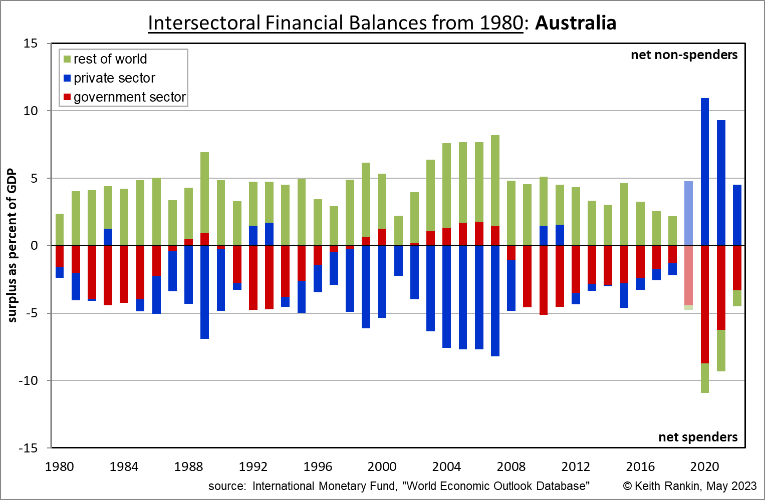
The Australian chart is historically much like New Zealand’s. Except, from 2020, Australia is moving away from dependence on foreign credit; hence it is keeping interest rates much lower than New Zealand’s, enough to achieve a fine balance with the rest of the world. Also, Australia is looking to be more relaxed about future government deficits than New Zealand is.
We should also note that the 2019 data are misleading for both Australia and New Zealand. This is because annual data in these countries is reported internationally on a June year basis. Thus, to convert to a December year, the IMF (for example) averages the year to June 2019 with the year to June 2020. Hence, the Covid19 impact has found its way into the 2019 data for New Zealand and Australia.
I include four other countries to show how different much of Asia and Europe is from United States, Australia and New Zealand.
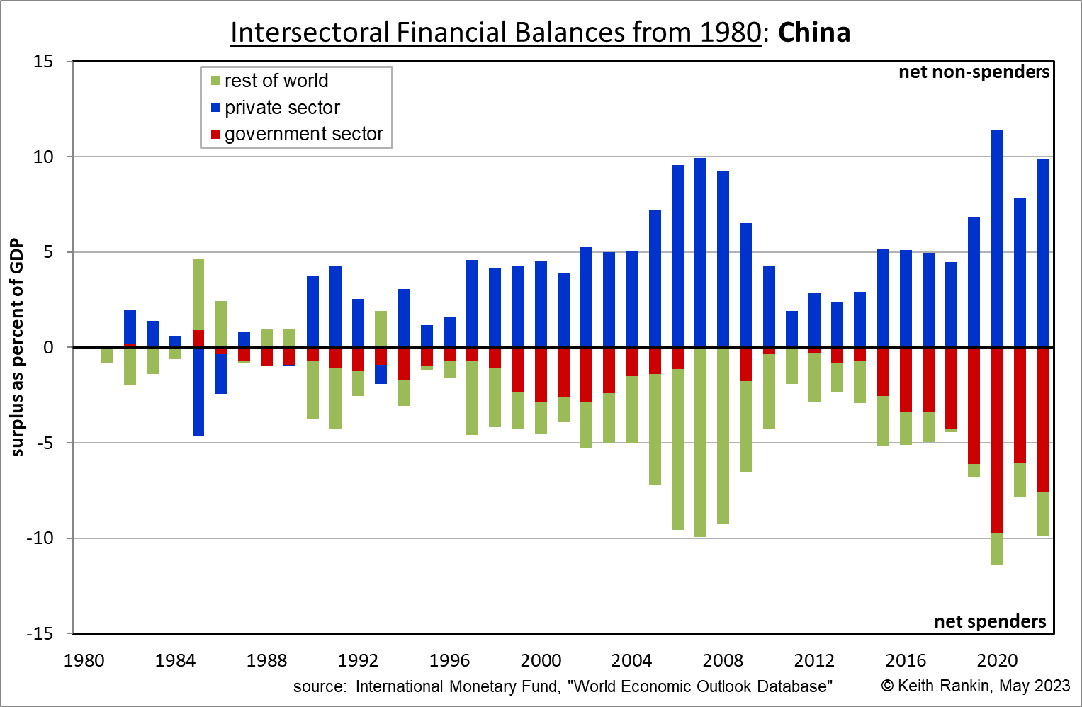
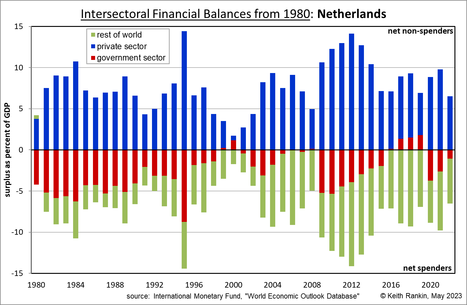
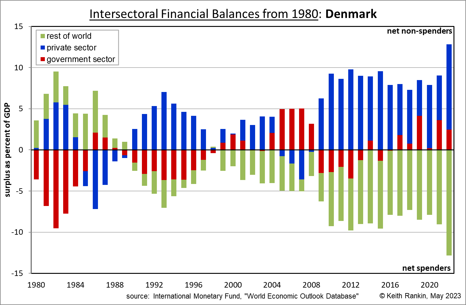
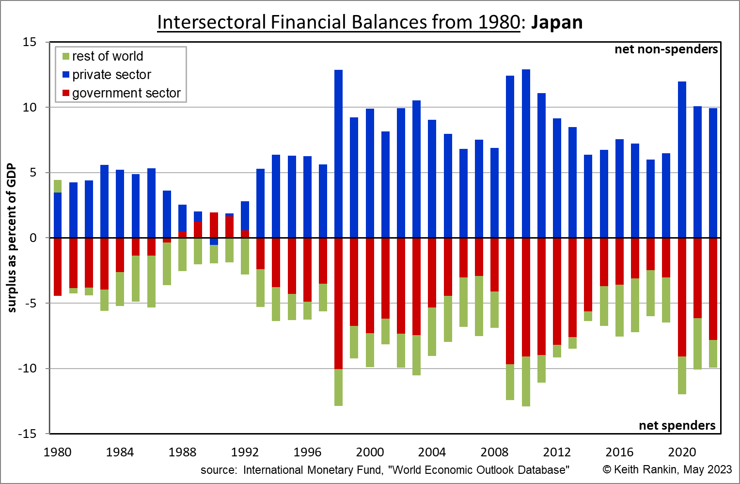
In these charts the ‘rest of the world’ is a net spender, meaning that these four countries export – each year – more than they import. We may note that, in the United States chart, the rest-of-the-world non-spending was mainly China. This role of China has much diminished in the last ten years. Now it is the European Union which is acting as the biggest net creditor. Netherlands best represents the European Union’s ‘exporter’ financial strategy, because it is in the Eurozone. Denmark on the other hand, while in the European Union, has its own currency which it can manipulate (through lower interest rates) in order to achieve an ongoing status of having a slightly undervalued currency (ie the exact opposite of New Zealand’s monetary policy subtext).
Note that Japan has easily the most accumulated government debt of any country in the world. It’s a strength, not a weakness. (Indeed Japan’s government only ran fiscal surpluses ahead of its very severe financial crisis around 1990.) At present Japan has an OCR equivalent interest rate of minus 0.10 percent and an inflation rate of 3.5 percent. So much for needing to have high interest rates to suppress inflation. Japan’s secret is that it is at minimal risk from foreign creditors changing their perception of Japan’s creditworthiness. Denmark, also at minimal risk, has an interest rate of 2.85 percent and annual inflation at 5.5 percent.
Notes
Since the Eurozone financial crisis of 2012, the European Union has pursued a financial policy of running current account surpluses and balanced budgets. Thus, the Euro interest rate has been kept lower than other major economies, keeping the Euro slightly undervalued. A slight undervaluation for the Eurozone as a whole translates as a very substantial undervaluation for two countries in particular: Germany and Netherlands. That’s why the chart above for Netherlands shows that the rest of the world has large deficits with respect to Netherlands, and why the Netherland’s domestic economy runs persistent financial surpluses. Netherlands is a chronic non-spender.
And note that, in the long-run the surplus countries (eg European Union, Japan, China) subsidise the deficit countries (eg United States, New Zealand). The higher the rates of global economic growth and global inflation, the higher the rate of subsidisation. New Zealand – in particular, the New Zealand private sector – is one of the great winners of this financial subsidisation game.
*******
Keith Rankin (keith at rankin dot nz), trained as an economic historian, is a retired lecturer in Economics and Statistics. He lives in Auckland, New Zealand.


