Analysis by Keith Rankin
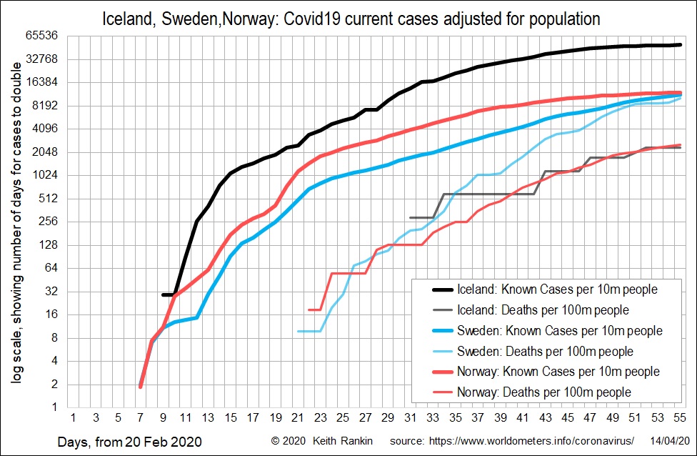
Today’s first chart looks at three Nordic countries: Iceland, Norway and Sweden. These give us a basis for analysis of underreporting of Covid19, in the main due to limited testing.
Yesterday, Norway was shown as a high incidence ‘recovering country’, even though it was less recovering than South Korea. Iceland, however, has had the worst incidence of Covid19 among the Nordic countries; though it has a low death rate. Iceland also happens to be a very small country with a very high testing rate. So, it’s a fair assumption that Iceland’s known incidence is close to its actual incidence of Covid19.
There is no obvious reason why the incidence of Covid19 should be greater in Iceland than in Norway. Yet the data shows Iceland’s incidence to be five times greater. This is likely to be the extent of the undercount of cases in Norway.
Known cases in Norway (which has flattened) are just a little higher than known cases in Sweden (which has not yet flattened). But deaths per capita in Sweden are four times higher than in Norway and Iceland. This suggests that Sweden’s undercount is much larger than Norway’s. Indeed it suggest that Sweden’s undercount is four times greater than Norway’s, which I have suggested is a fivefold undercount. That would make Sweden’s case undercount twentyfold.
This would mean that Sweden’s official count of 11,445 – multiplied by 20 – gives 229,000; over 2.2 percent of Sweden’s population. That would mean half a percent (five Swedes in 1,000) dying from Covid19, which feels about right.
Of course this is not the end of the matter in Sweden; it would seem likely that, eventually, ten percent of Swedes will contract Covid19; one million people. That is a likely final case incidence for a country for with a substantial amount of ‘natural’ physical isolation and a high normal degree of physical mobility.
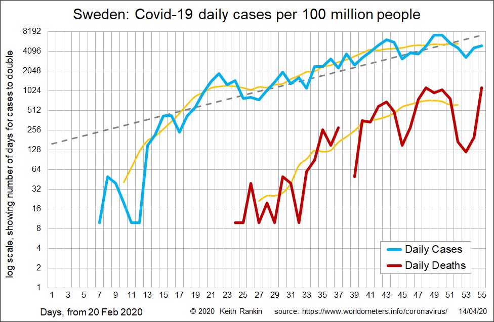
Today’s second chart looks further at Sweden. It shows daily known cases, and daily deaths. The yellow lines represent seven-day moving averages. While there is a hint that the long period of exponential growth may be slowing, the proviso is that Sweden – more than any other country I have seen – treats Covid19 largely as a Monday-Friday phenomenon. Deaths in particular are very few in weekends, and last weekend was longer than most.
Sweden has become known as the country most dismissive of the Covid19 threat, and with the fewest restrictions imposed on its people. (Even Brazil has more restrictions, albeit mandated at the state government rather than the federal government level.) Unlike Brazil, there seems to be widespread support for its ‘economy-first’ approach; an approach seemingly led by its ‘public health’ bureaucracy rather than its elected politicians.
Sweden will not experience the tragedy that has been Spain, thanks to voluntary measures informed by Italy and Spain. Sweden stands in marked contrast to Norway and Iceland, both themselves major victims of the new corona virus.