Analysis by Keith Rankin
While, United States’ local data on Covid19 is more readily available than for other countries, the American ‘county’ system of local governance is way out of date and often does not well represent urban conglomerations.
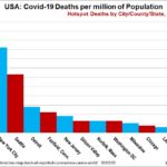
Doing my best from the available data, I constructed the following chart yesterday evening, and will update it again later today, once all states have reported for 30 March.
There are two pictures in this chart. The big new story is the emergence of New Orleans, Detroit and Milwaukee as Covid19 death hotspots. These are poor cities, and they represent the story that will emerge in April.
The March story, however, is that the highest deaths – reflecting incidences of infection in the first half of March – are the jetsetter spots (refer to A Jetsetter Disease), the places where the one‑percenters are found in disproportionate numbers, the places where people who travel business class are more likely to live.
These include New York City, Seattle (King County, Washington), Fairfield County (Connecticut), Silicon Valley (Santa Clara County, California), Norfolk (a large commuter county on the southern side of Boston), and Las Vegas (Clark County, Nevada).
Washington DC is a special case that’s demographically poor, but where the residents come in contact with the rich. (While the Virginia death rates are not yet so high, case statistics in Virginia are highest in Arlington County, which is in fact the high socio-economic suburb of Washington.)
New Jersey is a mix of relatively poor ‘New York’ suburbs, affluent areas like Princeton and Atlantic City, and relatively prosperous suburbs of Philadelphia (which is in Pennsylvania).
The Los Angeles data is still low overall, but this is a ‘super-city’ as we understand in Auckland, so the data masks the spread of cases within that conglomeration. Chicago (Cook County, Illinois), also, is not yet a hotspot. But watch!
The data for the prosperous communities – where the disease arrived in the United States – will soon be engulfed by the data for the poorer cities (where many houses are empty, and many others are overcrowded). So, it is important to take stock now of the initial Covid19 hotspots.
Also, with both state and county boundaries running through many of the big urban centres, it is not only the statistics that are disjointed. The ability of local and state governments to impose quarantines is severely compromised when boundaries run through cities rather than around them.