Keith Rankin Analysis: Migration within New Zealand: Evidence from the Election
New Zealand does not have reliable regional population statistics. The intercensal estimates that Statistics New Zealand publish are based on the extrapolation of trends that existed before the most recent census; in this case, the 2006 to 2013 trend. Sub-national population estimates are heavily revised after each census.
Last week I showed how, in the preliminary vote count for the 23 September election, the Auckland electorates revealed lower than expected vote tallies, and provincial New Zealand much higher than expected. These results meant that the population of Auckland had barely increased since 2014, or that Auckland had a disproportionate amount of uncounted special votes. Now that the final vote tally has been released, we see that both of these possibilities are true.
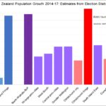
In today’s chart, I have grouped all electorates into regional categories, with greater Auckland divided into three categories: Auckland National, Auckland Labour, and Auckland fringe. Auckland National is those electorates in the isthmus, North Shore, and Pakuranga/Botany which have had a National MP for all this century. Likewise, Auckland Labour, which covers mainly the former Waitakere and Manukau cities, plus Tāmaki-Makaurau. While in many ways, Mt Albert and Mt Roskill are now a better fit with Auckland National, I have nevertheless included them with Auckland Labour. Auckland fringe is Helensville, Upper Harbour, Rodney, Hunua and Papakura.
The other particularly interesting grouping is the provincial ‘North-Waikato-BoP’: Northland, Whangarei, Waikato, Coromandel, Bay of Plenty, East Coast, Taupo, Taranaki King Country.
The chart shows the percentage increase in votes in these groups of electorates, adjusted by the overall increase in voter turnout (from 77.9% in 2014 to 79.67% in 2017). Thus, the chart gives an estimate of the increase in voter-age population in each electorate grouping.
Auckland Labour shows the smallest voter-age population increase. However, the higher overall voter turnout is not reflected in some of these electorates, which contain many of our most disengaged young people. Some residences and schools in South Auckland are undoubtedly overcrowded, and with disproportionate numbers of children.
We note that Tāmaki-Makaurau showed a particularly low vote in 2017, while other Māori electorates showed substantial percentage increases. This is strong evidence of ‘brown flight’ from Auckland to the provinces.
Of particular interest is the Auckland National grouping of electorates, which is the principal territory of the 2012-2016 Auckland house price bubble. There is evidence of a substantial net outflow from these nine electorates; partly people moving out of Auckland, and partly other people not moving into Auckland who otherwise would have moved to Auckland. It looks suspiciously like ‘white flight’, with the recipient electorates being on the Auckland fringe, the wider Auckland hinterland, and probably wider provincial New Zealand (including the South Island).
Other metropolitan electorates also showed slower population increases than their provincial hinterlands. Christchurch, not surprisingly, shows much growth on its fringe and little growth in its suburbs.
Dunedin shows least growth in its northern electorate. Hamilton mirrored this in its eastern electorate. So did Palmerston North, and Auckland Central. (Hamilton and Palmerston North are grouped together in North Island large provincial cities.) Cities with growing proportions of international students are certainly showing much smaller increases in votes cast.
To summarise, the major demographic features of the 2017 election are the redistributions from city to fringe (and hinterland) in Auckland and Christchurch, the distribution of non-voting international students, and the increase in provincial Māori.