Keith Rankin Analysis – Auckland Population: Evidence from the Election
Last year I wrote that there is no evidence of disproportionate population growth in Auckland, and even suggested that a number of central Auckland suburbs may be experiencing population decline. (See Immigration, and Immigration and Auckland Housing.)
I have done a preliminary analysis of the electorate voting statistics. The election statistics are based on electorates drawn up on the basis of Census 2013 population distribution. Electorate boundaries were the same in 2014 and 2017.

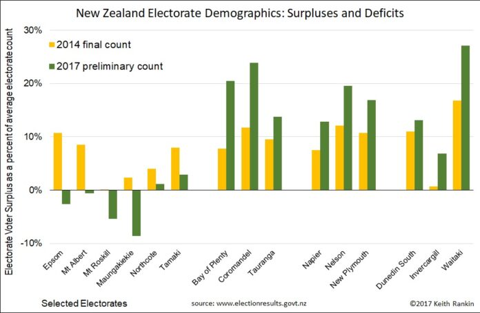
In today’s chart, showing selected electorates, the yellow bars show a surplus (positive percentage) either if the electorate has an above-average voter turnout, or if population increased disproportionately since the March 2013 census. The green bars will be lower than the yellow bars either if the electorate has had slower than average population growth since September 2014, or if the electorate has more special votes than the national average.
The results clearly show that there has been a net population flow from Auckland to the Bay of Plenty region; a flow that picked up after 2014. There has been a similar net flow to the ‘N’ provincial cities, and to Oamaru (Waitaki) and Dunedin. And the depopulation of the far south (eg Invercargill) appears to have reversed.
These are just preliminary results. I will do a more comprehensive analysis next week, after the final vote count. Certainly special votes may be disproportionately in Auckland.
These statistics shown do give the lie to the commonly repeated claim that net immigration into New Zealand is disproportionately into Auckland. And they do support the many anecdotal stories about Aucklanders selling up and moving to the more affordable provincial cities and towns.
When the electorate boundaries are redrawn after the 2018 census, Auckland might actually lose an electorate.
]]>


