
Analysis by Keith Rankin.
Role: Economic historian.
Keith Rankin, 26 August 2026
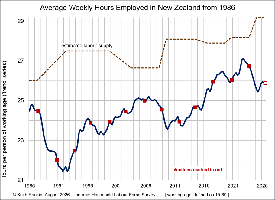
The above chart shows average weekly hours worked over the last 40 years. It’s calculated by taking total hours worked – according to the Household Labour Force Survey – divided by the population aged 15-69. Triennial elections are depicted in red.
The data series commences in 1986, in the year after the very neoliberal Rogernomics economic policy regime was implemented. Employment in the 1980s peaked in 1986. New Zealand’s long recession cycle began that year, interrupted by a brief ‘sugar hit’ before the August 1987 election and by a partial recovery in 1989/90.
Overall, this data is as accurate a picture attainable of the busts and growth phases of the New Zealand economy. This series – of hours worked – does not show the cyclical lag generally associated with unemployment data. Based on the latest data shown here, the cycle would appear to have turned down again, after a mini-boost in the summer of 2025/26. (There was a similar upturn in 2011.)
The chart also shows, in a stylised way, the relationship in post-1984 New Zealand between labour supply and hours worked. While the fluctuation in hours worked is a direct function of the demand for labour – which in turn is a function of aggregate demand in the national economy – the state of the labour market feeds back into labour supply. Labour supply can be understood as the total number of hours offered to employers.
The clear increase in labour supply over the period as a whole is known as the added-worker effect; refer my Retirement Age Labour in New Zealand, Scoop, 16 July 2026.
Wikipedia is too restrictive of its definition of this effect. In the 1980s the main demographic of additional workers was ‘married women’. In the 21st century the main demographic of additional workers is older people who would otherwise be categorised as retired.
In the 2020s another important demographic is young people (15-24) who would otherwise have been in fulltime education. In the Great Depression of the early 1930s, the biggest group of additional workers was single young women; though all demographics other than males aged 20-64 did show up as additional workers.
It is important to note that to be an additional worker you do not have to be employed. You only have to be in the labour force, meaning that you prioritise income earning over some other activities such as education or care-giving or voluntary work or leisure. And additional workers include people who hug their jobs; such as people who might otherwise have retired, had a child, or taken a gap year.
Then there is ‘additional work’, mainly characterised by existing workers seeking a second or third job, which is part of the added-worker effect. Strictly, labour supply is measured in hours, not people.
Unemployment of ‘primary breadwinners’ was generally regarded as the prime inducer of additional workers. Thus, if ‘Dad’ became unemployed or was obliged to work fewer hours in his main job, then so also ‘Mum’ became unemployed; meaning that ‘wives’ entered the labour force when their husbands became unemployed or underemployed. But rising housing costs – especially rents and mortgage interest – are also important drivers of people over 15 seeking additional work. Also falling wages relative to consumer prices drive people to seek more hours.
The added-worker effect is an income-effect, whereas the mainstream economists’ narrative emphasises the price (ie substitution) effect. Under the income effect, a household suffering from a rising ‘cost of living’ will seek more hours of work to compensate. Under the price effect, households facing lower hourly real wages (eg because of unanticipated CPI-inflation) will reduce the number of hours they want to work (or quit their jobs, or not look for replacement jobs); choosing more leisure instead, or maybe ‘choosing’ to become a beneficiary or a discouraged worker. This mainstream view emphasises the concepts of voluntary and involuntary unemployment, and has inspired the definitions used internationally for counting and calculating unemployment.
Thus it is hard to get a firm measure of true unemployment; of the gap between labour supply and labour demand. A measure of untapped labour.
Conceptually, the best measure of unemployment is to subtract hours worked from hours offered, and then to get a percentage by dividing by hours offered. The problem is that we have no reliable data for hours offered. What we can say is that more hours are offered when material living standards decline, and that this effect of ‘seeking more hours’ is revealed when the economy subsequently recovers; when the economy subsequently settles into a growth phase. This means that the unemployment undercount is proportionately higher during an economic crisis than during economic good times.
My ‘labour supply’ plot above is estimated, showing significant increases in labour supply with each economic crisis, and small reductions in labour supply at times when official unemployment falls to the (‘normal’) 3% to 4% range. (There is a delay in the reductions of labour supply, because there is typically a substantial debt accumulated in the critical years.)
Thus, in 1992, true unemployment in Aotearoa New Zealand was about 22% (still less than in the early 1930s), double the official 11%. True unemployment in 2006 was about 5.8%. At the end of 2009, true unemployment was 16%. True unemployment in 2019 was about 5.2%. In 2026, true unemployment is 11%, double the official rate.
Note on Net Immigration
My analysis here does not take any account of immigration. The data is adjusted for population, so when immigration is rapid, population growth is also rapid. I would note, however, that we would expect that the labour supply – hours offered per person – is generally higher for immigrants; reflecting the circumstances which led to them being accepted as immigrants.
Finally
The biggest driver of increased labour supply this century has been additional work offered by people aged over 65. And the highest level of underemployment occurs at present among people aged 15-24. Thus, increasingly, younger people are being supported by older people.
So far, this is the exact opposite of what the ‘financial literacy’ advocates – pension fund lobbyists – keep telling us. Those advocates claim that younger people from now onwards will be overemployed supporting retired and unwell older people; eg streaming into our aged-care and health-care facilities as needed care workers. We can afford more aged-care services – despite what the bean-counters tell us – precisely because we have a substantially underemployed cohort of young working-age people. Young people seeking paid work are not scarce; and the scarcity of money to pay them is a scarcity of choice.
Today we see neither overemployed young people nor any serious effort to invest in the productivity of our young labour force. Our polytechnics are focussed primarily on profiteering from international students; they are businesses first and educators second.
About the writer:
Keith Rankin (keith at rankin dot nz), trained as an economic historian, is a retired lecturer in Economics and Statistics. He lives in Auckland, New Zealand.