Analysis by Keith Rankin
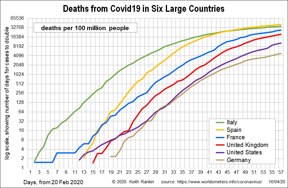
Today’s first chart looks at death rates for six major countries. We see that Spain has overtaken Italy, and that France and United Kingdom are likely to catch up with these in a week. We also note that United Kingdom death rates, as reported have been understated; these are basically hospital deaths. All four countries are likely to end up with between 300 and 500 deaths per million people; that’s about 30,000 deaths in United Kingdom.
The United States and Germany are well behind, and likely to stay so; both are showing more signs of stabilising than are France and United Kingdom.
The most important story here is that of Belgium. Not only does it now have the highest death rate in the European Union – higher than both Italy and Spain – but it is far from having stabilised. It looks like Belgium is heading for 800 deaths per million people; nearly the one in a thousand that San Marino has already reached.
To understand the extremely high incidence of Covid19 in Belgium, it is necessary to read my yesterday’s story: ‘Europia’ and the Spread of Covid19. Belgium – especially central and eastern Belgium – is an important part of what amounts to the federal district of the European Union.
In this regard it is worth noting that the French covid story shows that France is a country of two halves. If you draw a line from Le Havre to Marseilles, the vast majority of France’s Covid19 cases are to the northeast of that diagonal line; in particular the parts of Frances that border Belgium, Luxembourg and Germany. France did not get its viral load from Spain, despite Spain’s high incidence of Covid19.
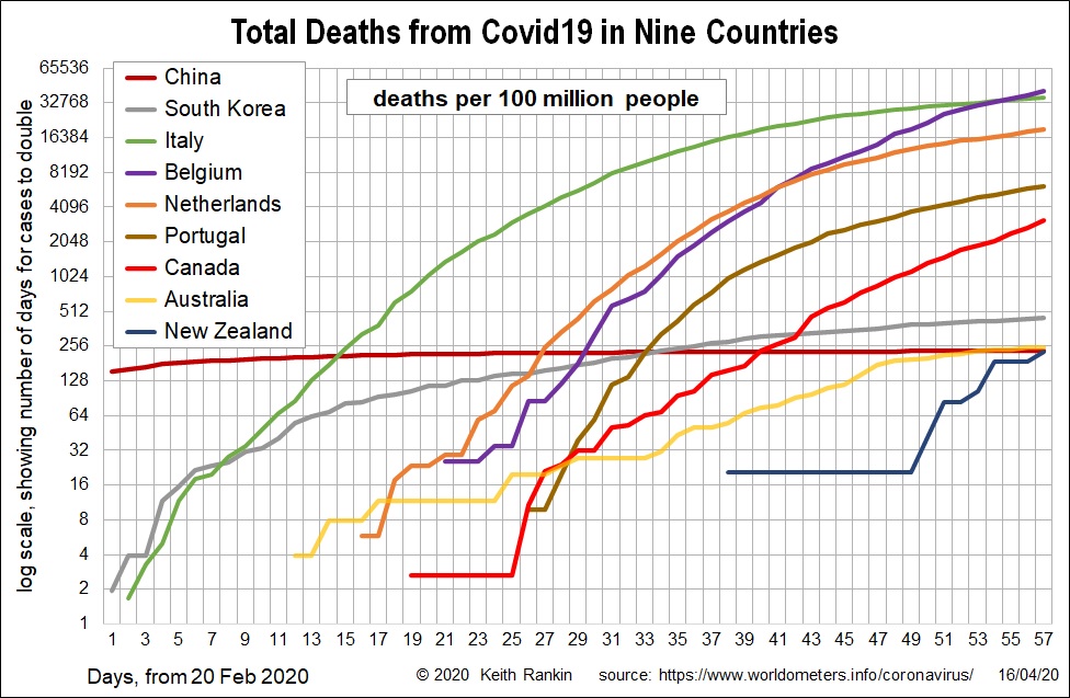
This chart shows two other important stories. Compare Netherlands with Portugal.
We have been hearing in the international media that the Netherlands in particular is making it very difficult to set up an EU-wide financial mitigation process; and that they are blaming Southern Europe for creating the crisis, as they did for the 2012 Eurozone financial crises from which the south has not yet fully recovered from. I have written elsewhere about the role of Netherlands in exacerbating these crises by prioritising its mercantilist view of national economic progress. (Northern European Mercantilism and the Covid19 Emergency.)
In the present crisis, Italy and Spain caught the bug very early. Today Ursula von der Leyen – head of the European Commission since December – offered a profuse apology for the European Union’s complete inaction and inability to protect Italy. Indeed, in this case the European Union bureaucracy has been, at best, asleep at the wheel. Their performance in dealing with Covid19 has been substantially worse than that of United States’ President Trump.
Netherlands pointing the finger at Italy and Spain is very much a case of ‘The Pot calling the Kettle Black’. Portugal, while still having a hard time, has coped surprisingly well and far better than the Netherlands.
This chart shows that Canada, while having less Covid19 than Europe and indeed the United States, seems to be showing the fastest rate of increase of the countries shown. Canada very much left it too late to halt the spread of the virus. Ottawa City (federal capital, population 1 million) has had 14 Covid19 deaths so far, and 678 laboratory confirmed cases. 25 percent of cases are due to community transmission. (refer)
The final story from this chart is that both New Zealand and Australia have now reached China’s death rate from Covid19. Our deaths will increase further. 21 New Zealand deaths will have New Zealand at the South Korean death rate.
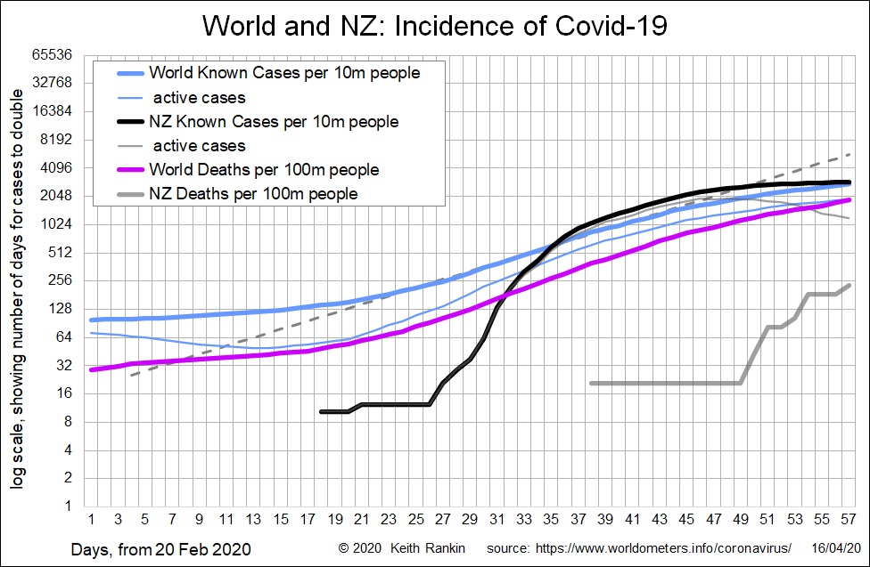
The final summary chart for the week shows that New Zealand cases are very much on par with the world as a whole, though death incidence is one tenth of the world average. The difference on cases is that New Zealand has stabilised – the thick black line is horizontal – whereas the world has not.
Further, New Zealand case statistics are almost certainly as reliable as those from Iceland and from Australia where there have been very high rates of testing, and presently have very low positivity rates. So, New Zealand’s level of coronavirus infection is already much lower than the unknown world average. It is that world rate that poses the biggest ongoing threat to New Zealand.