Source: The Conversation (Au and NZ) – By John Quiggin, Professor, School of Economics, The University of Queensland

Shutterstock
As we approach the release of Monday’s employment white paper we can expect to hear a lot about something called the NAIRU – the so-called Non-Accelerating Inflation Rate of Unemployment.
This ungainly acronym, which currently dominates the thinking of both the Reserve Bank and the Treasury, derives its power almost entirely from the economic crisis of the 1970s, and is overdue for reconsideration.
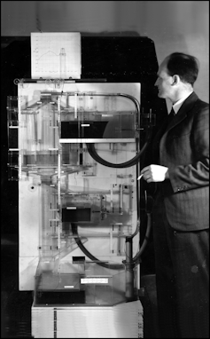
The story of the NAIRU begins even further back in time, in the 1940s, and is best illustrated by a curious machine displayed in the entrance of the Melbourne University Business, Economics and Education Library.

Wikimedia
The MONIAC is a hydraulic computer, one of 12 constructed by New Zealand economist Bill Phillips in 1949 to illustrate Keynesian economics.
MONIAC stands for MOnetary National Income Analog Computer, and, although the machine is made out of tanks and pipes and valves and coloured water, it is a working (early) computer.
A guide to the Melbourne University MONIAC says when in operation, water is “injected into the ‘active balances’ tank, pumped up to the top of the machine as income, and allowed to flow downwards as expenditure, with controlled amounts siphoned off to enter the tanks representing taxes and government spending, savings and investment, and trade”.
While the MONIAC was an amazing innovation, even more important was the thinking behind it, which a decade later led Phillips to discover the Phillips Curve, a graph still used today to show the relationship between unemployment and the rate of wages growth or inflation.
In the model described by Phillips, strong aggregate demand (a strong desire to spend) both cuts unemployment and pushes up inflation.
Weak aggregate demand boosts unemployment and cuts inflation.
The Phillips curve represents the trade-off.
At the time, with memories of the Great Depression still fresh, and the United States competing with the Soviet Union to achieve full employment, a slightly higher rate of inflation seemed a small price to pay to get closer to full employment.
It could be obtained by moving along the Phillips curve, using government spending and other measures to increase inflation and bring down unemployment.
Leading Keynesian economists including Paul Samuelson recognised at the time that the curve might not hold if people came to expect high inflation. However, given that earlier episodes of inflation in the early 1950s had been short-lived, it was thought that problem could be managed.
Phillips morphed into NAIRU
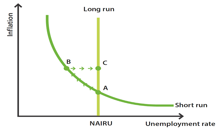
This prevailing view was challenged in 1968 by the great Chicago economist Milton Friedman who argued in his Presidential Address to the American Economic Association that, if inflation persisted long enough, the expectations of workers and businesses would adjust.
The inflation rate would become “baked in” as workers and suppliers increased their wages and prices by enough to compensate for inflation, whatever the unemployment rate.
Over the long term, there was a “natural rate of unemployment” – a floor – below which extra wages growth would simply lead to more inflation.
Translated to the graphical representation of the Phillips curve, Friedman implied that in the long run, the “curve” would be simply a vertical line, represented here with the annotation NAIRU in a graph prepared by Australia’s Reserve Bank.

Reserve Bank of Australia
The combination of high inflation and high unemployment (often referred to as “stagflation”) which emerged in the early 1970s seemed to vindicate Friedman. High inflation and high unemployment can’t coexist on a standard Phillips curve.
Friedman’s presentation of the problem implied the need for a full-scale model of what moved unemployment and wages, but it was never seriously attempted.
Instead, economists used Friedman’s insight to estimate the rate of unemployment at which inflation remained stable – the so-called “natural rate”.
Unfortunately for proponents of the idea, the “natural rate” turned out to vary over time, leading to the term being replaced with the clunkier but more descriptive “NAIRU”.
Worse still for proponents of the idea, estimates of NAIRU tended to move in line with the actual rate of unemployment. When unemployment was high, estimates of NAIRU were high. As it fell, estimates of NAIRU fell, suggesting that how far unemployment could fall was determined by how far unemployment had fallen.
Put to the test, NAIRU failed
The NAIRU model’s first real test since the 1970s came with the rapid upsurge and then decline in inflation in 2022 and 2023 that followed Russia’s invasion of Ukraine and the end of the COVID lockdowns.
Inflation was initially driven by a combination of supply chain disruptions and demand from savings made during the lockdowns.
Because the unemployment rate didn’t much move (presumably being near NAIRU, albeit an estimate that had progressively been lowered as unemployment fell) the upsurge in inflation could be seen as consistent with the existence of NAIRU, a vertical line on the Phillips graph.
However, the absence of a significant increase in wages growth was inconsistent with NAIRU, which was built around the idea that inflation was driven by growth in wages, passed on as higher prices.
Read more:
We can and should keep unemployment below 4%, say top economists
More damaging to the idea of a NAIRU was what happened next.
So far in 2023 inflation has dived (using the monthly measure, from 8.4% to 3.9%) but the unemployment rate has barely budged – at 3.7% in August, it’s where it was in January.
This doesn’t fit the standard NAIRU model. However, it makes perfect sense in a world where high inflation can be seen as the simple result of strong demand driven by COVID income support and supply constraints associated first with COVID and then Russia’s invasion of Afghanistan.
Let’s not use NAIRU to limit our ambition
The central banks that pushed up interest rates have been quick to claim credit for the latest decline in inflation, but this claim doesn’t stand up to scrutiny.
Higher interest rates work with a lag to drive inflation down by reducing investment and consumption, and increasing unemployment. But inflation has fallen without these things happening.
Unemployment may well rise as the economy contracts, but that will be an unnecessary cost, like undergoing a dangerous treatment for a medical condition that is curing itself.
Like a one-hit wonder from the 1970s, the NAIRU model has remained dominant on the strength of its success in predicting the emergence of stagflation in the 1970s.
But as a general model of inflation and unemployment, it is woefully deficient. It is to be hoped it isn’t used to limit the government’s ambition in the white paper.
Read more:
Why unemployment is set to stay below 5% for years to come
![]()
John Quiggin does not work for, consult, own shares in or receive funding from any company or organisation that would benefit from this article, and has disclosed no relevant affiliations beyond their academic appointment.
– ref. Living in the 70s: why Australia’s dominant model of unemployment and inflation no longer works – https://theconversation.com/living-in-the-70s-why-australias-dominant-model-of-unemployment-and-inflation-no-longer-works-211487


