Analysis by Keith Rankin.
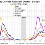
Before noting the role of Czechia – the Czech Republic – in the most lethal wave of the Covid19 pandemic in Europe, we should note the tragic recent circumstance of Portugal. In the first chart above, we see that Portugal, a country that in April performed very well compared to its neighbours, should have now suffered so much. One of the problems was that Portugal was never able to throw‑off Covid19 to the extent that its neighbours did. This has the look of a country that took very strong domestic measures, but kept its international borders open – especially its air border. This is especially pertinent in light of Portugal’s relationship with Brazil.
The other part of the Portugal story is the close correlation that Portugal’s death statistics show with the United Kingdom, a country that has had long economic and tourist ties with Portugal.
I have previously attributed Spain’s early resurgence of Covid19 to its strong population links with the United Kingdom, especially in the context that both the United Kingdom and Portugal were much slower to shake‑off Covid19 in May and June than were other West European countries.
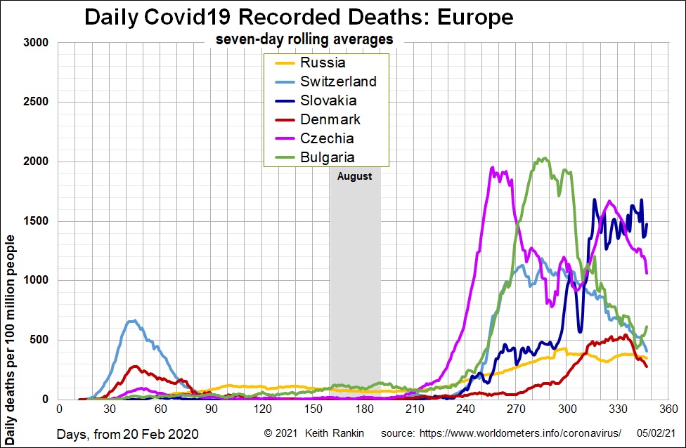
Nevertheless, the overall picture in Europe was that Covid19 was beaten, especially if looking at death statistics using charts with a simple arithmetic axis. Czechia had had a successful lockdown for about four weeks in March and April. Complacency then set in, alongside the concern in Europe about the economy and the summer tourist season. A clue may have been in this 1 July 2020 BBC story: Czechs hold ‘farewell party’ for pandemic.
Then, in the autumn, whoa!!
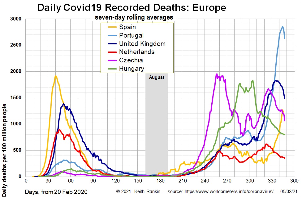
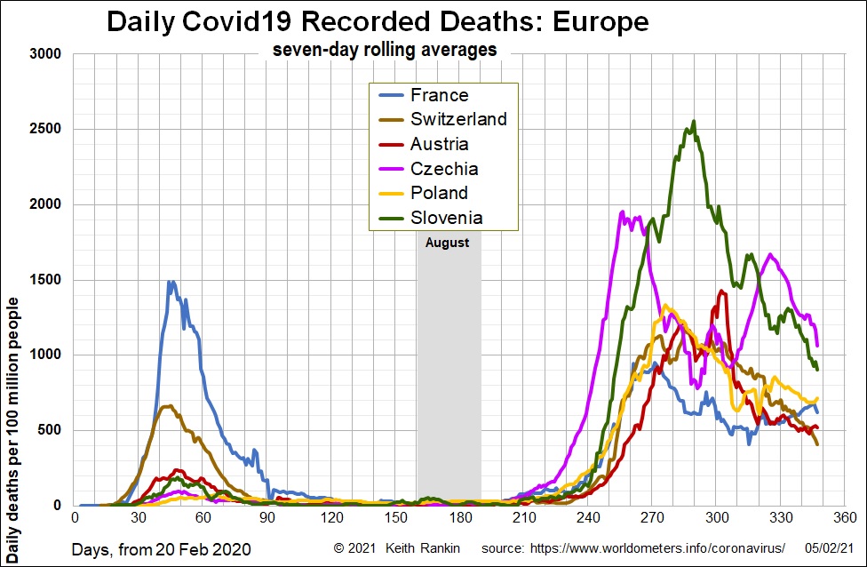
In these charts, clearly Czechia leads the way in the second European wave, with deaths peaking in early November. Only Belgium has a similar mortality peak in November, about a week after Czechia’s.
In December, this article about New Zealand was published internationally: Genomic epidemiology reveals transmission patterns and dynamics of SARS-CoV-2 in Aotearoa New Zealand. It shows that, out of 649 March/April cases sequenced, there were 277 separate introductions of the virus into the country. 57% of those 277 introductions were not transmitted within New Zealand.
The Covid19 discussion in the international media – and in places such as Wikipedia – focussed on the domestic experience and emphasised the very first introductions. It seems that, while countries were taking very strong domestic measures to constrain Covid19, too many countries did too little too late on their international borders. There was too much focus on the mythical ‘R’‑number (giving the impression that every infected person was a spreader), and on ‘flattening the curve’ (ie tolerating this coronavirus much as we once tolerated measles). Authorities were trying to curb domestic cases of the virus while leaving the tap on. Indeed, in New Zealand, in the first week of the March lockdown, the edict to self-isolate was not enforced while domestic lockdown breaches were treated sombrely. Subsequent enforceable quarantine processes were introduced. Yet it took many months before these measures were managed properly. Other countries clearly did not pay due attention to the many separate introductions of Covid19 into their countries.
Previously, I have noted the huge rise in Covid19 in Caribbean holiday destination over the northern summer. Probably the main incursions here came from the United States – which had much higher levels of domestic covid in June than did European countries. But in these Caribbean countries, Americans and Europeans mingled, and Europeans brought it back.
Perhaps even more significantly, Europe is the major target tourist destinations for United States tourists. Americans have shorter holidays than Europeans, so they tend to focus the key cities in their Lonely Planet (and other) guidebooks. One of those cities in Europe is Prague, the historic capital of Czechia. Prague is particularly known – like Barcelona – as a youth ‘must visit’ destination. Many young Americans and Europeans like to visit Prague before they return home to their studies. Another part of the story is that such young Americans booked cheap airfares in advance, and were unable to get refunds. So they went ahead with their trips, sometimes with misgivings, but also with the bravado of youth.
It looks as though there were other similar trans‑Atlantic introductions of coronavirus into the other main tourist cities of Europe, especially from July to September. And European Union bureaucracy countries like Belgium have very large numbers of border entries and exits in all months, and exits and entries in the holiday months of July and August.
From Prague, there seems to have been a spread into the other more westernised Eastern European countries. Another part of the story is that Russia had quite a lot of cases over the summer, and countries along the Black Sea – including Bulgaria – may have got much of its Covid from Russia.
If I am correct, then young infected visitors to Prague (many asymptomatic) will have first infected young locals, who in turn will have infected their parents and grandparents. Hence the death peak in late October and November, two to three months after the peak tourist inflows. Czechia then suffered again, with a huge Christmas outbreak. Good King Wenceslas might have been crying in his Bohemian grave.
In line with my comments above, I note the following very recent story: Covid-19: International travel ‘biggest impact’ on deaths. (The story is about deaths per capita, not deaths per case.)
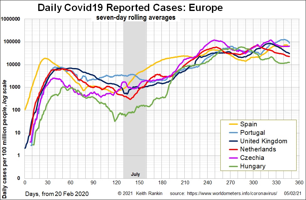
I have just included one chart that shows reported cases of Covid19, and is charted using the logarithmic scale to show trends in their early stages. This shows that, from low levels, cases in Czechia started rising in June. Then, from July to early January, cases in Czechia were being reported at a higher rate than in the United Kingdom. The steep rise in reported cases dates from early September, suggesting at the rise in infections happened in August, peak visitor season. United States’ students return to their studies at various dates in September.
This chart also shows how Portugal was unable to ‘shat the door’ on the covid virus in June and July. After that, Portugal followed the European norm – including a period of slow exponential growth in September and October. It’s only in January 2021 that the outbreak erupted in Portugal, making that country pretty much the worst affected in the world in January.