Te Huia was launched in April 2021 for a five-year trial which was due to end in June 2026, but has now been extended by a year.RNZ / Gill Bonnett
The Hamilton-to-Auckland train, Te Huia, has been given an extra year to prove itself.
The train provides an interregional passenger rail service between the regions of Waikato and Auckland.
On Thursday afternoon the New Zealand Transport Agency (NZTA) board agreed to a Waikato Regional Council request to keep government funding steady at 60 percent for a one-year extension.
The council took the step to ask for the extension in December 2025, expressing a need for certainty from NZTA before the council began its long term plan process.
The council argued that the current trial had been too heavily affected by Covid delays, being temporarily banned from operating in Auckland, and repeated line closures on the Auckland network.
Te Huia was launched in April 2021 for a five-year trial which was due to end in June 2026. It will now continue until the end of June 2027 with government funding steady at a 60 percent funding assistance rate.
Waikato Regional Council said councillors would now be asked to support continued local funding at the current rate when they meet next week to consider the budget for 2026/27.
The future of Te Huia and its funding would then be discussed with the public as part of the 2027-2037 Long Term Plan process.
Waikato Regional Council chairperson Warren Maher thanked the NZTA board for its decision.
“I also note the support we received from local councils, as well as champions of Te Huia.”
In December, letters of support from Auckland, Hamilton City, Waipā and Waikato district councils said they were committed to sustainable economic growth across the sub-region, along the Hamilton to Auckland corridor, and in the emerging economic zone centred around the north Waikato and south Auckland areas.
Also earlier this month, approximately 300 supporters attended a “Stack the Station,” event at Hamilton’s Frankton Station, calling for the permanent future of the Te Huia passenger rail service.
The lawyer for the accused Bondi Beach gunman, Naveed Akram, commented in court that his client was subject to “very onerous conditions” at Goulburn’s supermax prison. Goulburn Correctional Complex, in New South Wales, houses the country’s highest security prison.
At the High Risk Management Correctional Centre, prisoners endure “very strict daily regimes and intense scrutiny by staff”, according to a review by the NSW Ombudsman. The ombudsman concluded there is “no doubt” the unit fails to provide “a therapeutic environment for these inmates”.
Goulburn’s supermax facility is set aside for the most serious offenders. It’s overwhelmingly populated with those who are convicted or accused of terrorism offences. They are categorised as requiring the “top level of security classifications”.
Given the gravity of the crimes of which Akram is accused, it makes sense he would be kept in such a facility. His case is among the worst of the worst.
But it’s the type of exception that normalises harsh prison conditions across the country. The solitary confinement, intensive surveillance and long periods of lockdown that Akram will experience even while he awaits court proceedings are becoming increasingly common, not just for accused mass murderers but for many non-violent prisoners too.
What are the rules for prisons?
The minimum standards for Australian prisons are set out in the 2025 Guiding Principles for Corrections. They promote safe practices in relation to health and wellbeing, rehabilitation and reintegration, and respectful interactions, while also maintaining prison security. They are not legally enforceable.
Inspectors of Custodial Services across the country seek to uphold minimum standards, ensure accountability and prevent breaches.
But their main role is systemic reviews, not investigating individual complaints. As with ombudsman reports, the recommendations of inspectors are non-binding.
Toothless monitoring and oversight bodies risk the Australian prison system becoming a law unto itself.
The Mandela Rules say prisoners should be treated with respect and dignity. They say prisoners should not be subjected to torture and other cruel, inhumane and degrading treatment or punishment.
Breaches of standards include prolonged isolation, overcrowding and excessive strip searches.
But these rules are also non-binding.
How do Australia’s prisons fare?
The unprecedented Australian prison population, which stands at almost 47,000, makes overcrowding and lockdowns more likely, and effective enforcement elusive.
The Productivity Commission has reported several jurisdictions where prison populations are either nearing or exceeding the facility’s capacity.
In New South Wales, minimum standards for children and adults in detention have largely evaded scrutiny for years.
The Goulburn Correctional Facility houses Australia’s highest-security prison.Lukas Coch/AAP
In 2021–22, the NSW Ombudsman received 147 reports of young people held in segregation for more than 24 hours. It was a 46% increase from the previous year.
In 2023–24, there were 878 notifications of young people in segregation.
In addition, the NSW Ombudsman found in 2022 that officers were conducting fully-naked strip searches on young people in youth detention.
In adults prisons, segregation rates are not consistently recorded. But the NSW Ombudsman found in 2024 that of its sample of prisoners who were penalised with cell confinement, about three quarters were classed as particularly vulnerable, including 42% who were Aboriginal.
First Nations people most at risk
A further breach is systemic discrimination on the grounds of race.
First Nations people account for 37% of people in prison in Australia. But there are inadequate levels of Indigenous staffing. There are also very few cultural therapeutic programs and health and wellbeing services.
In 2025, the NSW inspector of custodial services expressed deep concern about the number of Aboriginal deaths in custody in the state. The inspector’s report highlighted “poor conditions in many correctional centres caused by a combination of understaffing, excessive lockdowns, poor staff culture, aged infrastructure, and high remand numbers”.
Accordingly, Australia must also establish and facilitate “a system of regular visits undertaken by independent international and national bodies to places where people are deprived of their liberty, in order to prevent torture”. These inspections are carried out unannounced in order to identify torture risks without state interference or window dressing.
But NSW, Victoria and Queensland, which have the highest prison populations, have consistently failed to implement the minimum standards outlined in the protocol.
The NSW and Queensland governments refused access to prisons in the first visit to Australia of the United Nations Subcommittee on Prevention of Torture in 2022.
This is an indictment on these governments’ lack of cooperation, especially given countries across South America, the Middle East and Africa with fewer resources to uphold standards have complied.
The slippery slope
The severe supermax prison conditions Naveed Akram will endure for the foreseeable future may be met with public approval.
However, extreme cases can give rise to a slippery slope of inflicting inhumane conditions on the great majority of people in prison: those on remand, sentenced for non-violent offences and held for breach of justice procedures.
As Nelson Mandela remarked, “no one truly knows a nation until one has been inside its jails”. Looking inside Australian prisons tells a story of prejudice, few protections and lack of transparency and accountability.
Source: The Conversation (Au and NZ) – By Se Youn Park, Sessional academic, School of Political Science and International Studies, The University of Queensland
Australian Prime Minister Anthony Albanese said his government will not help repatriate the 34 Australian women and children with links to Islamic State fighters who were released from a detention camp in Syria and are reportedly trying to return to Australia.
The women and children were among more than 2,000 people from 50 different countries detained at al-Roj camp in Kurdish-controlled northern Syria. The Australians were turned back by Syrian officials when trying to reach Damascus this week, with the goal of returning to Australia.
The Albanese government’s stance on the Australian women and children in Syria has never really been clarified, which is fuelling a lot of uncertainty at the moment.
There’s a precedent for repatriation
Australia has demonstrated it can repatriate its citizens safely when it feels compelled to. In 2022, for example, it helped repatriate four women – the wives and widows of IS militants – and their 13 children from al-Roj camp in Syria.
Women and children walk among tents at al-Roj camp in northeastern Syria.Baderkhan Ahmad/AP
It has also acknowledged that if citizens return independently from conflict zones, security agencies are capable of investigating and managing any risks.
Yet, it has not established a permanent framework for when and how such returns should occur.
Instead, Australia continues to rely on ad hoc decision-making shaped by individual circumstances, rather than a solid plan. This case-by-case approach has produced uneven and opaque outcomes.
Take for example the four women repatriated in 2022. What happened next remains only partially known. One of the women, Mariam Raad, was prosecuted in Australia for entering Islamic State-controlled territory. She pleaded guilty, but was discharged without conviction and placed on a good behaviour bond.
Others, including Mariam Dabboussy, returned and resettled in the community. Yet, there is little publicly available information about their legal situations, monitoring arrangements or long-term reintegration plans.
This opacity makes it difficult to assess whether Australia is applying consistent legal standards or managing risk systematically.
Mitigating risks through managed returns
The ambiguity here reflects a broader pattern of political caution and strategic delay.
For years, Australian governments framed the repatriation of citizens who had travelled to Syria or Iraq as an unacceptable security risk. They relied on citizenship revocation and political refusal to prevent it.
In 2022, however, the High Court limited the government’s power to revoke citizenship, removing one of these key tools.
At the same time, the conditions in the Syrian detention camps deteriorated, heightening international pressure on countries to repatriate their citizens trapped there.
These factors eventually forced a shift in Australia’s stance, resulting in the 2022 repatriation. However, this shift was never institutionalised.
In 2024, then-Home Affairs Minister Clare O’Neil seemed set to do this by preparing a plan to repatriate the remaining women and children. However, this plan was shelved and never revisited.
As a result, the problem has been deferred rather than resolved. This weakens Australia’s ability to manage the possible security risk posed by these women effectively. Leaving citizens in overseas detention does not eliminate risk. It just makes it somebody else’s problem.
When individuals remain in foreign camps, Australian authorities cannot monitor them effectively, prosecute them or support their disengagement from radical ideologies. This limits our intelligence capabilities and our ability to track former members and the potential threat they pose.
Avoiding repatriation does not prevent their return, either. It just makes returns harder to manage.
Some allies have a different approach
Last October, two Australian women and their four children escaped a camp in Syria and made their own way to Lebanon. Once at the Australian embassy, they were given passports to return to Australia.
When individuals return through informal pathways such as this, authorities have less time to prepare and fewer opportunities to implement structured legal, monitoring and reintegration measures. It’s also far more dangerous for the people involved.
Many of Australia’s allies have recognised this reality.
Several European governments have also begun repatriating women and children with more urgency.
Countries such as the Netherlands and Germany have implemented planned repatriation programmes linked to judicial processes and long-term supervision. These governments recognise that repatriation is not a concession. It is a security management strategy.
France, too, which had long been hesitant to repatriate its nationals from Syria, shifted from a “case-by-case” approach in 2022 after facing criticism from the European Court of Human Rights and the UN Committee Against Torture.
Responsibility to protect
There is also a deeper legal issue at stake. Many Australian women detained in Syria have been held for years without charge or trial. By leaving citizens in indefinite offshore detention, Australia risks undermining its commitment to due process and the rule of law.
The choice is not between security and accountability. It is between managing citizens within Australia’s legal system or leaving them in unstable environments where Australia has no oversight.
The question is no longer whether Australian women and children will return. It is whether Australia will manage their return deliberately, or continue responding only after events force its hand.
Sussan Ley has announced that, after a fortnight’s farewell tour, she will step down as the member for Farrer.
This sets the stage for what will be one of the most interesting and unpredictable byelections in Australian history. Potentially at least four candidates could have a realistic chance of winning. The byelection will be an early test of new Opposition Leader Angus Taylor’s popularity, and whether One Nation can translate strong performance in opinion polls into actual votes. It will likely be held some time in April or May.
The independent challenge
At the 2025 election, Ley suffered a 9% drop in her primary vote, to 43%. Independent Michelle Milthorpe, a local teacher, picked up 20% of the vote.
This large electorate – four times the size of Belgium – is more difficult for a challenger to cover than a well resourced sitting member.
Milthorpe received almost two-thirds of the preferences from other candidates. This allowed her to narrow the primary vote gap. She finished with 44% of the two-candidate preferred vote, compared to Ley’s 56%.
She therefore needs a 6% swing to win the seat. This is a significant swing but the Liberals will be without any personal vote Ley has gathered over 25 years as the local member. (In 2022, when there was not a significant independent vote, Ley won 52% of the primary vote, while the Coalition Senate team only got 46% in Farrer.)
Moreover, opinion polls suggest the Liberals’ national brand has taken a big hit.
Milthorpe has maintained her profile in the electorate since the election and has already announced she is running again.
Farrer is across the Murray River from Indi, held since 2013 by independents Cathy McGowan and then Helen Haines. Some of Haines’ supporters may well campaign for Milthorpe.
Once the Liberal vote drops into the low 40s they are vulnerable to teals and community independents. Liberal Sophie Mirabella won 45% of the primary vote in Indi in 2013 but still lost to McGowan. And high-profile Liberal Josh Frydenberg had 43% of the primary vote in Kooyong in 2022 but still lost to teal independent Monique Ryan.
Milthorpe is a serious chance to join the growing crossbench in the federal parliament.
Other likely candidates
For now, the on-again-off-again coalition between the Nationals and Liberals is on. Their agreement means they do not stand candidates against each other when there is a sitting member.
But Ley’s resignation means both parties can stand, and the Nationals have confirmed they will field a candidate. The last time there were competing Liberal and National candidates was after former deputy prime minister Tim Fischer retired in 2001. Sussan Ley was the successful Liberal candidate, but her victory margin over the Nationals candidate was a mere 0.1%.
One Nation polled 6.6% in Farrer in 2025, very similar to its share of the national vote. Given that opinion polls suggest One Nation’s national vote has risen to over 20%, it is likely to attract a much higher vote in the byelection than it did in 2025.
One Nation is likely to pick up – either on primaries or through preferences – much of the 10% that went to other right-wing parties in 2025. These include Shooters, Fishers and Farmers; Gerard Rennick People First; Family First and Clive Palmer’s Trumpet of Patriots.
The Liberal and National how-to-vote cards will preference each other ahead of One Nation. But this does not mean all their voters will follow them. One Nation will be hoping they can out-poll the Nationals and then enough Nationals voters give their second preference to One Nation that the One Nation candidate overtakes the Liberal. One Nation may then get enough preferences from Liberal voters to beat the independent.
Labor has never held Farrer since the seat was created in 1949. The incumbent government almost always goes backwards at byelections. So it is highly unlikely Labor can win the seat.
But the preferences of their supporters may determine which candidate does. Whether Labor runs – and it won just 15% of first preferences at the 2025 federal election – may depend on how important they regard it to guide these preferences with how-to-vote cards. In the longer term, it is in Labor’s interests for a progressive independent to establish themselves in a seat Labor cannot win themselves.
There have been reports of some Farrer voters urging the independent member for the NSW state seat of Murray, Helen Dalton, to also run as an independent. Other reports suggest that One Nation has sounded her out about being their candidate. But it would be a big gamble to give up her state seat to become one of four or five contenders for Farrer.
If the Liberals do hold the seat, they will be saying “well done Angus”. If they lose it to a moderate independent, there may be some buyer’s remorse about replacing Ley with Taylor. If they lose it to One Nation, some will be eyeing Andrew Hastie as their next leader.
Source: The Conversation (Au and NZ) – By Adam Simpson, Senior Lecturer in International Studies in the School of Society and Culture, Adelaide University
Thailand’s prime minister, Anutin Charnvirakul, will almost certainly stay in the job after a surprise result in last week’s elections saw his conservative Bhumjaithai Party win the most seats in the lower house.
The outcome was another significant setback for the progressive People’s Party – and Thailand’s pro-democracy movement more broadly.
While the People’s Party made some missteps in the campaign, the election demonstrates, yet again, the immense hurdles faced by progressive, democratic parties in a country where pro-military and pro-monarchy forces have outsized influence in politics.
The People’s Party finished second after leading in most pre-election polls. It will now be the primary opposition party in the country.
The formerly powerful Pheu Thai party came a distant third, and agreed to join the Bhumjaithai-led ruling coalition.
So, what does the election mean for the direction of a country? And what’s next for the pro-democracy movement that has attempted for years to bring reforms to the country?
Who is Anutin Charnvirakul?
Anutin took over the Bhumjaithai Party from his father, a former acting premier, in 2014. He had already followed his father into the family construction business, one of Thailand’s biggest.
Prime Minister Anutin Charnvirakul, head of the Bhumjaithai Party.Rungroj Yongrit/EPA
Anutin rose to the premiership last year after the previous prime minister, Paetongtarn Shinawatra, was removed from office for purportedly being too conciliatory towards Cambodia over an ongoing border dispute.
Anutin was elected prime minister in the parliament with the surprise backing of the People’s Party, in exchange for the promise of constitutional reform.
This elevated Anutin’s previously provincial Bhumjaithai Party to be a national-level player. It also allowed him to attract influential defectors from other parties to consolidate his position.
Support for his government dropped in early December due to the mishandling of floods in southern Thailand and alleged connections of his government to transnational scam criminals.
Soon after, Anutin launched preemptive airstrikes against Cambodia over their border dispute. This boosted nationalist sentiment among the public and providing a welcome distraction from domestic pressures.
With the People’s Party looking ready to withdraw support from the ruling coalition, Anutin then dissolved parliament and called early elections.
The airstrikes, drone attacks and ground clashes continued for the next few weeks along the border, ensuring national security would be a key election theme. This worked in favour of the conservatives, but provided challenges for the People’s Party.
Do progressive stand a chance in Thailand?
Many of the People’s Party’s problems are rooted in the struggles of predecessor parties to gain a toehold in Thai politics.
In the last election in 2023, the Move Forward Party won the most seats. But its popular leader was prevented from becoming prime minister by conservative forces in Thai society.
Thailand’s Constitutional Court then dissolved the party. This followed a pattern: its predecessor, the Future Forward party, was dissolved after its strong showing in the 2019 election.
Within 24 hours of the polls closing last week, the National Anti-Corruption Commission unanimously ruled that 44 former lawmakers from the Move Forward party committed gross ethical misconduct by proposing amendments to the Criminal Code’s Section 112. This is the lèse majesté law that carries stiff penalties for insulting or defaming Thailand’s monarchy.
The lawmakers, which include the People’s Party leader, Natthaphong Ruengpanyawut, and 14 other newly elected party MPs, could face lifetime bans from politics.
Did support collapse for the People’s Party?
Although Bhumjaithai handily won the election, capturing nearly 200 seats out of 500 in the lower house, the voting data suggest the People’s Party did not haemorrhage support to Bhumjaithai, as various news headlines made it seem.
Under the military-authored 2017 constitution, Thailand’s lower house elections include 400 individual constituency seats elected by first-past-the-post and 100 party list seats elected by proportional representation.
Bhumjaithai did very well in rural and regional constituency seats, where alleged vote-buying and patronage networks are more prevalent.
Some groups across the country have demanded national recounts following reports of electoral irregularities, in addition to the release of vote counts from polling stations and the re-running of some races.
A man holding a banner reading ‘nationwide vote recount’ protests at the national electoral office in Bangkok.Rungroj Yongrit/EPA
The party’s support in constituency seats was mostly concentrated in cosmopolitan centres with more educated urban voters, such as Bangkok, where it swept all 33 seats. However, it struggled to win seats in rural and regional areas.
In the national party list vote, though, the progressive party emerged clear winners. It earned around 30% of the national vote, compared with only 18% for Bhumjaithai in second place.
This suggests some people split their votes, supporting a Bhumjaithai candidate for their local seat and the People’s Party in the party list. Unfortunately for the People’s Party, the party list MPs only comprise one-fifth of the lower house.
In a small silver lining for progressive forces, a referendum on amending the constitution (held at the same time as the election) passed easily.
But Anutin and the conservatives are now in control of the drafting and approval process, which they could draw out for years. And in their hands, it may not deliver the changes sought by progressives anyway.
For interest groups and lobbyists, face-to-face time with political decision-makers is the most valuable kind of access there is.
As one New Zealand politician once put it (speaking anonymously to lobbying researchers), “politics is so much about relationships”. In-person meetings help build trust, develop shared priorities and identify where influence is possible.
This form of influence can often be hidden from view. In New Zealand, however, ministers’ diaries have been published since 2017, offering a window into who is meeting with whom.
Because transport policy has far-reaching consequences for climate, health and everyday life, we wanted to see what political access in this sector looks like in practice.
Our newly-published research analysed the diaries of transport and associate transport ministers under the two most recent governments – the Labour-Green-New Zealand First coalition (2017-2020) and the subsequent Labour government (2020-2022).
It offers a useful snapshot with some clear patterns – but one that needs to be interpreted with care.
What the diaries tell us
For meetings with interest groups related to the transport portfolios (880 out of a total of 11,079 meetings) we categorised the interest groups two ways: the type of interest group and the group’s focus – that is, the specific area of transport it seemed concerned with.
The first classification was adapted from a European approach to categorising interest groups. The second was developed by examining the groups’ websites and coding their main areas of focus, such as air travel, freight or consultancy.
Of the 974 groups we identified, 74% were commercial (56% firms and 18% business associations). Among non-commercial groups, citizen groups (9%) and trade unions (7%) were the most common.
Overall, commercial groups met with transport ministers about three times as often as non-commercial groups.
Looking at what these groups focused on, air travel (such as airlines and airports) had the highest level of access, accounting for 16% of meetings. Maritime (11%), rail (9%), automobiles (8%) and consultancy – including economic, trade and policy consultancies, law firms, and PR and lobbying firms (6%) – rounded out the top five.
Some groups were notable by their absence. Iwi and hapū and their organisations accounted for just 1% of encounters, despite the transport system’s well-documented failures for Māori, including lower access to transport and higher levels of harm.
Health groups were also rarely present, with just six encounters (0.7%) over the six years studied, even though the transport system causes at least as much health harm as tobacco.
An incomplete picture
Importantly, there are limits to what this analysis can show.
While the diaries provide a trove of information, they don’t record who asked for meetings but was turned away. That means we can’t tell whether groups absent from the records never sought access, or sought it and didn’t get it.
The diaries don’t capture more informal forms of access, such as conversations in social settings.
We also have to assume the records are complete and accurate, even though that may not always be the case. And because they don’t record the purpose of each meeting, we can only infer what was discussed.
There is clearly some discretion in who gets these meetings. Looking across the diaries of two ministers and three associate ministers, we found differences in both the overall number of meetings and the balance between commercial and non-commercial groups.
While all ministers met with more commercial than non-commercial groups, the ratio varied widely – from 1.6:1 to as high as 10:1.
Categorising interest groups is also challenging, and broad categories inevitably hide important differences. For example, some of the firms classed as commercial are partially owned by local or central government. Likewise, some commercial groups focus primarily on sustainable transport.
All of this means the diaries can show us who gets access, but not how that access translates into policy outcomes.
That question remains important, because part of the period covered by this analysis coincided with substantial – and now largely reversed – efforts to reshape the transport system around low-carbon goals. Yet groups supporting that agenda were a minority in these diaries.
In other words, major policy change happened without those groups dominating face-to-face access to ministers. This suggests that access is only part of what shapes policy and that the flow of influence between ministers and interest groups may be two-way; ministers and interest groups may both be using these meetings to promote their policy agenda.
Despite the challenges and limitations of the diary data, it suggests a clear pattern: commercial interest groups had much greater access to ministers than non-commercial groups. This is consistent with the small number of similar studies internationally – and highlights structured differences in who gets this most valued form of political access.
This analysis was based on work undertaken by a larger group of authors, including Alex Macmillan, Ryan Gage and Alice Miller.
Child vaccination has been one of Australia’s biggest success stories. Before the COVID pandemic, we hit the national target of 95% of one-year-olds fully vaccinated. Our child vaccination rates were among the best in the world.
Vaccination protects children from potentially severe illnesses such as measles, mumps and whooping cough. These diseases can cause severe pain, put children in hospital, risk their lives and leave them with ongoing health problems.
But Australia’s vaccine success is quickly slipping away. After the pandemic, the share of one-year-olds who are fully vaccinated kept falling. In some areas, it’s now barely 80%.
The risks are real. Whooping cough notifications are the highest since records began, 35 years ago. In the past week, there have been measles exposure sites in Sydney and regional New South Wales, including hospitals and a high-school hall.
We don’t want to end up like other countries. In America, dozens of people have been hospitalised with measles already this year, and Canada has lost its measles elimination status. An outbreak in London is putting children in hospital, and may force unvaccinated children to stay home from school.
Why aim high?
One-year-old fully immunised babies have received vaccinations for diphtheria, tetanus, pertussis (whooping cough), polio, hepatitis B, Haemophilus influenzae type b (Hib) and pneumococcal disease.
High vaccination coverage is necessary to achieve herd immunity: the point where diseases find it hard to spread to children who aren’t vaccinated. Some children aren’t vaccinated because they are too young. Others can’t be vaccinated because they have weakened immune systems.
When 95% of children are vaccinated, it’s difficult for even highly infectious diseases such as measles to spread in the community, protecting both the vaccinated and unvaccinated.
Grattan Institute analysis shows that over the past five years, Australia has recorded an unprecedented slide in the proportion of one-year-olds who are fully vaccinated. In the year to 30 September 2025, 92% of one-year-olds were fully vaccinated, compared with 95% in 2020.
Many parts of Australia are now well below national vaccination targets. Five years ago, 56% of regions and suburbs were achieving the national target for one-year old vaccination. Today it is just 18%.
Notes: SA3s are geographical areas typically covering a population of between 30,000 and 130,000 people. Data are for the four quarters to 30 September, rather than the calendar year. Due to boundary changes, some areas (shown in grey) cannot be directly compared between time periods.Grattan Institute analysis of Department of Health, Disability, and Ageing (2026)
Some areas are falling further behind
The declines have been biggest where children were already more vulnerable.
In the 10% of areas with the highest vaccination for one-year olds, uptake slid by just 1.3 percentage points since 2020 – from an average of 98% in 2020 to 97% in 2025.
But in the areas with the lowest vaccination, the fall was more than four times greater, at 5.7 percentage points – from an average of 90% in 2020 to 84% in 2025.
Notes: SA3s are geographical areas typically covering a population of between 30,000 and 130,000 people. Data are for the four quarters to 30 September in each year, rather than the calendar year.Grattan Institute analysis of Department of Health, Disability, and Ageing (2026)
Almost no area has recorded a vaccination increase. And every state has areas with sharp falls.
Some of the biggest surges in the share of one-year olds who are fully vaccinated are in:
Bankstown, Sydney, from 92.2% to 84.8%
Keilor, Melbourne, from 95.8% to 88.8%
Gascoyne, Western Australia, from 95.6% to 76.9%
Nerang, Queensland, from 94.1% to 82.2%
Barkly, Northern Territory, from 96.2% to 87.0%
Meander Valley and West Tamar, Tasmania, from 92.6% to 83.5%.
Notes: SA3s are geographical areas typically covering a population of between 30,000 and 130,000 people. Only SA3s in which data was available for both 2020 and 2025 are displayed. Data are for the four quarters to 30 September in each year, rather than the calendar year.Grattan Institute analysis of Department of Health, Disability, and Ageing (2026)
There is no single profile for communities with dangerously low vaccination. They are in cities and rural areas, in wealthy and poorer areas, and in every capital city.
Note: SA3s are geographical areas typically covering a population of between 30,000 and 130,000 people. Remoteness classification uses the Modified Monash Model. Each SA3 has been assigned to the MMM category in which the majority of its population live. Average vaccination rate is the population-weighted mean vaccination rate for SA3s within the MMM category. Data are for the four quarters to 30 September 2025, rather than the calendar year.Grattan Institute analysis of Department of Health, Disability, and Ageing (2026), Department of Health and Aged Care (2023), and ABS (2025)
Why the decline?
It has become much harder to get children vaccinated, and it’s not down to a single factor.
Instead, a major survey suggests a mix of psychological barriers to acceptance and practical barriers to access.
Misinformation and the intense debate around COVID vaccines has likely eroded trust in childhood vaccination. Among parents with unvaccinated children, almost half don’t think vaccines are safe.
But practical barriers matter too. One in four parents whose children are only partially vaccinated say it’s difficult to get an appointment when their child’s vaccination is due.
Governments have a plan – now they need to act
Australia’s federal and state governments must tackle both types of problem.
They agree. They are gearing up to respond to this emerging public health crisis with a new national vaccination strategy, agreed last year. It sets the right directions by emphasising building trust in vaccines, strengthening the immunisation workforce, using data to target effort and increasing accountability for getting results.
But the true test will be federal and state government budgets released in coming months. Those budgets must make new investments that turn the strategy into decisive action.
The investments should span the full gamut of the strategy, including:
public advertising
combating misinformation by better understanding community beliefs, tailoring government information and advertising, and helping health workers engage effectively with sceptical patients
modernising data systems to track trends and focus effort
delivering vaccination more often in more places, such as workplaces, community centres, and homes.
Crucially, tougher targets are needed to stop some communities falling behind, and funding for local efforts, tailored to local needs, to help them catch up.
Australia has hit ambitious vaccination targets before. Getting back to pre-pandemic levels will be harder than achieving them the first time, so governments must step up and redouble their efforts to protect Australia’s children.
Source: The Conversation (Au and NZ) – By Evelyn Parr, Research Fellow in Exercise Metabolism and Nutrition, Mary MacKillop Institute for Health Research, Australian Catholic University
Intermittent fasting has become a buzzword in nutrition circles, with many people looking to it as a way to lose weight or improve their health.
But new research from the Cochrane Collaboration shows intermittent fasting is no more effective for weight loss than receiving traditional dietary advice or even doing nothing at all.
In this international review, researchers assessed 22 studies involving 1,995 adults who were classified as overweight (with a body mass index of 25–29.9 kg/m²) or obese (with a BMI of 30 kg/m² or above) to assess the effectiveness of intermittent fasting for up to 12 months.
The authors found, when compared to energy restricted dieting, intermittent fasting doesn’t seem to work for people who are overweight or obese and are trying to lose weight. However they note intermittent fasting may still be a reasonable option for some people.
Alternate day fasting, for example, resulted in more weight loss when compared to time-restricted eating.
This is because participants who fasted every second day consumed about 20% less energy than those following time-restricted eating.
What did the Cochrane review find?
Cochrane review use gold-standard techniques to give an objective overview of the evidence. This review looked at 22 individual randomised controlled trials published between 2016 and 2024 from North America, Europe, China, Australia and South America.
The trials compared the outcomes of almost 2,000 adults who were classified as being overweight or obese. These participants either:
received standard dietary advice, such as restricting calories or eating different types of foods
practised intermittent fasting
received either regular dietary advice, no intervention or were on a wait list.
The authors found:
1. Intermittent fasting was no better than getting dietary advice
The researchers found intermittent fasting and receiving dietary advice to restrict energy intake led to similar levels of weight loss.
This finding was based on 21 studies involving 1,713 people, with the researchers measuring the change from the participants’ starting weight.
Dietary advice (from registered dietitians or trained researchers) could include an eating plan focused on fruit, vegetables, whole grains and seafood, restricting calories, or any specific dietary advice for weight loss.
The amount of weight the participants lost ranged from a 10% loss to a 1% gain, with either intermittent fasting or dietary advice.
These findings are similar to several recentmeta-analyses which found intermittent fasting is no better than dieting.
Previous research has found most of the alternate day fasting and periodic diet studies leads to about 6% to 7% weight loss. This is compared to very low energy “shake” diets (about 10%), GLP-1 medications (15% to 20%) and surgery (above 20%).
The review also found intermittent fasting likely makes little difference to a person’s quality of life, based on only three studies.
2. Intermittent fasting was no better than doing nothing
The researchers found intermittent fasting and no intervention led to similar levels of weight loss. This finding was based on six studies involving 448 people.
In the intermittent fasting studies, participants experienced about 5% weight loss. The “no intervention” or control group lost about 2% of their original weight.
In research, a 3% difference in weight loss is not considered clinically meaningful. That’s why the authors of this review concluded intermittent fasting is no more effective for weight loss than doing nothing at all.
However, the result for the “no intervention” condition could be due to the Hawthorne effect: the tendency for people to behave differently because they know they are being watched, such as in a clinical trial.
What are the review’s limitations?
There were few large, high-quality randomised controlled trials to draw on.
Only six studies were included in the part of the review which compared intermittent fasting and doing nothing. Two of these focused on time-restricted eating, which is arguably the least effective weight-loss strategy. One looked at the effects of fasting for one day per week. The other three were intermittent fasting studies, each with varying control groups, where some received guidance and others did not.
Also, the review only looked at studies where the interventions lasted between six and 12 months. It’s possible intermittent fasting strategies could be a long-term tool for weight maintenance. So we need to do more research, and ideally studies of longer duration.
In one 2024 study, researchers found intermittent fasting may lead to changes in metabolism and the gut that restrict how cancer develops. Another study from 2025 found intermittent fasting could improve the metabolic health of shift workers.
So if you’re practising or considering intermittent fasting, the current evidence suggests it can be a safe and effective way to manage your weight.
But for any weight loss strategy to work, it needs to align with your personal preferences. And it’s best to consult a health-care professional before starting any new diet, especially if you have any underlying health conditions.
Depression is a complex and deeply personal experience. While almost everyone has periods of sadness, low mood or grief, depression is different. Major depressive disorder is persistent, interferes with day-to-day activities, and can affect work, life and relationships.
One in five people will experience depression in their lifetime. Women are nearly twice as likely as men to develop it – a disparity that emerges around puberty and persists into adulthood.
But what causes it? The short answer is: many different things.
While there are various theories, we know brain chemistry, genes, hormones, stress, lifestyle and personality can all play a role. How these interact can vary greatly from one person to another.
An imbalance of brain chemicals?
The traditional “monoamine hypothesis” of depression was proposed more than half a century ago, in the 1950s. This theory suggests the root cause of depression is a deficiency in certain brain chemicals (or neurotransmitters) called monoamines – serotonin, dopamine and norepinephrine.
Several antidepressants have been developed based on this. They primarily work by increasing levels of monoamines such as serotonin.
However, it has become clear that the “chemical imbalance” explanation is an oversimplification.
Research over the past few decades has not found consistent evidence that individuals with depression always have lower levels of serotonin, or any single neurotransmitter.
Current understanding recognises depression as a complex condition influenced by multiple interacting factors, including genetics, trauma, medications, diet, sleep patterns and social interactions.
Genetic factors can increase your risk
According to one 2021 review, around 30 to 50% of the risk someone will develop depression may be inherited.
No single “depression gene” has been found. But large studies have identified over 100 genetic risk markers on chromosomes.
The genetic risk of depression is also thought to be “polygenic”. This means multiple genetic variants (each carrying a small effect) interact and collectively contribute to someone’s genetic risk.
One important and longstanding research question has been whether there is a genetic reason women are more likely than men to develop depression.
In 2025, a large study revealed substantial overlap between men and women’s genetic risk. However, on average, women with depression tend to carry more of the genetic variants linked to depression.
This suggests that there may be a greater genetic risk for depression in women and perhaps a stronger environmental influence on depression risk in men.
Still, carrying a genetic risk does not mean someone will necessarily develop depression. The interplay between genetic and non-genetic factors is complex.
Hormones and biological sex
Hormones – the body’s chemical messengers – also play an important role in mood and wellbeing.
In women, estrogen and progesterone levels naturally fluctuate across different life stages, including the menstrual cycle, pregnancy, the period after childbirth and menopause.
Our 2025 review found some women are more sensitive to these normal hormonal shifts, and more vulnerable to mood disturbances.
For instance, in the premenstrual phase of their cycle, around 8% of women experience a severe depression, with intense mood swings and irritability, called premenstrual dysphoric disorder.
Similarly, the dramatic hormonal changes during pregnancy and after childbirth (combined with sleep loss and stress) can contribute to postnatal depression.
Later in life, fluctuating and falling estrogen levels during the menopause transition years may also increase the risk of developing depressive symptoms or intensify existing ones.
Hormonal contraceptives – which contain synthetic forms of estrogen and progesterone – have also been linked to mood changes and depression symptoms. In fact, these are some of the most common reasons women stop taking them.
These findings show how hormones can act as biological triggers, and help explain why women are statistically more likely to experience depression at certain stages of life.
The effect of hormones on depression in men has predominantly focused on the protective role of testosterone, but findings remain inconclusive.
When we experience stress, our bodies activate the hypothalamic–pituitary–adrenal (HPA) axis, also known as the “stress-response system”. This helps us cope by maintaining balance in our body – what scientists call physiological homeostasis.
But when stress is constant or overwhelming, this system can become dysregulated. Stressful or traumatic experiences in childhood – such as neglect, abuse or severe adversity – can also disrupt the stress-response system.
As a result, we overproduce the stress hormone cortisol. High or persistent cortisol levels can alter the structure and functioning of key brain areas (the hippocampus and pre-frontal cortex) which are important for regulating mood and memory.
Cortisol can also trigger the release of inflammatory chemicals, which then cross into the brain or influence neural signals, leading to mood changes and depressive symptoms.
Importantly though, not everyone who experiences stressful life events becomes depressed.
Some people may be more vulnerable due to genetic factors, early life adversity or differences in brain chemistry. Others might cope with the same stress without developing depression or other conditions.
Does personality play a role?
Personality traits also influence how people respond to stress and may affect their risk of developing depression.
People who tend to experience anxiety, sadness and self-doubt are more likely to develop depressive symptoms, especially after stressful events. In contrast, traits such as resilience, optimism, and emotional stability seem to protect against depression.
This suggests that personality plays an important role in shaping both vulnerability and resilience to depression.
Lifestyle choices can help lower your risk
These include not smoking, limiting alcohol use, eating a balanced diet, staying physically active, getting enough sleep, maintaining a healthy body weight and having social supports.
Research shows these healthy habits and lifestyle factors can have a protective effect on mental health. They may even reduce the impact of genetic risk factors for depression.
There’s no single cause – and no universal treatment
Depression arises from a mix of factors – biological (genes and hormones), psychological (personality and thoughts) and social (stress and life events).
Treatment options are based on all of these factors, as well as considering how severe the depression is and whether a person has responded to previous treatments.
While science has made some progress in understanding depression, what underpins each person’s experience is unique.
Our research with New Zealand families highlights how supporting unstructured play can help adults feel less stressed and more connected, while also normalising playfulness in everyday family life.
In a world that demands constant busyness, play offers essential qualities we are at risk of losing: spontaneity, togetherness and the freedom to have fun.
Play in adulthood can look different from play in childhood. It is less about toys or games and more about how we approach everyday experiences.
Adult play can be physical, social, creative or imaginative. It might involve movement, music, humour, storytelling, problem-solving or simply doing something for the pleasure of it.
What makes an activity playful is not its form, but the mindset behind it: curiosity, openness and a willingness to engage without a fixed outcome. For adults, play is often woven into hobbies and moments of exploration that sit outside work and obligation.
The benefits of play in adult life
A recent study suggests a potential neurobiological pathway between playfulness and cognitive health in older adults.
At its core, play provides a space to reset, allowing us to step outside pressure and performance. In doing so, it supports not only stress regulation, but sustains emotional balance and quality of life across adulthood.
The value of playfulness also goes beyond the individual. Playful engagement in social contexts helps build shared emotional resources, shaping how people interact and cope together over time.
Playfulness in adults is also associated with higher emotional intelligence, including stronger ability to perceive and manage emotions in social situations. Observational studies further show that adults who engage playfully are more empathetic, reciprocal and positive in their interactions with others, reinforcing social connection and belonging.
Importantly, play has a unique ability to cut across age boundaries. When adults and children play together, even if unrelated, differences in age, role and status tend to fade, replaced by shared enjoyment and interaction.
Research suggests these inter-generational play experiences can strengthen relationships, support wellbeing and reduce age-based stereotypes. Play becomes a shared language, bridging age divides that are often reinforced by modern living.
As our work highlights, unstructured play remains both possible and meaningful in contemporary life, with families reporting benefits for children’s development as well as family cohesion and shared wellbeing. These findings suggest play can function as an ordinary, rather than exceptional, feature of family and community life.
Making room for play in everyday life
If play matters across the lifespan, the spaces we inhabit need to support it.
Yet most public environments continue to treat play as something designed primarily for children. Research in urban design suggests the most effective playful environments for adults are those that don’t announce themselves as playgrounds, but instead embed playful possibilities into everyday settings.
Features such as oversized steps, stepping stones, interactive seating or winding paths can invite exploration, balance and movement. In some cities, this extends to adult-sized play elements integrated into public space, such as musical swings that turn routine movement into playful interaction.
Despite these examples, play-oriented design remains the exception rather than the norm, with most public play infrastructure still concentrated in children’s spaces. Designing cities that invite adult play as part of everyday life could be a valuable investment in inclusion, social connection and population wellbeing.
Environments that support play are not just physical, but social. Just as urban design can invite or discourage playful movement, social norms shape whether play feels acceptable in adult life.
When play is treated as embarrassing, indulgent or something to apologise for, it quickly disappears. But when playful behaviour is visible and unremarkable, it becomes easier for others to participate.
Play has long been treated as something separate from adult life, confined to childhood or reserved for rare moments of leisure. Yet the evidence suggests playfulness continues to matter well beyond early development.
Reframing play as a legitimate part of adult life opens up new ways of thinking about wellbeing across the lifespan.
If you go to the gym often, you might have been told you shouldn’t lift weights in runners.
The common belief is it is bad for your performance and can lead to injuries.
But is this really the case? Let’s unpack the science.
What your feet are doing when you lift
Your feet are key to exercising safely and effectively.
When you walk and run, they act like a springs and help propel you forward with each step. Your feet also help you maintain balance by supporting your weight.
When you lift any amount of weight (for example, doing compound exercises such as squats) your feet are working hard to keep you stable – even if you’re not thinking much about them.
Researchers have also suggested having a stable foot helps you push more efficiently into the ground. This may increase the amount of weight you can safely lift.
But what you wear on your feet may also contribute to this.
Can’t I just wear runners?
Unsurprisingly, given their name, running shoes are designed specifically to improve your performance and protect your feet while running.
They generally have a raised heel, a thick, cushioned sole to absorb shock, and a “rocker” shape that helps you roll from your heel to your toe. These features help reduce the impact of running on your body.
But in the gym, this cushioned sole may absorb the force you create when lifting weights, making you feel less stable, strong, and powerful. This is likely why some people may say you shouldn’t lift weights in running shoes.
Some people may be concerned this can lead to weightlifting injuries.
One 2016 study found wearing running shoes for exercises like squats can change how your ankle and knee joints move. But there is no peer-reviewed evidence linking these changes to injury.
Weightlifting shoes may help you perform certain gym exercises.Victor Freitas/Pexels
What are my other options?
Aside from running shoes, there are three other shoe types people generally wear while lifting weights: minimalist (sometimes called “barefoot”), flat or weightlifting shoes.
Minimalist shoes are designed to simulate being barefoot. They have thin soles with almost no cushioning, and aim to let the foot interact with the ground as if you were not wearing shoes at all. Flat sneakers designed for casual wear, such as Vans or Converse, also have thin soles without cushioning.
As a result, these types of shoes may be a good choice for lifting weights because they will be more stable than runners.
In contrast, weightlifting shoes are designed to improve how you perform in the gym.
They typically have a raised heel and a solid, stiff sole without any give, often made of wood or hard plastic. This helps you stay stable at the bottom of a deep squat, which is particuarly useful for movements such as squats, cleans and snatches.
But how do these different shoes stack up?
Studies looking at the impact of footwear on gym performance is largely limited to the squat and deadlift, probably because these are focused on leg strength.
One study from 2020 comparing running and weightlifting shoes found the latter helped people squat with a more upright torso and more flexibility in their knees.
This can take stress off the lower back and make your leg muscles work harder, which is the main purpose of the exercise.
Similarly, research from 2016 showed people wearing weightlifting shoes felt more stable when squatting. This suggests they may be a better option for that specific exercise.
A 2018 study focused on people performing deadlifts. It found running shoes reduced how quickly people could push force into the ground compared to when they wore only socks. This may suggest that they were more stable without running shoes.
However, this difference was small and has not been consistently replicated in other studies.
So what shoes should I wear?
That ultimately depends on your personal goals and situation.
Weightlifting shoes might be your best bet when doing squats. But if you mainly stick to deadlifts, flat shoes may slightly boost your performance. That is if your goal is to lift as much weight as possible.
However, if you are an Olympic weightlifter who needs to get into a deep squat position for competition, weightlifting shoes are the ideal option.
For everyone else, what shoes you wear may not matter as much. So wear whatever is most comfortable and keep lifting those weights.
The Conversation fact-checks claims made on Q&A, broadcast Mondays on the ABC at 9.35pm. Thank you to everyone who sent us quotes for checking via Twitter using the hashtags #FactCheck and #QandA, on Facebook or by email.
Excerpt from Q&A, July 30, 2018.
…we don’t hear enough about the fact under the current government we have had net debt double.
– Shadow minister for finance Jim Chalmers, speaking on Q&A, July 30 2018
As the government and opposition seek to establish their economic credentials in the lead-up to the next federal election, we can expect to hear plenty about the relative performances of the Coalition and Labor Party with regard to government deficits and debt.
On ABC Television’s Q&A, shadow minister for finance Jim Chalmers claimed that “under the current government, we have had net debt double”.
Is that right?
Checking the source
In response to The Conversation’s request, a spokesperson for Chalmers provided the following sources:
According to the government’s Monthly Financial Statements, in September 2013 (the month of the 2013 federal election), net debt was under A$175 billion (A$174,577m).
Also, on the government’s own budget numbers, net debt for this financial year is A$349.9 billion (2018-19 Budget, BP1 3-16, Table 3).
So whether you look at the government’s Monthly Financial Statements or its budget, we’ve had net debt double under this government.
Chalmers told The Conversation:
The Liberals used to bang on about a so-called “budget emergency” and a “debt and deficit disaster”, but you don’t hear a peep from them anymore.
Not only has net debt doubled on the Liberals’ watch, but gross debt has crashed through half-a-trillion dollars for the first time ever, and their own budget papers expect it to remain well above half-a-trillion dollars every year for the next decade.
Verdict
Shadow minister for finance Jim Chalmers quoted his numbers (broadly) correctly when he said that “under the current government we have had net debt double”.
As at July 1 2018, the budget estimate of net debt in Australia was about A$341.0 billion, up from A$174.5 billion in September 2013, when the Coalition took office. That’s an increase of A$166.5 billion, or roughly 95%, over almost five years.
To put that in context, in Labor’s last term (2007-13, a nearly six-year period that included the Global Financial Crisis), net debt rose by about A$197 billion – around A$30 billion more than has been the case under the current Coalition government.
It’s worth remembering that over time, a government’s debt position will reflect deficits (or surpluses) of past governments.
What is ‘net debt’?
Gross debt is the total amount of money a government owes to other parties. Net debt is gross debt, adjusted for some of the assets a government owns and earns interest on.
Not all government assets are included in the calculation of net debt. For example, the equity holdings of Australia’s sovereign wealth fund – the Future Fund – are excluded.
It’s worth noting that net debt doesn’t give the full picture of a government’s balance sheet.
If the government borrows A$1 (by issuing bonds) to buy A$1 worth of equity (investment in another asset), net debt will rise. That’s because bond issuance (debt) will rise by A$1, without an accompanying increase in investments that pay interest.
In Australia’s case, this distinction is relevant, because the government currently has about A$50 billion of investments in shares (which aren’t considered interest-bearing for accounting purposes) and around A$50 billion in equity in public sector entities (like schools, hospitals and infrastructure).
Over time, a government’s debt position will reflect deficits of past governments, with budget deficits increasing the total debt, and surpluses reducing it.
Has net debt doubled under the current government?
The chart below shows net debt for Australia from 2001-02 to 2018-19. The 2017-18 and 2018-19 numbers are estimates, but all earlier numbers are actual net debt numbers.
As you can see from the chart, net debt has risen under both Coalition and Labor governments since 2008.
On July 1 2007, in the final year of the Howard Coalition government, net debt was minus A$24.2 billion. The government’s financial assets, such as those held in the Future Fund, were greater than government bonds on issuance, putting the government in a net asset (positive) position.
At the time of the election of the Labor government in November 2007, Australia’s net debt position was still negative (at minus A$22.1 billion) – meaning the government held A$22.1 billion more than it owed. By July 1 2013, in the final months of the last Labor government, net debt had risen to A$159.6 billion.
The Liberal-National Coalition won the federal election on September 7 2013. At September 30, net debt was A$174.5 billion (meaning that net debt rose by about A$5 billion per month in the three months before the 2013 election).
As at July 1 2018, the budget estimate of net debt in Australia was about A$341.0 billion. That’s roughly a 95% rise since the Coalition took office in 2013, making Chalmers’ statement about net debt having doubled under the current government broadly correct.
What can we take from this?
In terms of economic management, not a great deal.
Rather than being concerned about the level of debt, most economists would be concerned about the level of debt relative to gross domestic product (GDP), or the size of the population. On these measures, the rises in net debt under the current government have been less significant.
Let’s take the net-debt-to-GDP ratio.
It rose from about 11.3% in September 2013 (when the Coalition was elected) to 18.3% in July 2016, at which point the ratio roughly stabilised. The net debt to GDP ratio now stands at 18.6% and is predicted to fall in the next few years.
It’s also worth noting that during Labor’s most recent period of government, net debt rose by around A$197 billion – about A$30 billion more than has been the case under the current Coalition government.
My research on the effects of political parties in Australia on the economy found that, historically, economic growth and other important economic outcomes have had little to do with which party is in power. – Mark Crosby
Blind review
The author has a done a very competent job in analysing Jim Chalmers’ statement regarding net debt under the current government.
What the analysis shows is how complex the issue is, and that the argument over which major party is the better economic manager cannot be encapsulated simply by one number.
The net debt figures can be interpreted in a number of different ways, pointing to different assessments of a particular government’s economic management.
As the author notes, the net debt position depends not just on the current government’s actions, but also on the legacy inherited from previous governments. That’s because debt is used to finance borrowings, which are largely the result of previous governments’ fiscal policies.
An assessment of a government’s macro-economic management depends on analysis of several different factors, of which debt is only one. – Phil Lewis
The Conversation FactCheck is accredited by the International Fact-Checking Network.
The Conversation’s FactCheck unit was the first fact-checking team in Australia and one of the first worldwide to be accredited by the International Fact-Checking Network, an alliance of fact-checkers hosted at the Poynter Institute in the US. Read more here.
Have you seen a “fact” worth checking? The Conversation’s FactCheck asks academic experts to test claims and see how true they are. We then ask a second academic to review an anonymous copy of the article. You can request a check at checkit@theconversation.edu.au. Please include the statement you would like us to check, the date it was made, and a link if possible.
Source: The Conversation (Au and NZ) – By Adrian Beaumont, Honorary Associate, School of Mathematics and Statistics, The University of Melbourne
This year [Pauline Hanson] has voted effectively 100% of the time with the Turnbull government. Honestly you may as well vote LNP if you are voting One Nation because there is no difference.
– Deputy opposition leader Tanya Plibersek, doorstop interview, Caboolture, Queensland, July 10, 2018
In recent weeks, senior Labor Party figures have sought to draw attention to the voting patterns of Pauline Hanson’s One Nation party, arguing that a vote for the minor party is a vote for the Coalition.
At the Labor campaign launch in the Queensland seat of Longman ahead of Saturday’s crucial byelections, opposition leader Bill Shorten said it’s “a fact that if you vote One Nation, you are voting [Liberal National Party]. You are not protesting, you are being used to send a vote to the LNP.”
On the same day, shadow finance minister Jim Chalmers described One Nation as “the wholly-owned subsidiary of Malcolm Turnbull’s Liberal Party”.
Earlier this month, deputy opposition leader Tanya Plibersek said that in 2018, Pauline Hanson had “voted effectively 100% of the time with the Turnbull Government”.
Let’s look at the records.
Checking the source
In response to The Conversation’s request for sources and comment, Tanya Plibersek said:
Pauline Hanson voted with the Liberals to cut school funding and voted to cut family benefits while she voted herself a massive $7,000 a year tax cut. Australian voters deserve to know the truth about Hanson’s voting record in Canberra.
Plibersek’s office highlighted 20 such votes in 2018 in which Labor and the Coalition disagreed. Of those, Hanson abstained from one vote, and voted 18 times with the government. (The equivalent of 95% of the time, with the abstention excluded.)
A spokesperson told The Conversation Plibersek used the qualifier “effectively” in her original comment to indicate that Hanson voted with the Coalition almost all of the time.
Verdict
Deputy opposition leader Tanya Plibersek said Pauline Hanson has “voted effectively 100% of the time with the Turnbull Government” in 2018.
Parliamentary records show the figure to be between 83-86%, depending on the measure used.
Pauline Hanson’s One Nation party has cast 169 formal votes in the Senate to date in 2018. Of those, it was in agreement with the government 83% of the time.
If we look at the 99 occasions where the government and opposition were in disagreement, and One Nation cast an influential vote, we see that the minor party voted with the government 86% of the time.
Voting in the Senate
Votes in the Senate can be determined “on the voices” or “by division”.
For a vote to pass on the voices, a majority of senators must call “aye” in response to the question posed by the chair.
If two or more senators challenge the chair’s conclusion about whether the “ayes” or “noes” are in the majority, a division is called.
Bells are then rung for four minutes to call senators to the chamber. The question is posed again, and senators vote by taking their place on the right or left hand side of the chair, before the votes are counted by tellers.
Voting records are only published for votes passed by division.
Pauline Hanson’s One Nation Party is represented in the parliament by party leader and Queensland senator Pauline Hanson, and West Australian senator Peter Georgiou. New South Wales senator Brian Burston was a One Nation senator until June 2018.
Plibersek’s comment referred to votes on the second and third readings of legislation in the full Senate, excluding procedural votes, motions and votes in Senate committees.
But votes that take place in Senate committees, after the second reading, but before the third, are also important. Much of the legislative process is done “in committee”, where various parties propose amendments to legislation, and these are voted on.
So counting only the full Senate votes on legislation as being significant, as Plibersek did, does not give the full picture.
In this FactCheck, I will consider all the divisions, from a number of different angles.
There have been 187 divisions in the Senate so far this year. Of those, One Nation:
voted with the Coalition on 141 occasions (or 75% of the time)
voted against the Coalition on 28 occasions (or 15% of the time), and
abstained from voting on 18 occasions (or 10% of the time).
Of the 169 divisions where One Nation voted, it was in agreement with the government 83% of the time.
But it’s important to consider the balance of power.
When the Coalition and Labor vote the same way, minor party votes do not affect the outcome. When the Coalition and Labor are in disagreement, minor party votes are all important.
There have been 110 such divisions between the Coalition and Labor in the Senate in 2018 to date.
In these 110 divisions, One Nation:
voted with the Coalition on 85 occasions (or 77% of the time)
voted against the Coalition on 14 occasions (or 13% of the time), and
abstained from voting on 11 occasions (10% of the time).
If we look at the 99 divisions where the Coalition and Labor were in disagreement, and One Nation cast an influential vote, we see that the party voted with the Coalition 86% of the time.
By comparison, in the 110 divisions where Labor opposed the government, the Australian Greens supported the Coalition 5% of the time, and the Centre Alliance (formerly Nick Xenophon Team) did so 56% of the time.
The calculations for the Greens and Centre Alliance above do not include abstentions and cases where the party vote was split. – Adrian Beaumont
Blind review
The author’s points and statistics appear to be all in order.
As the FactCheck shows, while One Nation has not voted with the government 100% of the time, it has supported the Coalition in a large majority of cases. – Zareh Ghazarian
The Conversation FactCheck is accredited by the International Fact-Checking Network.
The Conversation’s FactCheck unit was the first fact-checking team in Australia and one of the first worldwide to be accredited by the International Fact-Checking Network, an alliance of fact-checkers hosted at the Poynter Institute in the US. Read more here.
Have you seen a “fact” worth checking? The Conversation’s FactCheck asks academic experts to test claims and see how true they are. We then ask a second academic to review an anonymous copy of the article. You can request a check at checkit@theconversation.edu.au. Please include the statement you would like us to check, the date it was made, and a link if possible.
We’re the highest-growing country in the world, with 1.6% increase, and that’s double than a lot of other countries.
– One Nation leader Pauline Hanson, interview on Sky News Australia, May 9 2018
One Nation leader Pauline Hanson has proposed a plebiscite be held in tandem with the next federal election to allow voters to have “a say in the level of migration coming into Australia”.
Hanson hassuggested cutting Australia’s Migration Program cap from the current 190,000 people per year to around 75,000-100,000 per year.
On Sky News, Hanson said Australia is “the highest-growing country in the world”.
The senator added that, at 1.6%, Australia’s population growth was “double [that of] a lot of other countries”.
Are those statements correct?
Checking the source
In response to The Conversation’s request for sources and comment, a spokesperson for Hanson said the senator “talks about population growth in the context of our high level of immigration because, in recent years, immigration has accounted for around 60% of Australia’s population growth”.
World Bank data for 2017 show that Australia’s population growth was 1.6%, much higher than comparable countries with immigration programs like Canada (1.2%), the UK (0.6%) and the US (0.7%).
Verdict
One Nation leader Pauline Hanson was correct to say Australia’s population grew by 1.6% in the year to June 2017. But she was incorrect to say Australia is “the highest-growing country in the world”.
According to the most accurate international data, the country with the fastest-growing population is Oman, on the Arabian Peninsula.
Hanson said Australia’s 1.6% population growth was “double than a lot of other countries”. It is fair to say Australia’s population growth rate is double that of many other countries, including the United States (0.7%) and United Kingdom (0.7%), for example.
Since Hanson’s statement, Australia’s population growth rate for the period ending June 2017 has been revised upwards to 1.7%. But Hanson’s number was correct at the time of her statement, and the revision doesn’t change the outcome of this FactCheck.
In terms of the 35 countries in the Organisation for Economic Cooperation and Development (OECD), Luxembourg was the fastest-growing country in 2016, with Australia coming in fifth.
Caution must be used when making international population comparisons. It’s important to put the growth rates in the context of the total size, density and demographic makeup of the population, and the economic stage of the country.
How do we calculate population growth?
A country’s population growth, or decline, is determined by the change in the estimated number of residents. Those changes include the number of births and deaths (known as natural increase), and net overseas migration.
In Australia, both temporary and permanent overseas migrants are included in the calculation of population size.
According to Australian Bureau of Statistics data, Australia’s population grew by 1.6% in the year to June 2017 – as Hanson said.
Since Hanson’s statement, Australia’s population growth rate for the period ending June 2017 has been revised upwards to 1.7%. But, as said in the verdict, Hanson’s number was correct at the time of her statement, and the revision doesn’t change any of the other outcomes of this FactCheck.
That’s an increase of 407,000 people in a population of 24.6 million.
All states and territories recorded positive population growth in the year to June 2017. Victoria had the fastest growth rate (2.4%) and South Australia recorded the slowest growth rate (0.6%).
Population projections are statements about future populations based on certain assumptions regarding the future of births, deaths and migration.
Population estimates are statistics based on data from a population for a previous time period. Population estimates provide a more accurate representation of actual dynamics.
World Bank data for 2016 (based on population estimates) provide us with the most accurate international comparison.
According to those data, Australia’s growth rate – 1.5% for 2016 – placed it at 86th in the world. The top 10 countries grew by between 3% and 5%.
How does Australia’s growth compare to other OECD countries?
Comparison of Australia’s average annual population growth with other OECD countries shows Australia’s rate of population growth is among the highest in the OECD, but not the highest.
This is true whether we look at annual averages for five-year bands between 1990 and 2015, or single-year data.
Looking again at the World Bank data, Australia’s rate of population growth for 2016, at 1.5%, was double that of many other OECD countries, including the United Kingdom (0.7%) and United States (0.7%).
Permanent v temporary migration levels
Hanson has proposed a national vote on what she describes as Australia’s “runaway rates of immigration”.
The senator has suggested reducing Australia’s Migration Program cap from the current level of 190,000 people per year to 75,000-100,000 people per year. The expected intake of 190,000 permanent migrants was not met over the last few years. Permanent migration for 2017-18 has dropped to 162,400 people, due to changes in vetting processes.
The greatest contribution to the growth of the Australian population (63%) comes from overseas migration, as Hanson’s office noted in their response to The Conversation.
The origin countries of migrants are becoming more diverse, posing socioeconomic benefits and infrastructure challenges for Australia.
Sometimes people confuse net overseas migration (the total of all people moving in and out of Australia in a certain time frame), with permanent migration (the number of people who come to Australia to live). They are not the same thing.
Net overseas migration includes temporary migration. And net overseas migration is included in population data. This means our population growth reflects our permanent population, plus more.
Population changes track the history of the nation. This includes events like post-war rebuilding – including the baby boom and resettlement of displaced European nationals – to subsequent fluctuations in birth rates and net overseas migration.
We can see these events reflected in the rates of growth from 1945 to the present.
The rate of population growth in Australia increased markedly in 2007, before peaking at 2.1% in 2009 (after the height of the global financial crisis, in which the Australian economy fared better than many others).
Since 2009, annual population growth has bounced around between a low of 1.4% and a high of 1.8%.
The longer-term average for population growth rates since 1947 is 1.6% (the same as it is now).
Interpreting population numbers
It’s worth remembering that a higher annual growth rate coming from a lower population base is usually still lower growth in terms of actual numbers of people, when compared to a lower growth rate on a higher population base.
There can also be significant fluctuations in population growth rates from year to year. So we need to use caution when making assessments based on changes in annual rates.
Economic factors, government policies, and special events are just some of the things that can influence year-on-year population movements.
Other factors we should consider when making international comparisons include the:
total size of the population
population density
demographic composition, or age distribution, of the population
economic stage of the country (for example, post-industrialisation or otherwise).
Any changes to the Migration Program should be considered alongside the best available research. – Liz Allen
Blind review
The FactCheck is fair and correct.
The statement about Australia’s population growth rate over the year to June 30 2017 is correct. The preliminary growth rate published by the Australian Bureau of Statistics at the time of Hanson’s statement was 1.60%; the rate was subsequently revised to 1.68%.
It is also true that many developed countries have lower population growth rates than Australia, but some have higher rates. According to United Nations Population Division estimates, Oman had the fastest-growing population between 2014 and 2015 (the latest data available).
With regard to misinterpretations of net overseas migration, it should also be stated that some people think this refers to the number of people migrating to Australia. It is actually immigration minus emigration – the difference between the number arriving and the number leaving. – Tom Wilson
The Conversation FactCheck is accredited by the International Fact-Checking Network.
The Conversation’s FactCheck unit was the first fact-checking team in Australia and one of the first worldwide to be accredited by the International Fact-Checking Network, an alliance of fact-checkers hosted at the Poynter Institute in the US. Read more here.
Have you seen a “fact” worth checking? The Conversation’s FactCheck asks academic experts to test claims and see how true they are. We then ask a second academic to review an anonymous copy of the article. You can request a check at checkit@theconversation.edu.au. Please include the statement you would like us to check, the date it was made, and a link if possible.
The Conversation fact-checks claims made on Q&A, broadcast Mondays on the ABC at 9.35pm. Thank you to everyone who sent us quotes for checking via Twitter using the hashtags #FactCheck and #QandA, on Facebook or by email.
Excerpt from Q&A, July 2, 2018.
We’ve delivered more than a million jobs in the last year.
And 65,000 or so new businesses have started up.
Now, in Labor’s last year, 61,000 businesses closed.
On Q&A, Liberal MP Sarah Henderson made the case for company tax cuts, saying the Coalition government’s “focus on backing business” was paying dividends.
“We are seeing a renewed sense of confidence because of our focus on backing business – small, medium and large – giving them the incentive to grow, to invest and to employ more people.”
Henderson said the Coalition had “delivered more than a million jobs in the last year, and 65,000 or so new businesses have started up”.
The member for Corangamite added that “in Labor’s last year, 61,000 businesses closed”.
Are those numbers correct?
Checking the source
In response to The Conversation’s request for sources, Henderson pointed to Australian Bureau of Statistics Counts of Australian Businesses data that show:
an increase of 66,755 businesses in the 2016-17 financial year, and
a decrease of 61,614 businesses in the 2012-13 financial year (the last financial year of the Labor government).
Regarding the employment figures, Henderson told The Conversation she had made an error, and had meant to say that more than one million jobs had been created over nearly five years.
Verdict
Liberal MP Sarah Henderson’s statement that the Coalition government “delivered more than a million jobs in the last year” was incorrect.
As Henderson noted in her response to The Conversation, growth in employment of “more than a million jobs” took place over more than four years.
Depending on which interpretation of “last year” we use – whether financial, calendar or year-to-date – the growth in the number of people employed was between 251,500 and 383,000.
In terms of whether the Coalition “delivered” these jobs, it’s important to remember that government policy is only one of many factors that determine employment dynamics. Changes in employment levels are never solely due to the efforts of any one government.
Regarding the numbers of businesses opening and closing, Henderson was correct.
In 2016-17 (the last financial year for which data are available), the total number of businesses in Australia increased by 66,755.
In the last financial year of the Labor government (2012-13), the total number of businesses decreased by 61,614.
It appears that the annual balance between business entrants and exits is correlated with the economic cycle.
Did the Coalition deliver ‘more than a million jobs in the last year’?
No.
As Henderson noted in her response to The Conversation, this statement was incorrect.
The growth in the number of people employed in “the last year” was between 251,500 and 383,000, depending on which interpretation of “last year” we use – whether financial year, calendar year or year-to-date.
The labour force survey includes three different series of employment data: original, trend, and seasonally adjusted.
The “original” series simply counts how many people are employed at any given time.
The “seasonally adjusted” series adjusts the original series to account for regular fluctuations in employment due to the calendar or seasonal pattern of certain economic activities – for example, tourism.
The “trend” component tells the story of the underlying, longer-term dynamics of employment by smoothing out the peaks and troughs due to short-term fluctuations in economic activity.
Any of the three measures can be used, but trend or seasonally adjusted employment are typically more relevant when it comes to economic policy-making. So in this FactCheck, I’ll look at the trend data.
These show that for the 12 months from June 2017 to the end of May 2018, the number of people employed in Australia increased by 277,300.
If we look at the last financial year for which we have complete data, ending June 2017, trend employment increased by 251,500 people.
And if we look at the last completed calendar year – 2017 – then the increase in employment amounts to 383,000.
To count “more than a million jobs”, we need to look back around four or five years.
Trend employment data show an increase of one million people employed between June 2014 and May 2018, and looking a little further back, between September 2011 and June 2017.
In terms of whether the Coalition “delivered” these jobs, it’s important to remember that government policy is only one of many factors that determine employment dynamics in a given period of time. Changes in employment levels are never solely due to the efforts of any one government.
Other factors that influence employment levels include (and are certainly not limited to):
federal policies
economic conditions in trading partner countries
changes in the international price of commodities, and
variations in the level of the interest rate and/or the exchange rate.
It’s difficult to establish with certainty the relative contribution to employment growth of each of these factors.
How many businesses started and closed?
To test these claims, we can look to the Australian Bureau of Statistics Business Register. The register provides a count of actively trading Australian businesses, excluding those with turnover below $75,000 that have not registered for GST.
In the 2016-17 financial year – the last full year of data under this Coalition government – 328,205 new business were registered and 261,450 existing businesses were closed.
This leaves us with a net increase of 66,755 businesses – in line with the “65,000 or so” quoted by Henderson.
Labor’s last term in government ended in September 2013. In the 2012-13 financial year, 239,229 new businesses were registered and 300,843 existing businesses were closed.
The net balance was a loss of 61,614 businesses. Again, this figure is in line with Henderson’s statement.
The annual turnover rate (the sum of exits and entries in proportion to total business) between 2007 and 2017 was around 30%.
It appears that that the annual balance between business entrants and exits is correlated with the economic cycle. That is – the more severe economic contractions are associated with higher exits, and lower entries. – Fabrizio Carmignani
Blind review
The conclusions in this FactCheck are correct.
I would have used employment changes from the same month in the previous year.
The practice of politicians to claim that they have “delivered” the change in total employment over a period is erroneous.
Isolating the contribution of government policy to employment growth is a much more complex exercise. – Tim Robinson
The Conversation FactCheck is accredited by the International Fact-Checking Network.
The Conversation’s FactCheck unit was the first fact-checking team in Australia and one of the first worldwide to be accredited by the International Fact-Checking Network, an alliance of fact-checkers hosted at the Poynter Institute in the US. Read more here.
Have you seen a “fact” worth checking? The Conversation’s FactCheck asks academic experts to test claims and see how true they are. We then ask a second academic to review an anonymous copy of the article. You can request a check at checkit@theconversation.edu.au. Please include the statement you would like us to check, the date it was made, and a link if possible.
Let’s say you want to encourage more drivers to shift to battery-electric vehicles. What’s the best way to do it?
Globally, billions have been poured into incentives to encourage drivers to switch. The most popular approaches are rebates to cut the purchase cost and schemes to fund fast public chargers. The logic is simple: make EVs cheaper and public charging easier and consumers will follow.
But my recent research on Australian battery-electric vehicle policies suggests it’s not simple. Highly visible policies subsidising the upfront cost of new battery-electric vehicles represent surprisingly bad value for money.
What shifts the dial much more are quieter policies reducing annual running costs, boosting convenience and strengthening consumer understanding. The best return on investment comes from subsidising home and workplace EV chargers. This is because of the large savings on annual operating cost and the certainty and convenience of charging cheaply at home or at workplace.
As Australian policymakers review tax exemptions on new battery EVs, it’s worth taking a hard look at what actually drives uptake in an economically efficient way.
Education campaigns and test drives tackle information gaps and misinformation.Robbie/Unsplash, CC BY-NC-ND
Australia’s slow start
Sales of battery and plug-in hybrid EVs rose to over 13% of new vehicles last December – the highest percentage to date.
But Australia is lagging. Battery-electric vehicles globally averaged more than 20% of new car sales last year.
To understand what drives uptake efficiently, I asked a panel of Australian industry experts to shortlist top policy contenders based on a systematic review of successful global policies. I ran benefit-cost analyses of the six shortlisted policies and projected how effective they would be over 30 years.
These policies were: purchase rebates, public and private charging, education programs, incentives to cut operating costs and fuel efficiency standards.
How do these policies rank?
Of the six, two clearly stood out as boosts to uptake – private chargers and education programs. Public chargers didn’t give much economic return, but are essential to giving drivers certainty.
Purchase rebates and cheaper operating costs: popular underperformers
Purchase rebates give buyers some money back to effectively make the EV cheaper. These policies aim to support early adopters who might be deterred by higher upfront costs.
The problem is, they don’t work very well. My analysis shows these policies have a benefit-cost ratio of just 0.88, returning just 88 cents in benefits for every dollar spent.
Why? Freeriders. Many well-heeled people who get the rebate would likely have bought the vehicle anyway. But the policies do little to drive change with other groups.
International studies similarly show broad-based rebates are often weak in encouraging people to buy battery-electric vehicles who weren’t already planning to, while benefits disproportionately flow to higher-income households.
Incentives to cut operating costs had the same poor benefit-cost ratio of 0.88. These incentives – such as exemptions from road tolls and parking discounts – are more evenly spread, as they extend to secondhand owners.
Fuel efficiency: exceptional on value, modest on uptake
At the start of 2025, the long-awaited New Vehicle Efficiency Standard came into effect, bringing Australia into line with other developed nations.
Low implementation costs give these standards the highest benefit-cost ratio of all policies assessed at almost 47.
Importantly, the policy is technology-neutral, meaning it acts to cut emissions across all vehicle technologies, including hybrids and internal combustion engines.
But while the standards are a highly cost-effective way to cut transport emissions, they won’t drive mass uptake of battery-electric vehicles. They function as a foundational policy — efficient, essential but insufficient on their own.
Rebates for home and work chargers: strong boost to uptake
Incentives for home or workplace smart chargers are little discussed. But these policies had the highest total return on investment and a benefit-cost ratio of 1.86, as well as strong effects on uptake over time.
Why? Cost savings and convenience. Smart chargers let households charge cheaply at off-peak times or from rooftop solar, which also eases pressure on the grid. Owners strongly value the convenience of charging at home or work, rather than having to go to a public charger and wait for the car to charge. In the future, vehicle-to-grid technologies allowing owners to sell power to the grid will be another incentive.
The policy would be particularly effective in Australia, where off-street parking and rooftop solar are common. To date, Australia doesn’t have a nationwide rebate for home chargers.
Private chargers at homes or workplaces are surprisingly effective at boosting uptake.Jono Searle/AAP
Public fast chargers: important but not economically efficient
Australian governments prefer to fund public fast chargers rather than offer rebates for home chargers. This makes some sense, as fast chargers give drivers more certainty they can recharge away from home.
It’s not very efficient, with a low benefit-cost ratio of 0.88. But public charging is more equitable than purchase rebates, as these chargers give renters and people in apartments a way to charge. The chargers boost confidence in the network, even if they are used infrequently.
While public fast-charging has a borderline economic benefit, it’s essential on a social and psychological front.
Public education and exposure: surprisingly effective
Information campaigns and public education are another underappreciated policy option. Test-drives and hands-on demonstrations let people new to the technology become comfortable.
Education policies tackle common information gaps and misconceptions around range, battery life, charging costs and safety.
These programs are cheap and highly effective, with a benefit-cost ratio of 3.05 and an initial boost to uptake.
Which way forward?
In earlier research, we found different policies were more effective at different stages of battery-electric vehicle adoption. This means it’s important for policymakers to put the right policies in place at the right time.
Until now, Australian policymakers have focused on building the network of public chargers and giving rebates to reduce purchase prices.
But as our research shows, it’s not always the shiniest, most popular policies which do the heavy lifting.
We could get far better traction with less visible but more effective policies around private chargers and education programs – and making sure purchase rebates go to people who need them.
Source: The Conversation (Au and NZ) – By Robyn Eckersley, Redmond Barry Professor of Political Science, School of Social and Political Sciences, The University of Melbourne
Regulating climate emissions just became more difficult. US President Donald Trump announced on Thursday the Environmental Protection Agency (EPA) has repealed its own 2009 legal finding that greenhouse gas emissions endanger human health.
Vindicated by a Supreme Court ruling in 2007, and based on scientific evidence, this so-called endangerment finding by the EPA provided the legal warrant for the regulation of greenhouse gases by the federal government. It underpinned the Obama administration’s Clean Power Plan, which regulated emissions from power plants. In his first term, Trump had tried to weaken it but a new version was introduced by the Biden administration.
Without the endangerment finding, and in the absence of new laws passed by both Houses of Congress, the federal government lacks the legal mandate for direct regulation of greenhouse emissions. The science hasn’t changed, but the obligation to act on it has been scrubbed out.
If you imagine the United States as a collection of big greenhouse gas pots with lids, the Trump administration has been lifting the lids off one by one, releasing more emissions by stepping up fossil fuel extraction, production and consumption. This legal finding held down the biggest lid on climate emissions — and Trump has pulled it right off. This will have a structural effect globally.
Environmental Protection Agency boss Lee Zeldin joins US President Donald Trump to announce the axing of the legal basis for climate regulation.Will Oliver/EPA Pool
What is the endangerment finding, and how was it developed?
In 1970, when the US environment movement was at its most influential, Congress passed an important piece of legislation called the Clean Air Act. It empowered the new Environmental Protection Agency (EPA) to declare something a pollutant if it endangered public health. Initially, it was used to regulate pollutants such as smog or coal ash, the byproducts of industry.
During the George W. Bush presidency, the EPA made a ruling that greenhouse gases were also a pollutant within the meaning of the Clean Air Act. This ruling was challenged in 2007 by fossil fuel interests in the case of Massachusetts v EPA, but the court ruled (five judges to four) that carbon dioxide and other greenhouse gases were “air pollutants” that endangered human health and welfare. It directed the EPA to assess their impact on human welfare — allowing the agency to regulate them.
However, the Bush administration did not push the EPA to implement the ruling.
How was the endangerment finding used for climate action?
President Barack Obama promised to act on climate during his election campaign but faced a hostile Senate when he came to power. His efforts to enact an emission trading bill failed.
However, the endangerment finding allowed him to use his executive power to direct the EPA to regulate emissions. In his first term, the EPA issued new vehicle emissions regulations for cars and light trucks, and some power plants and refineries.
In his second term, Obama extended those regulations to all power plants. These moves represented the US’s first significant steps towards emissions reductions. They enhanced Obama’s diplomatic credibility in the negotiations for the Paris Agreement in 2015. This provided a footing for bilateral cooperation with China on clean energy, helping to build diplomatic trust between the world’s two biggest emitters. Their lead negotiators worked together in the final days of the negotiations to get the Paris Agreement over the line.
Why has Trump overturned it?
On February 12, Trump announced the EPA would rescind the legal finding it has relied on for nearly 20 years. Among all the wrecking balls he has swung at efforts to decarbonise the US economy, this is the biggest. He claims the legal finding hurts Americans. The EPA’s director, Trump-appointed Lee Zeldin, called the rule the “holy grail of climate change religion”.
“This determination had no basis in fact — none whatsoever,” Trump told the media on Thursday. “And it had no basis in law. On the contrary, over the generations, fossil fuels have saved millions of lives and lifted billions of people out of poverty all over the world.”
But without federal action to curb emissions, the impact of climate change will intensify. The US is the “indispensable state” when it comes achieving the goals and principles of the Paris Agreement. Although China’s annual aggregate emissions are much higher than the US’s, the US is the world’s largest historical emitter, which makes it the most causally responsible for the global heating that has already occurred.
Yet the Trump administration regards climate change as a hoax. Trump has withdrawn the US not only from the Paris Agreement but also the UN Framework Convention on Climate Change. In short, the US is now actively fanning the flame of global heating.
In a case of history repeating itself, the arguments being made by Zedlin are pretty much the same as those once put forward by the original opponents of the endangerment finding: claiming that the original legislation was supposed to apply only to local pollutants such as smog, but not greenhouse gases, and that the science isn’t clear.
Those arguments don’t stack up, because there is indisputable evidence that increasing concentrations of greenhouse gases do indeed harm human health and welfare. The EPA is obliged to regulate harmful pollutants at the specific source.
What’s next?
This move will trigger court cases, which won’t be resolved quickly. Zedlin and Trump will face a crowd of litigants, including environment groups and NGOs. The Trump administration will likely ignore these and steam ahead with its “drill, baby, drill” slogan.
If the lawsuits fail, or Trump ignores them, it will be devastating. There will be no overarching federal legislation directly regulating emissions in the US. What’s more, a new Democrat president committed to climate action will not have this easy lever to regulate greenhouse gases. Instead, they will have to get new climate legislation through an intensely polarised Congress.
However, there are ways forward. Assuming Trump is prepared to leave office after his second term (admittedly, a big if), it is possible a new Democratic administration might have the numbers in Congress to enact new climate legislation. In the meantime, climate action is continuing to ratchet up at the state and city level in many US states.
Jackson’s campaigns energized a multiracial coalition that not only provided support for other late-20th-century Democratic politicians, including President Bill Clinton, but helped create an organizing template – a so-called Rainbow Coalition combining Black, Latino, working-class white and young voters – that continues to resonate in progressive politics today.
Vermont, where I teach political science, did not look like fertile ground for Jackson when he first ran for president. Then, as now, Vermont was one of the most homogeneous, predominantly white states in the country. But if Jackson seemed like an awkward fit for a mostly rural, lily-white state, he nonetheless saw possibilities there.
He campaigned in Vermont twice in 1984, buoyantly declaring in Montpelier, the state capital, “If I win Vermont, the nation will never be the same again.”
Jackson’s presidential ambitions coincided with a pivotal moment in Vermont politics: The state’s voting patterns were shifting left, with new residents arriving and changing the state’s culture and economy. In 1970, nearly 70% of Vermonters had been born there. By 1990, that figure had dropped by 10 percentage points.
The Vermont Rainbow Coalition, which was formed to support Jackson’s first campaign, organized a crucial constituency in a fluid time, establishing patterns that would persist for decades.
Setting the standard in Vermont
Jackson created a “People’s Platform” that would sound familiar to today’s progressives, calling for higher taxes on businesses, higher minimum wages and single-payer, universal health care.
In light of Jackson’s efforts, Vermont activists saw the potential for a durable statewide organization. Rather than disband the Vermont Rainbow Coalition after the 1984 primary, they kept the group going, endorsing candidates in campaigns for the legislature and statewide office in each of the next three election cycles. The coalition also endorsed Bernie Sanders’ failed bid for Congress in 1988.
Sanders served eight years as mayor of Burlington as an “independent socialist,” cultivating a core collection of local allies known as the Progressive Coalition who sought to wrest power away from establishment members of the city’s Board of Aldermen.
Jesse Jackson, right, appears at a demonstration for immigrants’ rights in Chicago in 2010.AP Photo/Nam Y. Huh
Sanders eventually went on to win election to the House as an independent in 1990, serving in the chamber until winning his Senate seat, also as an independent, in 2006. His presidential runs in 2016 and 2020 made him a prominent national figure and a leader among progressives.
Alexandria Ocasio-Cortez, who unseated a member of the House Democratic leadership in a stunning 2018 primary upset in New York, had been a Sanders campaign organizer and remains his close ally. On Jan. 1, 2026, Sanders swore in Zohran Mamdani – like Ocasio-Cortez, a Democratic socialist – as mayor of New York City.
Sanders paid tribute to Jackson at the 2024 Democratic National Convention. “Jesse Jackson is one of the very most significant political leaders in this country in the last 100 years,” Sanders said. “Jesse’s contribution to modern history is not just bringing us together – it is bringing us together around a progressive agenda.”
Not just Vermont
In Vermont, Jackson performed surprisingly well in unlikely places – taking nearly 20% of the 1984 primary vote in working-class Bakersfield and Belvidere, for example.
Today’s Vermont Progressive Party, which emerged out of the old Vermont Progressive Coalition, is one of the most successful third parties in the nation, winning official “major party” status in the state shortly after its official founding in 2000. The party has elected candidates to the state legislature, city councils and even a few statewide offices, including that of lieutenant governor.
New York Democratic Rep. Alexandria Ocasio-Cortez exhorts the crowd at a 2019 Bernie Sanders presidential campaign rally in Long Island City, N.Y.Invision/Greg Allen via AP
Vermont was not alone in experiencing the catalyzing effect of Jackson’s presidential runs. Jackson had a significant mobilizing impact on Black voters nationwide. In Washington state, the Washington Rainbow Coalition started in Seattle and spread across the state between 1984 and 1996. New Jersey and Pennsylvania had their own successful and independent Rainbow Coalitions. In 2003, the Rainbow Coalition Party of Massachusetts joined the Green Party to become the Green Rainbow Party.
In my own research, I’ve investigated the durability of the “Jackson effect” in Vermont. There is no better test of what differentiates the Vermont Progressive Party from the state’s Democratic Party than the 2016 Democratic primary race for lieutenant governor, which pitted progressive David Zuckerman against two prominent, mainstream Democrats.
Zuckerman beat the Democrats most handily in towns that had voted the most heavily for Jesse Jackson in 1984, an effect that persisted even when controlling for population, partisanship and liberalism.
Many people would point to Sanders as the catalyst for Vermont’s continuing progressive movement. But Sanders and the progressives owe much to Jackson.
Henry VIII is not remembered as a loving husband. Any English schoolchild can recount the unpleasant fates of most of his six wives with the rhyme: “Divorced, beheaded, died, divorced, beheaded, survived.” But though the end of his relationships are famous, less is known about Henry in love.
Now, a rare jewel discovered by an amateur detectorist and bought by the British Museum for the national collection may force us to reconsider the king’s brutal reputation.
The jewel is a heart-shaped locket, crafted in gold with red enamel decoration, and attached to a solid gold chain. On the face are the letters H and K linked together by the stems of a Tudor rose and a pomegranate, which was the symbol of Katharine’s Spanish royal family. It is a reasonable deduction that this remarkable jewel was connected directly to Henry and the first of his wives, Katherine of Aragon.
Katherine was the subject of Henry’s first and most shocking divorce, which precipitated England’s breach with the Roman papacy and the transformation of religion which we now know as the Reformation. In many ways Katherine also suffered the worst of the king’s personal cruelty. Although not executed, she was consigned to virtual house-arrest, much of the time separated from her only living child, Mary.
If this was indeed Henry and Katherine’s jewel it could be a vital clue to quite different moment in their relationship, and to a dimension of the king’s character that his otherwise notorious conduct has completely obscured.
In late medieval and Renaissance society, monograms – the linking of people’s initials – were often created to represent a personal connection, a marriage, a betrothal or even a secret love-match. Beneath the linked letters on the locket is the French word “Toujo(u)rs”, meaning “always” – a natural choice for a pledge between lovers. Here, the letters surely stand for Henry and Katherine.
The locket’s flower and fruit decoration seal the royal connection. The pomegranate symbol swept into English public life after the two families were joined through Henry’s marriage. Decorations for the coronation of the king and queen, just two weeks after the wedding, paired the Tudor rose with golden pomegranates. A woodblock print published to mark the occasion under the title A Joyful Meditation to All England, showed Henry and Katherine receiving their crowns under a twin canopy of the flower and the fruit.
Accounts of textiles commissioned for the royal household show dozens of different pieces – upholstery, wall-hangings, and livery to be worn by servants – all featuring the rose and the pomegranate prominently in their design.
Devoted designs
The decoration of the heart pendant is matched in a wide variety of treasures described in Henry’s household inventories. These contain descriptions of a bag of crimson satin, a silver comb case and standing cup all marked in the same way for the king and his queen. These lists also identify several collars or necklaces – described by the archaic term carkeynes – with heart-shaped pendants. One of these, coloured blue, is also inscribed, “H K”.
Henry spent prodigiously on beautiful, bespoke furnishings, but jewellery was his greatest passion. The inventories of his jewels and plate (gold, gilt and silver objets d’art) compiled shortly after his death in January 1547 record almost 4,000 individual pieces.
Jewellery was one of Henry VIII’s passions. Portrait by Hans Holbein, the Younger (circa 1497-1543).Thyssen-Bornemisza Museum
This Tudor heart pendant is a prime example of this level of investment. The locket itself is formed from 24-carat gold; the wide chain found with it is weighty and long – more than 40cm. Together they amount to 317 grams of precious metal. It is no wonder that the British Museum’s purchase price was £3.5 million.
It is clear from his wardrobe accounts – which record the purchase of decorative pieces for his household – that Henry took a personal interest in the material and design of many of these pieces. Surviving examples of designs for jewellery drawn by Hans Holbein, the German artist active at Henry’s court in the 1530s and early 1540s, may have come from a pattern book made to influence, or illustrate, the king’s developing tastes. He bought, or commissioned pieces, not only for his own household but also as gifts – often marking the new year – to family members and court favourites.
This may well be the origin of the heart pendant. Since it came to light, it has been spoken of as associated with Henry’s great pageant in the Pas-de-Calais in 1520, the so-called Field of the Cloth of Gold. Here he, Katherine and his court staged a ceremonial meeting with the French King, François I. A great many furnishings from the royal residences and chapels did cross the Channel to decorate the pop-up canvas palace and tents.
But I am convinced the message conveyed by this jewel is not political but profoundly personal. Toujours is an expression of deep, heartfelt attachment. An alternative theory, advanced by the British Museum itself, is that the pendant was made to mark the betrothal in October 1518 of Katherine’s only living child, Princess Mary, aged two, to the eight-month-old heir to the French throne.
But given the presence of pieces of very similar design in the royal household soon after the marriage and coronation, it must be possible that the pendant belongs to the early years of Henry and Katherine’s relationship. At first, she and the king were inseparable. Five months from the wedding she was pregnant. She conceived again each year from 1510 to 1513. One of these pregnancies resulted in a son, named Henry, born in January 1511. He lived for a little under two months.
In the late summer of that year, the king and queen embarked on a progress through the Thames Valley and on into the West Midlands, culminating at Warwick. It was in a Warwickshire field that the detectorist, Charlie Clarke, uncovered the heart pendant in 2019.
Could it be that a jewel gifted to Katherine at the time of the birth of Henry’s longed-for male heir was carried with the royal party – as so many of their personal jewels were – as they made their way into Warwickshire? It gives the locket an edge not just of romance, but of tragedy. Here, perhaps, Katherine was parted from a present that was, already, a memento mori of her lost son.
Looking for something good? Cut through the noise with a carefully curated selection of the latest releases, live events and exhibitions, straight to your inbox every fortnight, on Fridays. Sign up here.
After the US captured Venezuela’s president at the start of 2026, Donald Trump promised to “unleash” the country’s oil supply. He wanted companies to invest US$100 billion (£74 billion) to get hold of it.
Big oil though, seems less than keen on that idea, appearing to consider Venezuela too expensive or risky. Exxon Mobil’s unenthusiastic response, describing Venezuela as “uninvestible”, even earned a personal rebuke from Trump.
So maybe Trump misunderstood how big oil works, and thought of oil firms as the quintessential risk takers – the ultimate exploiters of uncertainty. Perhaps he had in mind Daniel Day Lewis’s character in the film There Will be Blood, who was willing to risk everything to get his hands of more of the black stuff.
But while that may have been true for some oil firms in the early 1900s, in the 21st century, nothing could be further from the truth. Big oil in 2026 does not like uncertainty. It prefers to invest in what it knows, like plastics and petrochemicals. It does not want to get involved with things as uncertain as Venezuela and green energy.
This idea is backed by my own research on the international oil industry, which shows that large oil companies tend to base their business strategies on long term oil production.
And South American countries play only a minor role in this outlook. Instead, big oil is focused on two key areas: shale oil in the US, and expanding petrochemical production in Asia.
The low cost of shale oil extraction gives it significant cost advantages as a raw material for refineries, while Asia’s growing share of global manufacturing provides a growth market for petrochemicals.
This in turn is linked to oil companies seeking to exploit growing demand for plastics (and lower demand for transport fuels) as part of a clear and long term path to profit. That path is what matters most to oil companies, and Trump’s plan for Venezuela (nor the green transition for that matter) does not provide it.
The priority of profit is also the reason why governments who want greener or cheaper energy cannot rely on powerful oil companies to help them out.
Strength in oil
Underpinning the oil industry’s extreme strength in the global economy is its captive market, where consumer choice is limited to a small number of producers. In the case of the oil market, those consumers are nation states. And even those with large oil reserves of their own need the companies’ technology to refine it.
Venezuela’s oil reserves were once part of this international captive market. But research has shown that not oil is equal. And the range of products which can be manufactured from a barrel of it depends on a mix of geological characteristics and technical capabilities.
Donald Trump at a meeting with oil executives in January 2026.EPA/JIM LO SCALZO / POOL
So while Venezuela produces more crude oil then it consumes, it needs to import fuels and petrochemicals to meet the needs of its economy. This is because it lacks the refineries to produce these products domestically.
International companies in the oil refining and services sectors control key technology and intellectual property in this area. Without their participation, Venezuela’s crude will remain unsuitable for international refineries.
This fundamental inequality around access to advanced refining technology means there is little relationship between a country’s oil reserves and whether or not it needs to import oil products.
Big oil may yet decide to stump up the investment required to open Venezuela’s oil industry if suitable guarantees are provided. But such state sponsored access places the risk with tax-payers, when those kind of guarantees could be better deployed in the development of clean energy.
And while society needs large firms to invest, politicians need to direct this investment towards productive opportunities. More cheap oil, petrochemicals and plastics are not the answer.
Governments need to recognise that the problem with oil companies is not that they take too many risks, but rather that they take insufficient risks in areas where investment is needed most. For as my research also shows, the retreat of the oil companies from green investment has been matched by a ramping up of their investment in high emission and heavily polluting plastics and petrochemicals.
Addressing this will not be easy. It will requires strong supranational coordination among states to influence the sector, by increasing the costs of oil production and limiting the construction of new infrastructure. But that’s a very different approach to trying to “unleash” the oil supply of a whole nation.
This is an article in our Guide to the Classics series.
I first encountered William Golding’s 1954 novel Lord of the Flies in my final year of primary school in the UK. A long-term staple of English and Australian classrooms, it invites debate about human nature, morality and the creeping dangers of unchecked power and herd behaviour.
The cover of the edition I read bore an ink drawing of a severed pig’s head, its eyes closed, blood streaming from its mouth. The vivid, disturbing image remains fresh in my mind decades later. It felt less like an illustration than a portent.
Set during wartime, Lord of the Flies tells the tale of a group of British schoolboys marooned on a tropical desert island after the plane evacuating them crashes. With no adults to guide them, the boys attempt to build a makeshift social order, establishing rules and electing a leader. But the fragile system soon teeters and collapses. Fear and resentment take hold. Violence follows.
Among the younger boys, rumours circulate about a threatening presence on the island. The idea of a “beast” begins to influence behaviour, lending form to anxieties that might otherwise have remained diffuse and unspoken.
At the centre of the mounting tension is a struggle between Ralph and another boy, Jack. Ralph remains committed to rules and procedure – to the maintenance of order and the hope of rescue. Jack, on the other hand, grows increasingly impatient with the idea of restraint. Hunting becomes his priority, and with it comes a very different model of leadership, one grounded less in consent than in command.
Stuck in the middle is Piggy – an asthmatic, overweight and bespectacled boy whose real name we never learn. Intellectually alert, he grasps the symbolic importance of objects and concepts more clearly than most. But he is mocked, interrupted, and continually sidelined. In certain respects, Piggy serves as a barometer of the group’s moral health – and as a measure of Ralph’s character. To defend Piggy is to defend reason itself.
I remember our faltering discussions revolving around what I now recognise as an age-old question: nature or nurture? Were the murderous schoolboys shaped by their circumstances, or were those circumstances merely revealing something already present?
Golding, a schoolteacher deeply marked by his Navy service in World War Two, wrote his novel to say,
you think that now the war is over and an evil thing destroyed, you are safe because you are naturally kind and decent. But I know why the thing rose in Germany. I know it could happen in any country. It could happen here.
Its stark warning about the thin veneer of civilisation – and the speed with which it can give way – continues to resonate in our age of resurgent authoritarianism (including in the United States), routine atrocity (including Sudan, Gaza and Ukraine) and an increasingly feverish public sphere.
A new BBC adaptation of the novel, by Adolescence creator Jack Thorne, is now streaming, to mixed reviews. He told the ABC he sees resonances between the “climate of populism and hate” Golding was writing about in the early days of the Cold War, and our current moment.
The adolescent cruelty and rage he drew on to write his portrait of young toxic masculinity are infused into his Lord of the Flies.
A moral fable
Golding studied the sciences before switching to English literature and training as a teacher. His early career was interrupted by World War Two. In the Royal Navy, he served in the North Atlantic and took part in the D-Day landings at Normandy. He later described the conflict as “the great formative experience” of his life.
When he returned to teaching, he began drafting what would become Lord of the Flies. Former pupils at the provincial grammar school where he taught classics recalled their schoolmaster intently writing at his desk during lessons. There, he composed his despondent fable about the collapse of order among boys not unlike them.
In a 1965 essay, Golding insisted Lord of the Files was not a realist novel in the conventional sense, but a fable – and therefore unapologetically moral. As he put it: “The fabulist is a moralist. He cannot make a story without a human lesson tucked away in it.”
Golding knew this was deeply unfashionable, acknowledging most audiences “do not much like moral lessons”. But he stood by the approach, “with all its drawbacks and difficulties” – and knew “the pill has to be sugared, has to be witty or entertaining, or engaging in some way or other”.
Ironically, he famously came to detest the book that bought him fame and fortune, dismissing it later as “boring and crude”. He went on to write 12 other novels, winning the Booker Prize in 1980 for Rites of Passage. In 1983, he was awarded the Nobel Prize for Literature.
Human nature, revealed
The marooned schoolboys in the novel must decide how to look after and govern themselves. They start by attempting to reproduce the structures of the world they have left behind. An assembly is called and rules are agreed upon. A conch shell becomes a symbol of authority, granting the one who holds it the right to speak. A signal fire is lit in the hope of rescue.
At first, there is a real sense of possibility. The island appears abundant and beautiful. Freed from classrooms and the drudgery of routine, the boys experience a surge of excitement. Golding’s description of Ralph, one of the novel’s primary figures, captures that early exhiliration:
He patted the palm trunk softly; and forced at last to believe in the reality of the island, laughed delightedly again, and stood on his head.
But then things start to fall apart. Consensus proves difficult to maintain. Discipline falters. Responsibilities are shirked.
As allegiances shift, the boys divide and the balance of power alters. It unfolds gradually, through small concessions and the accumulated weight of slights and petty grievances. The island, once a setting for adventure, becomes an arena in which a darker understanding of human nature is revealed.
At first, there is a real sense of possibility … but then things start to fall apart.Stan
The names of Golding’s central protagonists are key to unlocking the work, written in the dying days of the British Empire. Ralph and Jack are borrowed from R.M. Ballanyte’s 1857 novel The Coral Island, a Victorian narrative in which a trio of shipwrecked English boys embody pluck, Christian virtue and imperial confidence.
In Ballantyne’s book, evil is external. It arrives in the guise of cannibals and pirates. The danger lies beyond the boys, not within them. Their moral certainty remains intact. Steadfast, they take solace in their own innate goodness. The island tests their ingenuity, but not their character.
Golding challenged those assumptions. Ballantyne’s island, he observed, belonged to the 19th century. His would belong to the 20th. If the earlier tale reflected what he called the “smugness” of its age, Lord of the Flies would interrogate the confidence of his own.
‘What one man could do to another’
The “truth” of the novel stemmed from Golding’s profound disillusionment. Before World War II, he believed in what he called “the perfectibility of social man” – the idea that the correct social structures would “produce goodwill” and that injustice could be cured through “reorganization” and reform. But after 1945, he understood “what one man could do to another”.
He was reflecting on the decades between the two world wars in Europe – the rise of fascism and the consolidation of autocratic regimes in Hitler’s Germany and Stalin’s Russia. What disturbed him more deeply than “one man killing another with a gun, or dropping a bomb on him” was “the vileness beyond all words that went on, year after year, in the totalitarian states”.
Golding was disturbed by state ‘vileness beyond all words’ between the world wars – like these Jewish men being questioned by government officials in Berlin, 1933.AAP
These crimes, he stressed, were carried out “skilfully, coldly, by educated men, doctors, lawyers, by men with a tradition of civilization behind them, to beings of their own kind”.
Western civilisation had neither eliminated cruelty, nor prevented brutality. In some cases, it had rendered them systematic and efficient. The problem had nothing to do with political systems or failed institutions. The problem was humanity.
He had come to believe “man was sick – not exceptional man, but average man”. He said “the best job I could do at the time was to trace the connection between the connection between his diseased nature and the international mess he gets himself into”.
He was clear about his book’s message:
if humanity has a future on this planet of hundred million years, it is unthinkable that it should spend those aeons in a ferment of national self-satisfaction and chauvinistic idiocies.
Source: The Conversation (Au and NZ) – By Sebastian Maslow, Associate Professor, International Relations, Contemporary Japanese Politics & Society, University of Tokyo
Japanese Prime Minister Sanae Takaichi and her ruling Liberal Democratic Party (LDP) got a historic landslide victory in last week’s parliamentary elections.
This marks the first time since its founding in 1955 that the conservative LDP controls a two-thirds supermajority in the lower house. If necessary, Takaichi’s cabinet could also overrule any opposition in the upper house of the Diet (Japan’s parliament), where her coalition still lacks a majority.
Given this, Takaichi now has a massive mandate to push her agenda. This includes boosting defence spending, strengthening the military and even potentially revising Japan’s pacifist constitution, which constrains the role of the Self-Defence Forces and forbids going to war.
So, does this mean Japan could become a more militarised state under Takaichi? And if so, what are the implications for regional security?
Countering China’s rise
Takaichi has portrayed herself as Japan’s Margaret Thatcher and the standard-bearer of former Prime Minister Shinzo Abe’s legacy.
Abe, who led the LDP back to power in 2012, had pledged to “restore a strong Japan”. During his eight-year rule, Japan adopted a so-called “proactive pacifism”. Under this new security strategy, Japan began to depart from its postwar pacifism through a number of ways:
strengthening the military
lifting bans on arms exports
building new security partnerships (including with NATO, the European Union and the Quad)
consolidating its alliance with the United States.
In 2014, a new interpretation of the constitution also permitted Japan to engage in “collective self defence”, or aid an ally under attack.
Then-Prime Minister Shinzo Abe, centre, poses for a photo with his new Cabinet members, including Internal Affairs Minister Sanae Takaichi, bottom right, at the prime minister’s official residence in Tokyo, September 3 2014.Eugene Hoshiko/AP
Takaichi now sees her job as continuing Abe’s work. And her direction is clear.
Shortly after becoming prime minister last year, Takaichi triggered a spat with Beijing when she suggested Japan would come to Taiwan’s defence if it was attacked by China. Beijing retaliated with economic pressure and coercive rhetoric, but Takaichi refused to back down.
Takaichi, meanwhile, is hoping an assertive China will help her overcome domestic opposition to her security agenda. So far, the public supports her government, too. In a poll after the election, 69% approved of her cabinet’s performance.
How Takaichi wants to transform Japan’s military
Takaichi’s government will soon begin work on a revision of its National Security Strategy from 2022. It is likely to adopt her declared “crisis management” approach, combining security and economic objectives with industrial policy.
Despite mounting public debt, Takaichi has already increased defence spending to 2% of Japan’s GDP ahead of schedule, and has pledged to spend more.
Her government is also considering acquiring nuclear submarines and has announced plans to further deregulate arms exports, ultimately allowing the transfer of lethal weapons.
In addition, Japan is participating in a NATO-led initiative to supply Ukraine with military equipment. While Japan’s involvement is limited to non-lethal arms, this could lead to more defence cooperation with NATO overall.
On the domestic intelligence front, Takaichi has pledged to pass a new anti-spy law, establish a National Intelligence Bureau modelled on the Central Intelligence Agency (CIA) and issue a national intelligence strategy.
These initiatives are intended to bolster the country’s intelligence capabilities, which have often been hindered by bureaucratic infighting. The long-term aim is eventually joining the “Five Eyes” network.
Stronger ties with the Trump administration
Faced with threats from China, North Korea and Russia, Japan has little choice but to maintain its security alliance with the US.
At the top of Takaichi’s agenda, therefore, is managing the US–Japan alliance in the era of the so-called “Donroe doctrine”. This is Trump’s new security strategy that shifts the focus of US security towards the Western hemisphere, potentially distracting from the Indo-Pacific.
Trump endorsed Takaichi during her election campaign. And when she goes to Washington on March 19, she will likely attempt to influence the White House’s China agenda before Trump visits Beijing in April.
In order to offset the potential impact of a trade deal between the US and China, Takaichi could also use her new political capital to accelerate the implementation of Japan’s own US$550 billion (A$777 billion) investment pledge in the US.
How she uses her new-found power to manoeuvre in a world of great-power rivalry and uncertain alliances will define her legacy and shape the region for years to come.
Online chat service Discord has announced it will begin testing age verification for some users, joining a growing list of platforms trying to work out who is actually behind the screen.
The move comes as governments around the world push for stronger protections of young people online. The United Kingdom and France have imposed age verification for visitors of adult content pages. Australia now mandates that social media platforms ensure their account holders are older than 16.
Many people feel immediately uneasy about online age or ID checks. Will the log-in process become more time consuming? Will proving how old we are mean giving up anonymity and force us to hand over sensitive documents to private tech firms?
Will mandatory age verification impact our ability to browse, speak and participate online, making us “transparent citizens” tracked by corporations or the government?
These concerns are not unfounded. In fact, research points to even more risks. Sharing identity-related data makes breaches or identity theft more likely. Age verification systems could be abused for surveillance or lead to discrimination, especially for marginalised groups.
However, our research shows it is possible to provide truly anonymous, safe age checks online.
Not all age assurance works the same
Age assurance is the umbrella term for all kinds of methods that can help determine someone’s age online. This includes age verification – proving the user’s age, often with an official ID.
How age assurance is put into practice differs vastly across jurisdictions and platforms. The Australian government demands firms must take “reasonable steps” to prevent kids from making social media accounts, but the age assurance methods can vary.
The government of France provides more guidance, but still leaves implementation of age proofs to third parties. The European Union is actively preparing a reference implementation for an age verification solution, albeit it has not put age restriction policies in place yet.
To keep things simple, platforms are increasingly turning to facial age estimation. Users are asked to scan their face so an algorithm can guess how old they are.
At first, this may sound less intrusive than showing a government-issued ID. In practice, it often requires handing over highly sensitive biometric data to private companies. Unlike a password, your face can’t be changed if the data is stolen. Such age estimation is also prone to errors.
There is a plethora of alternative age assurance tech. These include user behaviour analysis, payment-based verification, document scans (such as government-issued IDs), video-based verification services involving these documents, and electronic attestations – such as the electronic passports familiar from border control at airports.
There’s no need to share sensitive data
One highly secure approach allows users to prove a single fact – such as being over 18 – not only with high certainty, but without revealing their name, address, or even date of birth. It’s based on cryptographic digital attestations.
For example, the German eID exchanges data directly between a microprocessor in a person’s plastic “eID card” and the platform. The microprocessor proves it belongs to a government-issued eID via a cryptographic key, which is shared with 9,999 other eIDs. This means the only thing a platform learns is that one of 10,000 potential people signed up.
When the service sends the current date and minimum age required to the eID, the microprocessor uses the date of birth, computes the current age and simply responds whether the user is old enough.
The EU digital identity and Google wallets are working on a slightly different approach. It doesn’t rely on special microprocessors built into physical cards, but on hardware components common in mobile phones.
This makes the approach more broadly applicable. These solutions involve highly advanced cryptography that communicates to the platform that a person possesses a digital document proving they’re older than 18, but without revealing any further details.
As you can see, age verification systems can be designed with unlinkability at their core. That means neither the government nor the platform can track a user’s activities despite being able to accurately verify their age.
The real issue isn’t age verification – it’s who runs it
If any government is serious about age assurance, the technical design will matter more than the policy itself.
Privacy-friendly age verification is complex and expensive. It will require governments to invest in the technical details, ensuring the age verification is robust while meeting privacy expectations.
And the software code will need to be open-access to allow for peer review. Transparency is the strongest safeguard against false promises made by the government or hidden attacks by cyber criminals trying to steal the data.
Government involvement must also convincingly resist looming threats of “function creep”, where the scope of data capture through an age verification infrastructure can quickly be changed through political decisions. There is no technical safeguard against such abuse – and governments need to earn their citizens’ trust in future legislation.
Indeed, the stakes are high: a single data breach can easily destroy public trust. If citizens don’t trust the age verification tool, they may just circumvent age controls altogether, as has happened in France.
The bigger picture
The internet is entering a new phase. For years, platforms avoided knowing the age of their users. That appears no longer politically or socially sustainable.
The real choice is not between safety and privacy. It is between two very different technical paths. One path normalises biometric (face, fingerprint and similar) checks, expanding the amount of sensitive data handed to private companies.
The alternative uses advanced cryptographic solutions that confirm age while protecting anonymity.
Age verification does not have to end anonymous participation online. Done properly, it could be the technology that protects it.
Scientists at Microsoft Research in the United States have demonstrated a system called Silica for writing and reading information in ordinary pieces of glass which can store two million books’ worth of data in a thin, palm-sized square.
The new system, called Silica, uses extremely short flashes of laser light to inscribe bits of information into a block of ordinary glass.
These pulses are called “ultrashort” for a reason. Each one lasts mere quadrillionths of a second (aka femtoseconds or 10–15 s).
To get your head around that: comparing ten femtoseconds to a single minute is like comparing one minute to the entire age of the universe.
Researchers used femtosecond lasers to write data to glass in the Silica system.Microsoft Research
These incredibly short flashes can be used to generate even shorter bursts of light lasting attoseconds (a thousandth of a femtosecond or 10–18 s).
These attosecond bursts can be used to observe the motion of electrons inside atoms and molecules – and in 2023 the Nobel Prize in Physics was awarded for pioneering work in this area, to Ferenc Krausz (coincidentally my former PhD supervisor), Anne L’Huillier and Pierre Agostini.
Writing in glass
Femtosecond laser pulses also have a practical technological application. They can be used to make changes deep inside transparent materials such as glass.
These lasers produce light of a wavelength that normally passes through glass without interaction. However, when ultrashort pulses of this light are tightly focused on a particular region, it produces an intense electric field that alters the molecular structure of the glass in the focal zone.
This means only a tiny three-dimensional volume, often less than a millionth of a metre to a side, is affected. This is called a “voxel”, which can be made at precisely controlled positions in the glass.
Decades of research
The idea of using laser-written voxels for three-dimensional data storage is not new.
Eric Mazur and co-workers at Harvard University in the US investigated volumetric optical storage back in the 1990s. Their groundbreaking work demonstrated that permanent data structures could be inscribed into common glass using femtosecond lasers.
In 2014, Peter Kazansky and colleagues at the University of Southampton in the UK reported data storage in fused quartz glass with a “seemingly unlimited lifetime”. This helped to to establish the idea of ultra-stable glass-based memory devices.
In 2024, Kazansky spun out a company called SPhotonix to commercialise what they describe as “5D glass nanostructuring”. Their vision of a “5D memory crystal” even made its way into popular culture: a similar device appeared in the latest Mission Impossible film, The Final Reckoning, portrayed as a secure vault capable of containing a powerful but sinister AI.
A complete system
The Silica project does not claim to have made a new scientific breakthrough. Instead the team presents the first comprehensive demonstration of a practical real-world technology.
Their work brings together all the key elements of such a storage platform based on femtosecond lasers and glass. It includes encoding data, writing, reading, decoding and error correction. The work explores different strategies for reliability, writing speed, energy efficiency and data density, and involves systematic assessments of the data lifetime.
A microscope setup is used to read information from the glass.Microsoft Research
Silica looked at two main types of laser-written voxels.
The first consists of tiny elongated void-like features created by laser-driven “micro-explosions” inside the glass. These allow an extremely high storage density of 1.59 gigabits per cubic millimetre.
The second type involves making subtle changes in the local refractive index of the glass. These can be written faster, using less energy – but each cubic millimetre of glass can hold less data. This method can write about 65.9 megabits per second, and the authors say this could be increased with more laser beams.
Finally, accelerated ageing experiments suggest that the written data, even in the case of the more sensitive phase voxels, could remain stable for more than 10,000 years. This vastly exceeds the lifetime of conventional archival storage media such as magnetic tape or hard drives.
The future
When I began my PhD in the late 1990s at the Vienna University of Technology, we were one of only a handful of laboratories worldwide that had the expertise to build lasers capable of generating femtosecond pulses.
Today, after decades of technological development, ultrafast lasers with the reliability, power and repetition rates required for industrial use can be purchased off the shelf.
Dense, fast and energy-efficient archival data storage is an exciting real-world application of these lasers. As ultrafast photonics continues to mature, I have no doubt more applications will follow. Exciting times ahead.
A new study published today in Nature has found that X’s algorithm – the hidden system or “recipe” that governs which posts appear in your feed and in which order – shifts users’ political opinions in a more conservative direction.
Led by Germain Gauthier from Bocconi University in Italy, it is a rare, real-world randomised experimental study on a major social media platform. And it builds on a growing body of research that shows how these platforms can shape people’s political attitudes.
Two different algorithms
The researchers randomly assigned 4,965 active US-based X users to one of two groups.
The first group used X’s default “For You” feed. This features an algorithm that selects and ranks posts it thinks users will be more likely to engage with, including posts from accounts that they don’t necessarily follow.
The second group used a chronological feed. This only shows posts from accounts users follow, displayed in the order they were posted. The experiment ran for seven weeks during 2023.
Users who switched from the chronological feed to the “For You” feed were 4.7 percentage points more likely to prioritise policy issues favoured by US Republicans (for example, crime, inflation and immigration). They were also more likely to view the criminal investigation into US President Donald Trump as unacceptable.
They also shifted in a more pro-Russia direction in regards to the war in Ukraine. For example, these users became 7.4 percentage points less likely to view Ukrainian President Volodymyr Zelenskyy positively, and scored slightly higher on a pro-Russian attitude index overall.
The researchers also examined how the algorithm produced these effects.
They found evidence that the algorithm increased the share of right-leaning content by 2.9 percentage points overall (and 2.5 points among political posts), compared with the chronological feed.
It also significantly demoted the share of posts from traditional news organisations’ accounts while promoting or boosting posts from political activists.
One of the most concerning findings of the study is the longer-term effects of X’s algorithmic feed. The study showed the algorithm nudged users towards following more right-leaning accounts, and that the new following patterns endured even after switching back to the chronological feed.
In other words, turning the algorithm off didn’t simply “reset” what people see. It had a longer-lasting impact beyond its day-to-day effects.
One piece of a much bigger picture
This new study supports findings of similar studies.
For example, a study in 2022, before Elon Musk had bought Twitter and rebranded it as X, found the platform’s algorithmic systems amplified content from the mainstream political right more than the left in six out of the seven countries.
An experimental study from 2025 re-ranked X feeds to reduce exposure to content that expresses antidemocratic attitudes and partisan animosity. They found this shifted feelings towards their political opponents by more than two points on a 0–100 “feeling thermometer”. This is a shift the authors argued would have normally taken about three years to occur organically in the general population.
My own research offers another piece of evidence to this picture of algorithmic bias on X. Along with my colleague Mark Andrejevic, I analysed engagement data (such as likes and reposts) from prominent political accounts during the final stages of the 2024 US election.
Our findings unearthed a sudden and unusual spike in engagement with Musk’s account after his endorsement of Trump on July 13 – the day of the assassination attempt on Trump. Views on Musk’s posts surged by 138%, retweets by 238%, and likes by 186%. This far outstripped increases on other accounts.
After July 13, right-leaning accounts on X gained significantly greater visibility than progressive ones. The “playing field” for attention and engagement on the platform was tilted thereafter towards right-leaning accounts – a trend that continued for the remainder of the time period we analysed in that study.
Not a niche product
This matters because we are not talking about a niche product.
X has more than 400 million users globally. It has become embedded as infrastructure – a key source of political and social communication. And once technical systems become infrastructure, they can become invisible – like background objects that we barely think about, but which shape society at its foundations and can be exploited under our noses.
Think of the overpass bridges Robert Moses designed in New York in the 1930s. These seemed like inert objects. But they were designed to be very low, to exclude people of colour from taking buses to recreation areas in Long Island.
Similar to this, the design and governance of social media platforms also has real consequences.
The point is that X’s algorithms are not neutral tools. They are an editorial force, shaping what people know, whom they pay attention to, who the outgroup is and what “we” should do about or to them – and, as this new study shows, what people come to believe.
The age of taking platform companies at their word about the design and effects of their own algorithms must come to an end. Governments around the world – including in Australia where the eSafety Commissioner has powers to drive “algorithmic transparency and accountability” and require that platforms report on how their algorithms contribute to or reduce harms – need to mandate genuine transparency over how these systems work.
When infrastructure become harmful or unsafe, nobody bats an eye when governments do something to protect us. The same needs to happen urgently for social media infrastructures.
Source: The Conversation (Au and NZ) – By Gregory Radisic, Fellow at the Centre for Space, Cyberspace and Data Law; Senior Teaching Fellow, Faculty of Law, Bond University
The proposal envisions satellites operating between 500 and 2,000 kilometres in low Earth orbit. Some of the orbits are designed for near-constant exposure to sunlight. The public can currently submit comments on this proposal.
SpaceX’s filing is just the latest among exponentially growing satellite megaconstellation proposals. Such satellites operate with a single purpose and have short replacement life cycles of about five years.
The approval process for these satellites focuses almost entirely on the limited technical info companies have to submit to regulators.
Cultural, spiritual, and most environmental impacts aren’t taken into account – but they should be.
The night sky will drastically change
At this scale of growth, the night sky will change permanently and globally for generations to come.
Satellites in low Earth orbit reflect sunlight for about two hours after sunset and before sunrise. Despite engineering efforts to make them less bright, truck-sized satellites from many megaconstellations look like moving points in the night sky. Projections show future satellites will significantly increase this light pollution.
In 2021, astronomers estimated that in less than a decade, 1 in every 15 points of light in the night sky would be a moving satellite. That estimate only included the 65,000 megaconstellation satellites proposed at the time.
Once deployed at a scale of millions, the impacts on the night sky may not be easily reversed.
While the average satellite only lasts about five years, companies design these megaconstellations for nearly continuous replacement and expansion. This locks in a continuous, industrialised presence in the night sky.
All this is causing a space-based “shifting baseline syndrome”, where each new generation accepts a progressively more degraded night sky. Criss-crossing satellites become the new normal.
And for the first time in human history, this shifting baseline means kids today won’t grow up with the same night sky every previous generation of humanity had access to.
Industry experts also note traffic management and logistical concerns. There’s currently no form of unified space traffic management in the same way that exists in aviation, for example.
Launching so many satellites uses up vast amounts of fossil fuels, damaging the ozone layer. After the satellites have served their purpose, the end-of-life plan is to burn them up in the atmosphere. This poses another environmental concern – depositing vast quantities of metals into the stratosphere, causing ozone depletion and other potentially harmful chemical reactions.
All this feeds into legal concerns. Under international space law, countries – not companies – are liable for harm caused by their space objects.
Currently, the main regulations concerning satellite proposals are technical, such as deciding which radio frequencies they will use. At national levels, regulators focus on launch safety, lessening environmental impacts on Earth, and liability if something goes wrong.
What these regulations don’t capture is how hundreds of thousands of bright satellites change the night sky for scientific study, navigation, Indigenous teaching and ceremony, and cultural continuity.
These are not traditional “environmental” harms, nor are they technical engineering concerns. They’re cultural impacts that fall into a regulatory blind spot.
This is why the world needs a Dark Skies Impact Assessment, as proposed by space lawyers Gregory Radisic and Natalie Gillespie.
It’s a systematic way to identify, document, and meaningfully consider all the impacts of a proposed satellite constellation before it goes ahead.
How would such an assessment work?
First, evidence must be gathered from all stakeholders. Astronomers (both amateur and professional), atmospheric scientists, environmental researchers, cultural scholars, affected communities, and industry all bring their perspectives.
Third, it will define clear criteria for when unobstructed sky visibility is critical for science, navigation, education, cultural practice, and shared human heritage.
Fourth, it must include mitigation pathways such as brightness reduction, orbital design changes, and deployment adjustments to lessen harm. This should include incentives for using as few satellites as possible for a given project.
Finally, the findings must be transparent, independently reviewable, and directly tied to licensing and policy decisions.
It’s not a veto tool
A Dark Skies Impact Assessment doesn’t prevent space development. It clarifies trade-offs and improves decision making.
It can lead to design choices that reduce brightness and visual interference, orbital configurations that lessen cultural impact, earlier and more meaningful consultation, and cultural considerations where harm can’t be avoided.
Most importantly, it ensures that communities affected by satellite constellations aren’t finding out about them after approval has already been granted and bright lights crawl across their skies.
The question is not whether the night sky will change – it’s already changing. Now is the time for governments and international institutions to design fair processes before those changes become permanent.
There’s little worse as a pool lifeguard than hearing the words “code brown” come through your radio. For swimmers on a hot day, there’s also little worse than being told to immediately get out of the water because there’s poo floating in the pool.
During hot summers, public pools in Australia are often crowded with families and children. The risk of “code brown” incidents at your local pool is probably substantial.
So how is a public pool cleaned after poo or vomit accidentally ends up in the water – and how long before it’s safe to get back in?
The short answer is: it depends. Let’s dive in.
The dangers of poo in the pool
Contaminated swimming pools are hazardous for swimmers. They have been linked to outbreaks of “crypto”, short for cryptosporidiosis. It’s a highly contagious gastric illness and has unpleasant symptoms including diarrhoea, stomach cramps, fever, nausea and vomiting.
New crypto cases are monitored as it’s a notifiable disease in Australia. If multiple cases are traced to a swimming pool, the pool will be closed for extra cleaning and chlorine treatment.
There are other pathogens, such as viruses, that can infect swimmers using pools exposed to poo or vomit incidents. For example, one study in the United States found rapid onset vomiting and diarrhoea (acute gastroenteritis) affect 28% of swimmers who’d used a norovirus-contaminated swimming pool.
However, the specific protocol for the staff will also differ depending on the age of the pool, the type of filtration system, chemicals used for disinfecting the water, and … the type of the poo.
Broadly speaking, if a solid stool or vomit is found, the pool is closed and the poo or vomit must be scooped out using a pool scoop or bucket. Then, it should be discarded down the sewer.
When all the particulates have been removed, a pool vacuum is placed in the water for additional cleaning, and the chlorine concentration is raised for an extended period to disinfect the entire pool.
A pool can be reopened once all of the water has been through the pool’s filtration system. This is known as pool “turnover”. How long this takes depends on the age of the pool and its filtration system. Older pools may take eight hours or longer, but newer pools can be as quick as 25 minutes.
Generally, when staff have followed all the proper guidelines, you can assume the water is safe to swim again when the pool is reopened.
Sometimes, you need superchlorination
The protocol changes for loose stool or diarrhoea. The pool is still closed to the public and the particles are scooped out as best as possible.
Then, the chlorine levels are raised and kept at a higher-than-normal level for a bit over a day. This is called shock superchlorination. After this the chlorine levels fall back to safe swimming levels, the other pool chemicals are rebalanced, and the pool reopened.
Chlorine is one of the most common types of disinfectants used in public swimming pools. You might hear lifeguards talk about free chlorine and total chlorine when referring to pool water quality.
Free chlorine is the “active” part of chlorine. Once it makes contact and kills potentially harmful germs (such as bacteria, protozoa or virus), the chlorine is “inactivated” upon reacting with various compounds, and turns into combined chlorine.
In fact, that strong chlorine smell around swimming pools comes from combined chlorine products called chloramines. These are produced when free chlorine reacts with substances such as urine or perspiration in the water.
Lifeguards also monitor pool water quality throughout the day, performing manual checks and keeping an eye on automatic measurements.
On busy days chlorine might be checked every three hours to ensure levels are maintained within specific ranges to maintain optimal pool water quality. This is known as “balancing the water”.
Don’t go to the pool when sick
It’s important to take precautions when visiting a pool to ensure that you and everyone around you stays healthy during and after your visit.
The best way to do this is to not visit the pool if you’re feeling unwell or have had diarrhoea in the past two weeks, or if you have been diagnosed with cryptosporidiosis or infections such as E. coli, shigella or viruses.
Swimming can be fun and exciting for kids who might forget about a bathroom break. Parents should take their babies and toddlers to the toilet every 20–30 minutes to prevent accidents from occurring.
For babies and toddlers, swim nappies are encouraged to prevent accidental code browns. However, the disposable option are usually not effective at containing urine or poo. Reusable swim nappies are a far better option, designed to provide a snug fit.
If you see a poo or vomit at the pool, get out of the water and tell a lifeguard or staff member immediately. Then, follow all directions given by staff members and seek medical attention if you feel unwell in the days following the incident.
After a coup by the Liberals’ conservative faction, the party has dumped its first female leader Sussan Ley, who had dire polling, in favour of Angus Taylor.
Jane Hume, from the moderate side of the party, won the position of deputy leader. Before entering politics Hume worked in the financial sector. Her win in last week’s ballot came after a turbulent year for her, with mistakes in the election campaign, and then being removed from the frontbench by Ley.
Now back in a big way, Hume takes the shadow portfolio of employment, industrial relations, productivity and deregulation, which will give her a major role in the economic debate.
On her new roles, Hume says she wants to get Australia’s industrial relations system working for employees and employers:
I can understand why previous Coalition governments have been timid on industrial relations reform. They are still scarred by WorkChoices back in 2007. And that’s an easy slogan, I think, for Labor governments to throw, or Labor oppositions to throw, at Liberals and at the Coalition. I’m really not interested in revisiting WorkChoices.
I’m very much interested in looking at job opportunities and career opportunities. What is it that my kids and their kids are going to be looking for in a workplace? […] How do we get our industrial relations system working for both employees and employers? And to some extent, I think that requires a new level of imagination. We want workplace flexibility.
On what a Coalition childcare policy may look like, Hume points to restoring choice and rejecting “dependency” in Labor’s one-size-fits-all approach to childcare:
I do think that there has been an objective, if you like, of dependency that has been part of the Labor Party’s tactics of government, but that’s not healthy. And we can see it in something like childcare.
We need to make sure that we encourage innovation and aspiration, that we reward effort so that when people want to step up and say, hey, I’d really like to start a business, I’d like to really start a family, I’m going to work really hard so that I can send my child to the school that I choose, that there are opportunities for families and individuals to do exactly that.
[A] one-size-fits-all approach [makes] the place a little greyer. I’d like to inject some optimism and some colour back into the Australian economy and to society.
On women in the Liberal party, Hume says the party needs to attract more women but rejects the idea of quotas, saying she’s proud to have made it on merit alone:
I fundamentally believe that we need more women in parliament from every party, not just the Liberal Party. Women’s voices are more than 50% of the Australian population. It’s really important that their voices are heard loudly and clearly in the places where decisions get made about their lives. And I have always been a champion of women within my party.
When we talk about female representation, it’s almost like people say the word “quotas” in the same breath and it’s not that binary. […] There are so many different ways of doing this and quotas is only one way. And it’s one that doesn’t necessarily suit the culture or the nature of the Liberal Party.
I think that the women that I know within the Liberal Party, both those that aspire to be in parliament and those that are already there, would feel a level of insult if they felt that they needed special dispensation just for their presence. […] I love the fact that I know that I got to where I am on merit alone and that my female colleagues did the same. It makes us more powerful, more confident and more able to do our jobs.
Asked whether the Liberals need to run a female candidate in the Farrer by-election to maximise their competitiveness, Hume says a women candidate be “terrific” but stresses the decision is up to the party organisation.
There’s no doubt that female candidates are hard workers, they’re great communicators, they feel very representative of the community and they tend to know their communities extremely well.
I’d like to see female candidates in every seat across the country because the more women we have in parliament, the better represented women’s voices are.
Reflecting on how she has changed in her nearly 10 years in parliament Hume said she was surprised how little of her business experience translated to politics:
I think I’m far less naive. I did come in bright-eyed, bushy-tailed, nothing but a ponytail and a dream. And I did feel at that stage too that perhaps my business experience would translate over easily to politics. They are very different beasts.
In business, when teams work together, […] you can be part of the boat that rises on the tide. Politics is a little bit more of a zero-sum game, one in one out. You’re either the party of government or the party of opposition, you’re in the ministry, or you are out of the ministry. […] Because of that, it can create interesting relationships, challenges that perhaps I hadn’t expected before I entered parliament. But I love it. […] What I didn’t realise, but I love most about the job, is that every single day is different.
I think it’s a far better workplace now than it was when I first arrived. It’s far more welcoming to newcomers and to those that might not necessarily fit the cookie-cutter mould of an Australian politician.
Distracted driving happens when people shift their attention from the primary task of driving to a secondary task such as using a mobile phone or eating.
We recently examined the specific effects of different distraction types on driving performance – and discovered some carried a greater risk than others.
What we studied
Driving distractions that cause accidents can happen for any of these reasons:
auditory distractions, such as listening to music, having a conversation or hearing a baby cry
visual distractions, such as looking at a navigator or passengers
cognitive distractions such as thinking, daydreaming, or future planning
behavioural distractions such as texting, calling, fixing a mirror or eating/drinking.
In our study we used a driving simulator in a controlled laboratory setting to systematically manipulate distraction conditions and assess their impact on driving.
The simulator had three screens with nearly 180° peripheral vision in a driving scenario.
We distracted participants in four ways. We:
called their mobile phone while they were driving (auditory distraction)
asked them to locate a specific key of a computer keyboard located in front of them, which was a part of the driving simulator (visual distraction, as drivers need to look at the key by moving their eyes from road on the screen)
engaged them in a conversation (cognitive distraction)
instructed them to move a cup from one side of their driving seat to the other (behavioural distraction).
We studied 103 Australian drivers aged 16–82 in the Australian Capital Territory, using a road deviation measure to reflect the “sway” of the vehicle.
How did these distractions impact driving?
Participants’ driving was worse when they were involved in listening (auditory distraction) and when they were asked to do a task (behavioural distraction) compared with the other two types of distractions (cognitive and visual).
The reason is likely to be that our brains struggle to concentrate on driving and deal with these distractions at the same time. The result? An increased risk of making a mistake on the road.
The results did surprise us. Before the study, we assumed visual distractions would impact drivers most but that was not the case with our results.
A possible explanation is that when drivers intentionally look away from the road, they mentally predict what will likely to take place during the next few seconds. This is an internal decision.
That is not the case for most auditory distractions – these are largely created by others and often happen unexpectedly, like a baby crying or hearing a favourite song on the radio. Drivers may not be mentally prepared for this type of distraction.
Also, audio distractions can happen any time, even in a complex driving moment (such as high traffic or merging). Drivers are less likely to take their eyes off the road in these complex moments.
It must be noted these four distractions can be interrelated (a phone ringing is mainly an auditory distraction but it also sparks the brain to do something, which is cognitive). And you may also look at your phone, which is is a visual distraction.
In our study, we used verbal conversations as a measure of cognitive distractions but drivers can also be cognitively distracted by thinking about problems or being in a hurry.
Our study supports previous research investigating in-vehicle distractions.
Mobile phone usage is the big one – a United States study found using (not just hearing it ring) a phone while driving increases the chances of a collision by up to four times.
Australian research found non technology-based activities – such as eating, drinking, smoking and interacting with passengers – all have the potential to increase crash risk as well.
So, how do we make our roads safer?
Our findings suggest there are a few key takeaways for drivers, educators, government bodies and road safety organisations.
On an individual level, drivers need to be aware of the auditory and behavioural distractions they face, and the potential impact on road safety. We found people often don’t know which distractions negatively influence their driving the most.
While many drivers talk with passengers, it can affect their locus of control and driving behaviour. They therefore need to be mindful of the level of noise inside the vehicle and try to avoid arguments or noisy conversations.
Podcasts and audio books can have a similar effect on driving performance.
Inside vehicle distractions are increasing with the rapid growth of technologies such as smartphones, smart watches and navigation systems. It is therefore essential drivers are also aware of how to use (or not to use) these gadgets safely.
Road safety organisations and government bodies must develop road safety promotions that highlight inside vehicle distractions (in particular, auditory and behavioural types). Often, these promotions only focus on external distractions such as poor weather, road conditions and pedestrian behaviour.
We would like to acknowledge Hilmi Khan, research assistant in this project for his contribution.
In 2024, 38 Australian women were murdered by a partner or ex-partner. Thankfully, new data show the number of women killed by intimate partners has reduced to 32 over the most recent reporting period. The annual rate to June 2025 was among the lowest on record.
Nonetheless, more needs to be done to get the number of intimate partner homicides to zero. Thanks to tireless advocacy by many, the federal government has a target to reduce female victims of homicide by 25% per year. It’s part of the National Plan to End Violence against Women and Children.
One common way of trying to prevent intimate partner and family homicide is through risk assessment and management. Risk assessments are used by police, family violence sector agencies and others to prioritise cases where harm seems most likely.
Sadly, our new research, published in the Journal of Family Violence, suggests it’s almost impossible to use these risk assessments to accurately predict who will attempt to kill their partner.
How do we assess risk?
Completing a risk assessment involves identifying the presence of “risk factors” in a potential perpetrator: characteristics that are thought to be associated with increased risk of homicide.
Pastresearch has found women who are killed by a partner are more likely than abused women generally to have experienced things like strangulation, stalking, controlling behaviour and threats to kill.
Because they are more common in homicide cases, many people believe these kinds of characteristics are risk factors that can help them predict future homicide. Unfortunately, that’s not true.
Past research has found women who are killed by a partner are more likely than other abused women to have experienced certain risk factors.Ben Blennerhassett/Unsplash, CC BY
Homicide is (thankfully) extremely rare. In Victoria, there were about 18 family violence-related homicides for every 100,000 family violence reports made to police in 2024–25.
Because it’s so rare, it’s virtually impossible to predict who might be a victim of homicide, or who will commit a homicide, even when lots of risk factors are present.
Our research
Our recent research showed this in a population of nearly 40,000 family violence reports recorded by Victoria Police.
We followed every person for 12 months in police databases to see who was involved in a subsequent family violence homicide or an incident that could have resulted in death (such as a very serious assault).
We tested the most commonly identified risk factors for intimate partner homicide to see if any of them alone, or combined, could predict a fatal or near fatal outcome.
We found none of them could. More than 99% of people with these risk factors were not involved in a fatal or near fatal attack in the 12 months we followed them.
For example, police recorded that 7,337 people had, in the past, threatened their partner or family member with serious harm or death. Among those who did go on to very seriously harm or kill, about 22% had previously made such threats.
However, 99.84% of those who had made a threat did not kill or attempt to kill a partner or family member in the 12 months after the police risk assessment.
The same is true of those who used jealous and controlling behaviour towards a partner or family member. Police recorded 12,123 people as having done this, and of those who very seriously harmed or killed, 29% had a history of jealous and controlling behaviour.
The new research looked at nearly 40,000 police reports.Melissa Meehan/AAP
But again, 99.87% of people with jealous and controlling behaviour at the time of the original police report did not go on to kill or seriously harm.
The same was true of strangulation, stalking, and other risk factors for homicide.
We then tested whether combinations of these risk factors could predict homicide, with similar outcomes. Whichever way we looked at the data, the result was the same – every previously assumed risk factor or combination of risk factors got it wrong more than 99% of the time.
It’s possible we could have made more accurate predictions if we followed people for a longer period, say ten years.
But, while more homicides would have occurred, the overall rate of lethal and near lethal violence would have still been extremely low. Even more importantly, the results would not mean much in practice because risk assessments tend to guide responses in the short to medium term, not over many years.
What’s behind this?
We got these results because fatal or near fatal violence is very rare. It was only present in 55 cases in our sample of nearly 40,000 police reports.
While 55 deaths are of course 55 too many, all the risk factors we examined were unfortunately much more common.
Access to firearms was the least common factor, recorded in about 1,300 family violence cases. The most common factor, the perpetrator having identified mental health problems, was present in around 13,500 family violence cases.
Together, this means that even when a risk factor is present, most of those with it do not go on to use fatal or near-fatal violence.
These results don’t mean we should stop paying attention to strangulation, stalking or threats to kill. They do mean we should stop thinking these behaviours can help us predict homicide.
Of course, we must respond when these awful behaviours are identified and prevent people who’ve done such things from causing further harm.
But risk management should not be based on the idea that all people who act in this way are likely to kill, when the reality is that the overwhelming majority will not.
In some circumstances, very intrusive risk management is warranted to ensure immediate safety (such as remanding the person who has been violent). But in most cases, the presence of these risk factors doesn’t indicate that a homicide is imminent.
The evidence suggests while prediction is not possible, prevention is. The best way forward is not to create a false expectation that we can ever know who will kill.
Instead, we must adopt evidence-based preventative strategies and fund them fully, so they are available to everyone who needs them. Perhaps then the goal of zero intimate partner or family homicides will be closer to a reality.
The National Sexual Assault, Family and Domestic Violence Counselling Line – 1800 RESPECT (1800 737 732) – is available 24 hours a day, seven days a week for any Australian who has experienced, or is at risk of, family and domestic violence and/or sexual assault.
Source: The Conversation (Au and NZ) – By Amin Saikal, Emeritus Professor of Middle Eastern Studies, Australian National University; The University of Western Australia; Victoria University
While the world is focused on the fate of a ruined Gaza, Israel has accelerated its creeping annexation of the West Bank.
Israeli legislative moves, security operations, settlement expansion and support of settlers’ violence are forcing the Palestinians out of their lands at an unprecedented rate.
US President Donald Trump has publicly opposed Israel’s annexation of the occupied territory, but he may not be able to stop it – unless he acts now and acts decisively.
Creeping annexation
Last July, the Israeli parliament (Knesset) passed a resolution in support of the annexation of the West Bank. It was non-binding, but clearly signalled where the legislative body stood on the issue.
Then, when US Vice President JD Vance was visiting Israel in October, the Knesset approved two bills calling for the formal annexation of the territory. Vance called the move a “very stupid political stunt” intended to embarrass him.
The bills were aligned with Israeli Prime Minister Benjamin Netanyahu’s avowed opposition to the creation of an independent Palestinian state on his watch.
Then, earlier this month, the Israeli security cabinet approved a series of measures that furthered the de facto annexation of the West Bank.
The measures, pushed by the far-right finance minister, Bezalel Smotrich, and Defence Minister Israel Katz, are designed to remove any “legal obstacles” to the expansion of Israeli power across the territory, in violation of international law.
The measures provide more immunity for Israelis – the settlers, in particular – to purchase and own land in the West Bank.
They also give the Israeli state control over some historical and religious sites and limit further the Palestinian Authority’s administrative functions in the zones that are supposed to be under its jurisdiction under the 1993 Oslo Accords.
Netanyahu’s broader ambitions
The moves came at a crucial time in US-Israel relations. In January, the Trump administration announced the start of phase two of the US-brokered ceasefire in Gaza. Immediately after the measures were approved, Netanyahu made his sixth visit to the United States in a year to ensure Trump remains aligned with his course of action.
Netanyahu wants the fate of the Gaza Strip to be shaped according to his vision of Israel’s interests. He has been very vocal about his ambition for a “Greater Israel” stretching from the Jordan River to the Mediterranean Sea.
Netanyahu also remains adamant Israel stays the most powerful actor in the region. Israel has already degraded the capabilities of Hamas and Hezbollah, the two main regional proxies of its chief adversary, the Islamic Republic of Iran. It has also widened its military footprint in both Lebanon and Syria.
He has repeatedly stressed the need for a US-led military campaign to not only dismantle Iran’s nuclear program, but also degrade its missile capability and force it to severe ties with its proxies.
He regards this as the only way to remove the “existential threat” posed by the Iranian regime.
What will Trump do?
The new Israeli measures in the West Bank will no doubt embolden settlers to engage in more violent acts against the Palestinians. The stories coming out of the territory show how Israel is rapidly slicing away the Palestinians’ territorial, social and cultural existence.
A Bedouin man inspects the damage at his house in Istih Al-Dyouk Al-Tahta, a suburb of the West Bank city of Jericho, on February 11, a day after it was demolished by Israeli settlers.Atef Safadi/EPA
The United Nations and the European Union have strongly condemned the new Israeli measures and settler violence.
They have instead accelerated efforts to make the internationally backed two-state solution an impossibility. The recent measures help establish deeper “facts on the ground” that render the annexation of the West Bank a fait accompli. This would give Trump no other option but to go along with it.
Yet, Trump has the power and leverage to restrain Netanyahu. And he can stand firm behind his own stated opposition to West Bank annexation.
As an unpredictable, transactional leader, the president may even go so far as to attack Iran on behalf of Netanyahu in return for Netanyahu holding back from formal annexation of the West Bank.
Trump now faces the biggest tests of his presidency. The first is how he will manage Netanyahu, whom he has praised as a “war hero”. The second is how he will settle the conflict with Iran – whether it will be a deal or yet another devastating war.
But the 2025 rankings hide a more troubling story. New Zealand’s score has been falling for a decade, even as its position near the top holds.
The index scores more than 180 countries on a scale from 0 to 100, where 0 means highly corrupt and 100 means very clean. With a score of 81, New Zealand now sits joint fourth with Norway, after a two-point drop from last year.
That pattern reflects not just mounting challenges at home, but a wider global shift that is dragging down even top-performing countries.
A decade ago, a dozen nations would have earned “A-grade” rankings at the top of the board. Today, that group – including Denmark (scoring 89), Finland (88), Singapore (84), Sweden (80) and Switzerland (80) – has nearly halved.
Some might argue a top-four ranking is still strong, especially when two-thirds of countries receive failing grades (below 50). But that misses the broader point.
New Zealand’s score has fallen from 91 in 2015 to 81 today. If that trend continues, it risks slipping out of the top tier altogether.
A global slide
At a global level, the picture is also deteriorating. The average CPI score fell by one point this year to a historic low of 42. That may not sound like much, but it is the first drop in a decade – and from an already low baseline, even small declines are notable.
There is now a clear pattern of gradual but noticeable slips among top performers, including New Zealand, Sweden, Canada and the United Kingdom. The United States is the only other country near the top to have seen a drop as steep as New Zealand’s, with its score falling from 76 in 2015 to 64 today.
For Aotearoa, that global slide has real-world consequences. Falling in the corruption rankings weakens “Brand New Zealand” and makes the country potentially less attractive to investors, tourists, skilled migrants and trading partners.
Around 30% of New Zealand’s exports go to countries with CPI scores above 70, including Australia, Japan, Singapore and the UK – markets where reputation and trust carry weight.
At the same time, about a third of New Zealand’s exports go to countries with CPI scores below 50, including China and several Southeast Asian nations.
They point to the absence of a national anti-corruption strategy and a central agency. This comes alongside lax lobbying rules, inadequate reporting on political donations and gaps in electoral safeguards.
Successive governments have been slow to address these issues. The current government has faced scrutiny over the role of well-resourced lobby groups – including the tobacco and gun lobbies – and millions of dollars in political donations from the property industry.
Several high-profile fraud cases have rattled sectors ranging from construction and building inspection to infrastructure, health, procurement and IT. There have also been concerns about judicial appeal processes being bypassed through ministerial approval or alternative resolution mechanisms.
To stop sliding further down the global rankings, New Zealand requires a dedicated anti-corruption strategy – one focused more on prevention than response.
New Zealand is now the only one of its four other key security partners without a central anti-corruption agency, after Australia established its own in 2023. Since then, Australia’s CPI score has risen by two points.
A similar body in New Zealand could strengthen information-sharing, improve early-warning systems and provide ongoing oversight of integrity risks.
There is also a need for more competitive markets and stronger checks and balances to help counter the influence of special interest groups.
It is ironic that much of New Zealand’s drop in the 2025 CPI index has stemmed from growing concern from business leaders about public sector conduct, including how public contracts and licences are awarded.
While the government pitches itself as “business friendly”, limited competition across retail, construction and banking helps explain why more business leaders feel the market is not working for everyone.
US academic Robert Klitgaard, a leading authority on anti-corruption, devised a simple formula: “corruption equals monopoly power plus discretion minus transparency”. By that equation, New Zealand would need to address monopoly power across several sectors, reduce ministerial discretion and fast-tracking processes, and increase political transparency.
In an election year, politicians should understand that the public’s satisfaction with the political system is mainly driven by the interplay between how well the economy is performing and perceptions of injustice and corruption.
There are of course trade-offs between the two. But given the steady drop in New Zealand’s index score over the past decade, any government will need to pay more attention to fighting real or perceived corruption more effectively.
Migraine is a debilitating neurological condition which can cause nausea, vomiting, and sensitivity to light or sound, in addition to severe headaches.
Migraine affects roughly five million Australians, but few people understand the different stages of a migraine attack.
Knowing the four distinct phases can help you recognise the symptoms and manage pain at each stage.
Phase 1: Premonitory
The first phase of migraine development is the “premonitory” or “prodrome” phase. It functions like a warning period which begins 24 to 48 hours before a migraine attack fully sets in.
The premonitory phase has a lot to do with the hypothalamus. The hypothalamus is the part of the brain which regulates key functions such as body temperature, appetite, mood and sleep.
When a person experiences a migraine attack, their hypothalamus becomes abnormally activated. The hypothalamus is connected to other parts of the brain with different functions, so this abnormal activation can also disrupt how those parts function.
This can lead to symptoms such as poor concentration, food cravings, irritability and insomnia. If you notice these early signs, you’re more likely to “catch” the start of a migraine attack and be able to treat it early.
Phase 2: Aura
The second phase of a migraine attack is called “aura”. Aura refers to various neurological symptoms which affect your vision, speech or ability to feel sensations. Visual auras, which mainly affect your vision, are the most common kind.
Visual aura symptoms can include seeing flashing lights, swirling shapes or blind spots. A sensory aura can lead to numbness or tingling in your face or limbs. In severe cases, people may even have trouble speaking.
Research suggests a process called cortical spreading depression contributes to aura symptoms. During this process, a wave of electrical activity spreads very slowly through the brain and can impact how certain brain regions function.
Only 30% of people experience migraine with aura.
Phase 3: Headache
The third phase of a migraine attack is the headache. This is when people typically experience a throbbing or pulsating headache, alongside other symptoms like nausea and sensitivity to light and sound.
This phase usually lasts between four and 72 hours if untreated.
When different brain networks become activated during a migraine attack, other symptoms can develop in addition to headache.
When the medulla or “vomit centre” of the brain is abnormally activated, it can lead to nausea and vomiting.
The trigeminal nerve, the nerve which allows you to feel sensations on your face, can also become abnormally activated. This causes the release of chemicals which may be perceived by the brain as pain.
One of these chemicals is a protein called calcitonin gene-related peptide (CGRP). Some injectable types of migraine medication block this protein to reduce pain.
Phase 4: Postdrome
The fourth and final phase is the “postdrome”. It is also known as the “migraine hangover”.
During this recovery phase, your brain is working hard to return to its normal functioning. That is why you may feel even more fatigued or have difficulty concentrating after a migraine attack.
So, how can I manage a migraine attack?
It helps to know the symptoms and stages of migraine development.
If you have predictable symptoms, particularly during the premonitory phase, it’s best to carry pain medications or anti-nausea tablets with you. That way you can treat early symptoms as soon as they arise. It can also be a sign to rest, ideally before the headache phase sets in.
In the aura phase, taking migraine-specific pain medications such as triptans, aspirin or anti-inflammatory pain killers may stop the headache phase from starting.
If you have more than four migraine attacks each month, you may also consider taking preventive medications. These are usually daily tablets which help control the baseline level of head pain you experience. Injectable options are also available.
Finally, don’t ignore the postdrome phase. If you push yourself too hard during this recovery period, you may experience overlapping migraine attacks. This is when one migraine attack starts before the last one resolves itself. Overlapping migraine attacks are much harder to treat.
You may also experience other symptoms related to the migraine attack. These can include dizziness, neck pain, or ringing in the ears. If you have any of these additional symptoms, you should consult your neurologist to check they are not caused by a more serious underlying condition.
And if you are a woman who experiences migraine with aura, speak to your doctor before starting hormone-based contraception. This is because you may need different treatment than someone who does not experience aura symptoms.
By understanding the different phases and symptoms of migraine, you will be better equipped to tackle any future attacks that come.
Consumers will soon have a clearer picture of how specialists’ fees compare if legislationbefore parliament is passed.
New legislation would allow the government to publish details on the revamped Medical Costs Finder website about what individual specialists charge.
It’s a step forward for transparency, and will go part-way to relieving bill shock.
But our new research, which has been peer reviewed and accepted for publication in the Australian Economic Review, suggests how transparency alone won’t be enough to rein in specialists’ fees.
We also show how far specialists’ fees have risen since Medicare began.
What is the Medical Costs Finder website?
The Medical Costs Finder website cost A$24 million to build. It relies on specialists voluntarily uploading their fees. But by the end of 2025, only about 88 individual doctors had done so.
If the bill passes, new legislation would allow the government to upload billing data that’s routinely collected for Medicare claims. This would allow patients to compare out-of-pocket costs before they even book an appointment.
With more fee information, patients would have informed discussions with their GPs about where they are referred.
However, transparency may have unintended consequences.
Some doctors might charge more once they see their neighbours charging higher rates.
There is also the persistent perception that higher price equals better quality, which is often not true.
So the website also needs to report measures of quality health care, such as clinical outcomes and wait times for an appointment. Without this, transparency might inadvertently encourage some patients to choose more expensive doctors, wrongly assuming they will get better care.
Ideally, fees and waiting times should be provided at the doctor level, rather than at postcode level as it is currently done. That’s because fees can vary substantially within a postcode.
To truly fix the system, we also need to make Medicare Benefits Schedule (MBS) fees fairer. These are fees the Australian government sets for providing certain services.
In 2014–2019 the then government froze indexation of the MBS rebate for specialists. This proved a fundamental failure. It led to the schedule fee falling behind the cost of practice, providing a legitimate excuse for specialists to charge higher gaps to maintain (or increase) real incomes.
This set a precedent where fees for some specialities have run out of control, substantially higher than they would be if they had been properly indexed since Medicare started in 1984.
For example, mean fees for an initial consultation with a specialist (Medicare code 104) are now 34% higher than inflation would predict. This is an average across all specialities billing 104 but the rise in some specialities is substantially higher. Psychiatrist fees (code 296) are 77% higher.
This chart outlines how much fees for initial consultations with various specialists have risen since 1984. It also shows how much MBS fees would have risen in line with the Consumer Price Index (CPI) or another measure, the Producer Price Index (PPI).
So to make Medicare fees sustainable, they should be calculated based on the real-world expenses of running a clinic, including rent, staff, advanced training, and the time a doctor provides.
To keep these payments fair over time, they should be updated every year to match inflation and the rising costs of medical technology.
What else could we do to make fees fairer?
We propose specialists be invited to participate in a “fair fees” scheme, agreeing to charge the MBS fee or a set percentage above it. Those who participate would display a sign of certification, and their patients would receive a Medicare rebate.
Those who choose not to participate would be required to advise patients upfront that no Medicare rebate will be available for their services. This uses the public subsidy as a powerful regulatory lever to protect patients from excessive charges.
The government can also encourage fair pricing by offering higher subsidies to doctors who work in regional areas where medical care is harder to find.
Other options include paying specialists a single fee for an entire treatment based on how well the patient recovers, rather than for every single test or appointment. This rewards specialists who provide high-quality care and successful results rather than those who simply process the highest number of patients. This ensures patients pay for a successful health outcome rather than being charged for every individual test or unnecessary follow-up appointment without knowing the full costs.
Even if the government does not currently have the budget to fully cover “fair” rebates, it could control specialists’ fees, as occurs in other countries.
In the past, Australian government policy has focused almost exclusively on setting rebates rather than regulating fees. This may have been because of perceived constitutional constraints. But fees can be regulated in ways that would withstand legal challenges.
In a nutshell
The proposed legislation for greater transparency for specialists’ fees is a necessary start, but it is only the first chapter.
To ensure a health system that is truly fair, we must address the underlying economics of specialist pricing and ensure Medicare remains a guarantee of affordable care, not just a small discount on an ever-rising bill.
For a typical family, that means several hundred dollars more a year, on top of a household budget already stretched by rising rents, energy prices and grocery costs.
The premium increase once again outpaces general inflation, which rose to 3.8% in the 12 months to December 2025.
With insurers posting strong profits, many people are asking: is this increase actually justified?
How are premium increases decided?
Each year, private health insurers apply to the federal health minister for approval to raise their premiums. These rises kick in each April.
Australia’s financial regulator, the Australian Prudential Regulation Authority, assesses the applications first. Insurers must show projected changes in revenue and claims costs, alongside data on their financial performance.
It then goes to the Minister for Health for approval. Under the Private Health Insurance Act 2007, the minister must approve the change unless it’s against the public interest.
This year, Health Minister Mark Butler said he asked insurers to resubmit their applications multiple times before reaching a final decision. But the approved average of 4.41% was still the highest since 2017.
Individual funds varied considerably in how much they are approved to raise their premiums. NIB was approved at 5.5%, Medibank at 5.1% and Bupa at 4.8% – all above the industry average. HBF came in at just 2.1%.
Each insurer’s approved increase reflects its own financial circumstances, including how much it’s paying out in claims, the age and health profile of its members, its financial reserves, and how efficiently it’s run.
How much are companies paying and profiting?
To understand the 4.41% increase, it helps to look at what insurers have been paying out in recent years.
“Benefits” is the industry term for the money paid back to members to cover their medical costs, such as hospital stays and dental appointments.
When benefits grow faster than premiums, insurer margins get squeezed.
Each year insurers request to increase their premiums based on their forecast of benefit payouts in the coming year. But these don’t always align, or may not be approved.
Total benefits paid, covering both hospital treatments and general treatments (such as dental and physiotherapy) grew 10.2% in 2023 and a further 7.6% in 2024.
Over those same years, approved premium increases were just 2.9% and 3.0%. So insurer payouts were growing at roughly double the rate of what they were collecting.
To understand why, we need to go back to the early COVID years. In 2020, elective surgeries were cancelled and people avoided medical appointments. Total benefits paid dropped by 5.5%, even as premiums kept rolling in. Insurers built up large surpluses.
Then, from 2021, that pent-up demand came flooding back. Benefits jumped 8.3% in 2021, against a premium increase of just 2.7%, the lowest on record at the time.
Before COVID, the system was roughly in balance. Benefits grew 3.1% in 2019, broadly in line with the 3.25% premium increase that year.
The escalating premium increases approved for 2025 (3.7%) and 2026 (4.4%) suggest insurers are now trying to claw back that balance.
So is the 4.41% increase justified?
On pure claims-cost grounds, there seems to be a case for increasing premiums. Benefits have grown at roughly double the rate of premiums for two years.
As Australia’s population ages and undergoes elective surgery at a greater rate, we’re likely to see a rise in benefits paid in the coming years.
But the industry’s high profit figures complicate the story.
Industry-wide profit after tax was A$1.39 billion in 2018. It dipped during COVID to around $951 million, then rebounded to $1.98 billion in 2022, the highest in recent years, before settling at $1.59 billion in 2023. That is still well above pre-pandemic levels.
Gross margin, a measure of how much revenue is left after paying claims, tells a similar story. It held at around 14% and 13% in 2019 and 2020, then surged to 18.8% in 2022. By 2023, margins had begun to ease downward, at 17%.
Balancing profits and controls
Insurers are not in financial trouble, with profits remaining large, though cracks are beginning to emerge in the industry.
But the bumper years of 2021 and 2022 have passed. Claims are rising faster than premiums, and margins are tightening. A 4.41% increase looks like an attempt to bring revenue back into line with the real and rising cost of what Australians are claiming.
In the United States, health insurers are legally required to return at least 85 cents in every premium dollar to members in large group markets, a rule introduced under the Affordable Care Act.
Australian insurers briefly fell short of that benchmark in 2022, returning only 81 cents per dollar and in 2023, returning 83 cents per dollar.
Imposing a requirement requiring insurers to return a set percentage of premiums as benefits could give consumers greater peace of mind that premiums are being used for care, not profits.
This would bring Australian regulation closer in line with international best practice.
Bowel cancer has been making headlines around the world, following the death last week of actor James Van Der Beek. The former Dawson’s Creek actor was diagnosed with colorectal cancer at age 45.
Bowel cancer, also known as colorectal cancer, develops when cells in any part of the large intestine grow in an uncontrolled way.
In 2025, it was estimated to be the fifth most commonly diagnosed cancer in Australia. Roughly one in every 21 men and one in every 25 women are projected to be diagnosed with bowel cancer by the age of 85.
Our research from 2019 shows rates of bowel cancer are increasing among younger Australians.
So if you’re a younger person, should you be worried about bowel cancer? And how can you reduce your risk of developing it?
Who’s most at risk?
Australia has one of the highest overall rates of bowel cancer internationally. It’s also the second most common cause of cancer-related death.
About half of all bowel cancer cases appear to be linked to lifestyle-related factors. These include alcohol consumption, smoking, physical inactivity, diets high in red and processed meat, and low fibre intake.
The remaining cases are influenced by factors you can’t control. These include genetics, inflammatory bowel disease, and older age.
Current research suggests the average Australian has a one in 23 chance of being diagnosed with bowel cancer by the age of 85.
Our research from 2019 investigated bowel and rectal cancer in people aged 50 and below. Between 1982 and 2014, the average rates of both cancers in this age group increased by between 1% and 9% per year, a worrying trend.
It’s unclear what is driving this increase. But current evidence suggests lifestyle changes over time (such as poorer diet, increased alcohol intake and physical inactivity) may contribute to it.
However, we also tend to diagnose younger people later. This is because we either don’t recognise bowel cancer symptoms or attribute them to other, often more benign conditions.
In contrast, rates of bowel cancer in Australians over 50 have fallen since the 1990s. This is likely due to factors such as screening and advancements in treatment.
Despite these opposing trends, bowel cancer is still more common in older adults. In 2021, there were 1,884 cases recorded in people under 50 compared to 13,020 in people over 50.
Are there ways to reduce my risk of developing bowel cancer?
Yes. Here are three.
1. Do a poo test
Bowel cancer is one of the few cancers we can successfully screen for.
We can use screening to find and remove a polyp before it develops into cancer. We can also use screening to diagnose cancers at a very early stage, when treatment is simpler and survival rates can be as high as 90%.
In Australia, we’ve adopted the National Bowel Cancer Screening Program. Under this program, people can complete a free at-home stool (poo) test every two years. This test detects small traces of blood in the stool which may indicate a polyp or cancer.
Originally the program offered this test to people aged between 50 and 74. However, only 41.7% of eligible Australians did the test from 2022 to 2023. That means many people who could benefit from early detection missed out.
During 2022 and 2023, the Australian government supported a revision to the national guidelines for population screening of bowel cancer. Given the rising rates of bowel cancer among younger Australians, the guidelines now recommend beginning bowel cancer screening at age 45.
As of July 2024, people aged between 45 and 49 can request a stool (poo) kit as part of the National Bowel Cancer Screening Program. In the first six months of the expanded program, 77,000 eligible Australians aged 45 to 49 requested a kit.
Younger Australians must opt-in to screening by requesting a kit through the National Cancer Screening Register. But if your family has a history of bowel cancer, a screening colonoscopy might be more appropriate. It’s important to discuss this with your GP.
2. Look out for symptoms
Bowel cancer often has no symptoms in the early stages, which is why screening is so effective. But in some cases, you might notice the following symptoms:
changes in bowel habits, which last more than a few weeks
visible blood in stool
persistent abdominal pain
unexplained weight loss
anaemia, a medical condition where you don’t have enough red blood cells or haemoglobin to carry oxygen around your body.
If you experience any of these symptoms, speak to a GP.
It’s also important to tell your GP if you have any family history of bowel cancer. This is particularly true for younger people. Having even one close relative diagnosed under age 60 increases your own risk.
3. Prioritise healthy living
You can reduce your risk of developing bowel cancer just by adopting a healthier lifestyle. Some helpful changes you can make are:
following a healthy diet centred around wholegrains, legumes, and vegetables while limiting processed meat consumption
staying active, aiming to do at least 30 minutes of activity most days
limiting alcohol consumption
quitting smoking.
So no matter how old you are, small actions including screening regularly, noticing symptoms, and living healthily, can help reduce your risk of developing bowel cancer.
Osteoarthritis is a common degenerative joint disease that causes pain, stiffness and swelling, and reduces your range of motion. It often affects the knees, hips and hands, although it can also occur in other joints throughout the body.
If you’ve been diagnosed with osteoarthritis, your doctor has probably recommended exercise. This has become standard treatment advice in recent years.
However, a new review suggests exercise might not be as beneficial as first thought.
But when you take a closer look at the study, there are reasons to be cautious. So it shouldn’t prompt you to ditch your exercise regimen.
What the review did
The research team conducted an “umbrella review” – an overview of systematic reviews, which collate and analyse the findings from individual studies to answer a specific question. Reviewing previously published systematic reviews provides an even bigger snapshot of a given research topic.
After searching thousands of studies, they included five major systematic reviews (comprised of 100 individual studies, with 8,631 patients) before adding another 28 recent trials (involving another 4,360 patients).
Using this data, they looked at the effect of exercise on knee, hip and hand osteoarthritis, and compared it to several alternatives, including doing nothing, placebo (fake) treatments, education, manual therapy, painkillers, injections and surgery.
Compared to doing nothing and placebos, they found that exercise resulted in small reductions in pain in the hip, knee and hand: between 6 and 12 points on a 100-point scale.
However, exercise did not seem to improve function any more than either of these comparisons.
For knee and hip osteoarthritis, there was evidence that exercise was just as effective at reducing pain and improving function as medicines such as ibuprofen and corticosteroids, which are injected into the joint to reduce inflammation. These also reduced pain by around 5–10%.
The researchers concluded exercise was less effective at improving pain and function than a total joint replacement in people with knee and hip osteoarthritis.
What were the limitations?
First, the authors lumped all types of exercise together. This means strength training, aerobic exercise, stretching, aquatic exercise and tai chi were all considered to be the same.
This is crucial, because we know not all exercise is created equal. Previous reviews have shown, for example, that aerobic exercise might be best for reducing pain and function in people with knee osteoarthritis, while stretching was least effective.
Similarly, the authors didn’t consider the clinical status of the patients. Evidence has shown people with more severe pain and worse function at the start of an intervention see better responses to exercise than those with less pain and good function.
Second, the review treated both supervised and unsupervised exercise the same.
However, research shows supervised training results in much better outcomes than unsupervised – likely because a trainer is there to help push the patient along.
Third, the authors didn’t account for the duration of the exercise, and most study periods were quite short: around 12 weeks.
It’s likely that sticking to an exercise regime over the long term will have better results, leading to a larger scope for improvement than if you just did something for a few weeks.
As such, the results of this review may not accurately reflect the benefits of exercise in people with osteoarthritis who commit to consistent exercise as an ongoing part of their weekly routine (which is often recommended).
Finally, the review didn’t account for the dose of exercise the studies used. Improvements in pain and function seem to increase with total weekly exercise in people with osteoarthritis. One review, for example, found the optimal benefits occurred at around 150 minutes of moderate intensity exercise per week.
These limitations suggest this new review likely undersells the benefits of exercise for osteoarthritis.
Less pain and better physical and mental health
Putting aside the limitations of the review, the small reductions in pain the review reports might still have a positive impact on someone’s life. A 10% reduction in pain could make a meaningful difference to your ability to move around, work, socialise and care for others.
The review also found exercise can reduce pain to the same extent as non-steriodal anti-inflammatory medications and corticosteroids – without the side-effects or the costs.
These factors can have a huge impact on your health and happiness.
What should you do now?
Based on the findings of this new review, you should be confident that any type of exercise will lead to some degree of pain relief.
However, based on prior evidence, it’s likely you can get even greater overall health benefits from exercising if you stick with it.
The best type of exercise is the one that gets done. If you enjoy being outdoors and walking, then this is going to be a great choice as it will improve all aspects of your health as well as reduce pain.
And if pain permits, don’t be afraid to occasionally challenge yourself by upping the intensity to the point where holding a conversation starts to become difficult.
If going to the gym is more your thing, lifting weights will also bring significant overall health benefits – especially if you stick to it long term.
Source: The Conversation (Au and NZ) – By David C. Barker, Professor of Government and Director of the Center for Congressional and Presidential Studies, American University School of Public Affairs
The Mueller report was supposed to settle, once and for all, the controversy over whether the Trump team colluded with Russians or obstructed justice.
Shouldn’t nearly 700 hundred pages of details, after almost two years of waiting, have helped the nation to achieve a consensus over what happened?
Well, no.
As the German philosopher Goethe said in the early 1800s, “Each sees what is present in their heart.”
Since 2013 – long before Donald Trump was even a candidate – we have been studying the “dueling facts” phenomenon: the tendency for Red and Blue America to perceive reality in starkly different ways.
Based on that work, we expected the report to settle next to nothing.
The conflicting factual assertions that have emerged since the report’s release highlight just how easy it is for citizens to believe what they want, regardless of what Robert Mueller, William Barr or anyone else has to say about it.
The Mueller report has sparked dueling perceptions of fact. Here, Attorney General William Barr, right, is sworn in to testify before Senate on May 1, 2019.AP/J. Scott Applewhite
Dueling facts in American democracy
Our research has led us to several conclusions about the future of political discourse in the U.S.
The first is that dueling fact perceptions are rampant, and they are more entrenched than most people realize.
This has serious implications for American democracy. As political scientists, we wonder: How can a community decide the direction they should go, if they cannot even agree on where they are? Can people holding dueling facts be brought into some semblance of consensus?
To figure that out, it is important to determine where such divergent beliefs come from in the first place.
This is the perspective we began with: If dueling fact perceptions are driven by misinformation from politicians and pundits, then one would expect things to get better by making sure that people have access to correct information – via fact-checking, for example.
We envisioned the dueling facts phenomenon as being primarily tribal, driven by cheerleading on each side for their partisan “teams.” We assumed, like most other scholars, that individuals are simply led astray by their team’s coaches (party leaders), star players (media pundits) or fellow fans (social media feeds).
But it turns out that the roots of such divergent views go much deeper.
Dueling facts: Climate change was referred to on an Obama administration EPA page, left; it was excluded on the Trump administration’s version of the page.EPA vis AP
We found that voters see the world in ways that reinforce their values and identities, irrespective of whether they have ever watched Fox News or MSNBC, and regardless of whether they have a Facebook account.
For example, according to our data from five years of national surveys from 2013 to 2017, the most important predictor of whether a person views racism as highly prevalent and influential is not her partisan identification. It is not her general ideological outlook. It is not the amount or type of media that she consumes. It is not even her own race.
It is the degree to which she prioritizes compassion as a public virtue, relative to other things like rugged individualism.
Facts rooted in values
Values not only shape what people see, but they also structure what people look for in the first place. We call this “intuitive epistemology.”
Those who care about oppression look for oppression, so they find it. Those who care about security look for threats to it, and they find them. In other words, people do not end up with the same answers because they do not begin with the same questions.
For example, the perception that vaccines cause autism – against all available empirical evidence – is now shared equally by Democrats and Republicans. Partisanship cannot account for this dueling fact perception.
But when we looked at the role of core values and their associated questions, we found the strongest predictor. If someone we surveyed ranked this question highly, “Does it appear that people are committing indecent acts or degrading something sacred?” they were by far the most likely to believe that vaccines are dangerous.
Partisan identity, on the other hand, has no relationship at all with those beliefs. Because the starting points for different groups of citizens are deeply polarized, so are their ending points. And the starting points are often values rather than parties.
The stronger those commitments to their values are, the stronger the effects. Those with extreme value commitments are much more certain than others that their perceptions are correct.
What next?
Perhaps the most disappointing finding from our studies – at least from our point of view – is that there are no known fixes to this problem.
Fact-checking tends to fall flat. The voters who need to hear corrections rarely read fact-checks. And for those who might stumble across them, reports from distant and distrusted experts are no match for closely held values and defining identities.
Education is the another possible means of encouraging consensus perceptions, but it actually makes things worse.
Rather than training people how to think more reasonably, college and graduate school merely sharpen the lenses graduates use to perceive reality. In our data, those with higher levels of education are more, not less, divided. And the higher the level of training, the more tightly values and perceptions intertwine. Education provides the tools to more efficiently match their preferred values to their perceived facts.
Based on this evidence, we conclude that dueling fact perceptions (or what some have labeled “alternative facts”) are probably here to stay, and worsen.
Mueller’s muddle
We suspect that the Mueller report would have been rejected by roughly half the country, even if its conclusions had been definitive.
But with key phrases like “Accordingly, while this report does not conclude that the President committed a crime, it also does not exonerate him,” the report’s indecisiveness reinforces how difficult it can be to really know the “truth” about a lot of things.
If a respected prosecutor like Robert Mueller can’t offer a firm conclusion after two years of document dumps and interviews, what are the rest of us to do?
As with so many other things, people will go with their guts, using their heads to feel better about the choices they have already made.
Our conclusions are much more definitive than Mueller’s: We see clear evidence of collusion and obstruction. Collusion between values and facts. Obstruction of the capacity to observe and accept legitimate evidence.
So for the past couple of weeks, the chorus of “I told you so!” has rung out from the country’s Blue coastlines and from every Red mile of heartland in-between.
And with that, the U.S. continues to inch ever closer to a public square in which consensus perceptions are unavailable and facts are irrelevant.
Source: The Conversation (Au and NZ) – By Christopher R. Knittel, Professor of Applied Economics and Director of the Center for Energy and Environmental Policy Research, MIT Sloan School of Management
Fuel economy standards are an important way for the U.S. to combat climate change. However, a 2018 study conducted by the Trump administration proposes hitting the pause button on regulations, potentially leaving billions of dollars in benefits on the table.
This is a significant change from the Obama administration, which ramped up prior fuel economy standards. That administration mandated the fleet-wide fuel economy of passenger vehicles and light trucks to reach 54.5 miles per gallon by 2025. The federal government’s cost-benefit analysis, completed in January 2017, concluded that this was technologically feasible and that benefits exceeded costs by over US$90 billion.
The current administration challenges that conclusion and recommends freezing standards at model year 2020 levels through 2025. Their analysis finds that the costs exceed the benefits by over $170 billion – a difference of over $260 billion from the previous report.
Who is right? The answer matters, because fuel economy standards are the last remaining major federal regulation to fight greenhouse gas emissions. The current administration has eliminated other regulations related to clean power and is promoting coal consumption. If the Obama administration’s analysis is correct, then pausing fuel standards will cost the economy money and impact the environment. If the Trump analysis is correct, then this may be the right call. There is a lot at stake.
My colleagues and I analyzed the differences between the two reports, looking to see whether those differences are supported by research and best practices. While both studies contain flaws, we found that the Trump administration’s study contains more.
First, the Trump administration’s study doubles the “rebound effect” – it assumes that consumers will drive twice as many extra miles if they purchase an efficient car. As a result, this leads to more traffic deaths, a claim that has been repeated a number of times. Yet, there is no justification in the research literature for doubling the rebound effect, so this focus on costs associated with increased accidents and deaths is artificial.
The study’s second flaw is that it ignores the global impact of carbon emissions, only looking at the impact on the U.S. This effectively announces to the world that the U.S. does not care about climate impacts outside of its borders. This is a major difference that reduces the social cost of carbon – the economic harm due to emitting a ton of CO2 into the atmosphere – from $48 per ton globally to only $7 per ton in the U.S. This impacts the bigger picture, as it reduces the benefits of fuel standards from $27.8 billion in 2016 to $4.3 billion in 2018.
Third, the study claims that eliminating the fuel economy standards decreases the number of vehicles on the road by 6 million cars by 2029. However, this is completely inconsistent with economic theory, which predicts that tighter standards make both new and used vehicles more expensive. As standards increase vehicle prices, total fleet size should decrease over time – but the 2018 analysis claims the opposite.
In contrast, if standards are rolled back, this should increase demand for vehicles, resulting in a larger fleet. This mistake alone leads the Trump administration to claim over $90 billion of cost savings, from the fewer cars on the road, that just aren’t there.
Mistakenly assuming 6 million fewer cars on the road also means that the study’s assumptions about miles driven and fatalities from car crashes may be off, too.
Finally, the Trump administration study doubles the assumed costs of new technologies required to meet fuel standards compared to the 2017 analysis. We couldn’t find any empirical justification for that.
The Obama administration’s study found $90 billion in net benefits, while the Trump administration’s found a net loss of $186 billion. If the first analysis is right, then the U.S. is leaving this $90 billion on the table by not capturing those net benefits.
Both researchers and the administration need to take a closer look at the data, because this latest study could have a lasting impact on climate change protections in the U.S. and climate change in the world. A change this important needs to be supported by data and best practices, rather than flawed statistics.
The Conversation contacted the Presidential Staff Office to confirm and request an explanation for Jokowi’s claim. They explained that his statement was made based on data from the Ministry of Villages, Disadvantaged Regions and Transmigration, citing reports from the Central Bureau of Statistics (BPS) on poverty rates from March 2017 to 2018.
Data showing the decline of poverty in rural areas.BPS 2018
To verify the accuracy of Jokowi’s claim, The Conversation asked economic researcher Ridho Al Izzati from SMERU Research Institute.
Analysis
Before testing that claim, firstly, we must understand the indicators the Indonesian government uses to measure poverty. These measures were introduced by economists James Foster, Joel Greer and Erik Thorbecke in 1984 to calculate poverty rates.
Those indicators include:
The poverty rate, the percentage of people living below the poverty line as compared with the total population. From this indicator we can figure out the number of poor people.
The poverty gap rate measures how far or how deep is the level of income of the impoverished population from the poverty line. This indicator is measured by calculating the average distance between the income of the poor and the poverty line. The further they are from the poverty line, the more impoverished they are.
The poverty severity rate measures income inequality among poor people. This indicator is the average of the squared poverty gap. This calculation is made to identify the distribution of income among poor people and how far the most impoverished is from the people who are closest to the poverty line.
Although the BPS uses all three indicators to measure poverty, the first approach is most frequently used because it’s considered the easiest and the most popular among policymakers.
If we use all three approaches to evaluate Jokowi’s statement, then his statement is not exactly accurate. Although calculations of the number of poor people along with the depth and severity of poverty are correct, the percentage of impoverished people is not accurate.
The percentage of rural poverty in March 2017 was around 13.93% and in March 2018 it became 13.2%. This means the rural poverty rate fell by 0.73 points. At the same time, urban poverty rates decreased by 0.7 points from 7.72% in March 2017 to 7.02% in March 2018. Thus, there is no significant percentage difference between the decline of poverty rates in the city and rural areas.
The number of poor people in rural villages decreased 1.29 million from 17 million people in March 2017 to 15.8 million people in March 2018 while the number of impoverished people in urban cities decreased by 500,000 people from 10.6 million in March 2017 to 10.1 million in March 2018. So, it is true that the reduction in the number of impoverished people in rural areas is twice the number of those in the cities.
Moreover, the rural poverty gap rate has declined by 0.12 points from 2.49% in March 2017 to 2.37% in March 2018. Urban poverty rates declined by 0.07 points from 1.24% in March 2017 to 1.17% in March 2018. This means that rural poverty gap rate did decline by almost twice the rate of the decline in urban poverty depth.
For the poverty severity rate, numbers from rural areas have decreased by 0.04 points from 0.67% in March 2017 to 0.63% in March 2018. In urban areas, poverty severity has declined as much as 0.02 points from 0.31% in March 2017 to 0.29% in March 2018. This implies that the decline in rural poverty severity is twice as much as in the city.
Although most of Jokowi’s statement are statistically valid, if we aim to assess his accomplishment in eradicating poverty, it would be best to measure this from the beginning of his administration, from September 2014 until March 2018 (the most recent data available).
Thus, I offer an additional analysis of Indonesia’s poverty rates from the beginning of Jokowi’s time in office. My analysis based on data provided by the BPS exhibits a different fact.
When we look at the period between September 2014 and March 2018, the decrease in urban poverty percentages are actually bigger when compared to numbers from rural villages.
The rural poverty rate in September 2014 (a month before Jokowi’s inauguration) was 13.76%. If we compare this with the numbers from March 2018, it decreased by 0.56 points.
During the same period, the rate of decline for urban poverty is actually higher than rural levels. Urban poverty rates declined by 1.14 points from 8.16% in September 2014 to 7.02% in March 2018.
Graph 1:The percentage of poverty between September 2014 and March 2018. During this period, the rate of poverty experienced a rise in March 2015 but has steadily declined since then.
However, the decrease in the number of poor people in villages is indeed greater than in the cities during Jokowi’s time in office.
During Jokowi’s administration, the number of impoverished people living in rural areas declined by as much as 1.5 million people from 17.3 million in September 2014 to 15.8 million in March 2018.
During the same time frame, the number of poor people in cities declined by 200,000 people from 10.3 million to 10.1 million.
Graph 2:The number of people struck by poverty from September 2014 to March 2018. The number rose briefly in March 2015. Afterwards, it declined before rising back up on September 2016 to March 2017. Instead, the number of impoverished people only rose on March 2015 and steadily declined significantly afterwards.
For the rate of poverty gap during Jokowi’s administration, rural numbers actually increased by 0.12 points from 2.25% to 2.37%.
The urban numbers for poverty gap declined by 0.08 points from 1.25% in September 2014 to 1.17% in March 2018.
Graph 3:Poverty gap.
The similar trend, in which the decline rate of poverty numbers in the cities is higher than in the villages, also occurs in the poverty severity rate. The rate of rural poverty severity has increased by 0.06 points from 0.57% in September 2014 to 0.63% in March 2018. The urban poverty severity rate declined by 0.02 points from 0.31% in September 2014 to 0.29% in March 2018.
Graph 4:Poverty severity rate.
The above analysis is made by taking the dynamic welfare of the population into account. A household can escape poverty at a certain year but at any time it can return to poverty. This phenomenon is known as vulnerability.
Conclusion
As a conclusion, it is valid to say that between March 2017 and March 2018, the number of impoverished people in rural areas did experience a bigger drop than those in the city. But the percentage of poverty rate showed a different story.
Secondly, if viewed as a whole from the beginning of Jokowi’s time in office, then the overall decline of poverty is actually much larger in cities than in rural villages, although in terms of numbers the decline in poverty is much bigger in rural areas.
This is due to the fact that poor people in villages outnumber those in cities; thus making poor people in villages easier to identify than in cities.
Many poverty eradication programs are effective in reducing the number of poor people (especially those who are close to the poverty line) but are unable to improve the welfare of those most impoverished until at least near the poverty line. This becomes important to note considering that poverty eradication policies should be able to improve the welfare of all who are suffering from poverty without leaving a single one behind. – Ridho Al Izzati
Blind peer review
After rechecking with BPS data, I can confirm that the data used by the author are correct.
However, we cannot decisively say that Jokowi’s statement is inaccurate. Jokowi’s statement would only be inaccurate if we used numbers from the entire span of his administration. But, it would still be accurate if we only limit ourselves to data from the last year.
I would like to emphasise that I agree with the writer’s notion in using the statistical data as a whole and not in sections. Therefore, to actually measure Jokowi’s success in eradicating poverty, it would be best to use data from the beginning of Jokowi’s time in office from September 2014 instead of using data from the past year only.
I would also like to note that it would be better if the writer elaborated on why the poverty gap and severity indexes need more attention. Apart from that, the writer could also add a simple illustration so that both concepts could be easier to understand. – Teguh Dartanto
The Conversation checks the validity of claims and statements made by Indonesia’s presidential candidates before the 2019 presidential election. Their statements are analysed by experts in the field, which are then subjected to a blind peer review.


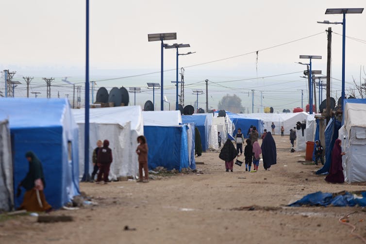


