Analysis by Keith Rankin.
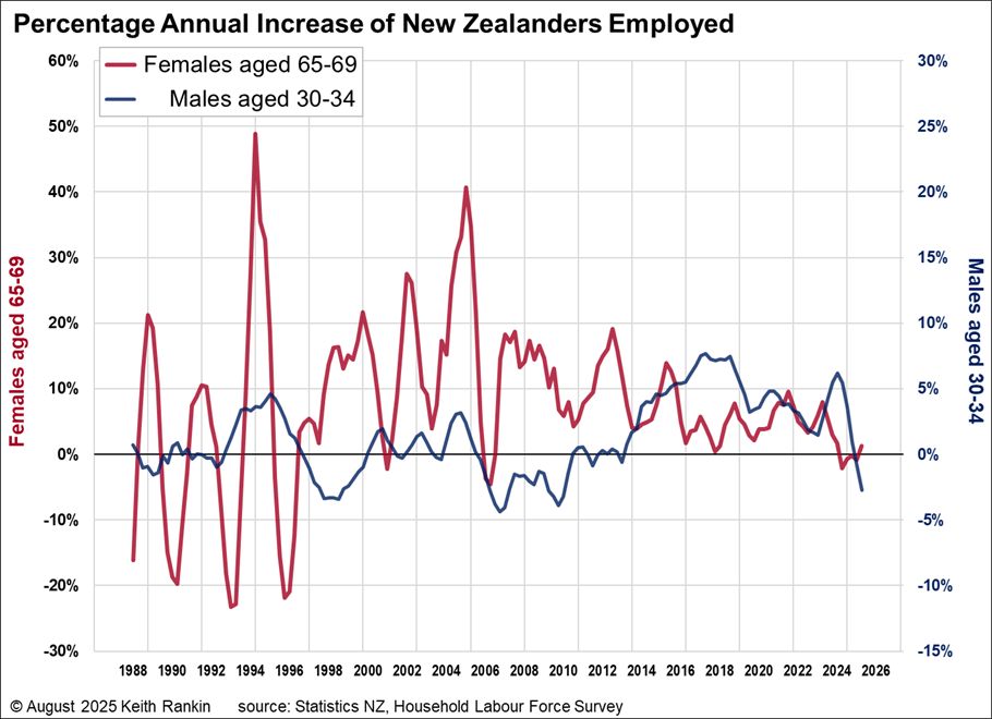
The above chart shows – in red – the annual percentage increase (since 1988) in numbers employed of women aged 65-69, based on Household Labour Force Survey employment data. (And it shows, for comparison, males aged 30-34; in blue, their percentages are shown on the right-hand side of the chart. I explain below why I contrast older women with younger men.)
The employment growth of older women is particularly variable. But there are some clearly discernible patterns. To help show these, I have used “vertical gridlines” 33 months apart; 2¾ years is the persistent period of New Zealand’s trade cycle.
There are several reasons why employment may go up or down. First is simply the growth of the population for the demographic portrayed. For the latest data, the most recent women portrayed (the 2025 data point) were born around 1957 (ie born in 1957±2). Birth numbers in New Zealand peaked in the decade from 1955 to 1964; so, there will be many more women still alive in this birth cohort than in previous cohorts, and recent international migration will be low for that age group. Especially as life expectancy has been rising, population growth is a major reason for an increase in women aged 65-69 who are employed. So, growth of employment in this demographic should be well above the zero showing for the last two years.
Another reason for higher employment numbers is ‘labour force participation rates’. Charts that I posted recently from the same dataset show participation rates for women aged 65-69 having risen to 44% in 2022, the last peak of the cycle. (See my Employment in New Zealand – especially of women – at the Age Margins.) It’s unlikely that the actual participation rate has fallen since 2022; more likely it has risen in line with the trend this century (participation up from 10% to 44% of the available population); although the official participation rate has fallen. The difference between the actual and official participation rates is known as ‘hidden unemployment’)
The third reason for changing employment for ‘retirement-age women’ is the ‘added-worker effect’. This effect, highly apparent for this demographic, means that employment and actual labour force participation move essentially counter to the economic cycles (including the 33-month trade cycle). This countercyclical effect, similar to the enrolment patterns for tertiary education, is particularly apparent from 1988 to 1997. And it’s understated by the employment data, because the times when more older women want to be employed will be times of generally high unemployment. The data peaks here – eg in late 1988 and mid-1991 – reflect both the increased desire for paid work, and the reduced ability to secure paid work.
The ‘added-worker effect’ operates when other sources of household income are reduced, or when major costs such as mortgage interest or rent are high and/or rising. For this demographic there is also a ‘subtracted worker effect’, meaning that these women choose to retire whenever they can afford to retire.
It is apparent that, for the most part, the peak increases in the employment of older women follow the 33-month trade cycle. The red peaks are on or close to the charts’ vertical gridlines. There were however disruptions to the cycle caused by the 2008/09 Global Financial Crisis, and in the 2020s thanks to the Covid19 pandemic.
Males aged 30-34
The blue graph for males aged 30-34 shows the economic cycle as we would expect. This is a demographic with a very high and stable labour force participation rate. As is apparent, the blue plot is to an extent countercyclical to the red plot. The main male employment cyclical peaks were in the mid-1990s, the mid-2000s, the late 2010s, and in 2023.
We particularly note that employment growth for youngish men was weak in the late 1990s and the late 2000s. Rising young-male employment was particularly strong between 2024 and 2018, reflecting strong immigration for this demographic.
Since the present government has been in power – ie from November 2023 – employment growth for youngish men has plummeted, despite high levels of net immigration, and despite this being the baby-blip generation born in the early 1990s. Basically, the economy ‘tanked’ in 2024 and 2025.
Female birth cohorts
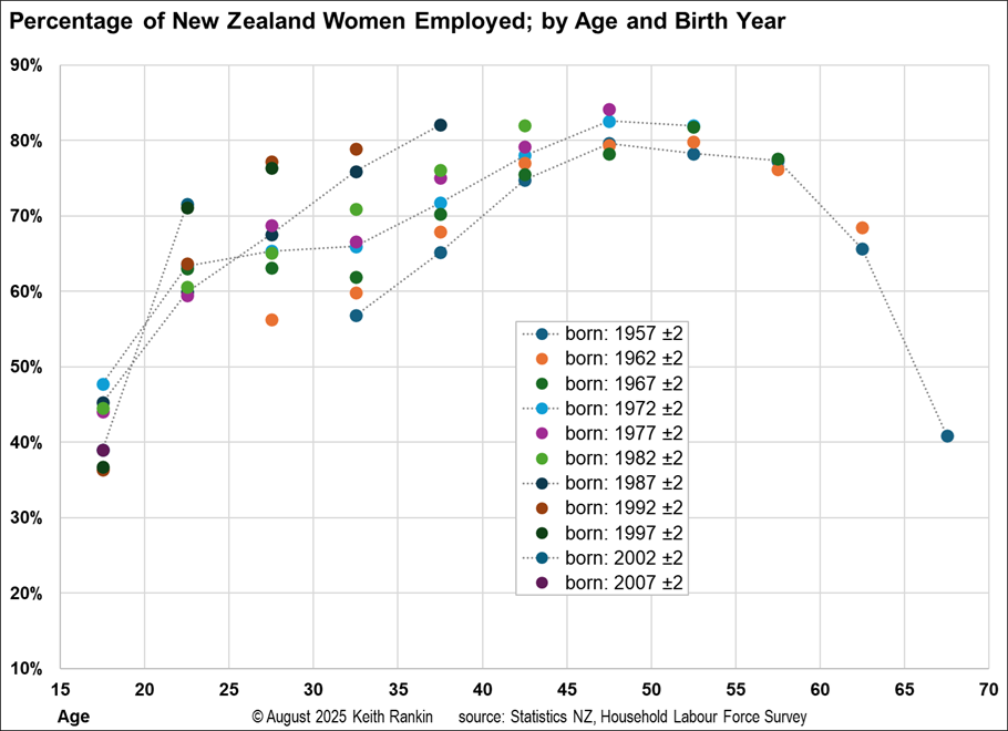
The second chart shows women’s employment/participation for different ‘generations’. For women born around 1957, employment peaked at just under 80% of the available population, when they were aged about 47. For the next generation, that peak is even higher, at about 83% of available women; and this is despite more women having babies later in life.
Generally, younger generations of women have had markedly higher participation rates, especially between ages 25 to 40.
Finally
Once upon a time ago we ‘worked to live’. Since the neoliberal and feminist revolutions, we have ‘lived to work’. I am not convinced that this is progress. Progress is supposed to be productivity growth; more outputs per unit of (labour and other) inputs. What we have seen is much more input – with labour inputs being shown here – yet economic growth if anything seems to have slowed.
To have a sustainable future, we should be stabilising output, while contracting inputs. Employment counts, as defined by the HLFS, are crude measures of inputs. It is perfectly possible to have more people employed, wanting and getting fewer hours per week on average. That’s not what we have here. Rather, we have more and more people desperate for employment to pay the bills, and a substantial decline in time committed to the other non-income-focused aspects of life. Women have been on the frontline of this seek-more-work play-less zeitgeist.
*******
Keith Rankin (keith at rankin dot nz), trained as an economic historian, is a retired lecturer in Economics and Statistics. He lives in Auckland, New Zealand.