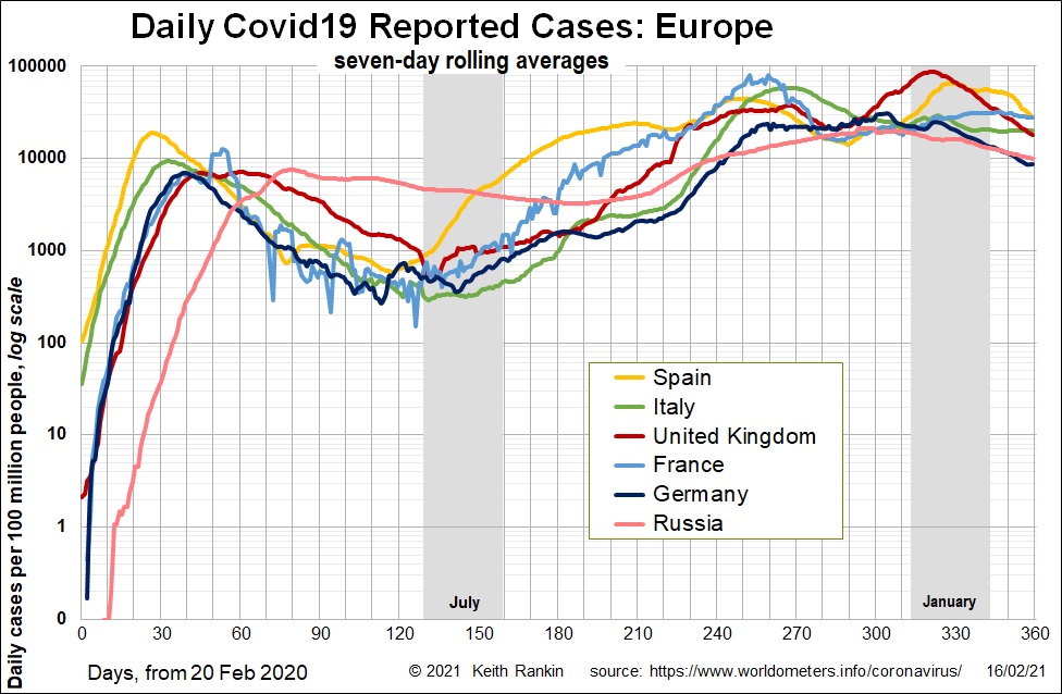
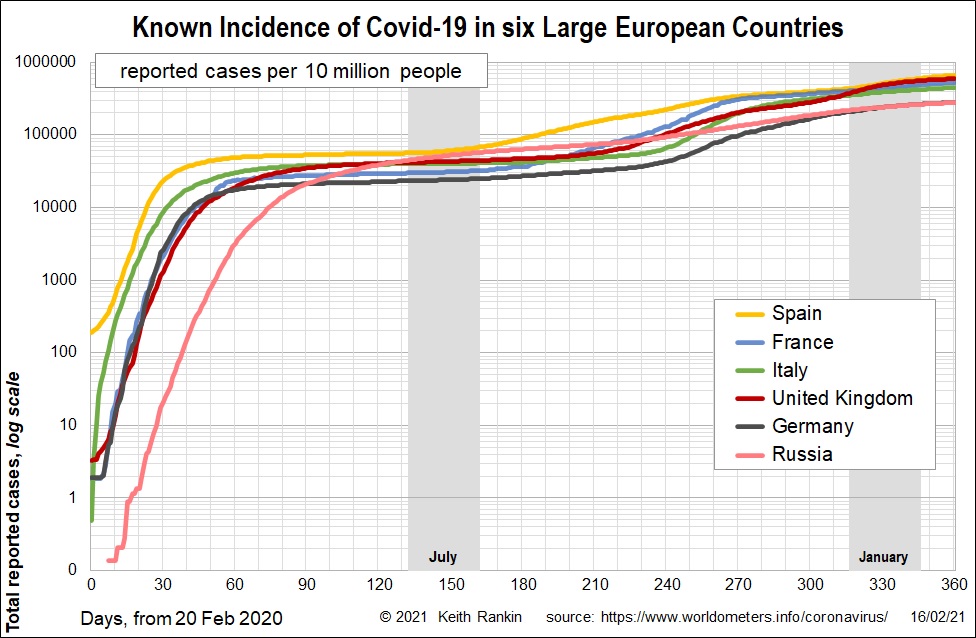
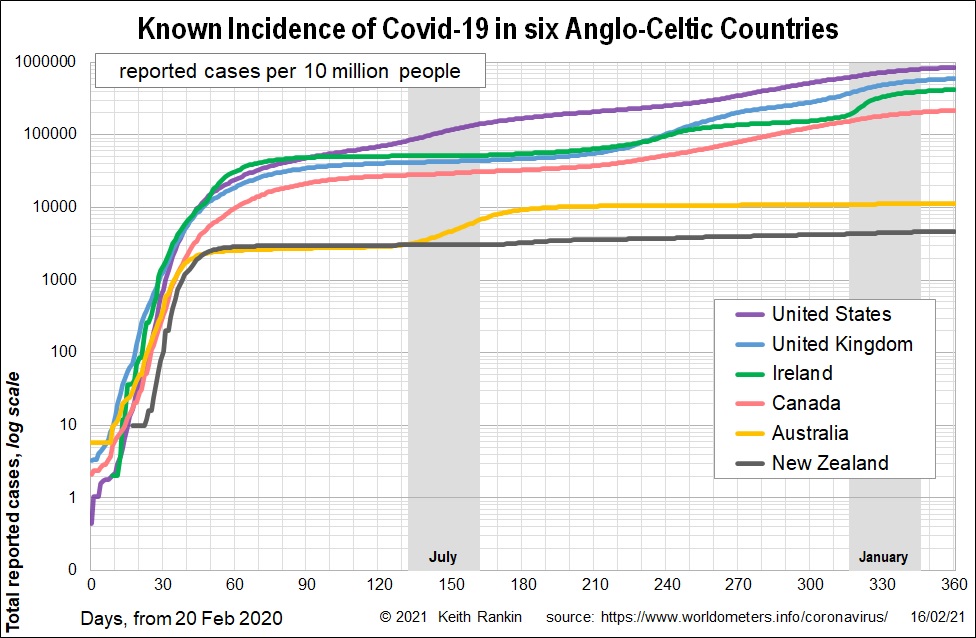
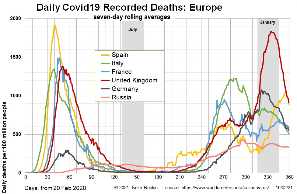
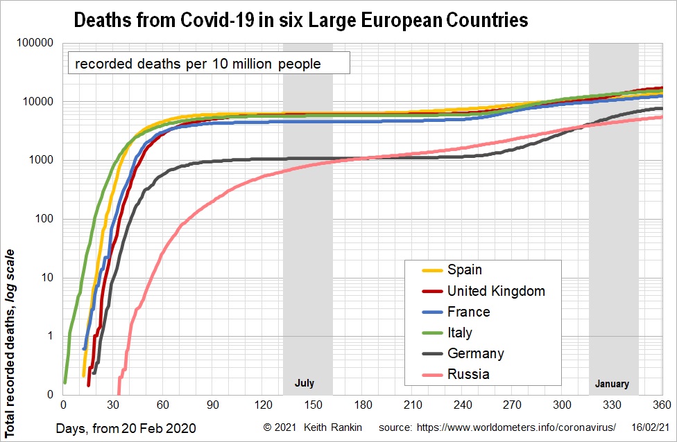
Fewer reported cases than the New Year peak, but still more than in the first peak. Chart by Keith Rankin.Convergence of reported cases, at three to six percent of the population. Chart by Keith Rankin.United States approaching confirmed infection rate of ten percent. Chart by Keith Rankin.Latest death rates reflect differences in restrictions rather than vaccinations. (Arithmetic scale.) Chart by Keith Rankin.The worst death tolls – including UK – now approaching two per thousand. Chart by Keith Rankin.Canada’s death rate 100 times New Zealand’s; other Anglos worse. Chart by Keith Rankin.